


The Russian beauty brand at the center of this collaboration represents a new generation of influencer-driven enterprises reshaping global cosmetics. Emerging from Moscow’s competitive beauty scene, the brand was conceptualized by a Russian public figure whose social media savvy and environmental advocacy provided immediate credibility. Their core philosophy merges Eastern European botanical traditions with modern sustainability demands, appealing to a global audience fatigued by greenwashing in the beauty industry.
Product development is deeply rooted in terroir-driven sourcing, with ingredients harvested from family-owned farms spanning Ukraine’s sunflower fields to Kazakhstan’s alpine meadows. This regional focus allows traceable supply chains while supporting rural economies – a narrative that resonates powerfully in marketing campaigns. The product range strategically bridges skincare and wellness, offering everything from rosehip serums to camel milk moisturizers, each formulation avoiding synthetic preservatives through innovative cold-process techniques.
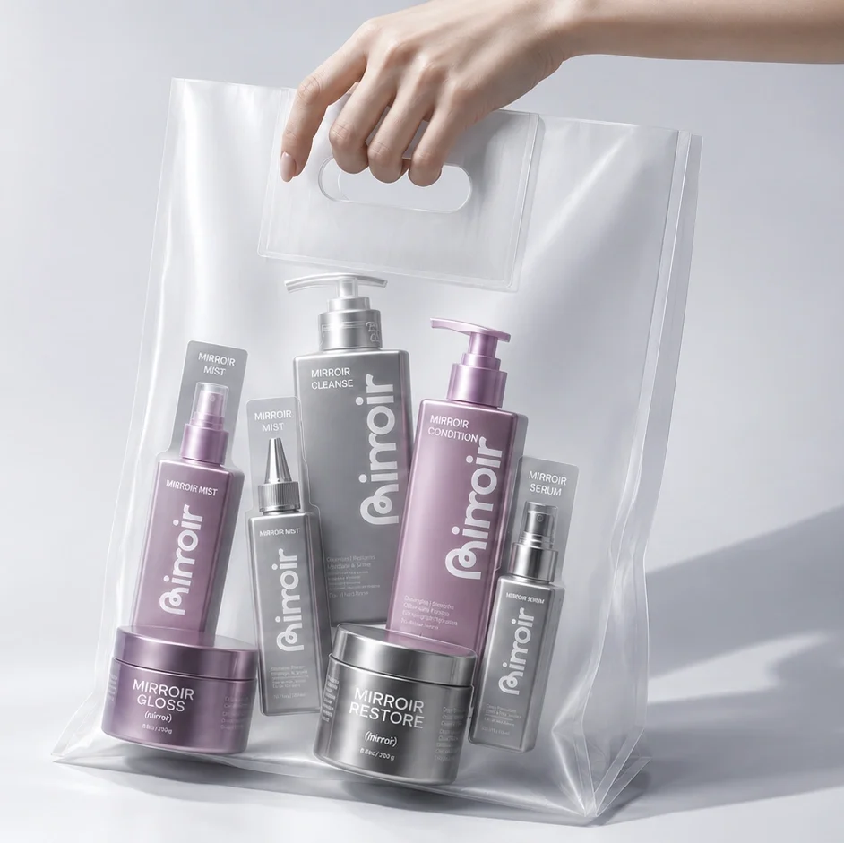
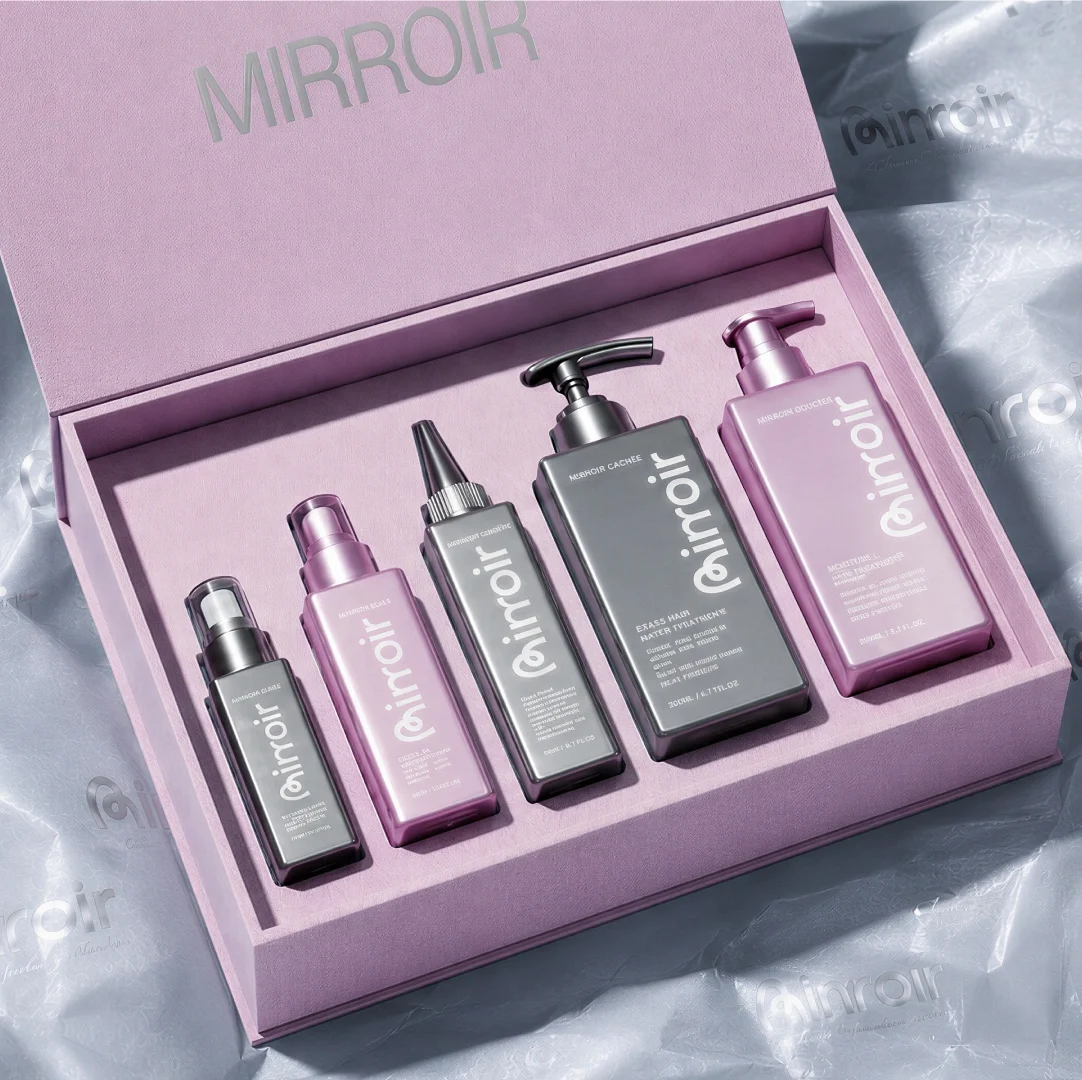
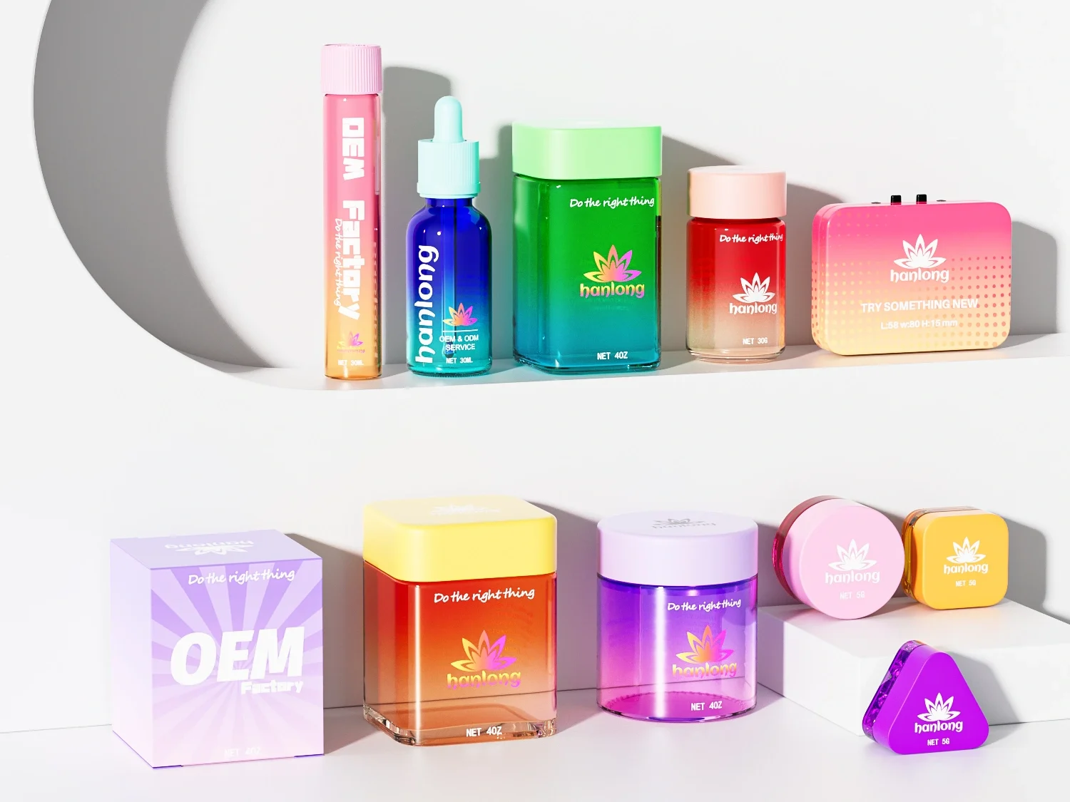
Visual identity plays a paramount role in the brand’s Instagram-centric strategy. The signature pastel palette (particularly #FFB7C5 and #F8E9E4 Pantone shades) was creating shelf recognition in crowded digital feeds. Packaging goes beyond aesthetics as a functional manifesto with materials like glass and aluminum. These choices reflect a calculated balance between luxury perception and environmental responsibility critical for Western markets.
Global expansion strategy reveals meticulous market segmentation. European markets receive Nordic-inspired minimalist designs, while Middle Eastern editions incorporate discreet geometric patterns inspired by Islamic art. For the Chinese market, QR-code enabled packaging links directly to Rednote tutorials, leveraging the platform’s social commerce ecosystem. This localization extends to product formats – upcoming Middle Eastern launches feature argan-oil based products in heat-resistant UV glass, addressing both cultural preferences and climatic challenges.

Initial Collaboration: Establishing a Foundation
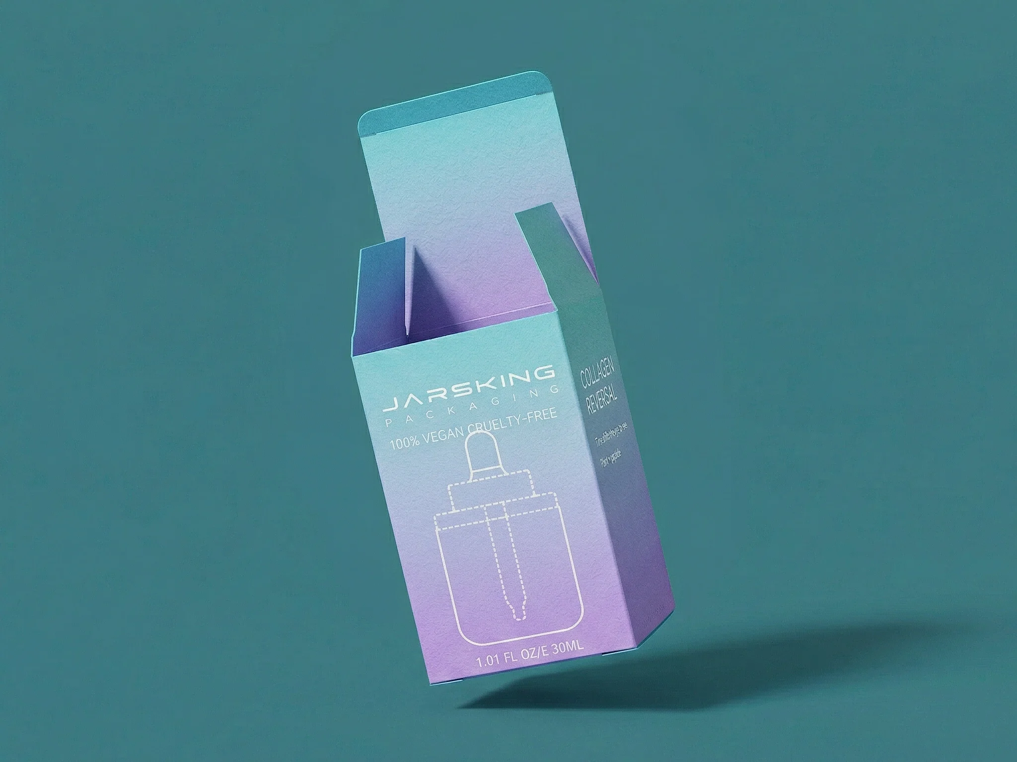
The partnership’s genesis stemmed from the brand’s urgent need to transition from conceptual packaging designs to production-ready solutions that could withstand global distribution demands. As a digital-native company scaling rapidly, the client required packaging that balanced Instagram-worthy aesthetics with functional durability – a complex challenge given their use of delicate, plant-based formulations prone to oxidation. Jarsking’s engineers evaluated borosilicate glass, PCR plastics, and biodegradable polymers against pH-sensitive serums and oil-based creams.
The breakthrough emerged in a hybrid design strategy: amber-tinted glass to shield light-reactive ingredients, paired with silicone sleeves for shock absorption during transit. This approach not only preserved product integrity but also elevated the brand’s signature pastel palette. By reimagining packaging as both protective armor and aesthetic showcase, Jarsking laid the groundwork for a versatile system that would later expand into serums, creams, and travel kits—each iteration refining the balance between beauty and resilience that became central to the brand’s global identity.
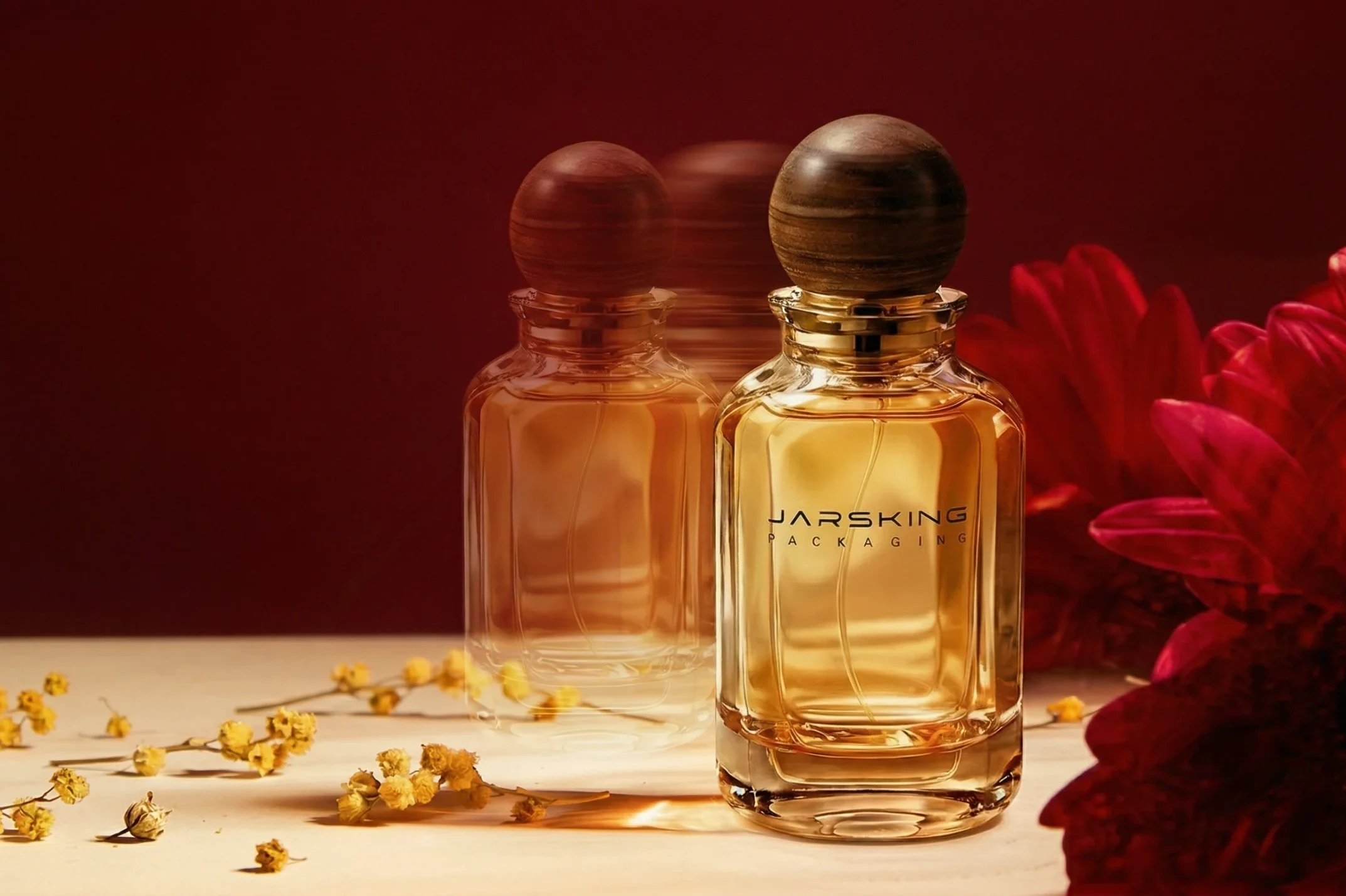
For the brand’s antioxidant-rich serums—delicate formulas prone to degradation from light and air—Jarsking crafted a solution that blended scientific protection with Instagrammable appeal. The 30ml dropper bottles, dubbed “Blush Frost,” featured translucent pink glass that acted like sunscreen for skincare. This material blocked some harmful UV rays while allowing the serum’s natural golden hue to glow through, creating a jewel-like effect that became a hallmark of the brand’s social media presence. The dropper system was designed for both precision and hygiene. Glass pipettes ensured single-drop accuracy, ideal for potent actives like vitamin C or retinol. A tamper-evident seal addressed consumer safety concerns. Users appreciated how the mechanism felt “pharmacy-grade yet luxurious,” bridging clinical trust with beauty indulgence.
Recognizing the on-the-go lifestyles of millennial shoppers, Jarsking added detachable silicone sleeves in six muted pastel shades. These sleeves served triple duty: protecting glass from drops, providing firm grip, and enabling color-coded organization for multi-serum users. The matte texture contrasted with the glass’s sheen, creating visual depth that photographed beautifully on influencers’ vanity trays.

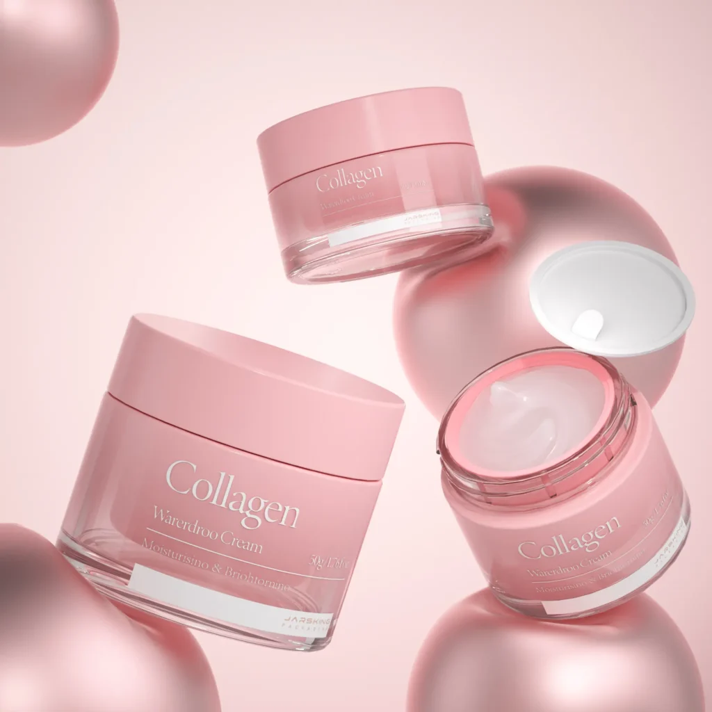
For the brand’s probiotic-rich night creams—formulations requiring defense against air and contamination—Jarsking reimagined preservation as an art form. The ivory-colored airless jars, with their soft matte finish, evoked the clean elegance of marble statues while serving as high-tech guardians for sensitive ingredients. The jars’ seamless design hid a clever two-compartment system: one chamber housing live probiotic cultures, the other containing stabilizing oils.
The jars’ airless pump technology worked like a precision elevator, pushing the base upward with each press to prevent oxygen exposure. This not only kept the probiotics alive but also allowed users to scrape every last bit of product—a detail skincare enthusiasts celebrated in “empty jar” TikTok tutorials. The rose gold logos added a whisper of luxury against the neutral backdrop. Subtle textural contrasts elevated the user experience. The jar’s weighted base provided satisfying heft, while the ribbed lid offered nonslip grip for nighttime routines.
The brand’s alcohol-free toners required a dispensing system that married eco-conscious design with spa-like luxury. The 120ml Misty Rose spray bottles became an instant standout, their curved glass bodies echoing the soft contours of rose petals. Designed for sensitive skin formulations, these bottles delivered a velvety-soft mist that customers described as “walking through a morning dew garden” – gentle enough for post-procedure skin yet refreshing for midday pick-me-ups.
Jarsking engineered the spray mechanism to achieve 300 precise doses per bottle, each spritz releasing a cloud of micro-droplets that evenly blanket the face without dripping. This consistency proved crucial for active ingredients like hyaluronic acid and chamomile extract, ensuring every application delivered the perfect hydration boost without overwhelming delicate complexions. The bottles’ airtight seals prevented oxidation, keeping toners fresh for up to 18 months – a key advantage for the brand’s global distribution network.

The rose gold actuator cap added a touch of opulence, its ergonomic ridge fitting perfectly between fingertips for controlled misting angles. Additionally, The refill-friendly design featured wide necks, making it easy to replenish products from bulk containers while minimizing plastic waste. Social media exploded with tutorials showing the bottle’s dual use – setting makeup with a delicate haze while doubling as a purse-sized cooling spray during heatwaves. Post-launch surveys revealed 83% of buyers kept refilling their “rose mist companion,” cementing its status as both sustainable staple and beauty ritual essential.
To elevate the brand’s holiday gift sets into shareable lifestyle moments, Jarsking engineered a nested 30-40-50ml bottle system that combined visual storytelling with practical functionality. The gradient pink palette—transitioning from Dusty Quartz (a muted mauve) to Peony Bloom (a vibrant carnation hue)—was strategically chosen to evoke the warmth of seasonal celebrations while maintaining the brand’s signature pastel identity. This chromatic progression created an instant “unboxing narrative,” encouraging customers to share the aesthetically pleasing arrangement across social platforms.
The modular design centered around a magnetic bamboo tray, its natural grain providing organic contrast to the soft pink bottles. Each compartment cradled interchangeable components—droppers for serums, sprayers for toners, and airless pumps for creams—allowing users to customize their skincare rituals. This “mix-and-match” flexibility transformed static gift sets into interactive experiences, with influencers demonstrating personalized combinations like “Winter Glow Trios” or “Jet-Set Essentials.”

Middle Eastern Market Adaptation: Design Synthesis
As the brand enters the Middle Eastern market, Jarsking’s design team has meticulously woven regional artistry into the brand’s minimalist DNA, creating packaging that feels both culturally attuned and distinctly on-brand. Drawing inspiration from iconic Islamic architectural marvels—such as the intricate tessellations of Morocco’s Alhambra and the star-and-geometry motifs of Dubai’s Sheikh Zayed Mosque—designers reimagined these patterns as subtle, tactile details.
Color palettes evolved to include warm metallics—rose gold accents on pump dispensers, copper-foil stamping on labels—that echo the region’s affinity for opulence. These are layered over the brand’s signature pastels, creating depth without overpowering; a blush pink serum bottle might feature a cap with a gold-anodized geometric inlay, marrying desert sunset hues with urban sophistication.
Asian Market Strategy: Culturally Intelligent Design
For the brand’s Asian expansion, Jarsking is redefining luxury packaging as multisensory, tech-integrated experiences that cater to the region’s unique blend of tradition and hyper-modernity. The design philosophy centers on “pocket palaces”—travel-sized serums and creams with slim, origami-inspired silhouettes that fit seamlessly into miniature handbags popular across Asian metropolitan cities.

The inclusion of QR codes represents a thoughtful bridge between physical product and digital experience. By allowing consumers to trace ingredient origins, Jarsking acknowledges the sophisticated ingredient awareness common among Asian beauty consumers, particularly in markets like South Korea and Japan where formulation expertise is highly valued. Providing access to production information caters to the growing demand for ethical consumption narratives and authenticity verification that has emerged strongly in Chinese luxury markets.
The material choices create a tactile experience that communicates luxury without ostentation. Matte gold accents provide a subtler interpretation of luxury that feels contemporary rather than flashy, appealing to the evolving aesthetic preferences of affluent Asian consumers who increasingly value understated elegance. Textured frosted glass creates a tactile experience that distinguishes the product on crowded beauty counters while providing a sensorial dimension to the unboxing experience—crucial in markets where product unboxing content is widely shared on social platforms.
The strategic use of limited editions demonstrates cultural intelligence in Jarsking’s approach. Seasonal motifs like cherry blossoms (significant in Japan, Korea, and China) and Lunar New Year designs show cultural respect while creating timely marketing moments aligned with major consumption periods in these markets. This approach taps into the collector mentality prevalent in many Asian markets, where limited edition packaging often drives purchase decisions and creates secondary market value.

Conclusion
The collaboration between Jarsking and this Russian influencer beauty brand exemplifies how innovative packaging can serve as both a market differentiator and a cultural bridge. By aligning material science with storytelling, the partnership has transformed skincare containers into ambassadors of the brand’s core values—purity, sustainability, and cross-cultural elegance. The success lies not just in solving logistical challenges but in elevating packaging to a tactile extension of the brand’s digital-first narrative.
Far from being a constraint, the brand’s eco-commitments have become its most potent marketing tool. Jarsking’s material innovations—from UV-filtering glass to compostable inserts—demonstrate that environmental responsibility can coexist with luxury. This duality resonates powerfully with Gen Z and millennials globally.
The brand’s expansion into the Middle East and Asia reveals a blueprint for globalization rooted in respect rather than homogenization. By embedding region-specific motifs like arabesque geometries, Jarsking has proven that cultural nuance isn’t about pandering—it’s about creating dialogue. These designs honor local traditions while advancing the brand’s minimalist ethos, fostering emotional connections that transcend borders.
Packaging’s role as a bridge between physical products and digital ecosystems has been fully realized. QR codes linking to Rednote tutorials and sourcing to ingredients have transformed static containers into interactive touchpoints, deepening engagement in markets where social commerce reigns. This synergy between tactile craftsmanship and digital utility positions the brand at the vanguard of beauty’s phygital future.
As the partnership evolves toward carbon-neutral materials and AI-enhanced packaging, it charts a path for the beauty industry’s next decade—one where every bottle tells a story of environmental stewardship, cultural synthesis, and technological boldness. In an era of fleeting trends, this case study reminds us that enduring brands are built not just on what’s inside the package, but on the values and visions its very existence proclaims.