Jarsking covers all cosmetics,cannabis and perfume markets. Ask custom solutions here!
The world’s go-to cosmetic packaging factory for custom branding. Talk to Jarsking Team
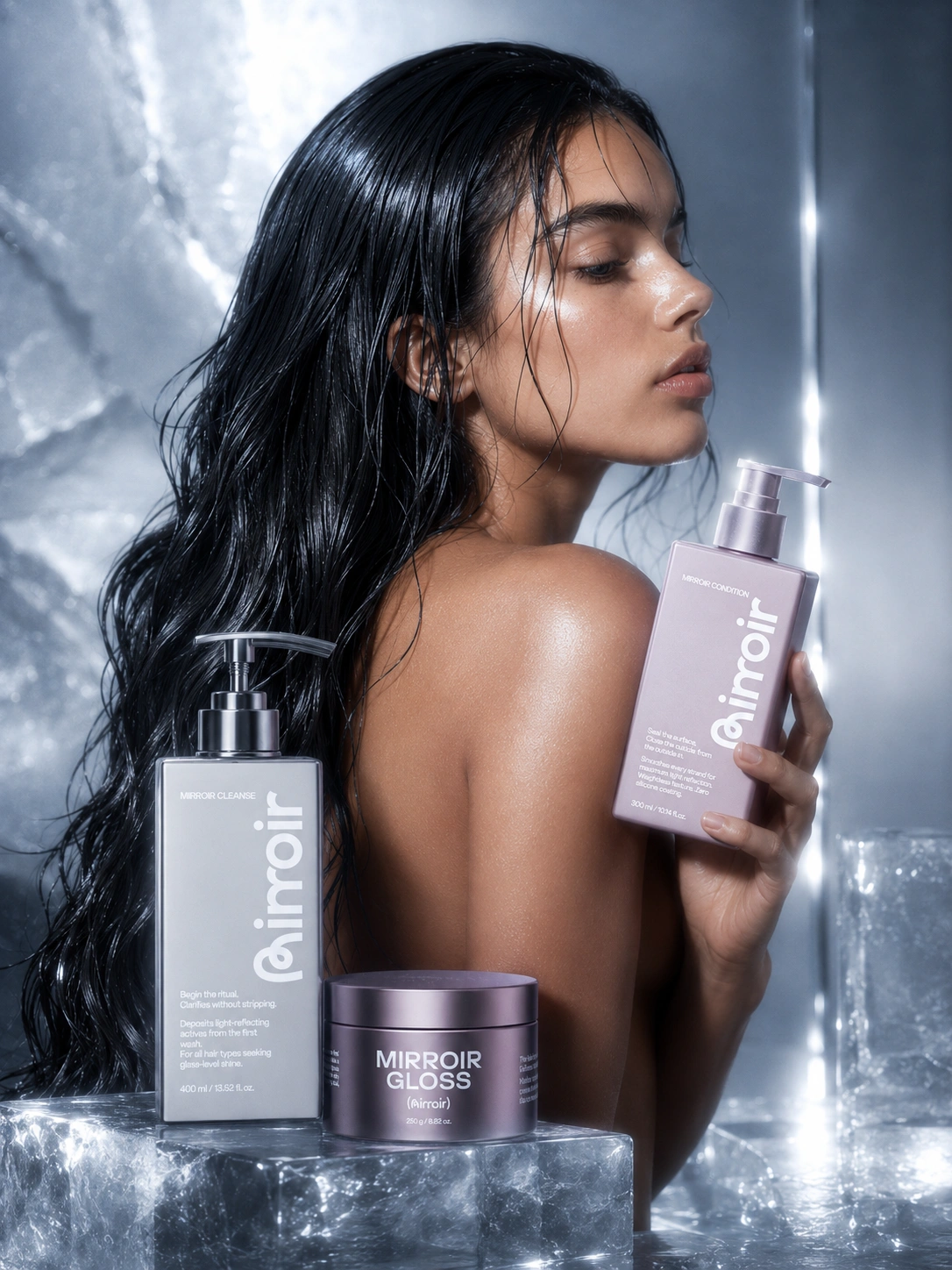
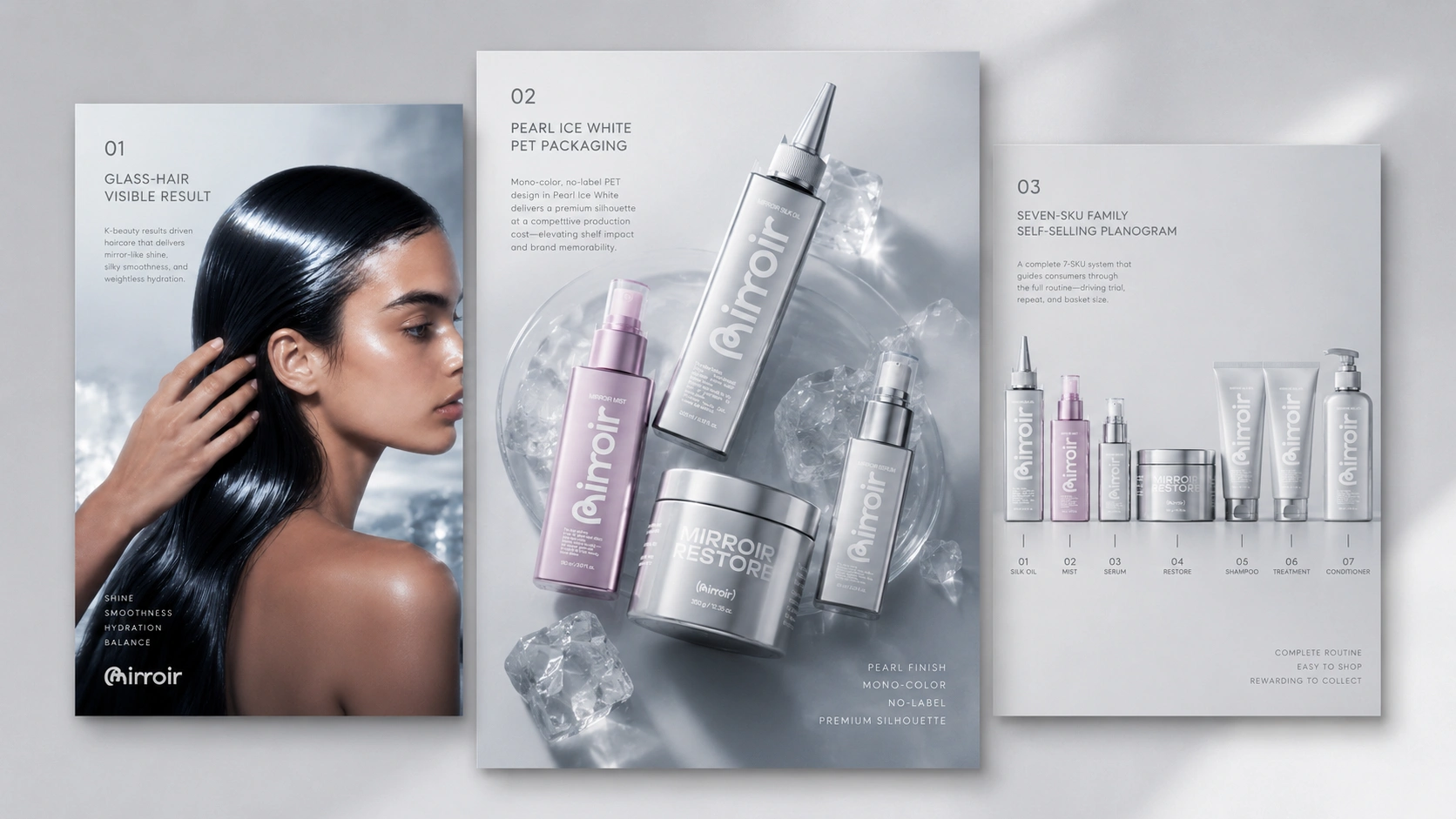
MIRROIR is a full-concept packaging development project created by Jarsking — a working demonstration of how a science-led hair care brand can be conceived, structured, and packaged as a coherent, retail-ready system, from brand philosophy to bottle specification to social content deployment.
Every element shown here — the silhouette, the dual-colorway architecture, the decoration strategy, the product hierarchy, the gift set format — was developed on Jarsking’s square PET bottle platform, with real manufacturing logic built into every creative decision. The result is a seven-SKU luxury hair care collection that photographs at a level far above its production cost and communicates a specific, differentiating brand idea from the first glance.
The name MIRROIR — a deliberate twist on the French miroir, mirror — carries both its promise and its method in a single word. Reflection is not the aesthetic goal. It is the technical one.
The wordmark is set in a round, fluid sans-serif with a custom-modified letterform: the opening character functions simultaneously as a monogram and as a visual motif that suggests a strand of hair in motion, a continuous loop, a ritual that repeats. Set against brushed metallic surfaces or printed directly onto the bottle body, the logo reads with quiet authority. It does not announce itself. It reflects.
The supporting tagline — “There is a kind of hair that can silence a room” — appears in a contrasting script italic beneath the wordmark. The typographic pairing is deliberate: modern system-brand confidence softened into something the consumer can feel personally. The script is not decoration. It is the emotional permission structure for the product promise.
Color in the MIRROIR system does two things simultaneously: it communicates functional position within the ritual, and it creates a shelf architecture that rewards the consumer who collects the full range.
Steel Grey governs the primary cleansing and treatment SKUs — Cleanse, Restore, and Silk Oil. Cool, measured, and directional, it reads as scientific credibility without clinical coldness. Against it, the white surface print and dark pewter pump hardware create a monochromatic hierarchy that feels considered rather than minimal.
Pearl Violet covers the conditioning and finishing SKUs — Condition, Mist, Serum, and Gloss. The shift in colorway is a deliberate phase signal: the system moves from function toward luminosity, from correction toward completion. The violet reads as warm and tactilely inviting — the color of something that belongs on a vanity rather than a shelf.
| SKU | Format | Volume | Colorway |
|---|---|---|---|
| MIRROIR Cleanse | Square pump bottle | 400 ml / 13.52 fl. oz | Steel Grey |
| MIRROIR Condition | Square pump bottle | 300 ml / 10.14 fl. oz | Pearl Violet |
| MIRROIR Restore | Wide-mouth jar | 350 g / 12.35 oz | Steel Grey |
| MIRROIR Silk Oil | Precision applicator bottle | 200 g / 7.05 oz | Steel Grey |
| MIRROIR Mist | Fine-mist spray bottle | 150 ml / 5.07 fl. oz | Pearl Violet |
| MIRROIR Serum | Compact spray bottle | 60 ml / 2.03 fl. oz | Pearl Violet |
| MIRROIR Gloss | Wide-mouth jar | 250 g / 8.82 oz | Pearl Violet |
The product copy embedded in each SKU visual is not supplementary brand language. It is structural — each bottle announces its role in the ritual the moment it is picked up.
The oversized grey bottle and full-face wordmark make it the most architecturally dominant piece in the set — appropriate for a product that begins everything.
MIRROIR Condition is the direct counterpart to MIRROIR Cleanse. Same square PET bottle body. Same pump format and dark pewter hardware. Same full-face wordmark at the same scale. The difference is the colorway — pearl violet where Cleanse is steel grey — it creates the visual pairing that anchors the entire product family: grey and violet, function and warmth.
A cream-format finish demands a jar. Wide-mouth, pearl violet, with the monogram lid that makes scooping a considered gesture.
The decision to use direct surface printing rather than applied labels on the square PET body is a design and commercial decision simultaneously. It keeps the surface plane uninterrupted, eliminates label edge visibility in wet bathroom environments, and allows the brand wordmark to scale dramatically across the full bottle face — creating a shelf presence that reads clearly at every distance.
The Jarsking square PET platform is photographed at a level far above its production cost — a critical commercial advantage in a market driven by social media visual content. In these channels, packaging is the product’s first advertisement.
The full lineup reads as a single design object when displayed together on a glass bathroom shelf: the alternating grey and violet forms create visual rhythm, and the graduated heights create a silhouette that rises toward the center and drops at each end. It is a range built for the shelf first and the individual sale second — because a consumer who sees the complete system is more likely to begin with one and return for the rest.
The social media system for MIRROIR was designed with the same structural discipline as the packaging system itself. The Instagram profile mock-up shows a feed organized around three visual registers: campaign imagery, flat lay product content, and editorial close-ups — each contributing to the same tonal signature without repetition.
The mobile story series consolidates the brand’s core messages into five frames: brand identity, hero product, formula philosophy, outcome, and system summary. The sequence is the same logic as the ritual: start with feeling, move through understanding, arrive at commitment.
The open-face tray shown here is a secondary packaging format designed for one specific commercial situation: when the brand wants to push Gloss or Restore as a standalone hero rather than as part of the full seven-SKU system.
The format works commercially because it solves a specific retail problem. When a brand runs a single-product promotion — a hero launch, a limited campaign, a counter feature — the full range display can actually dilute the focus. This tray isolates the product, elevates it, and gives the retailer something that functions as its own point-of-sale unit without additional fixtures.
The MIRROIR gift box is designed to open as a ritual in itself. The branded metallic tissue and bubble shipper carry the MIRROIR pattern print throughout the fulfillment experience, ensuring the brand arrives intact at the moment it matters most.
Jarsking Capability Note: The MIRROIR gift box concept can be developed across rigid board construction with deboss, foil, or screen-print branding, custom tray inserts in multiple colorways, and both magnetic closure and ribbon pull formats. Structural prototyping and material selection support are available alongside primary packaging development.
Jarsking’s outputs for the MIRROIR concept include a seven-SKU packaging system across five formats and two colorways, full wordmark and logo construction, dual-colorway decoration strategy, gift set and retail display design, mobile story series, social media identity, campaign direction, and a product family architecture designed for both premium retail and content-driven e-commerce channels.
17th Floor, East Tower, Building 2,
Yiyun Tech Innovation Center,
No. 33-13, Jinshi Third Road, Dayuan Street,
Baiyun District, Guangzhou City,
Guangdong Province, China
Office 10, 24th Floor,
The One Tower,
943 Sheikh Zayed Road,
Barsha Heights (Al Thanyah First),
Dubai, United Arab Emirates
© Copyright 2026 Jarsking Packaging All Rights Reserved.