logo

Custom Hair Care Packaging System

Project Overview

Second Strand™ Fibre Lab is a full-concept packaging development project created by Jarsking — a working demonstration of how a science-led haircare brand can be conceived, structured, and packaged as a coherent, retail-ready system, from logo geometry to bottle specification to lifestyle deployment.

Every element shown here — the silhouette, the color palette, the phase architecture, the label language, the gift set format — was developed on Jarsking’s customizable HDPE bottle platform, with real manufacturing logic built into every creative decision.

Brand Name and Logo

The name positions the brand at the intersection of clinical intelligence and accessible luxury — serious enough for professionals, refined enough for the premium retail shelf.

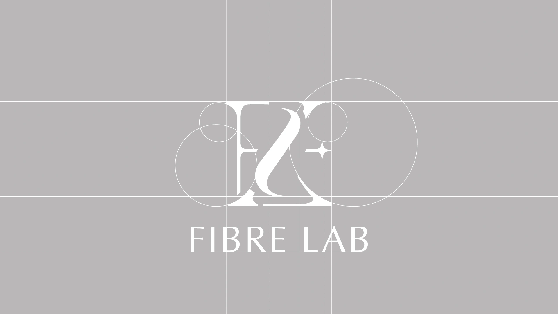
The monogram mark — a fluid interlocking of F, L, and 2 — was constructed on a precise geometric grid, using circular arcs and strict vertical axes to ensure balance and scalability. A single four-pointed star element introduces lightness and distinction. The result is a logo that reads as both heritage and modern, technical and elegant — one that can carry the brand from the e-commerce thumbnail to the boutique window display.

Products & Packaging

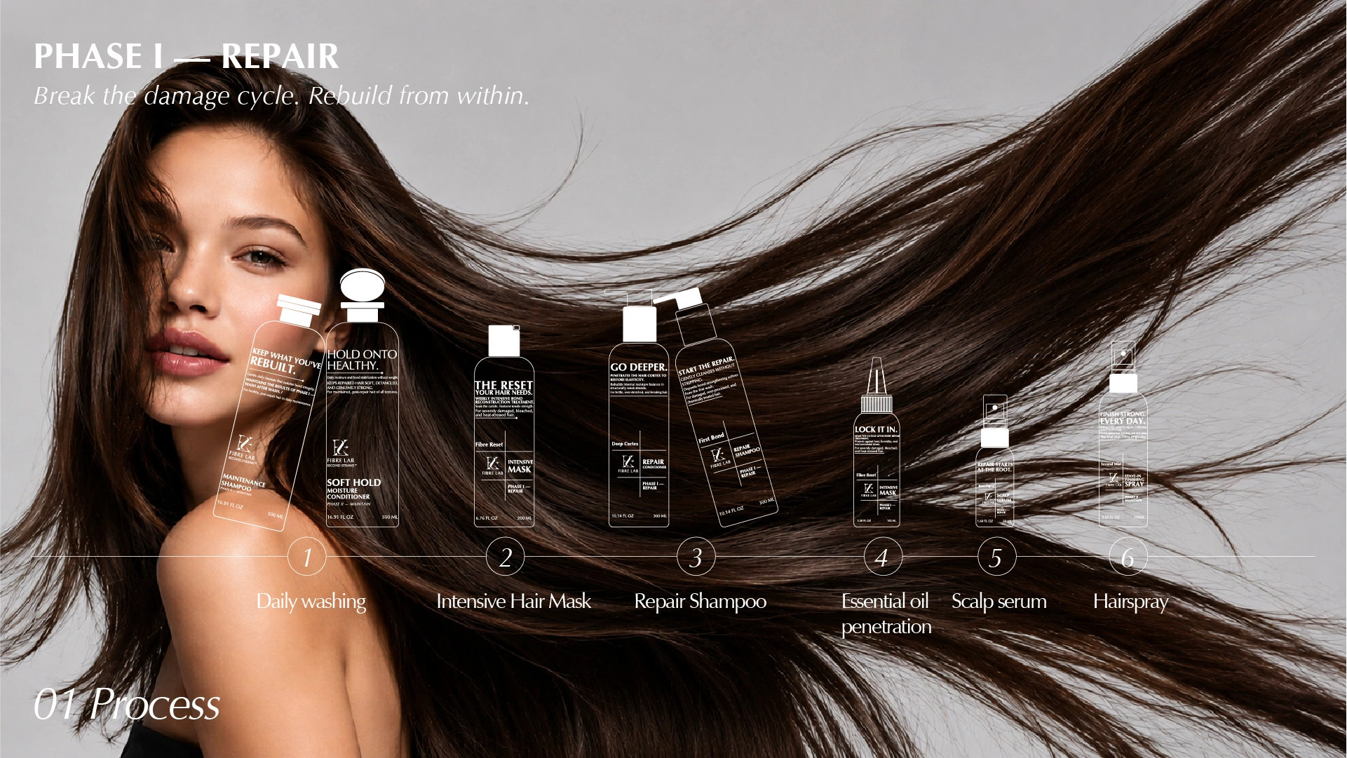
Fibre Lab organizes its entire system around a two-phase protocol that mirrors the actual sequence of repair:

  • Phase I — Repair: Rebuild the internal bond structure first, addressing damage at the cortex and cuticle level before anything else.
  • Phase II — Maintain: Protect and reinforce what has been restored, making strength a sustainable daily habit rather than a one-time treatment outcome.
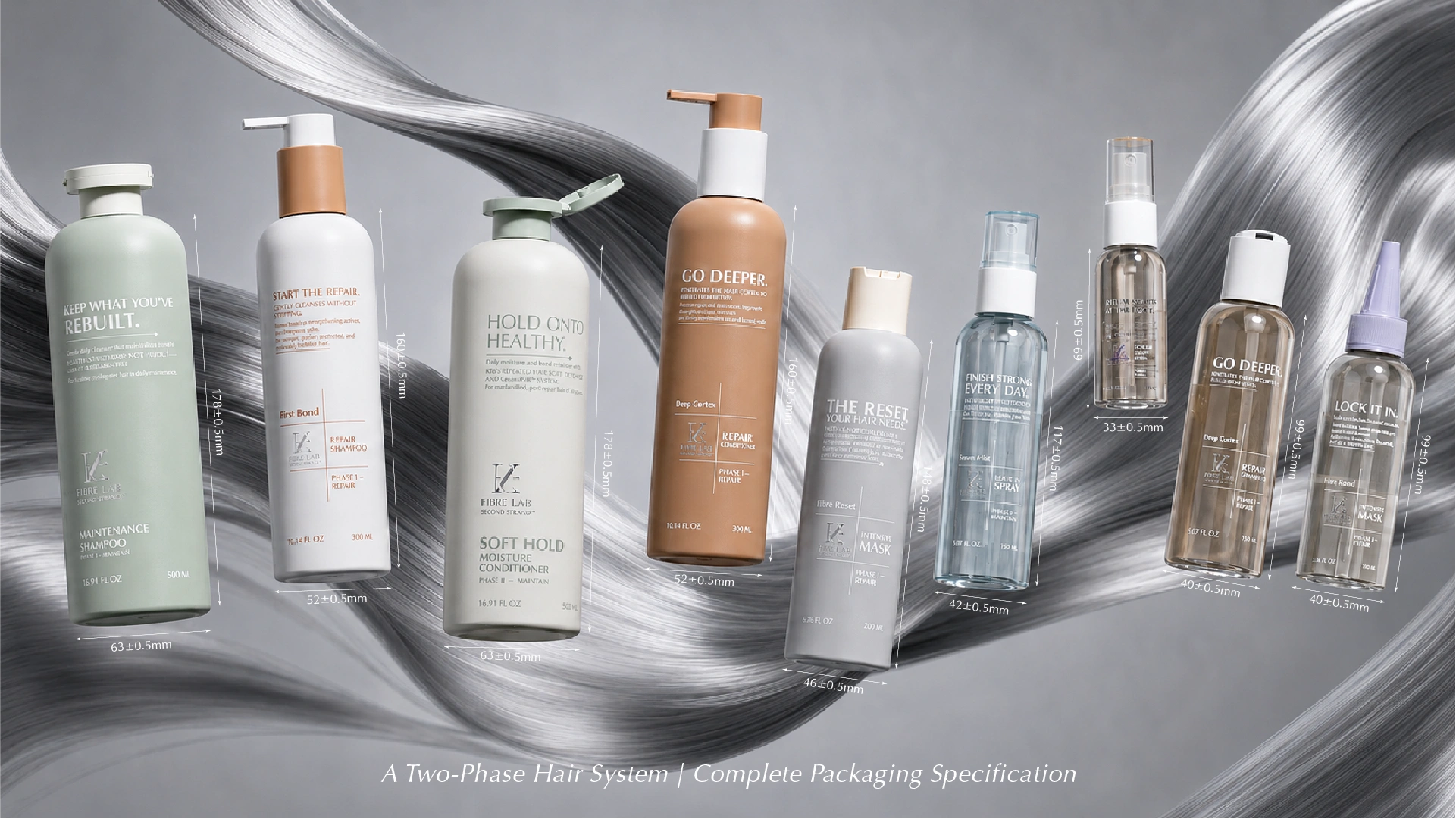
  • Every bottle communicates its position in the protocol through three deliberate signals: label copy that names the action, color that marks the phase, and format that reflects the moment of use.
  • The silhouette range — from compact treatment bottles to full-size pump formats — reflects a product architecture where size and form follow function, not trend.
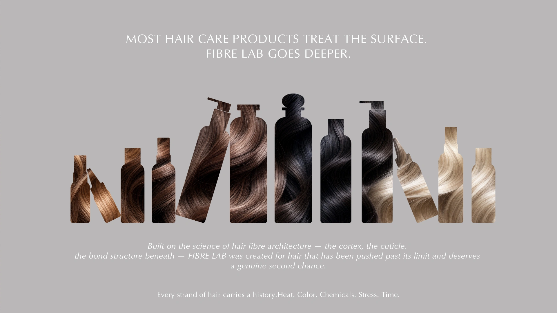
  • The hair textures shown within each bottle silhouette — blonde, warm brown, deep brunette, jet black — signal that the system was developed for hair diversity, not a single hair type or concern.

Color Language

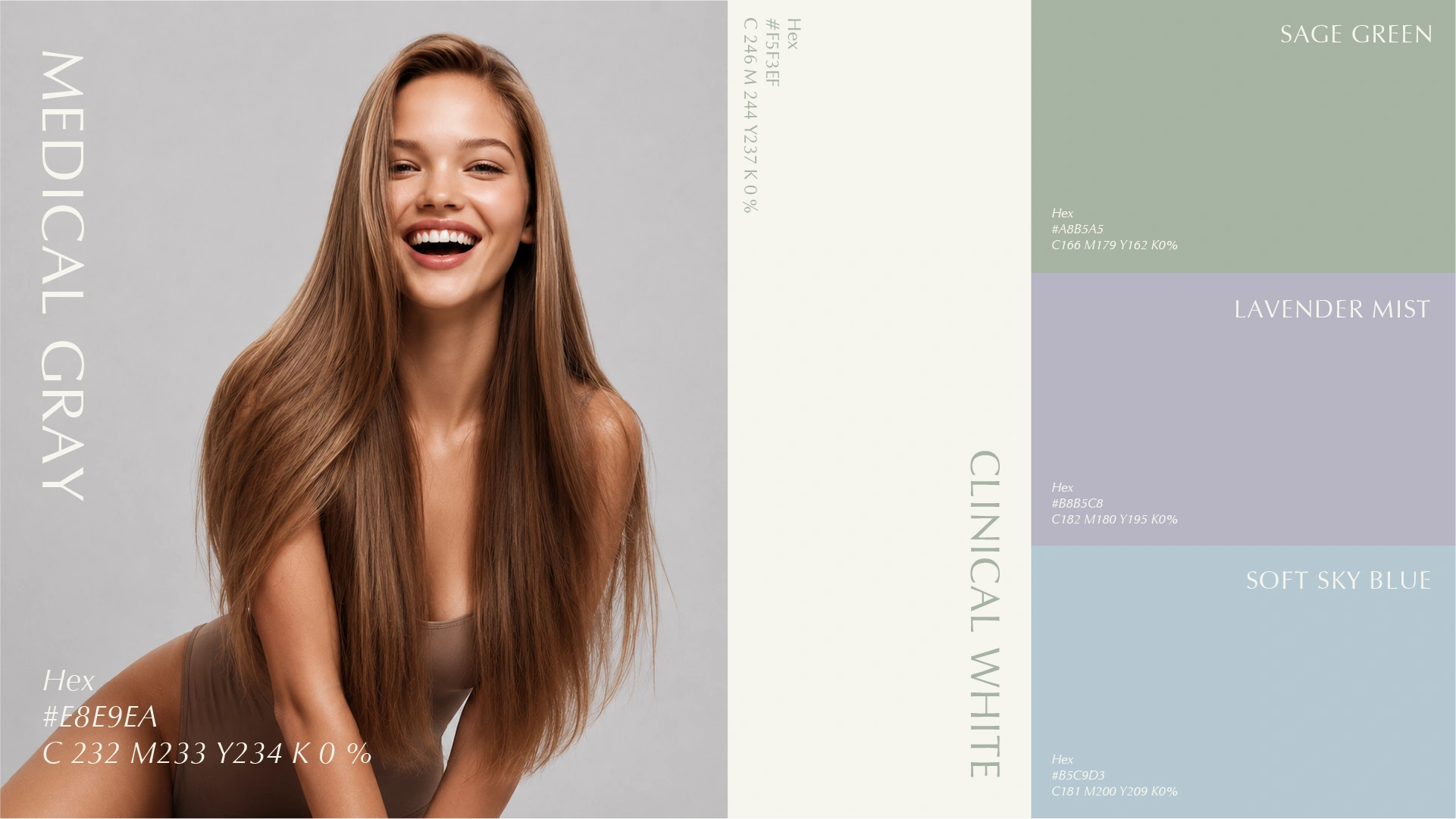
Color in hair care packaging does significant work. It establishes category signals — clinical, natural, luxurious — without a single word. The Fibre Lab color system was designed to communicate all three at once.

Watercolor_painting_illustration_featuring_cylindr1

Medical Gray

The primary background tone for large-format bottles in the Maintain phase. Cool, measured, and clean — it reads as science without sterility. Against it, the white label copy and warm terracotta accents create hierarchy and warmth.

Clinical White

A warm off-white — softer than pure clinical white, more elevated than standard packaging white. Used as the body tone for Repair-phase bottles, it communicates purity and formula confidence without the coldness of a stark white system.

Sage Green

Reserved for the Maintenance Shampoo — the daily ritual anchor of the system. Sage reads as botanical intelligence: grounded, considered, and trustworthy. On shelf, it provides the range’s most distinctive silhouette and serves as the visual entry point for first-time buyers.

Lavender Mist

Applied to treatment and leave-in products in the Repair phase. Lavender’s association with restoration and calm makes it a natural fit for intensive care formats — masks, serums, and scalp treatments. It signals gentleness without sacrificing sophistication.

Soft Sky Blue

Used on transparent spray formats and leave-in products. The translucency of the bottle combined with this pale blue tone creates a sense of lightness and breathability — reinforcing the product’s role in post-repair daily protection.

A Two-Phase Hair System. One Coherent Packaging Platform.

The Fibre Lab packaging system was designed as a unified architecture, not a collection of individual bottles. Every format in the range — from the 500ml pump bottle down to the 100ml intensive mask — shares a common structural logic: clean vertical lines, consistent neck finishes, and a proportioned label zone that carries product narrative without visual overload.

Product System & Ritual

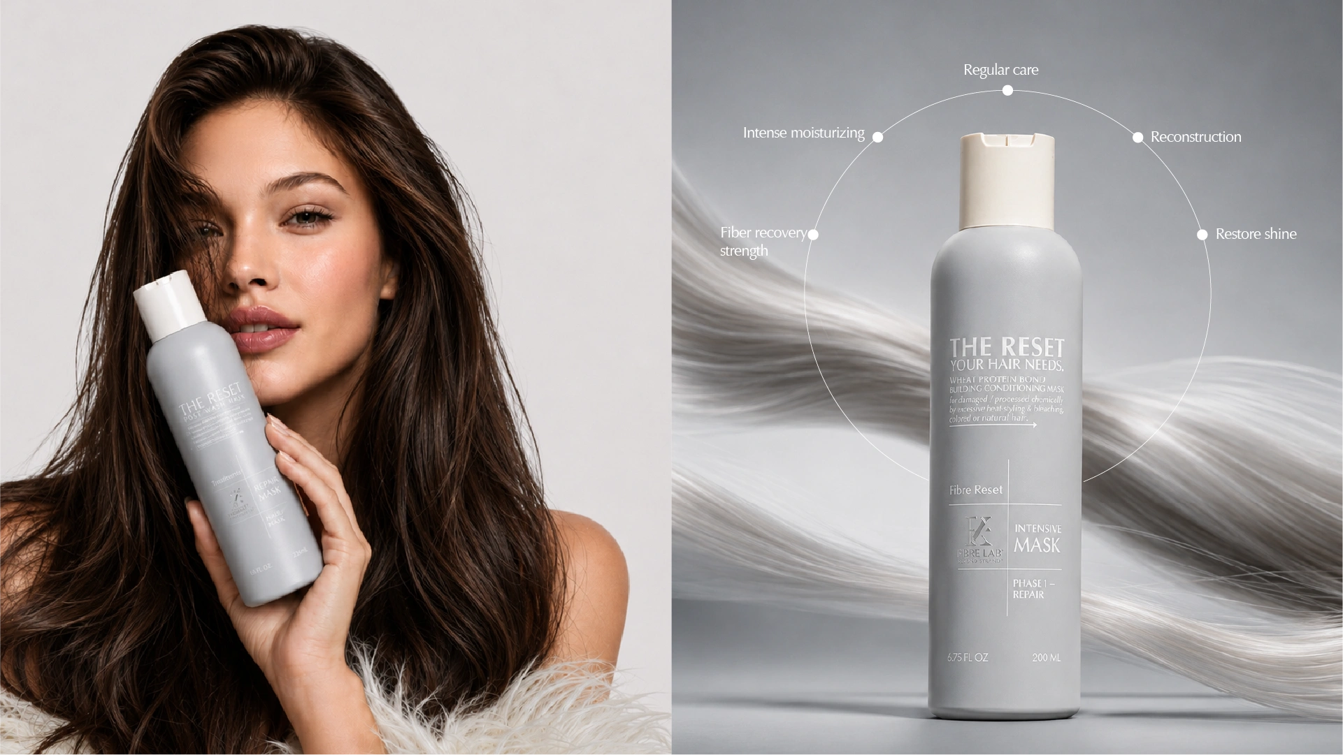
Hero Product Spotlight

Phase II: Maintain

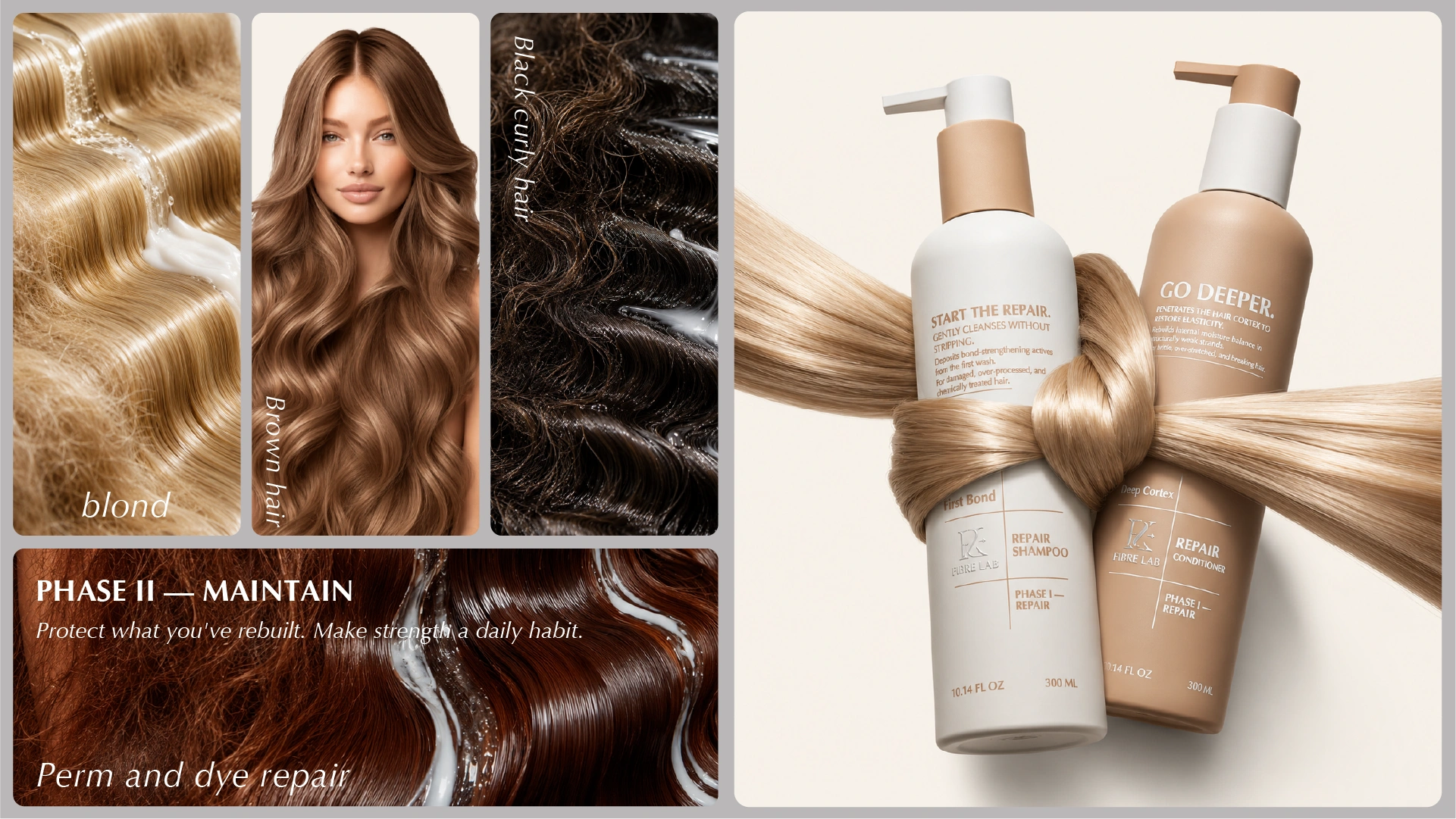
Phase II was designed for inclusivity. The visual language of the Maintain range — and the imagery used to represent it — spans blond, brown, and black curly hair, as well as hair recovering from perm and color services. This range does not target a single hair type. It supports the full spectrum of people who have invested in repair and want to protect that investment.

The Phase II bottles share silhouette proportions with Phase I, but the shift in colorway makes the phase transition immediately readable on a bathroom shelf or retail fixture.

Lifestyle / Gift Collection

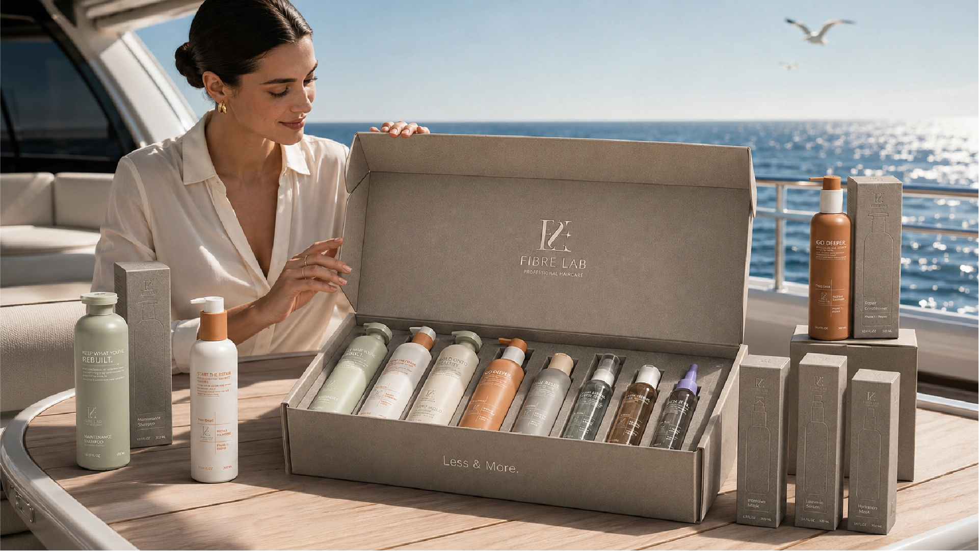
Premium hair care at this positioning level demands packaging that performs twice: once at the moment of purchase, and again at the moment of gifting. The Fibre Lab gift presentation was designed for both.

The full system is presented in a rigid structural box with a matte, tactile surface finish in a warm stone gray — the same tonal family as the product palette. Inside, the bottles are nested in a structured tray, each product visible in its phase sequence, creating a visual roadmap of the two-phase ritual the moment the lid is lifted.


Jarsking Capability Note: This gift box concept can be developed across rigid board construction with foil or emboss branding, custom tray inserts, and multiple closure formats. Structural prototyping and material selection support is available at every stage.

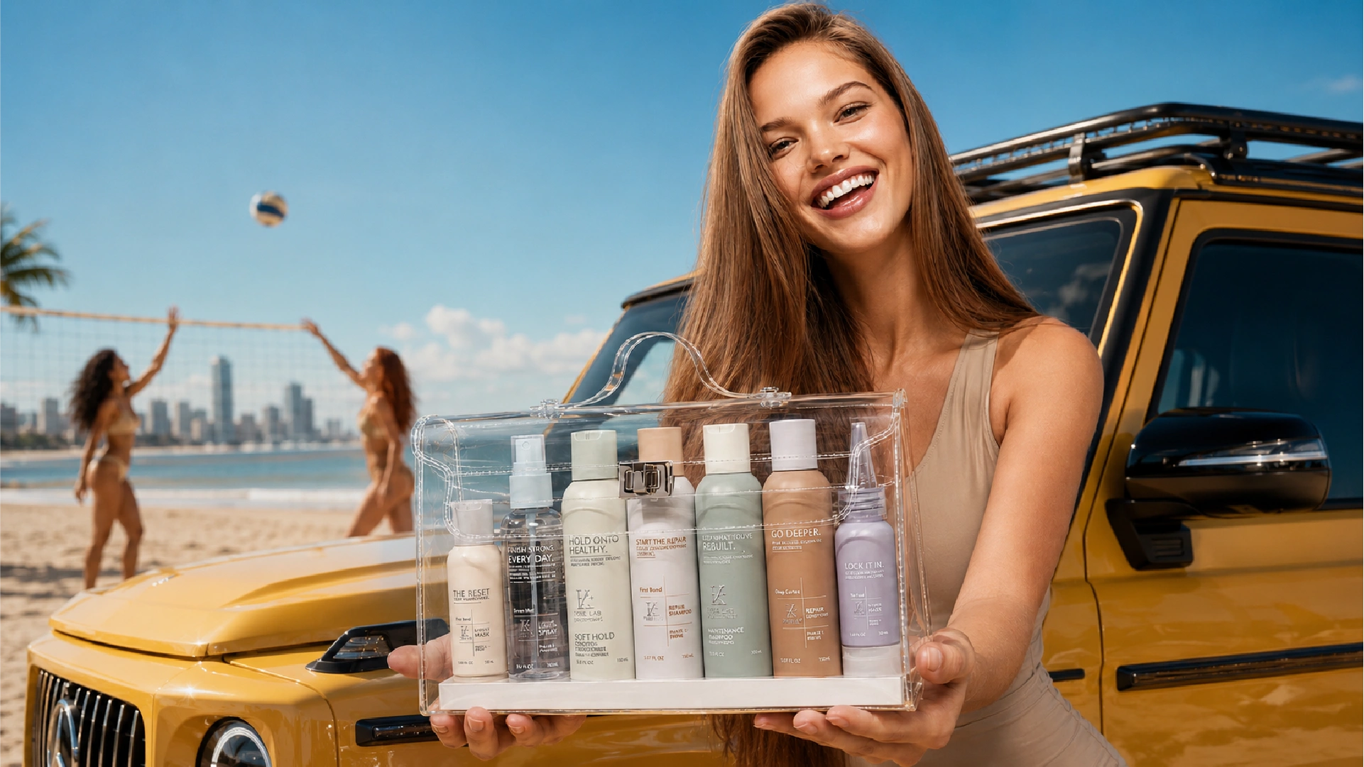
Travel Kit / Active Lifestyle Campaign

The travel format mirrors the full system in miniature: the same phase structure, the same color coding, the same product hierarchy — compressed into trial and travel sizes that fit cleanly into the custom clear case. The case itself is a design object: a structured, handled acrylic or PET format with a metal latch closure, designed to be displayed on a counter rather than hidden in a bag.


Packaging Design Note: The travel kit creates a commercially distinct product tier that supports trial, gifting, DTC starter sets, and retail impulse formats — all from the same bottle architecture.

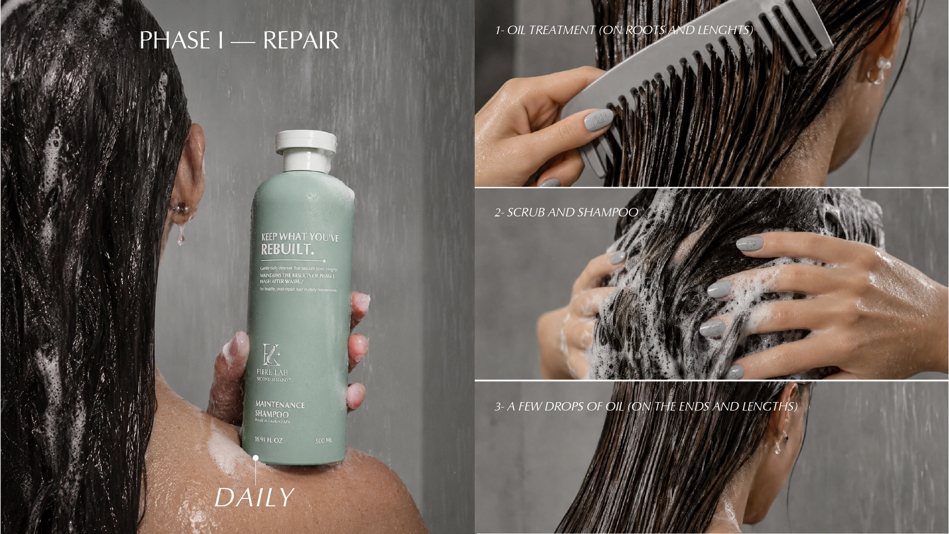
Phase I Repair / Daily Ritual Photography

The 500 ml Sage Green bottle in the shower communicates the product’s role immediately: daily, grounding, essential. The three-step usage sequence shown alongside the hero product — oil treatment, scrub and shampoo, oil on ends and lengths — transforms the packaging’s functional copy into a tactile ritual.


Packaging Insight: The flip-top cap format on the Maintenance Shampoo is a deliberate functional choice. In a wet shower environment, a disc-top or flip cap is significantly more ergonomic than a screw cap.

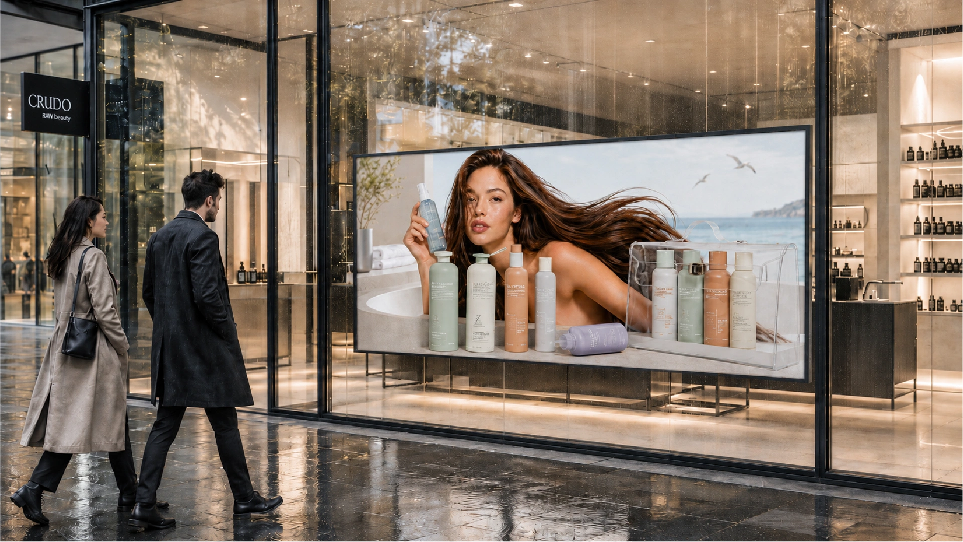
A Collection That Commands Retail Space

The Fibre Lab collection, visualized at flagship-retail scale. The color palette, the bottle silhouettes, the label hierarchy, the campaign imagery: all of it reads cleanly at storefront scale without losing the system’s intelligence or restraint.

This matters commercially. Premium beauty retail — specialist stores, department beauty halls, concept boutiques — is a competitive placement environment where packaging has to communicate brand positioning in under three seconds. The Fibre Lab system’s architectural clarity, its muted-premium color language, and its disciplined typographic hierarchy are built for exactly this test.

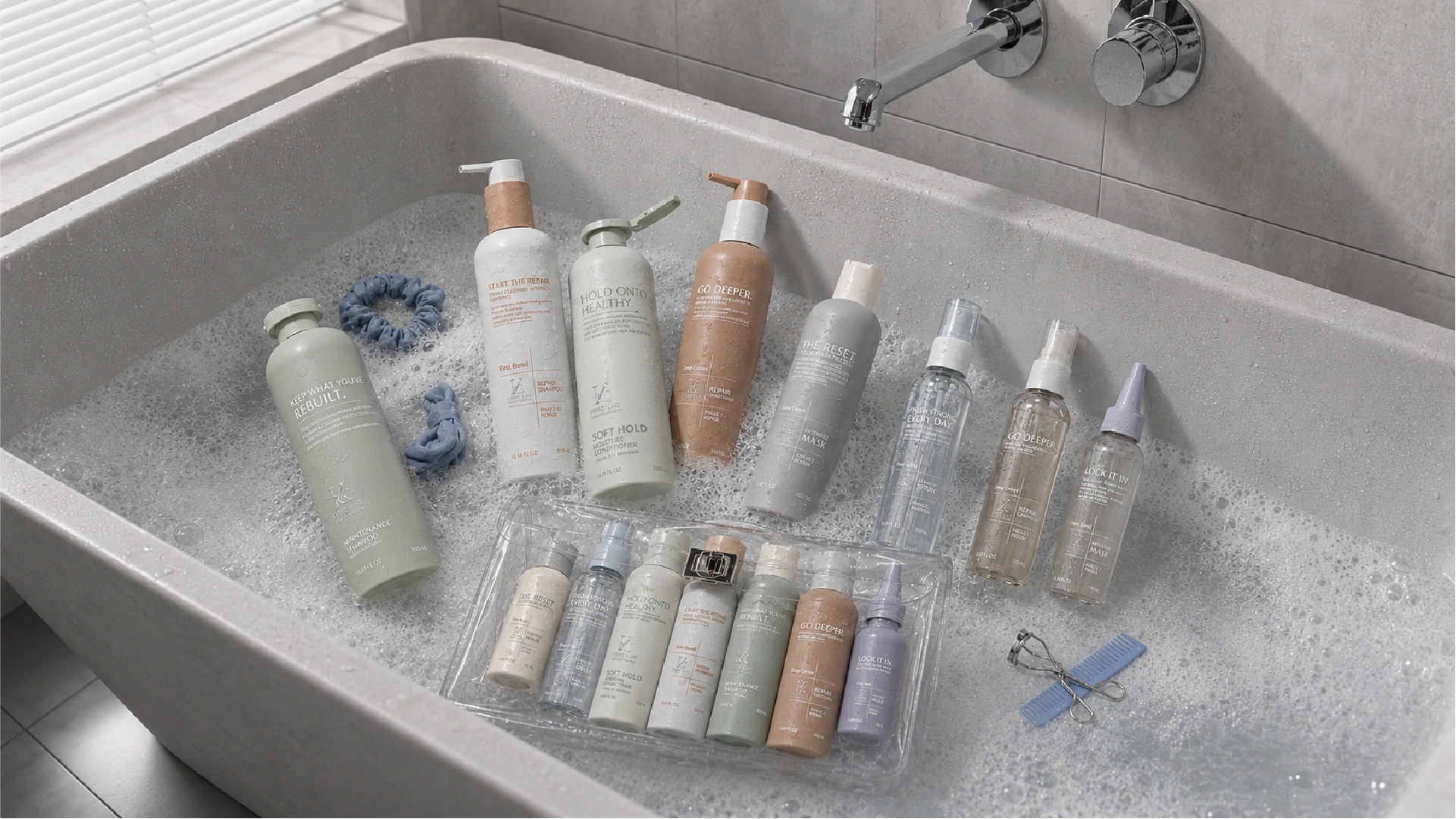
Full Range in Bathroom Context

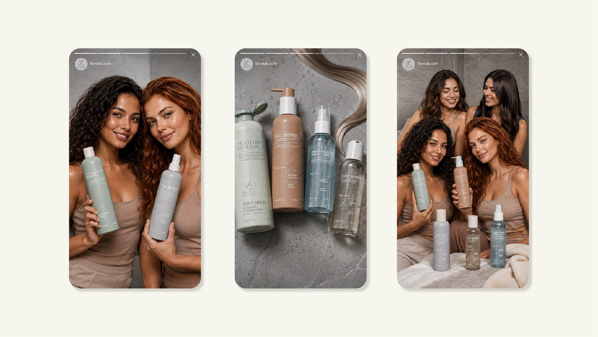
Social Media Story Frames

From Concept to Counter — Jarsking Delivers the Whole Journey

Second Strand™ Fibre Lab is a concept packaging proposal built on Jarsking’s HDPE customizable bottle platform. Every SKU in this system is designed for production.

It demonstrates what is possible when brand intelligence and packaging engineering are developed together from the first sketch.

Previous slide
Next slide

Request Quotation