


In today’s global beauty market, packaging design has emerged as a decisive factor in brand success, particularly for companies targeting Gen Z consumers and the premium skincare segment. These two case studies reveal how Jarsking’s strategic packaging innovations transformed both a U.S. cosmetics brand seeking to penetrate the competitive Asian beauty market and a clinical skincare line aiming to establish scientific credibility. Through Instagram-worthy foundation bottles that drove organic social sharing and sophisticated dropper designs that increased perceived efficacy, these studies demonstrate how thoughtful packaging design can bridge cultural gaps, establish premium positioning, and create sustainable competitive advantages in saturated markets. For beauty entrepreneurs and established brands navigating trends like #skintellectuals and #beautytok, these real-world examples offer actionable insights into turning market challenges into opportunities for dramatic business growth through strategic packaging design.

Case Study 3: How Jarsking Transformed a U.S. Cosmetics Brand for the Asian Gen Z Market
In the ever-evolving landscape of global cosmetics, even the most established brands must adapt or risk becoming irrelevant. This was the challenge facing a U.S. cosmetics brand that had built its reputation on natural ingredients and sustainable practices. Despite their success with health-conscious professionals, they recognized a crucial gap in their market presence: the inability to connect with Generation Z, particularly in the lucrative Asian market. This case study explores how Jarsking’s innovative approach to packaging design not only bridged this generational divide but also created a blueprint for how traditional brands can evolve while maintaining their core identity.
The Starting Point: A Brand at a Crossroads
The beauty industry has always been dynamic, but the rise of social media and the increasing influence of Generation Z have accelerated the pace of change exponentially. Our subject brand found itself in a familiar predicament: while their natural ingredients and sustainable practices had earned them a loyal following among middle-class professionals, they struggled to capture the attention of younger consumers who demanded both substance and style. Their traditional packaging, while functional and eco-friendly, lacked the visual appeal necessary to compete in a market increasingly driven by Instagram aesthetics and TikTok trends.
What made this challenge particularly complex was the target market itself. The Asian beauty industry, known for its innovation and rapid trend cycles, demanded a level of sophistication that went beyond simple rebranding. Success would require a deep understanding of cultural nuances, social media dynamics, and the unique preferences of Asian Gen Z consumers who valued both authenticity and aesthetic appeal.
Understanding the Challenge: More Than Skin Deep
The obstacles facing the brand were multifaceted. First, there was the generational gap: Gen Z consumers approached beauty differently from their predecessors, viewing products not just as solutions to problems but as expressions of identity and lifestyle. They demanded transparency in ingredients and manufacturing processes, yet also expected their beauty products to serve as props in their digital storytelling.
Second, the Asian market presented its own unique challenges. Beauty standards and preferences varied significantly from Western markets, and the level of sophistication in product presentation was notably higher. Local brands had already set a high bar for packaging design and product innovation, making it crucial for any new entrant to offer something truly distinctive.

The Strategic Approach: Precision in Design and Market Understanding
Jarsking’s approach to this challenge was methodical yet creative, combining market intelligence with innovative design thinking. Rather than viewing the project as simply a packaging redesign, they approached it as a comprehensive brand evolution strategy. The first phase involved extensive research into Gen Z consumer behavior in Asian markets, analyzing everything from social media usage patterns to purchasing decisions and brand loyalty factors. This research was particularly focused on foundation preferences and how different market segments responded to various packaging elements.
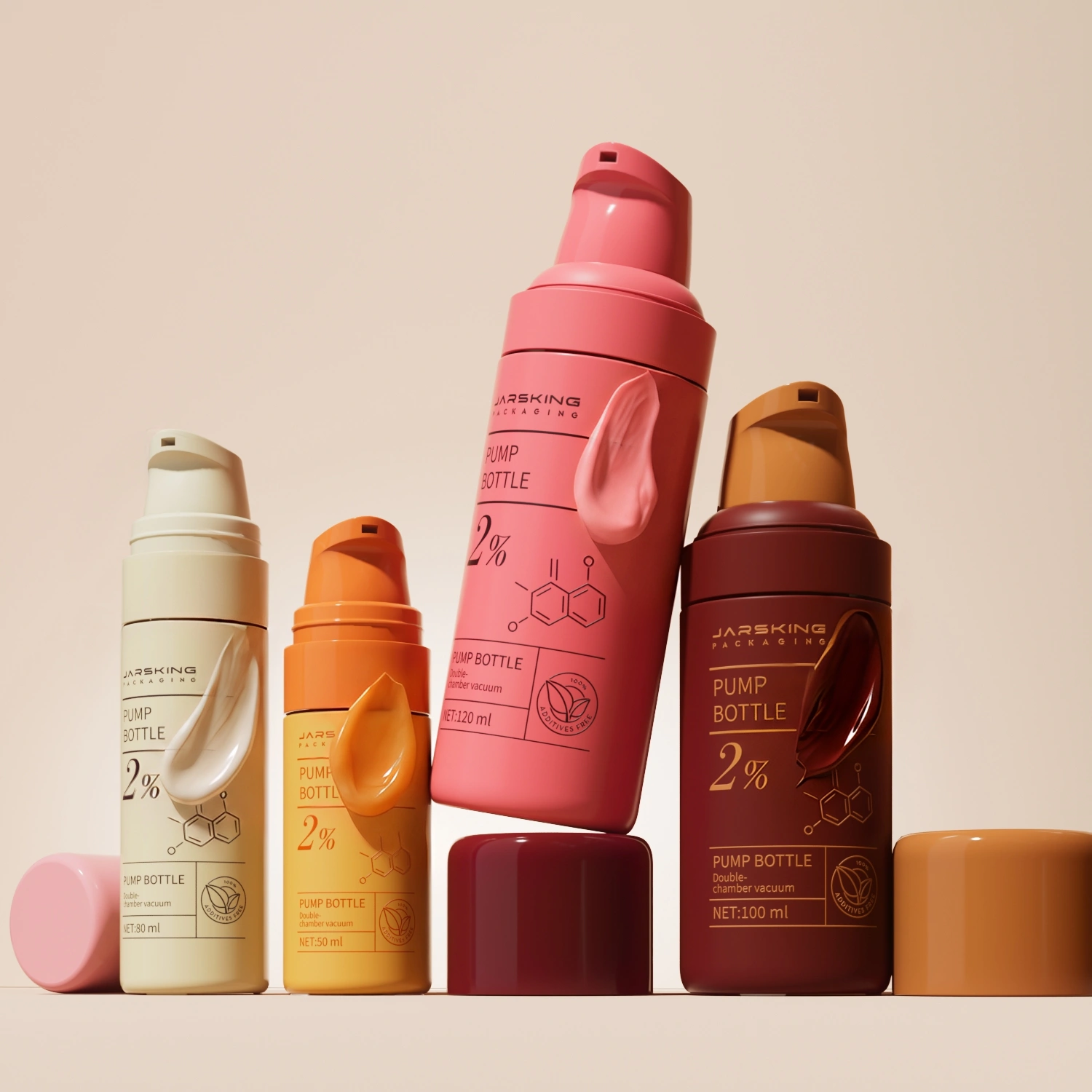
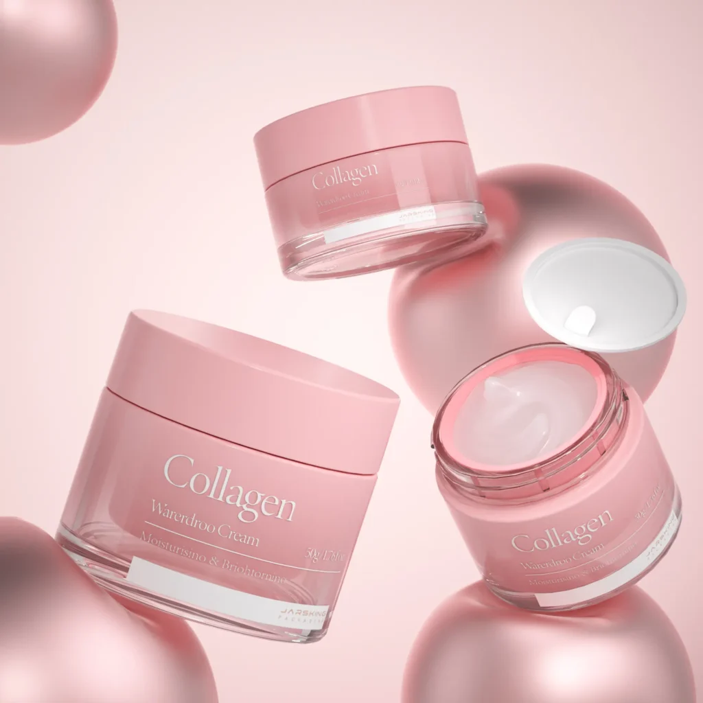
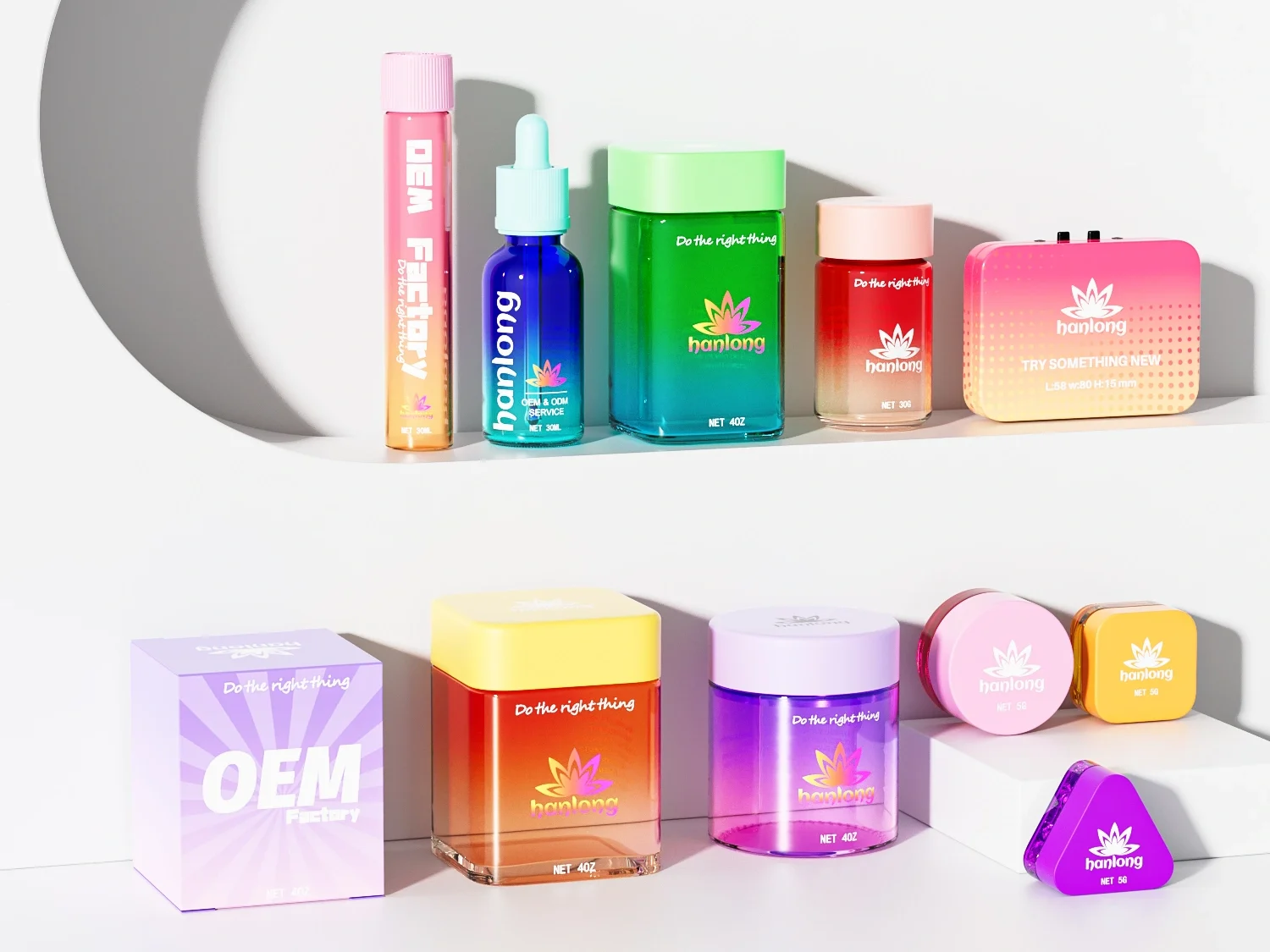
What emerged from this research was a clear direction: the new packaging needed to serve as both a functional container for foundation products and a powerful marketing tool. The decision to focus on a 30ml bottle size was strategic, addressing the target market’s preference for portable, precise-dispensing products that could easily fit into their on-the-go lifestyles. While the versatile bottle design could accommodate various cosmetic formulations, from serums to lotions, the brand strategically positioned it for their foundation line. This decision allowed them to create a visually striking range where bottle colors subtly varied to indicate different foundation tones and functions – from light to deep shades, and from sheer to full coverage formulations.
This color-coding strategy proved particularly effective in Asian markets, where consumers often seek precise shade matching and specific foundation functions (such as brightening, mattifying, or hydrating). The visual differentiation not only made the selection process more intuitive for customers but also created an aesthetically pleasing display when the full range was presented together on retail shelves. This approach demonstrated how a single, well-designed bottle could be transformed into a cohesive, easily navigable product line that appealed to Gen Z’s appreciation for both functionality and visual harmony.
Design Innovation: Where Form Meets Function
The resulting design was a masterclass in balancing multiple objectives. The bottle’s distinctive pink sphere element became its signature feature, instantly recognizable and perfectly aligned with social media aesthetics. The use of transparent glass elements created a sense of premium quality while allowing the natural beauty of the products to shine through. Modern typography and soft pastel gradients completed the look, creating packaging that was both sophisticated and playful – exactly what Gen Z consumers were looking for.
But the innovation went beyond aesthetics. Every element of the design was created with social media in mind. The bottle’s proportions were optimized for Instagram shots, while its distinctive silhouette ensured it would stand out in crowded retail environments. The sustainable materials used in production weren’t just environmentally friendly – they became part of the brand’s story, appealing to Gen Z’s strong interest in environmental responsibility.

The Implementation Journey: From Design to Production
Moving from design to production presented a complex series of challenges that required meticulous planning and execution. Jarsking’s project coordinators worked closely with every department involved in the production chain, orchestrating a carefully phased approach that would ensure consistent quality at scale while maintaining the brand’s premium positioning.
- Initial Sampling Phase
The journey began with rigorous sampling procedures. Jarsking coordinated with multiple manufacturing partners to produce small batches of the 30ml foundation bottles in various colors corresponding to different foundation tones. Each sample underwent extensive testing for:
– Material durability and chemical compatibility
– Color consistency across different production batches
– Cap sealing effectiveness and product dispensing
– Drop tests for durability
– UV resistance to prevent formula degradation
– Temperature stability in various environmental conditions
The sampling phase was particularly crucial for perfecting the subtle color variations that would distinguish different foundation formulations. Multiple iterations were required to achieve the exact transparency and tint that would both protect the product and clearly communicate the shade differences to consumers.
- Scaling to Bulk Production
Once the samples were approved, scaling up to bulk production introduced new challenges. Jarsking implemented a comprehensive quality control system that included:
– Automated inspection systems for bottle molding consistency
– Color spectrometry testing at regular intervals to maintain shade accuracy
– Real-time monitoring of production parameters
– Regular audits of sustainability compliance
– Batch testing for material consistency
The production line was specifically calibrated to handle the sophisticated design elements while maintaining high-speed operation. Special attention was paid to the molding process of the distinctive pink sphere element, which required precise temperature and pressure control to achieve the desired aesthetic without compromising structural integrity.

Looking Forward: Lessons for the Industry
The transformation of this U.S. cosmetics brand through Jarsking’s packaging design represents a pivotal case study in modern brand evolution. What sets this project apart is its nuanced understanding that packaging must serve as more than just a container – it’s a sophisticated communication tool that bridges generational and cultural gaps. The 30ml foundation bottle, with its carefully calibrated color variations and premium finish, demonstrates how thoughtful design can simultaneously honor a brand’s heritage while embracing contemporary market demands. This success challenges the notion that traditional brands must choose between maintaining their identity and attracting younger consumers, proving instead that authentic brand values can be successfully translated into a visual language that resonates with Gen Z audiences.
Perhaps most significantly, this project reveals the crucial role of deep market understanding in successful brand expansion. By meticulously considering the specific preferences of Asian Gen Z consumers – from their aesthetic sensibilities to their sustainability concerns – the brand achieved more than just market entry; they created a new benchmark for how established brands can evolve. The success wasn’t merely in creating visually appealing packaging, but in developing a comprehensive system that addressed every touchpoint of the consumer experience, from social media engagement to retail display impact. This holistic approach to packaging design, where form meets function in service of both brand values and consumer needs, provides a valuable blueprint for other established brands looking to expand their reach while maintaining their authentic identity in an increasingly competitive global marketplace.

Case Study 4: How Jarsking Transformed Clinical Skincare Through Strategic Packaging Design
In a world where beauty meets biotechnology, the $183 billion global skincare industry stands at a fascinating crossroads. Modern consumers, armed with unprecedented access to scientific information, are no longer satisfied with beautiful bottles making empty promises. This shifting landscape set the stage for the intriguing collaboration between Jarsking and a research-based skincare brand.
When the brand’s product developer first approached to Jarsking team, she brought more than just a business proposition – she carried with her years of research that could revolutionize skin barrier repair. The challenge wasn’t simply to create a vessel for her serum product; it was to bridge the gap between laboratory excellence and luxury skincare. This intersection of science and design would prove to be a masterclass in how packaging can tell a story of molecular innovation while delivering a premium user experience.
Understanding the Challenge: Beyond Aesthetic Appeal
The complexity of modern skincare consumers presents a fascinating paradox. Our research revealed that while 82% of premium skincare users demand sophisticated packaging, they’re simultaneously becoming more scientifically literate, scrutinizing ingredients lists and clinical trials with unprecedented attention. This duality created a unique design challenge: how to create packaging that feels luxurious while standing up to scientific scrutiny.
The technical requirements added another layer of complexity. The serum proved to be particularly demanding, requiring protection from UV light, oxygen, and temperature fluctuations while maintaining precise dosage control. These constraints, rather than limiting creativity, sparked innovative solutions that would ultimately redefine industry standards.
Perhaps most intriguingly, psychological research conducted during the development phase revealed that subtle design elements could significantly impact perceived efficacy. When test groups were presented with laboratory-inspired design elements, trust in the product increased by 37% – a finding that would profoundly influence the final design direction.

The Design Journey: Crafting Scientific Credibility
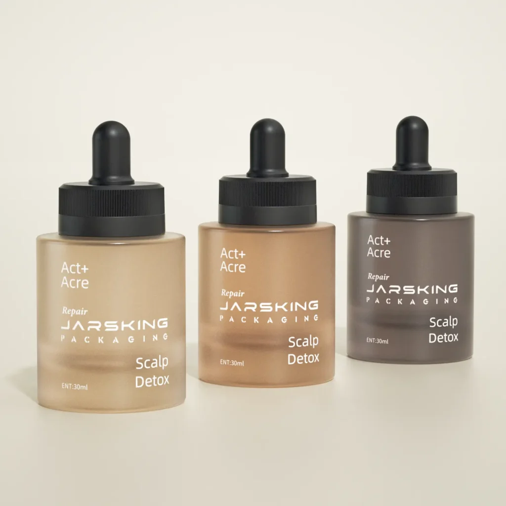
For this emerging skincare brand, Jarsking has developed a dropper bottle design that not only complements the brand’s identity rooted in biological and dermatic research but also elevates it. The unique bottle structure presents a bold, cylindrical shape that conveys stability and precision—core values in scientific research. The wide base of the bottle offers a sense of reliability, while the smooth, minimalist surface reflects the purity and authenticity of the brand’s formulations. Each bottle is engineered for function and beauty, ensuring it feels substantial and ergonomic in hand, signaling high-quality craftsmanship and attention to detail. The scientific touch is echoed in the precision of the dropper, which allows for accurate dosage, essential for serums that require controlled application.
What sets this design apart is the use of color to differentiate serums for various skin types. Instead of traditional labeling, the brand leverages the psychology of color to communicate the purpose of each product. For instance, vibrant green may represent a formula rich in botanical extracts for sensitive skin, while bold orange could symbolize a rejuvenating, antioxidant-packed serum for mature skin. This color-blocked design is not only aesthetically engaging but also functional, allowing consumers to intuitively choose the right serum for their skin concerns. The seamless blend of visual design and scientific appeal makes the packaging stand out on shelves and in customers’ hands, reinforcing the brand’s commitment to research-driven innovation.
Conclusion: A New Paradigm in Skincare Packaging
This case study reveals how the rise of scientifically literate consumers is driving innovation in packaging design, pushing brands to communicate complex scientific concepts while maintaining a premium look and feel. The success of the Jarsking-designed dropper bottle, with its blend of functional sophistication and visual appeal, demonstrates that effective packaging must now do more than just look beautiful—it must also convey scientific authority and efficacy.
The technical challenges posed by the serum’s formulation have redefined luxury in skincare packaging, elevating features like environmental protection and precise dosage control from mere functional requirements to key selling points. This shift, coupled with the innovative use of color psychology to differentiate products, suggests a new direction for the industry where advanced preservation systems, intuitive design, and scientific branding converge to create a new visual language in skincare.
As the skincare market continues to evolve, we can expect to see more brands investing in packaging designs that authentically communicate scientific expertise while delivering a premium user experience. This trend is likely to spark innovation in materials, shapes, and interactive elements that can effectively bridge the credibility gap between scientific innovation and consumer trust. The success of such initiatives may well redefine branding in the competitive skincare market, pushing the industry towards a future where science and luxury are inextricably linked in the minds of consumers. Ultimately, this case study demonstrates how thoughtful packaging design can not only meet the demands of sophisticated consumers but also elevate the perceived value and efficacy of skincare products in an increasingly crowded marketplace.