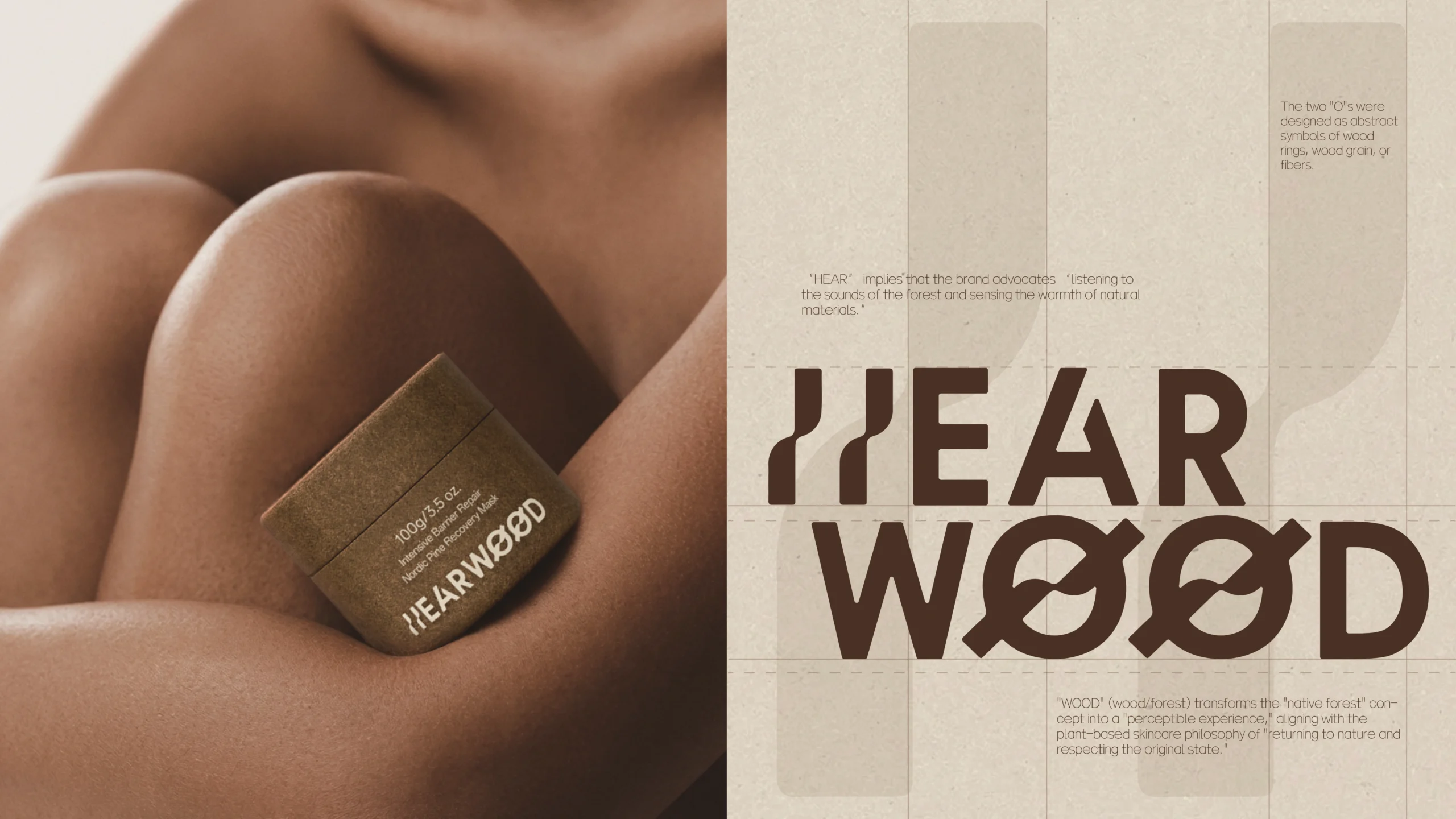
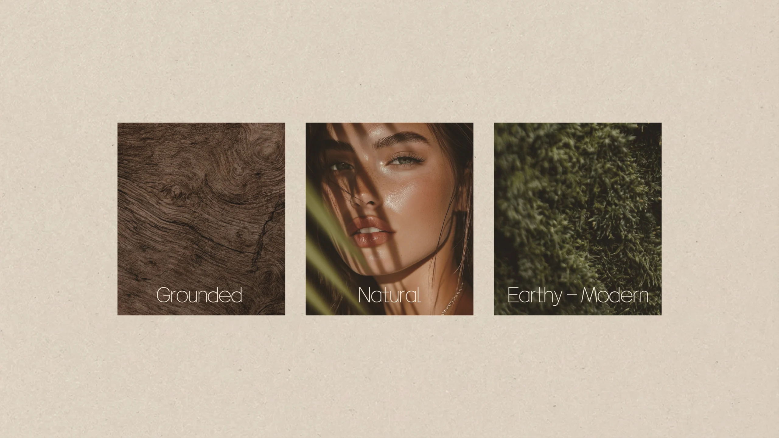
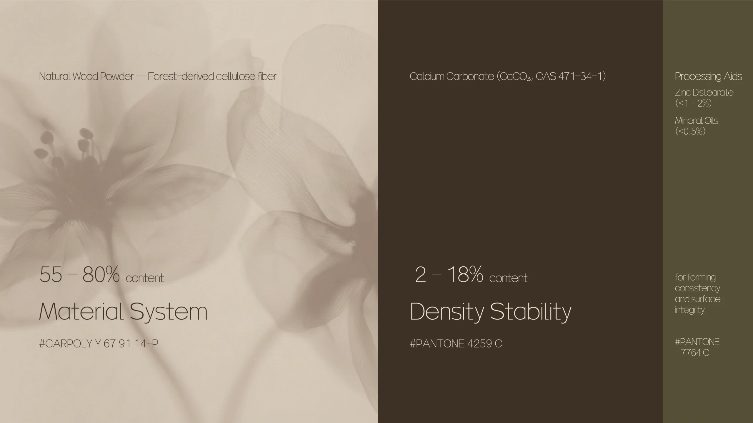
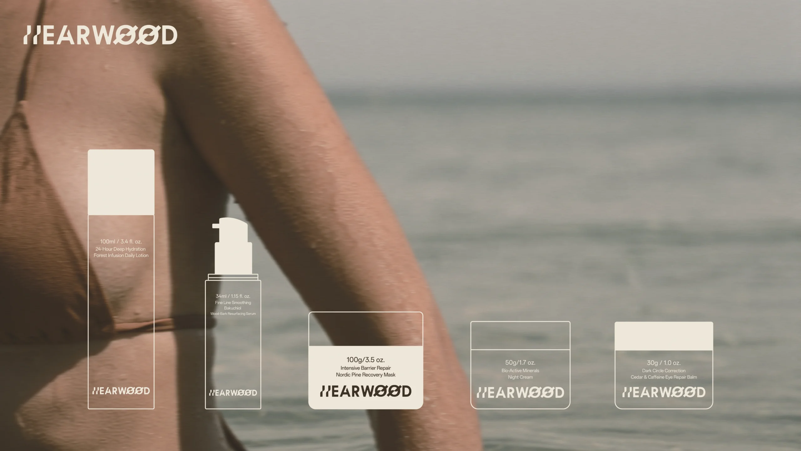
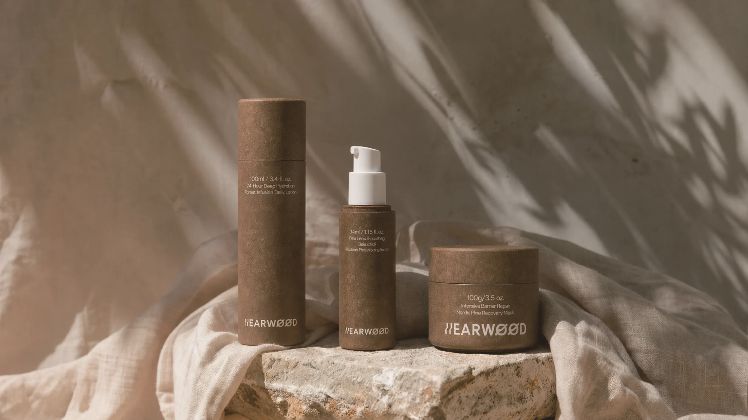
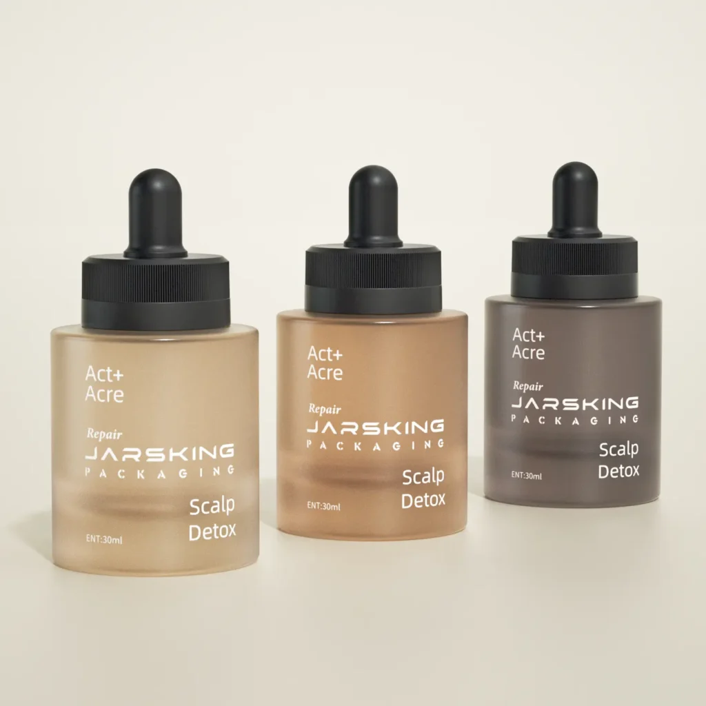
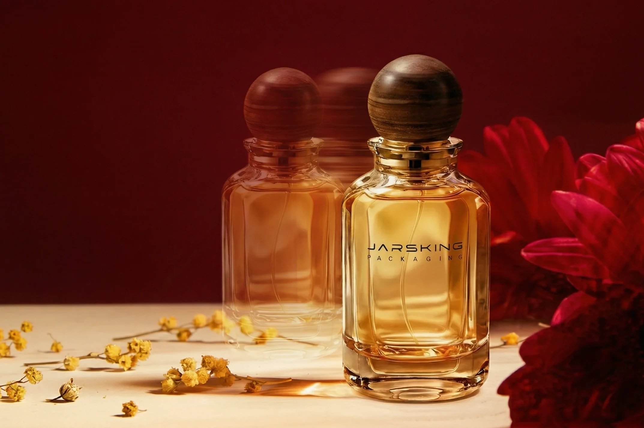
· LATEST DESIGN


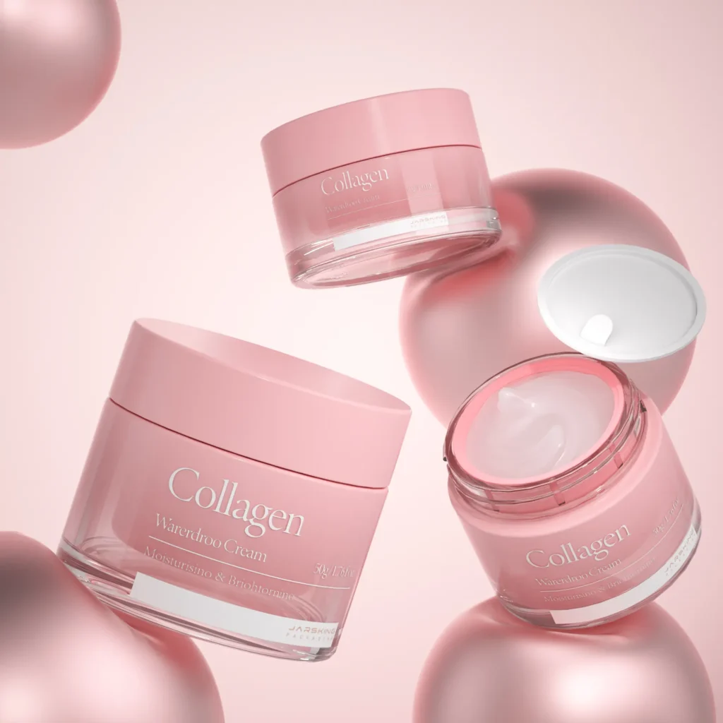
· LATEST DESIGN
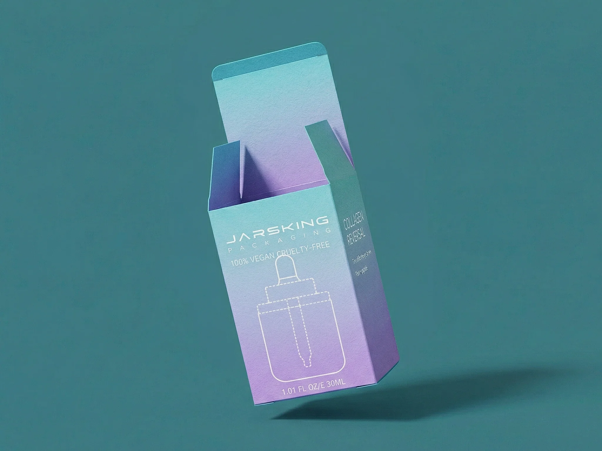


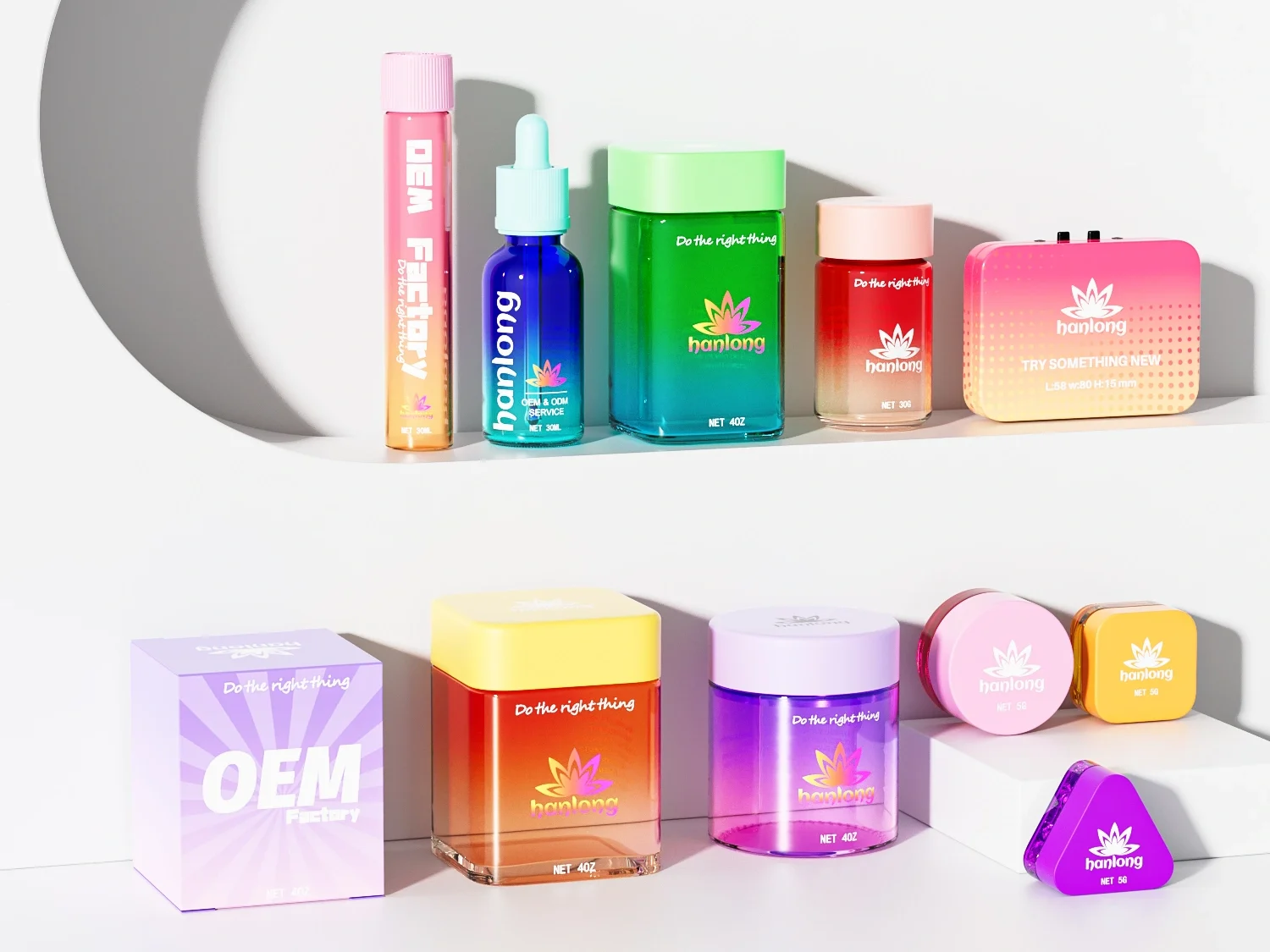
· LATEST DESIGN


· LATEST DESIGN


Jarsking covers all cosmetics,cannabis and perfume markets. Ask custom solutions here!
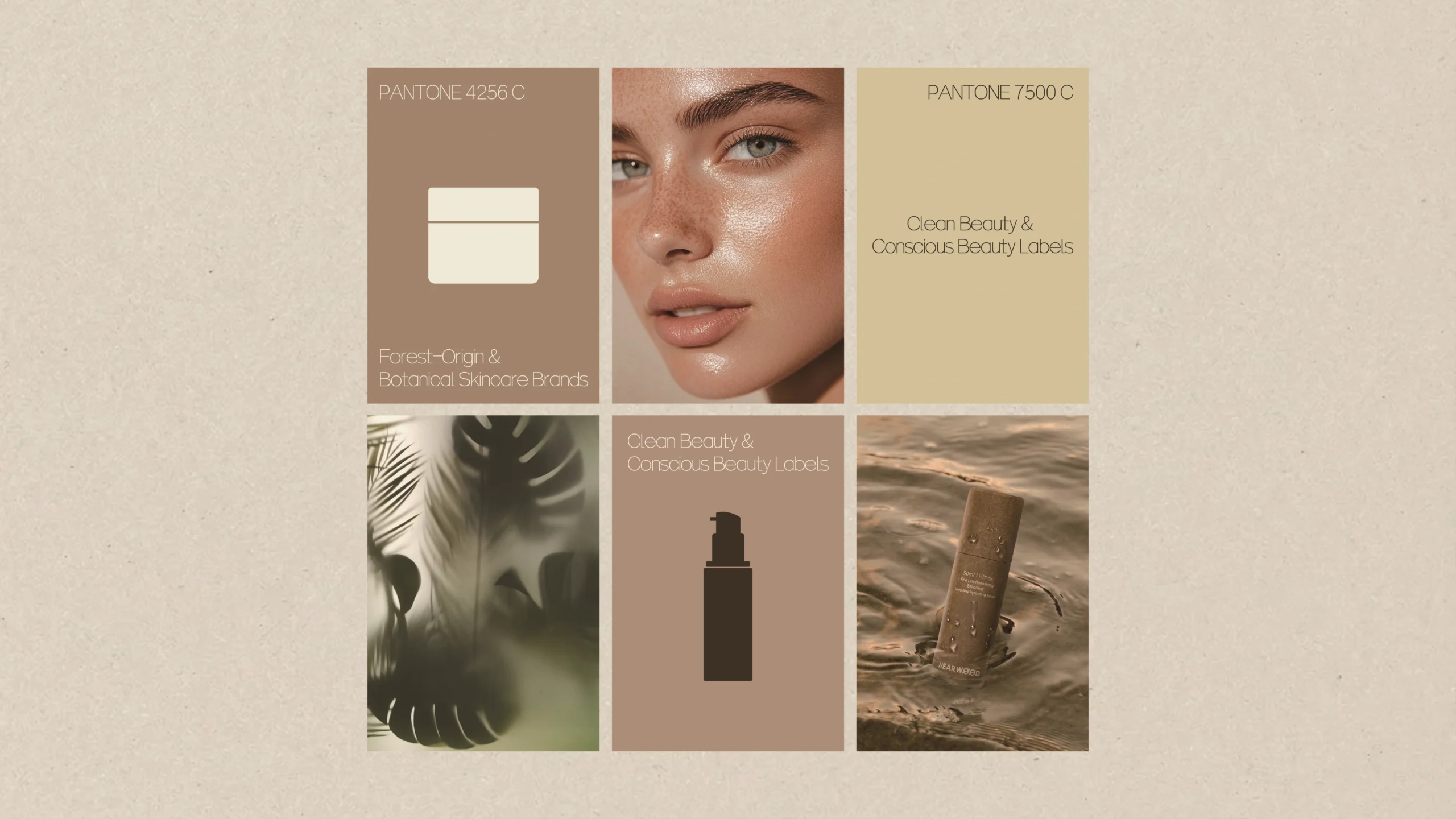
· EFFICIENCY+
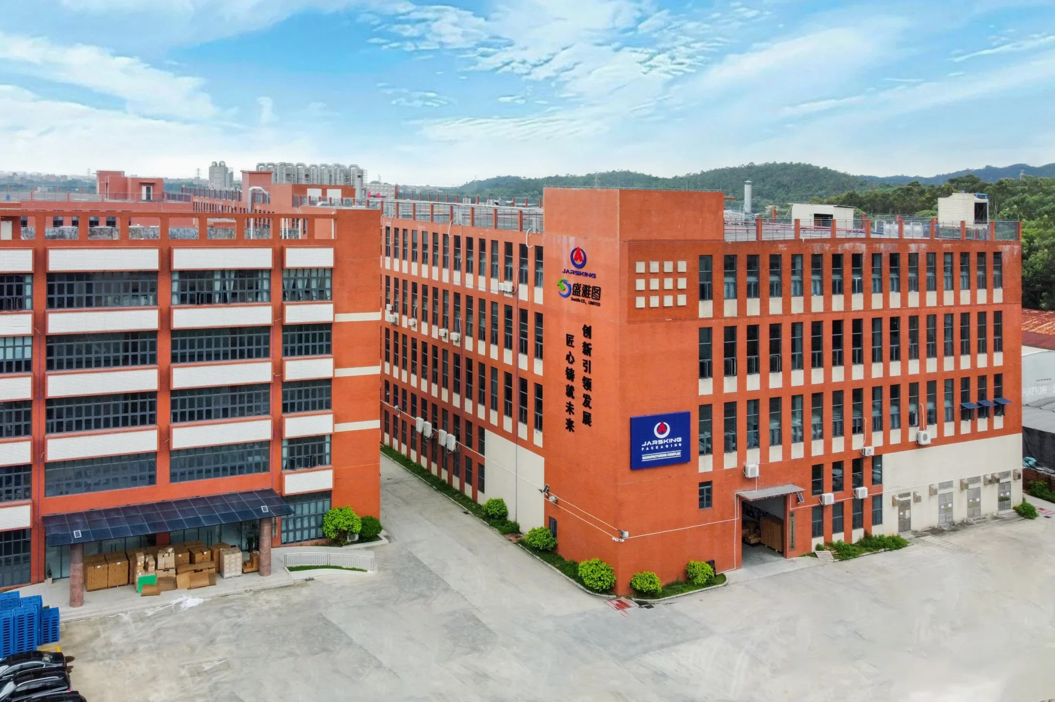
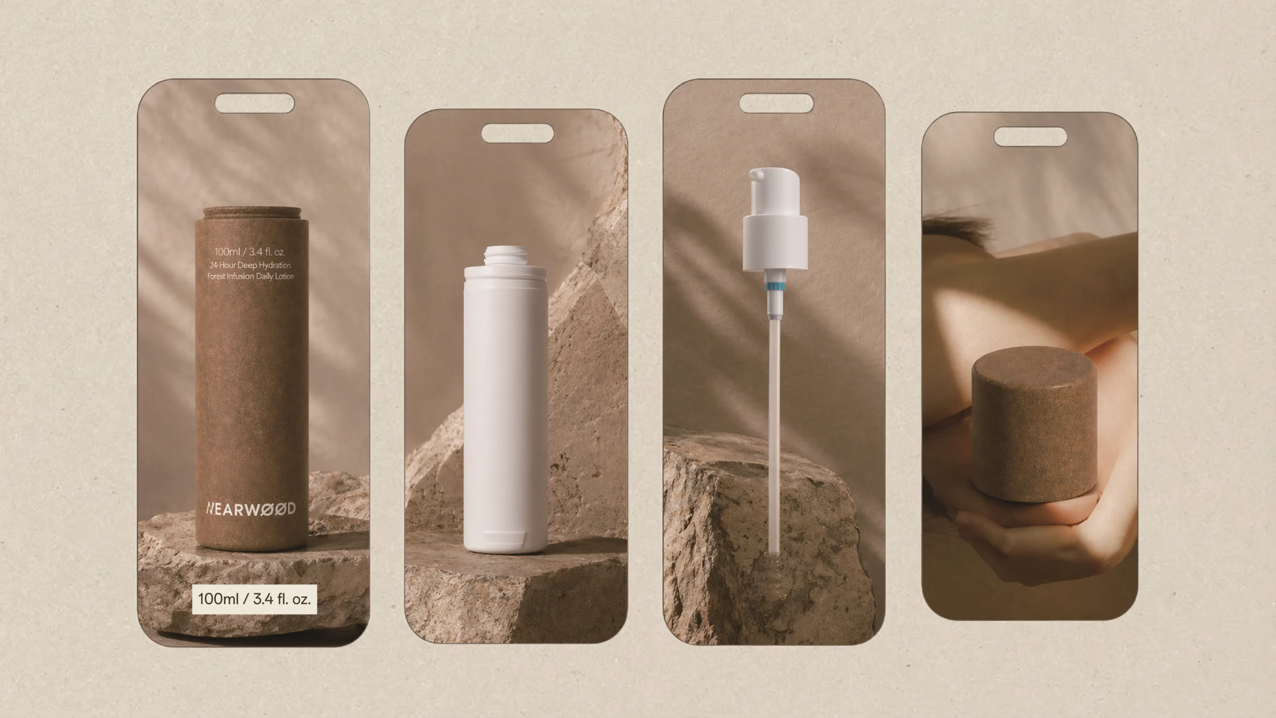
JARSKING STUDIO


The world’s go-to cosmetic packaging factory for custom branding. Talk to Jarsking Team