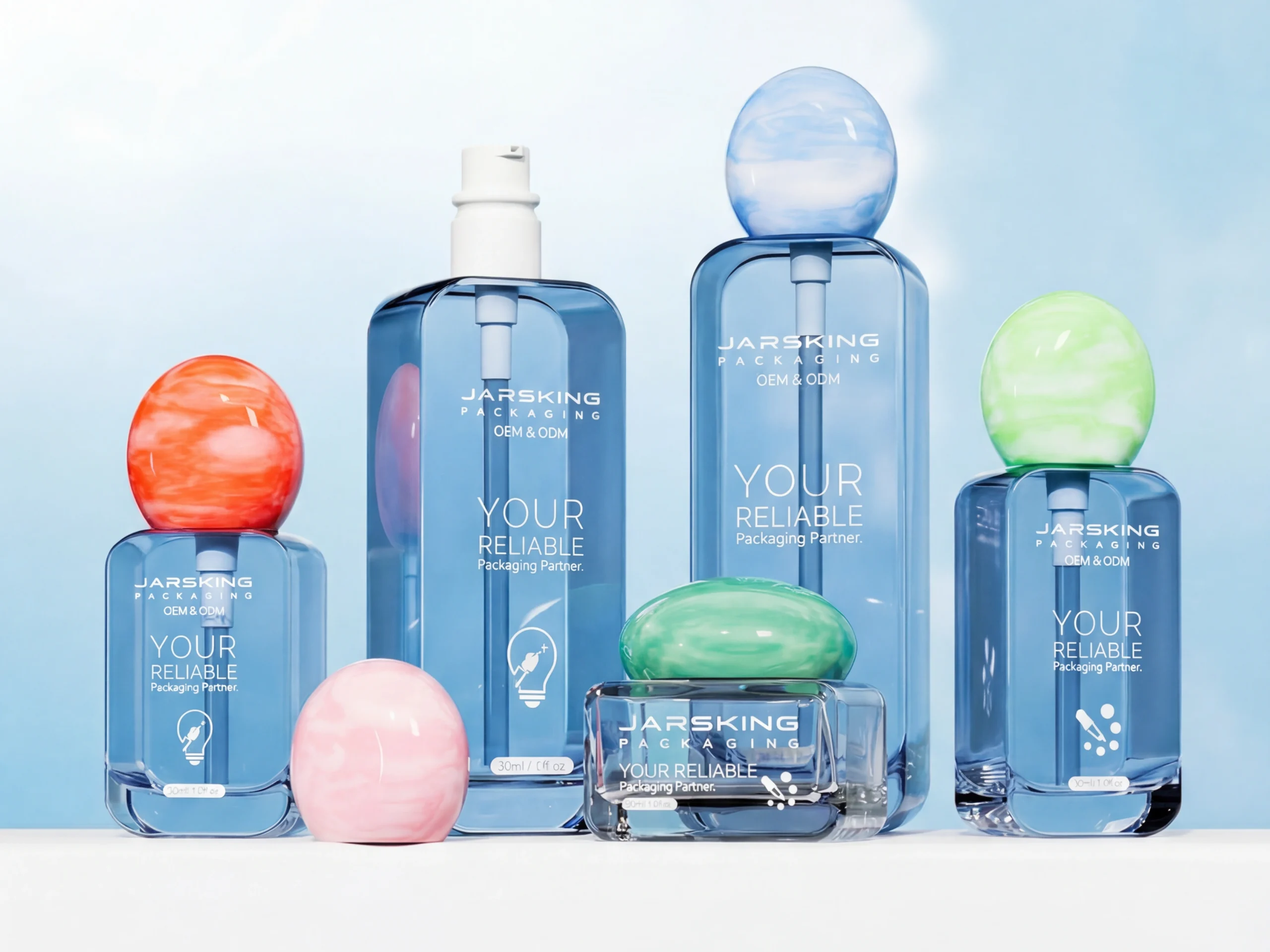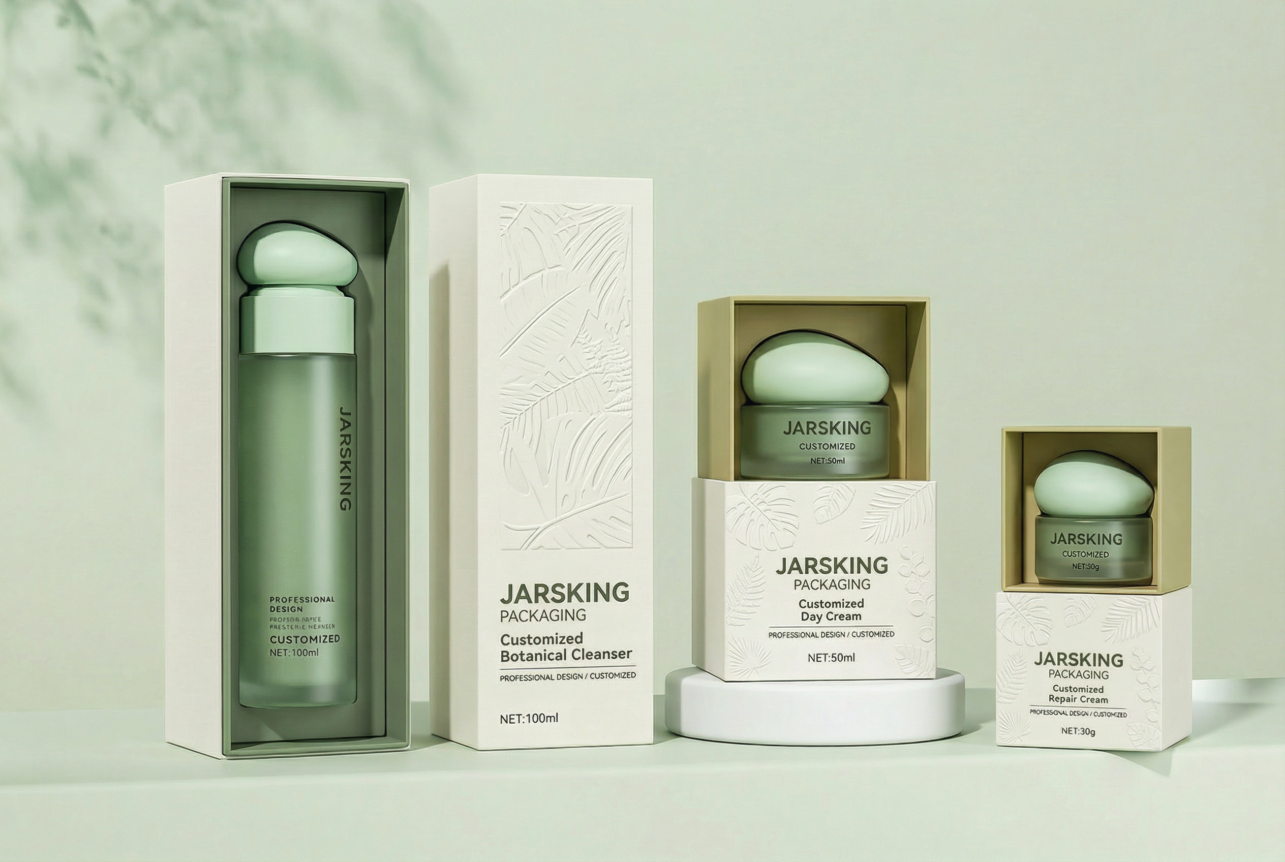


Jarsking covers all cosmetics,cannabis and perfume markets. Ask custom solutions here!
The world’s go-to cosmetic packaging factory for custom branding. Talk to Jarsking Team

Creative Director of Design
In the crowded aisles of modern retail, consumers make purchasing decisions within seconds. Research from the Point of Purchase Advertising International (POPAI) reveals that 70% of brand selections happen at the point of sale, with packaging design serving as the silent salesperson that can make or break a product’s success. This split-second decision-making process has given rise to two distinctly different packaging philosophies: minimalist and maximalist design approaches.
Minimalist packaging champions the “less is more” philosophy, stripping away unnecessary elements to focus on essential brand messaging through clean lines, strategic white space, and carefully curated typography. In contrast, maximalist packaging embraces abundance, utilizing bold colors, complex graphics, and sensory-rich experiences to capture attention and create memorable brand encounters. Both approaches have proven successful across various industries, but their effectiveness depends largely on brand positioning, target demographics, and market context.
The choice between these design philosophies isn’t merely aesthetic—it’s a strategic business decision that impacts consumer perception, purchase behavior, and brand equity. Minimalist designs often signal premium quality and sophistication, commanding higher price points and appealing to consumers seeking authenticity and sustainability. Maximalist designs, meanwhile, excel at generating excitement, communicating product benefits, and standing out in competitive categories where differentiation is crucial.
This comprehensive analysis explores how leading brands have leveraged both approaches to achieve market success, examining the psychological principles that drive consumer responses and providing actionable insights for brands navigating this critical design decision. Understanding these contrasting philosophies and their applications can transform packaging from mere product protection into a powerful brand asset that drives sales and builds lasting customer relationships.
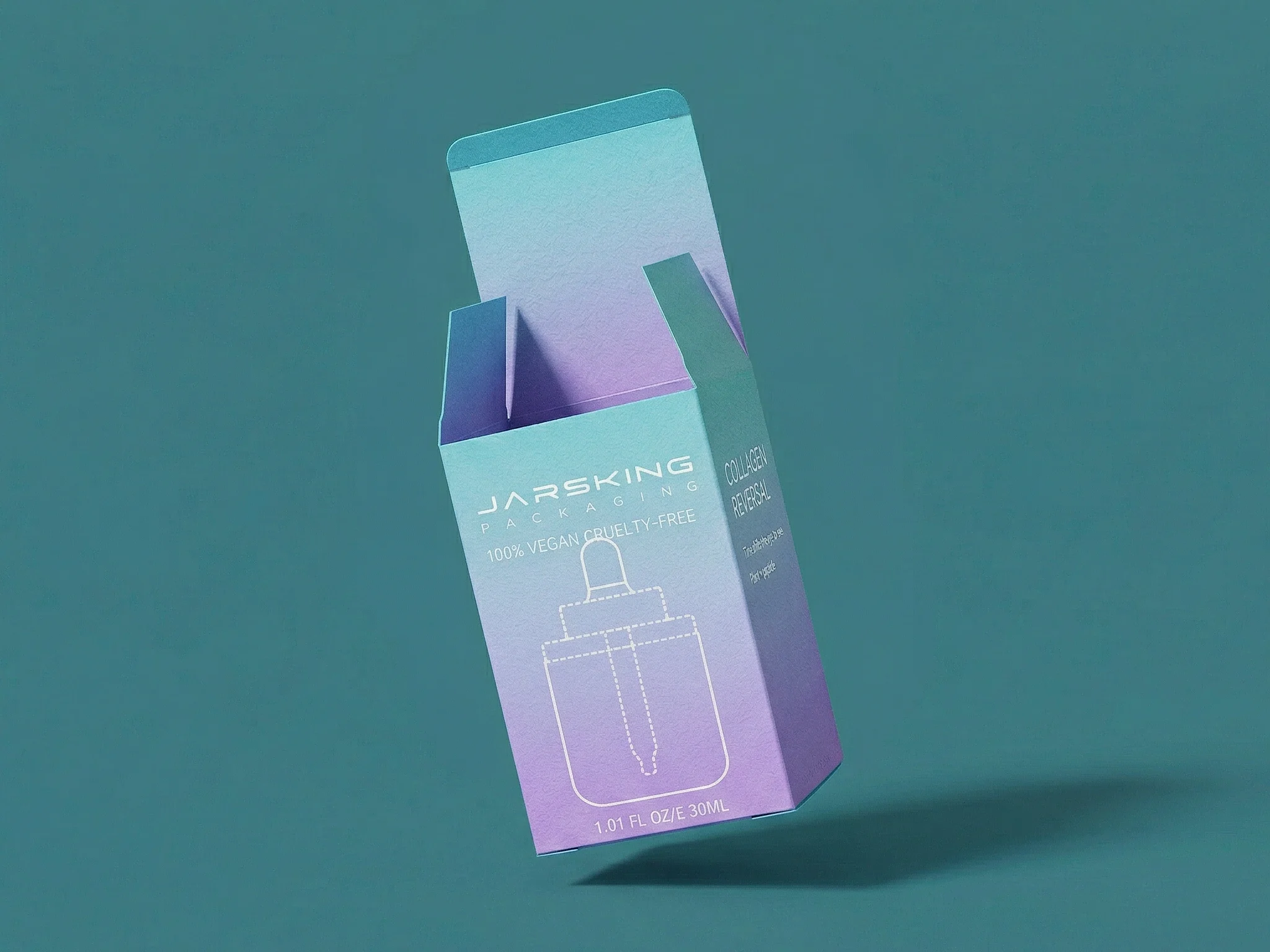
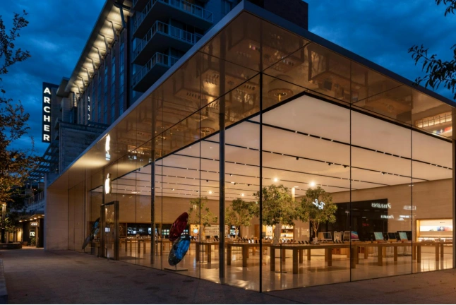
The minimalist packaging movement draws inspiration from the Japanese concept of “Ma”—the purposeful use of emptiness to create meaning. This design philosophy operates on the principle that removing non-essential elements allows the truly important aspects of a product to shine through. Steve Jobs famously applied this thinking to Apple’s packaging, stating that “simplicity is the ultimate sophistication,” a philosophy that has influenced countless brands across industries.
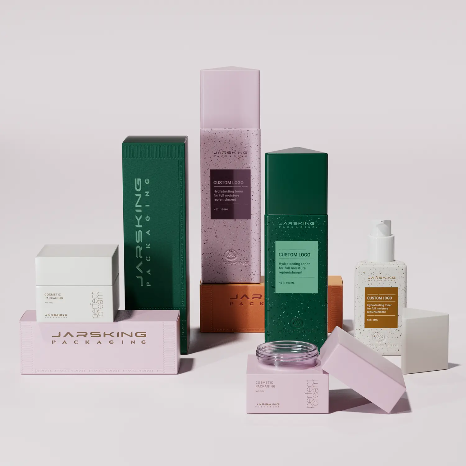
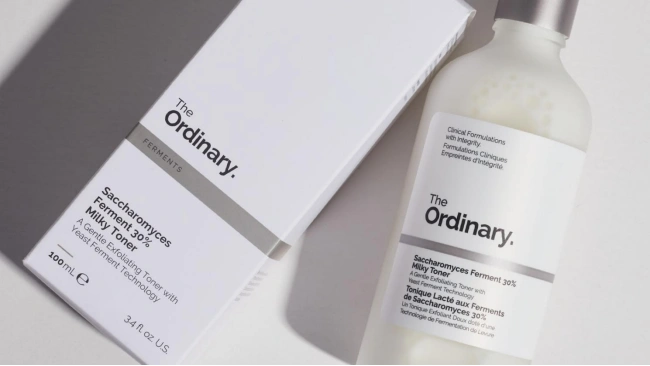
Minimalist packaging prioritizes functionality while creating an almost meditative unboxing experience. The approach relies on the Gestalt principle of “less but better,” where each design element serves a specific purpose. This methodology requires designers to make difficult decisions about what to include and, more importantly, what to eliminate. The resulting designs often feature generous white space, which psychologically suggests premium quality and allows the eye to rest, creating a sense of calm and luxury.
Strategic restraint in minimalist design extends beyond visual elements to material choices and structural design. Brands embracing this philosophy often invest in higher-quality substrates and finishing techniques, understanding that with fewer elements competing for attention, each component must be perfectly executed. The tactile experience becomes crucial—the weight of the packaging, the texture of the paper, and the precision of die-cuts all contribute to the overall brand perception.
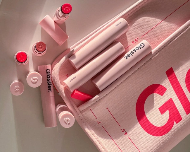
Typography in minimalist packaging serves as both functional communication and artistic expression. Brands typically employ clean, sans-serif fonts like Helvetica, Futura, or custom typefaces designed specifically for clarity and elegance. The hierarchy is established through size variation rather than decorative elements, with generous letter spacing creating an air of sophistication. Glossier’s packaging exemplifies this approach, using their custom “Aperçu” font consistently across all touchpoints, creating instant brand recognition through typographic consistency.
Color palettes in minimalist design are deliberately restricted, often featuring monochromatic schemes or limited color combinations. White, black, and neutral tones dominate, with accent colors used sparingly for maximum impact. When color is employed, it’s typically meaningful—Tiffany & Co.’s iconic blue box demonstrates how a single color can become synonymous with brand identity. The restraint in color usage allows for greater impact when contrast is needed, such as highlighting key product information or creating visual hierarchy.
Material selection becomes paramount in minimalist packaging, as the quality must compensate for the lack of decorative elements. Brands often choose uncoated papers, soft-touch coatings, or premium boards that feel substantial and luxurious. The texture itself becomes a design element—Aesop’s brown glass bottles with simple typography create distinction through material choice rather than graphic complexity. Sustainable materials are increasingly favored, aligning with the minimalist ethos of conscious consumption and environmental responsibility.
Minimalist packaging reflects deeper brand values of authenticity, quality, and mindful consumption. Brands adopting this approach often position themselves as premium alternatives to mass-market products, using design restraint to signal superior quality and craftsmanship. This strategy taps into the consumer psychology principle that people associate simplicity with trustworthiness and expertise—a phenomenon known as the “fluency effect.”
The minimalist approach also appeals to environmentally conscious consumers who interpret simple packaging as more sustainable. While this isn’t always factually accurate, the perception of reduced waste and thoughtful design choices aligns with growing environmental awareness. Brands like Patagonia have successfully leveraged this association, using minimal packaging design to reinforce their environmental mission and attract like-minded consumers.
From a practical standpoint, minimalist packaging can reduce production costs once initial design investment is made. Fewer colors mean simpler printing processes, and standardized designs can achieve economies of scale. However, the apparent simplicity often masks significant investment in design development, material quality, and production precision. The challenge lies in creating designs that appear effortless while being meticulously crafted.
Achieving differentiation through simplicity presents unique challenges in crowded retail environments. Minimalist packages must compete for attention against more visually aggressive designs while maintaining their restrained aesthetic. This requires exceptional execution in every detail—from typography selection to material quality—as there are fewer elements to create impact. The design must be distinctive enough to stand out while remaining true to minimalist principles.
Communicating comprehensive product information within minimalist constraints requires creative solutions. Brands must prioritize messaging hierarchy carefully, often utilizing secondary packaging, inserts, or digital integration to convey detailed information without compromising the clean aesthetic. QR codes have become popular solutions, allowing brands to maintain visual simplicity while providing access to comprehensive product details and brand stories.
The risk of appearing boring or generic looms large in minimalist design. Without bold graphics or colors to create immediate impact, brands must rely on subtle differentiators like typography, layout, and material quality. This requires significant investment in design expertise and often results in higher production costs for materials and finishing techniques. The challenge is creating memorable designs that consumers can easily identify and differentiate from competitors using similar approaches.
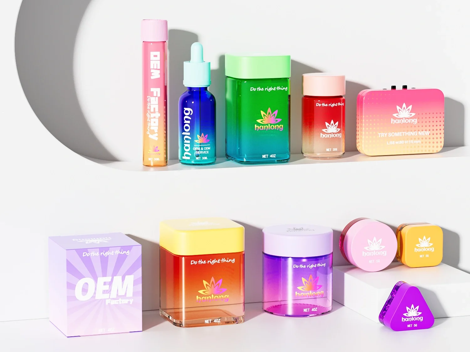
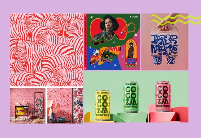
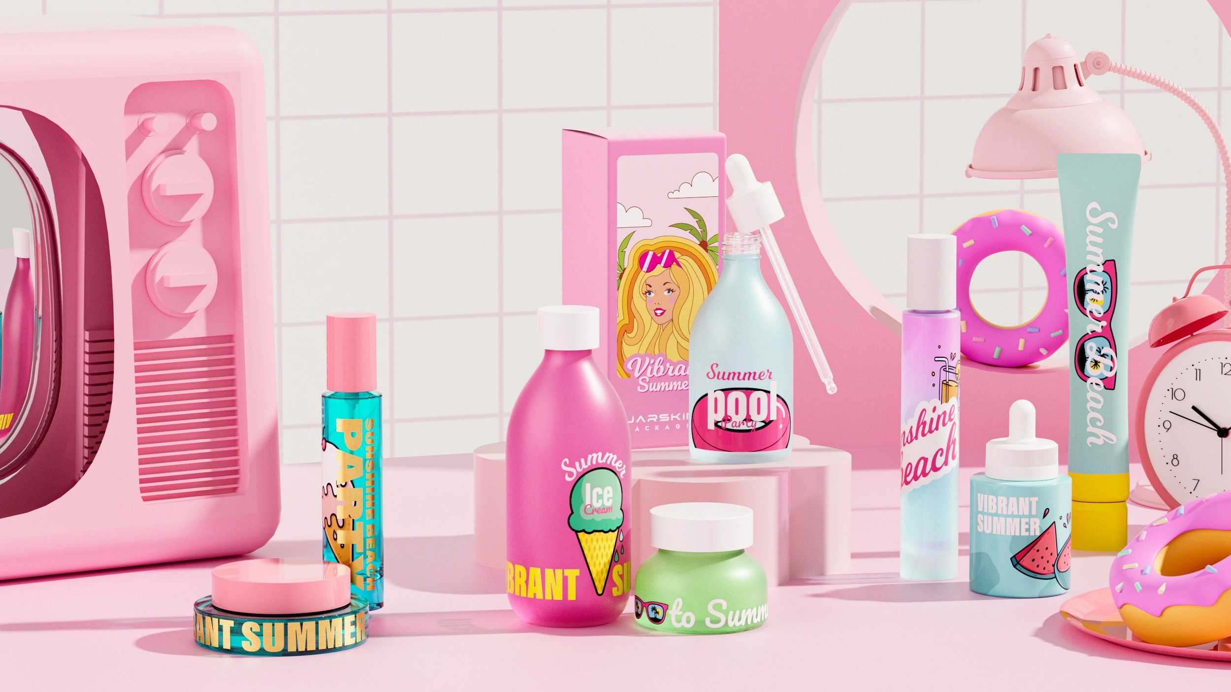
Maximalist packaging design operates on the principle of sensory abundance, creating immersive brand experiences that demand attention and evoke emotional responses. This approach draws from baroque art traditions and pop culture influences, embracing complexity as a means of communication and engagement. Unlike minimalism’s emphasis on reduction, maximalism celebrates addition, layering multiple visual elements to create rich, textured experiences that tell comprehensive brand stories.
The maximalist philosophy views packaging as prime real estate for brand expression, utilizing every available surface to communicate value propositions, personality traits, and cultural connections. This approach recognizes that in certain market contexts, more information and visual stimulation can increase consumer confidence and purchase intent. The design strategy focuses on creating memorable experiences that photograph well for social media sharing, understanding that packaging often extends beyond the point of purchase into digital brand amplification.
Maximalist design requires careful orchestration of chaos, where apparent visual complexity follows underlying organizational principles. The challenge lies in creating designs that feel abundant without becoming overwhelming or confusing. Successful maximalist packaging achieves what design theorists call “organized complexity”—multiple elements working in harmony to create cohesive brand experiences that reward closer inspection while maintaining immediate impact.
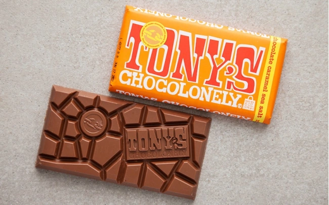
Typography in maximalist packaging often combines multiple font families, sizes, and treatments to create dynamic visual hierarchies. Hand-lettered elements, decorative typefaces, and experimental typography are common, with text often integrated into illustrative elements. Brands like Tony’s Chocolonely use typography as both information delivery and decorative element, with uneven chocolate bar segments mirrored in varied text sizing and placement that reinforces their social mission messaging.
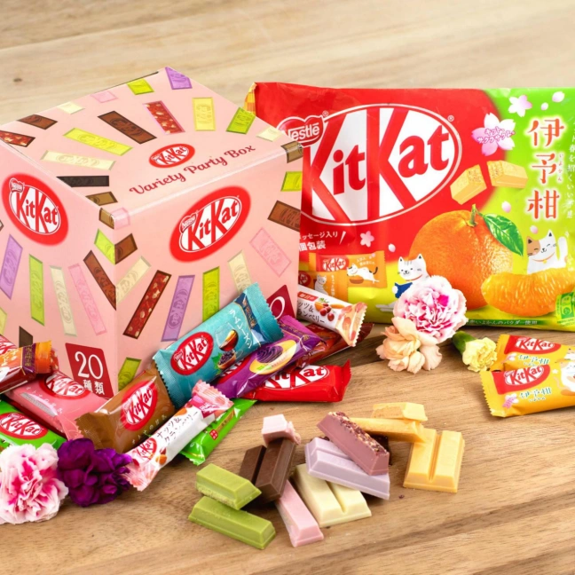
Color palettes in maximalist design embrace vibrancy and contrast, often incorporating rainbow spectrums, neon accents, and unexpected color combinations. The goal is to create emotional resonance and category disruption through bold chromatic choices. Japanese Kit-Kat packaging exemplifies this approach, with each limited-edition flavor featuring unique color schemes that communicate taste experiences visually—from the deep purples of sweet potato flavors to the bright pinks of sakura varieties.
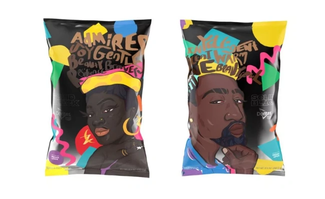
Graphics and illustration play central roles in maximalist packaging, with complex patterns, detailed illustrations, and photographic elements layered to create rich visual tapestries. These elements often incorporate cultural references, artistic movements, or brand storytelling devices. The challenge is maintaining legibility and hierarchy while creating visually engaging compositions. Successful maximalist designs use techniques like focal points, visual pathways, and strategic repetition to guide consumer attention through complex information landscapes.
Maximalist packaging reflects brand values of celebration, inclusivity, and cultural relevance. Brands adopting this approach often position themselves as disruptors or cultural commentators, using design abundance to signal creativity, authenticity, and connection to diverse communities. This strategy appeals to consumers seeking brands that reflect their complex identities and cultural interests, particularly younger demographics who value self-expression and social consciousness.
The maximalist approach often emphasizes transparency and education, using packaging real estate to tell comprehensive brand stories, explain production processes, or advocate for social causes. This information density can build consumer trust and loyalty by demonstrating brand values and expertise. Brands like Ben & Jerry’s have successfully used maximalist packaging to communicate political stances, ingredient sourcing, and company history, creating deeper emotional connections with aligned consumers.
From a market positioning perspective, maximalist packaging can justify premium pricing through perceived value abundance. When consumers see detailed graphics, multiple colors, and complex information presentation, they often perceive higher quality and greater brand investment. This approach works particularly well for limited editions, seasonal products, or brands targeting collectors and enthusiasts who appreciate detailed design work and cultural references.
Successful maximalist packaging requires sophisticated information hierarchy management to prevent cognitive overload. Designers employ techniques like color coding, size variation, and spatial grouping to organize complex information into digestible chunks. The key is creating multiple entry points for consumer engagement while maintaining clear primary messaging. This often involves extensive user testing to ensure designs communicate effectively across diverse consumer segments.
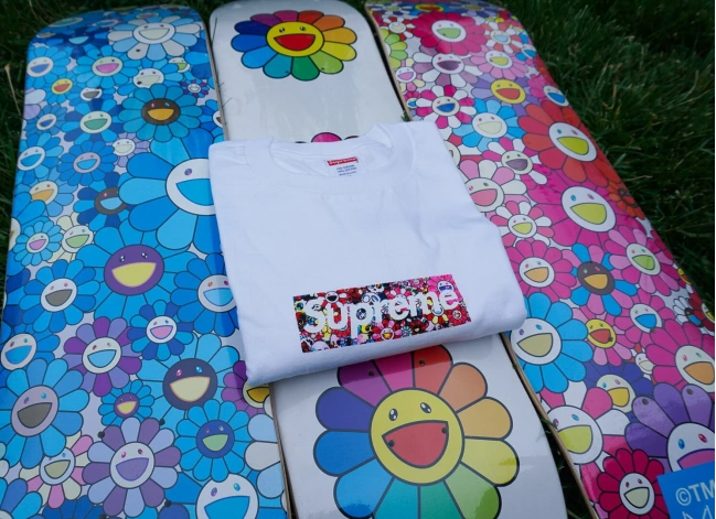
Interactive and tactile elements frequently enhance maximalist packaging experiences. Techniques like embossing, foil stamping, die-cutting, and specialty inks add sensory dimensions that reward physical interaction. Supreme’s packaging often incorporates these elements, with holographic stickers, textured surfaces, and unexpected structural elements that create memorable unboxing experiences and encourage social media sharing.
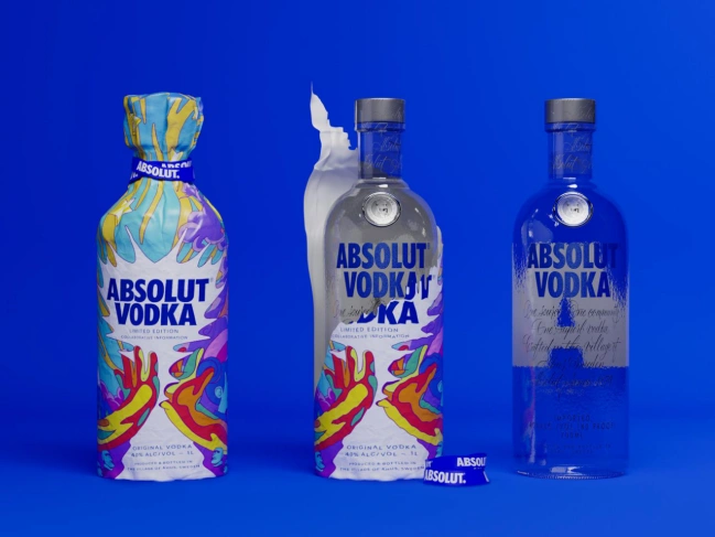
Limited editions and collectible packaging represent key maximalist strategies, allowing brands to experiment with bold designs while maintaining core product consistency. This approach enables brands to test new visual territories, celebrate cultural moments, or collaborate with artists without permanently altering their brand identity. The scarcity factor inherent in limited editions also increases perceived value and urgency, driving immediate purchase behavior among target consumers.
The psychological impact of minimalist versus maximalist packaging design operates through fundamentally different cognitive mechanisms. Minimalist packaging triggers what psychologists call “processing fluency”—the ease with which information is processed by the brain. Research from the Journal of Consumer Research demonstrates that consumers associate processing ease with positive attributes like trustworthiness, quality, and premium positioning. This fluency effect explains why minimalist designs often command higher price points and appeal to consumers seeking authenticity and sophistication.
Minimalist packaging also activates what environmental psychologist Sally Augustin terms “restorative environments”—spaces or designs that reduce cognitive fatigue and promote mental clarity. In increasingly cluttered retail environments, simple packaging designs provide visual relief and can actually increase consumer attention through contrast. The white space and clean lines characteristic of minimalist design create what designers call “breathing room,” allowing key brand messages to resonate more powerfully with consumers.
Maximalist packaging, conversely, operates through “arousal theory”—the principle that moderate increases in stimulation enhance attention and engagement. Research from the International Journal of Research in Marketing shows that complex visual designs can increase time spent viewing products and improve recall of brand information, particularly among younger consumers who have developed higher tolerance for visual complexity through digital media exposure. The sensory richness of maximalist packaging can trigger positive emotional associations and create stronger memory encoding.
However, maximalist design must carefully balance stimulation with comprehension. The “mere exposure effect” suggests that repeated exposure to complex designs can increase liking over time, but initial exposure must not exceed consumers’ cognitive capacity. Successful maximalist packaging achieves what researchers call “optimal complexity”—enough visual interest to engage without overwhelming processing capabilities.
Price point implications vary significantly between minimalist and maximalist packaging approaches, though both can support premium positioning through different mechanisms. Minimalist packaging typically commands higher prices through perceived quality and exclusivity signals. Apple’s packaging exemplifies this strategy—the clean white boxes with minimal text suggest precision, quality, and premium positioning that supports their price premium over competitors. Research from the Journal of Business Research confirms that simple packaging designs increase willingness to pay by an average of 15-20% across product categories.
Maximalist packaging can also support premium pricing but through different psychological triggers. The perceived value comes from visual abundance—consumers interpret complex designs as representing higher brand investment and production costs. Limited edition maximalist packaging often commands significant price premiums, with collectors willing to pay multiples of standard product prices for unique designs. Supreme’s collaborations with artists like Takashi Murakami demonstrate how maximalist packaging can create collectible value that far exceeds the underlying product cost.
Target demographic alignment represents perhaps the most critical factor in packaging approach selection. Minimalist packaging typically appeals to older, higher-income consumers who value sophistication and environmental consciousness. These consumers often prefer brands that align with their self-image of refined taste and mindful consumption. Conversely, maximalist packaging resonates strongly with younger demographics who grew up with social media and appreciate brands that reflect their complex cultural interests and values.
Category-specific effectiveness varies considerably based on product type and purchase context. Luxury categories like skincare, technology, and premium food items often benefit from minimalist approaches that signal quality and sophistication. Categories targeting younger consumers or emphasizing fun and creativity—such as snacks, beverages, and fashion accessories—frequently perform better with maximalist approaches that create excitement and social media shareability.
Information communication efficiency represents a key differentiator between packaging approaches. Minimalist packaging must distill complex information into essential messages, often requiring creative solutions like QR codes, inserts, or digital integration to provide comprehensive product details. This approach works well for simple products or brands with strong recognition but can challenge new products requiring extensive explanation. Conversely, maximalist packaging can incorporate detailed information directly on the package but must organize it effectively to prevent confusion.
Shelf presence and visibility considerations vary significantly between retail environments. In premium retail settings with curated product selections, minimalist packaging often performs better by signaling quality and allowing products to complement rather than compete with each other. In mass retail environments with high product density, maximalist packaging may be necessary to achieve visibility and communicate value propositions quickly to passing consumers.
Storage and shipping logistics can favor minimalist packaging through standardized dimensions, simplified printing processes, and reduced material complexity. However, maximalist packaging often requires specialized printing techniques, multiple materials, and custom structural elements that can increase production costs and complexity. The trade-off between visual impact and operational efficiency must be carefully evaluated based on brand priorities and resources.
Sustainability factors increasingly influence packaging decisions across both approaches. Minimalist packaging often achieves better environmental outcomes through material reduction and simplified production processes. However, the relationship isn’t absolute—maximalist packaging using sustainable materials and production methods can outperform minimalist alternatives using conventional approaches. Consumer perception of sustainability often favors minimalist aesthetics regardless of actual environmental impact, creating potential messaging advantages for brands adopting restrained design approaches.
Isabella translates brand identity into tangible art. Specializing in surface design and 3D rendering, she ensures every package visually communicates a powerful and cohesive brand image from concept to reality.
17th Floor, East Tower, Building 2,
Yiyun Tech Innovation Center,
No. 33-13, Jinshi Third Road, Dayuan Street,
Baiyun District, Guangzhou City,
Guangdong Province, China
Office 10, 24th Floor,
The One Tower,
943 Sheikh Zayed Road,
Barsha Heights (Al Thanyah First),
Dubai, United Arab Emirates
© Copyright 2026 Jarsking Packaging All Rights Reserved.