


The most expensive packaging designs of 2026 look like they were sketched on a napkin. And that’s exactly the point.
In an era where artificial intelligence can generate flawless designs in seconds, where every brand has access to perfect symmetry, precise gradients, and polished typography, something unexpected is happening: designers are intentionally breaking the rules. They’re embracing wobbly lines, irregular textures, and controlled chaos—not despite their imperfections, but because of them.
This isn’t a passing fad or a nostalgic throwback. It’s a strategic response to a fundamental shift in how consumers perceive authenticity. When AI-generated perfection becomes ubiquitous, imperfection becomes the ultimate proof of human authorship.
Three interconnected movements are reshaping visual design in 2026: Naive Design, which celebrates childlike spontaneity; Anti-Design, which deliberately violates established principles; and Freehand Artistry, which showcases visible traces of the maker’s hand. Each approach takes a different path, but they all converge on one truth: in a world saturated with algorithmic perfection, strategic imperfection builds trust.
The Cultural Context: Why Imperfection Is Winning
The AI Perfection Fatigue
The democratization of AI design tools has created an unexpected problem. When Nano Banana Pro, Midjourney, and Stable Diffusion became accessible to everyone, the barrier to creating visually polished work collapsed. Today, a startup with zero design budget can generate packaging concepts that rival work from established agencies. A solo entrepreneur can produce brand identities that look as refined as Fortune 500 companies.

This accessibility should have been purely positive. Instead, it triggered what design observers are calling “algorithmic sameness”—a visual homogeneity that makes brands indistinguishable from one another. AI tools, trained on similar datasets and optimizing for similar aesthetic principles, tend to produce work that clusters around certain visual patterns: soft gradients, balanced compositions, trendy color palettes, geometric precision.
The result? Consumer fatigue. When everything looks polished, nothing stands out. When every brand deploys the same level of visual sophistication, perfection itself becomes generic.
“Because AI can fix a layout, match a colour palette, and correct grammar in minutes, perfection is increasingly no great distinguisher.”
— Creative.Salon, October 2025
The very speed that made design frictionless has triggered a craving for grit, surprise, and visible human fingerprints.
The Authenticity Economy
This shift toward imperfection isn’t happening in isolation—it’s part of a broader cultural movement toward authenticity. Research from Stackla’s Consumer Content Report consistently shows that 90% of consumers say authenticity is important when deciding which brands they like and support, yet 51% of consumers think less than half of brands create authentic content.
Social media has accelerated this trend. Instagram’s pivot toward “photo dumps” and BeReal’s entire premise—unfiltered, spontaneous moments—reflect audience preference for genuine over curated. Influencers who reveal behind-the-scenes mess consistently outperform those maintaining polished facades. The most viral content often features mistakes, outtakes, and imperfections that prove “this is real.”
Table 1: Consumer Authenticity Preferences
| Factor | Percentage of Consumers | Source |
|---|---|---|
| Say authenticity is important in brand selection | 90% | Stackla, 2023 |
| Believe most brands create authentic content | <50% | Stackla, 2023 |
| Prefer user-generated content over brand content | 79% | Nosto, 2024 |
| More likely to recommend brands perceived as authentic | 86% | Cohn & Wolfe, 2024 |
This cultural shift translates directly to design expectations. Consumers have developed sophisticated radar for detecting when brands are performing authenticity versus embodying it. A perfectly rendered “handmade” aesthetic triggers skepticism. An actually imperfect design—one that reveals traces of human decision-making—builds credibility.
The psychology is straightforward: perfection signals mass production and algorithmic generation. Imperfection signals care, craft, and human attention. In a world where anyone can generate perfection, only humans can create meaningful imperfection.
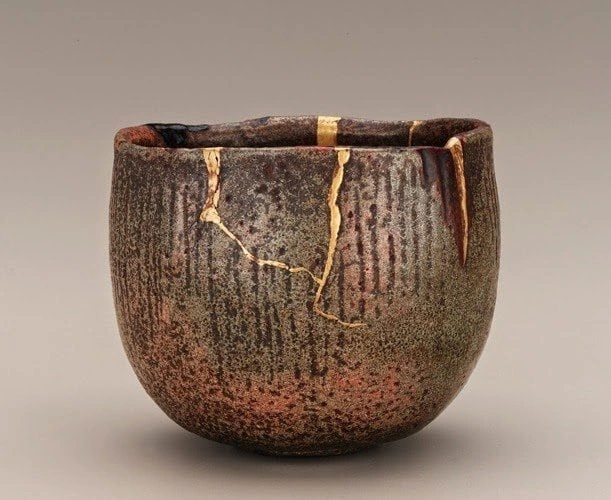
Historical Precedent: Wabi-Sabi Meets Modern Design
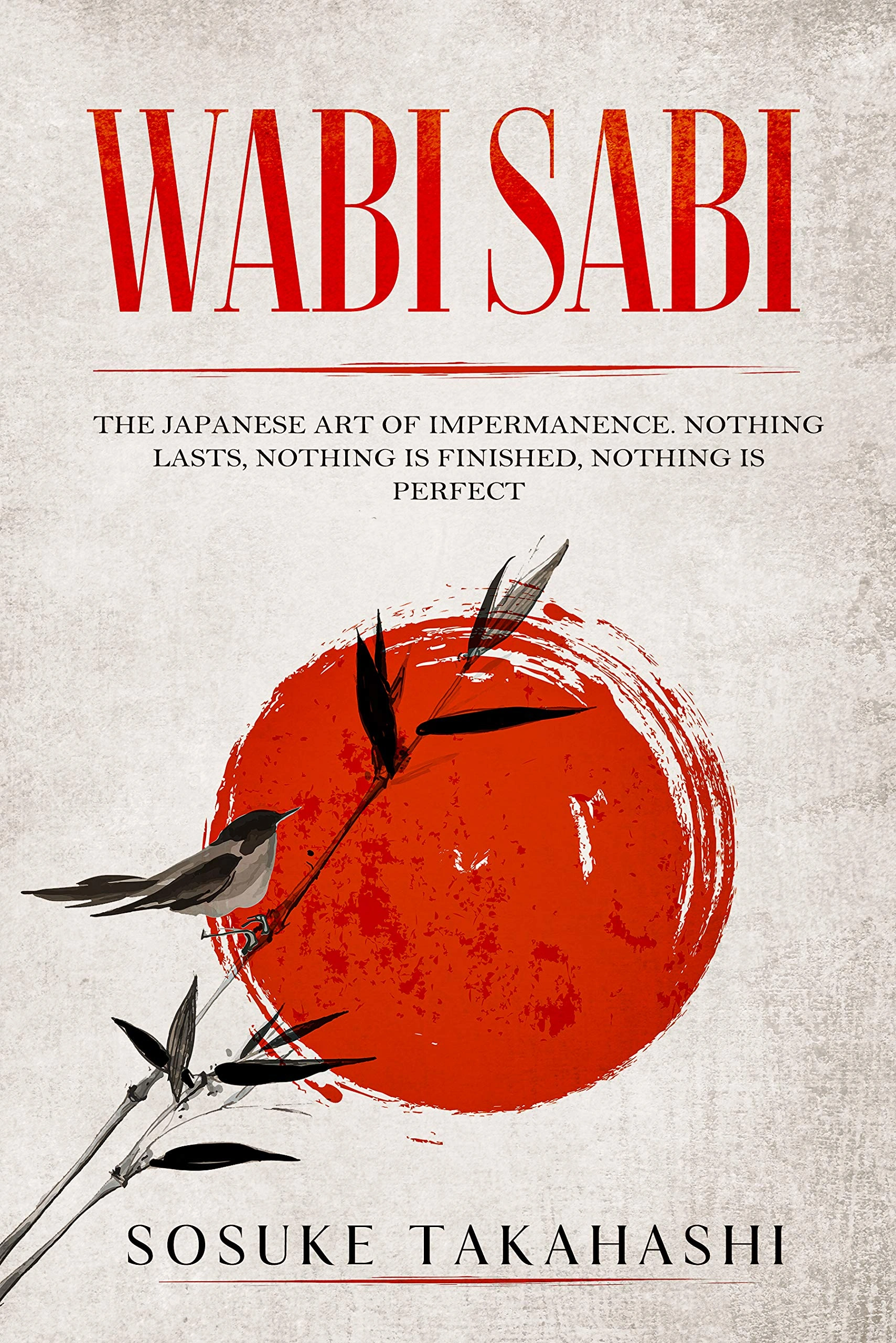
While this trend feels contemporary, it has deep philosophical roots. The Japanese concept of wabi-sabi—finding beauty in imperfection, impermanence, and incompleteness—has influenced designers for decades. But 2026 marks its mainstream adoption in Western commercial design.
The Seven Principles of Wabi-Sabi in Modern Design:
| Principle | Japanese Term | Design Application 2026 |
|---|---|---|
| Simplicity | Kanso (簡素) | Eliminating non-essential elements |
| Asymmetry | Fukinsei (不均斉) | Embracing irregular layouts and forms |
| Understated Beauty | Shibumi (渋味) | Subtle, unobtrusive elegance |
| Naturalness | Shizen (自然) | Absence of pretense or artificiality |
| Subtle Grace | Yugen (幽玄) | Profound meaning beneath the surface |
| Freedom from Habit | Datsuzoku (脱俗) | Breaking from convention |
| Tranquility | Seijaku (静寂) | Active calm, not emptiness |
Source: The Wabi-Sabi House by Robyn Griggs Lawrence
What’s changed isn’t the philosophy—it’s the urgency. As digital fatigue intensifies and AI perfection becomes background noise, ancient wisdom about beauty in imperfection suddenly feels radically relevant.
The "Too Perfect" Problem
Psychological research supports what designers intuitively understand: humans find slight imperfections more trustworthy than flawless execution. This phenomenon relates to the “uncanny valley” effect—when something appears almost but not quite human, it triggers discomfort rather than connection.
Studies in consumer psychology published in the Journal of Consumer Research reveal that imperfections signal authenticity and effort. The brain recognizes irregularity as evidence of genuine human involvement, making it a more powerful trust signal than polished perfection. When presented with two virtually identical products—one with perfect packaging, one with slight asymmetry—test subjects consistently rated the imperfect option as more “handmade,” “trustworthy,” and “worth paying more for.”
This isn’t about preferring low quality. It’s about recognizing that in an automated world, imperfection becomes the most reliable indicator that a human being actually cared about this thing.
Defining the Trend: Three Faces of Imperfection
Naive Design: Childlike Chaos with Purpose
Naive Design embraces aesthetic elements typically associated with children’s artwork: wobbly lines, uneven fills, scratchy textures, irregular typography, and illustrations that look like they emerged from notebook margins. Think smiley suns, stick figures, and the visual vocabulary of spontaneous creation.
But here’s the crucial distinction: this isn’t actual childishness. It’s sophisticated designers consciously choosing to work within constraints that mimic untrained hands. The wobbles are deliberate. The asymmetry is calculated. The “mistakes” are intentional.
According to Kittl’s 2026 Design Trends Report, Naive Design works because it “communicates friendliness, craft, and authenticity” in ways that polished design simply cannot. The style particularly succeeds in categories where brands want to signal approachability: organic food products, artisanal beverages, natural skincare, independent fashion labels.
When Naive Design Works Best:
| Industry Category | Why It Works | Example Applications |
|---|---|---|
| Children’s Products | Playful, trustworthy, engaging for kids | Books, toys, educational materials |
| Food & Beverage | Approachable, honest, craft-focused | Organic snacks, craft coffee, artisan bakeries |
| Fashion & Streetwear | Unique, expressive, trend-driven | Apparel graphics, limited editions, indie brands |
| Natural Beauty | Authentic, plant-based, transparent | Skincare packaging, wellness products |
| Arts & Culture | Creative, energetic, community-centric | Event posters, indie publications, creative studios |
Source: Analysis from Lindsay Marsh Design Trends 2026
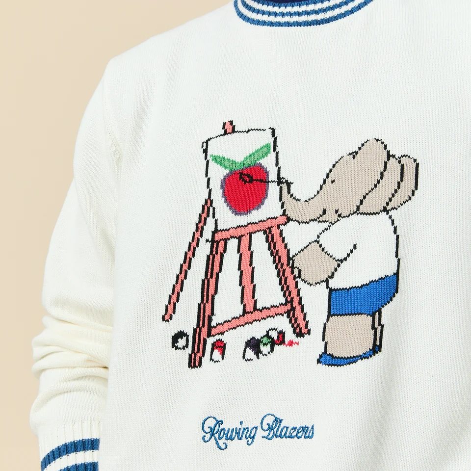
Rowing Blazers, the preppy streetwear brand, exemplifies sophisticated naive design. Their graphics feature intentionally crude illustrations and hand-scrawled typography that would fail any formal design critique—yet the work succeeds precisely because it rejects those formal standards. The aesthetic communicates irreverence, creativity, and human touch in a market saturated with digitally perfect competitors.
The style works best when brands can authentically claim craft-based values. A multinational corporation deploying naive design risks appearing disingenuous—trying to purchase authenticity it hasn’t earned. But for genuinely small-batch producers, indie brands, and companies with legitimate maker stories, naive aesthetics provide visual vocabulary that perfectly matches their positioning.
Anti-Design: Breaking Rules Intentionally
If Naive Design is gentle rebellion, Anti-Design is full-throated revolution. This movement deliberately violates established design principles—hierarchy, readability, balance, harmony—creating work that challenges viewers’ expectations of what “good design” should accomplish.
Anti-Design manifests through jarring color combinations, aggressively overlapping text, chaotic layouts, clashing typefaces, and compositions that seem to actively resist coherent structure. The result often appears messy, even ugly by conventional standards. That’s the point.
“Anti-design is a philosophy and aesthetic that rejects supposed design rules and norms and instead embraces chaos, asymmetry and noise.”
— Creative Bloq, May 2025
This aesthetic isn’t new—it echoes punk graphics of the 1970s, Dadaist provocations of the 1920s, and various avant-garde movements that questioned design orthodoxy. What’s changed is scale and accessibility. Anti-Design has migrated from art school experiments and underground zines to mainstream brand expression.
Anti-Design Risk Assessment Matrix:
| Brand Type | Suitability | Risk Level | Success Factors |
|---|---|---|---|
| Creative Agencies | High | Low | Demonstrates innovation, attracts creative clients |
| Fashion/Streetwear | High | Low | Appeals to youth culture, stands out in market |
| Tech Startups | Medium | Medium | Works if target audience is creative professionals |
| Food & Beverage | Medium | Medium | Requires strong brand story and cultural awareness |
| Healthcare | Low | High | Trust signals more important than differentiation |
| Financial Services | Low | High | Professionalism and clarity essential |
| Legal Services | Very Low | Very High | Conservative aesthetics communicate competence |
The philosophy underlying Anti-Design asks fundamental questions: Who decides what constitutes “good” design? Why should all brands aspire to the same polished aesthetic? Might deliberate ugliness be more honest than performative beauty?
Brands embrace Anti-Design for several strategic reasons. First, it guarantees attention. In feeds filled with tasteful minimalism, aggressive visual chaos stops scrolls. Second, it signals cultural awareness and risk-taking—particularly appealing to creative industries and youth markets. Third, it provides immediate differentiation in categories where competitors all deploy similar “premium” aesthetics.
Gumroad, the digital product marketplace, famously adopted brutalist web design—a digital manifestation of Anti-Design principles. The site stripped away decorative elements, used stark typography, and created deliberately uncomfortable layouts. Rather than hurting usability, the aesthetic attracted exactly the creative, technically savvy users Gumroad wanted to serve.

However, Anti-Design carries inherent risks. Without strong art direction, chaos becomes actual mess rather than intentional statement. The approach works for brands whose audiences appreciate artistic provocation—galleries, fashion labels, creative tools. It fails spectacularly for industries requiring trust signals: healthcare, finance, legal services, where conventional design principles communicate competence and reliability.
Freehand Artistry: Controlled Spontaneity
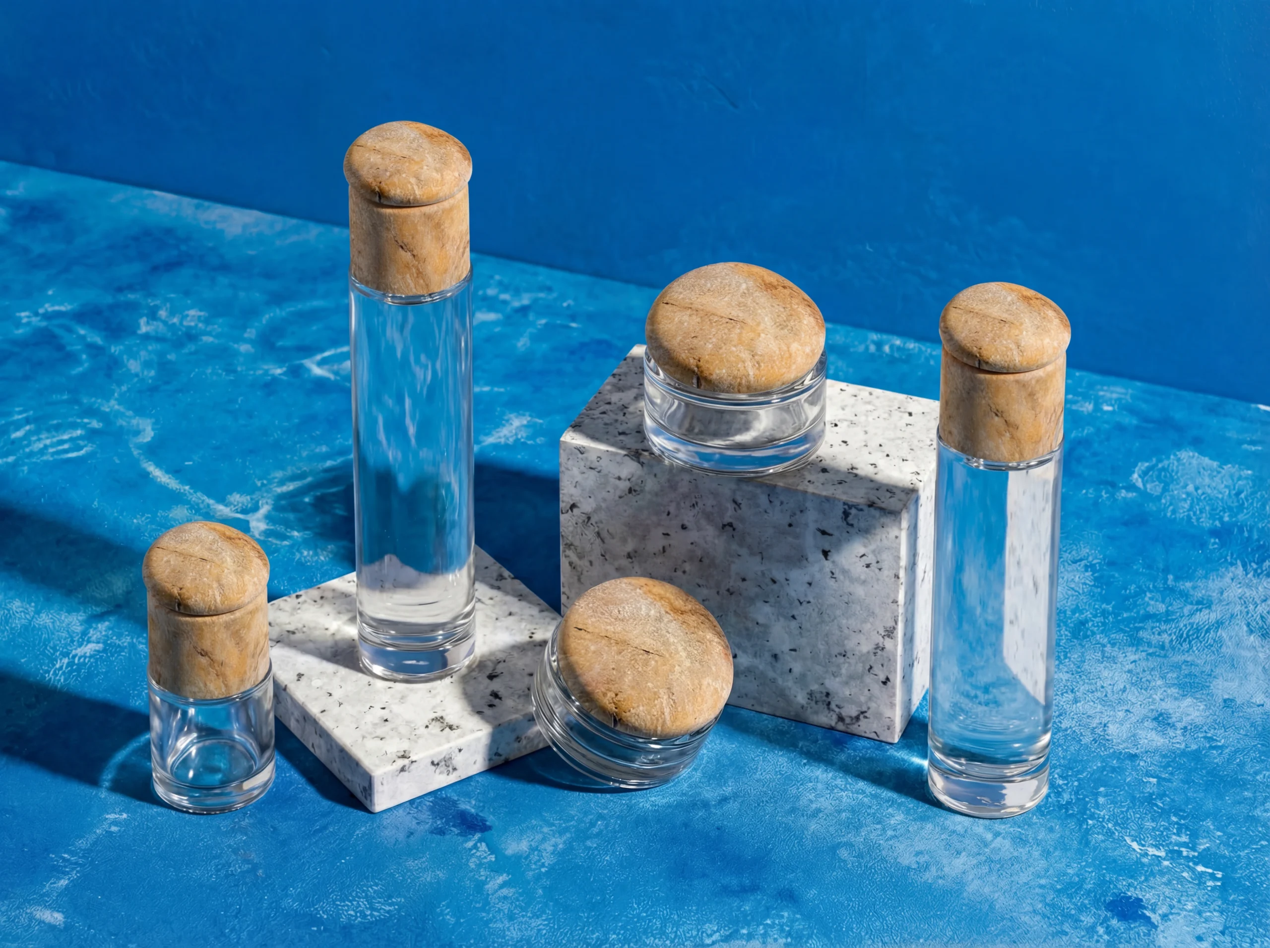
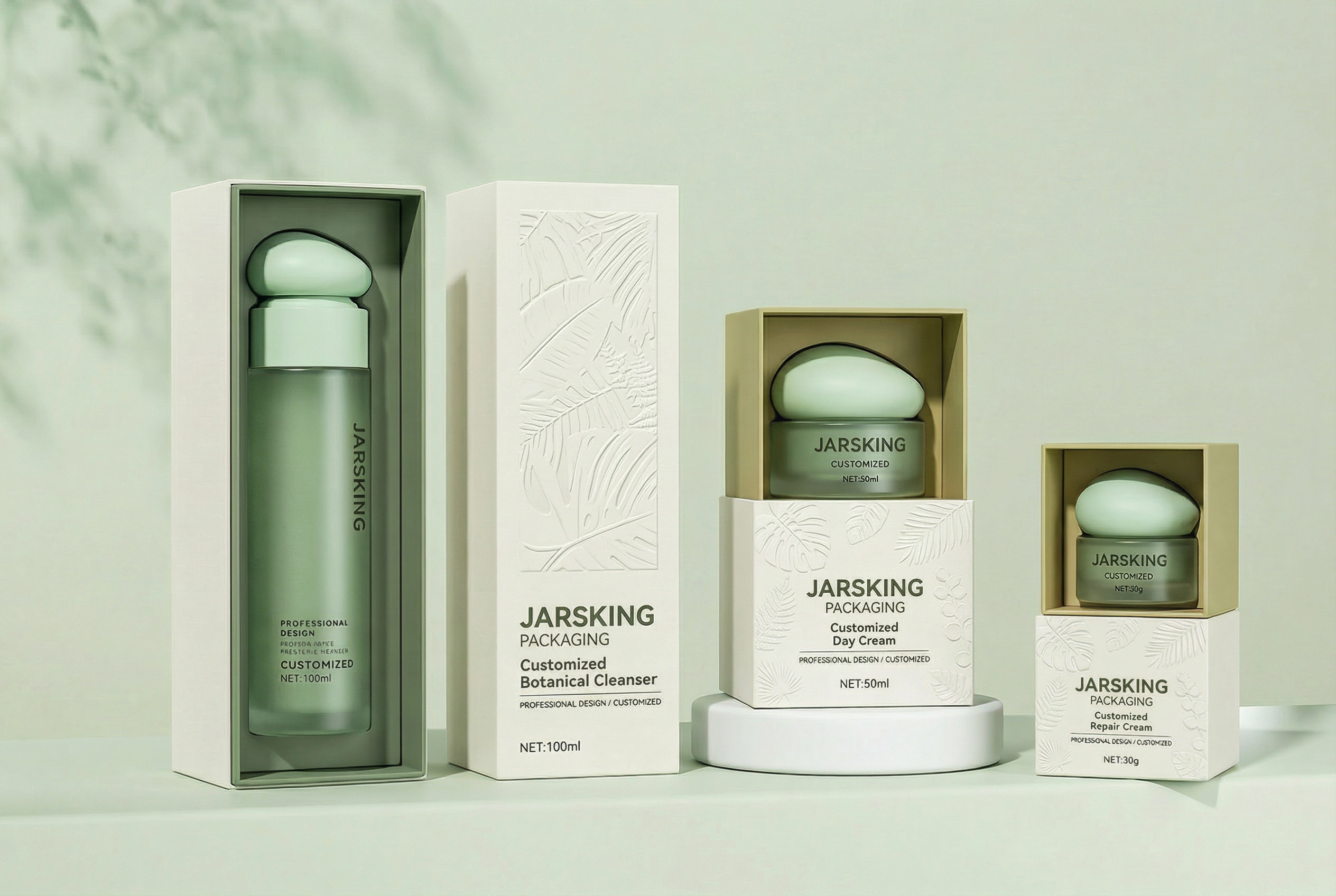
Freehand Artistry occupies middle ground between Naive Design’s playfulness and Anti-Design’s aggression. This approach celebrates visible evidence of the artist’s hand: brushstrokes, irregular line weights, organic patterns, painterly textures, and the subtle variations that distinguish handmade work from digital production.
The aesthetic draws from traditional illustration, watercolor painting, screen printing, and other analog techniques—though contemporary practitioners often create these effects digitally before introducing controlled imperfections. The goal isn’t to deceive viewers into thinking work is purely handmade, but rather to incorporate visual language associated with craft and artistic intention.
Psychologically, Freehand Artistry leverages what researchers call “effort heuristics”—the tendency to value things more highly when we perceive they required significant effort to create. Each visible brushstroke, each irregular edge, each hand-drawn element signals: “A skilled person spent time on this.”
This perception justifies premium positioning. Luxury brands increasingly adopt freehand elements precisely because imperfection has become a marker of exclusivity. When mass production achieves perfection cheaply, wealthy consumers seek products bearing marks of individual human attention.
Freehand Artistry Techniques in Packaging:
| Technique | Visual Effect | Brand Application | Premium Potential |
|---|---|---|---|
| Letterpress | Visible debossing, ink variation | Craft spirits, luxury stationery | High (+30-40%) |
| Screen Printing | Soft edges, texture from mesh | Artisan foods, boutique cosmetics | Medium (+20-30%) |
| Watercolor Effects | Organic bleeds, color flow | Natural beauty, wellness products | Medium (+20-30%) |
| Hand-Applied Elements | Twine, stamps, wax seals | Limited editions, gift sets | Very High (+40-60%) |
| Embossing Variations | Irregular depth, tactile surface | Premium beverages, luxury goods | High (+30-40%) |
Source: Pricing analysis from 99designs Pricing Guide
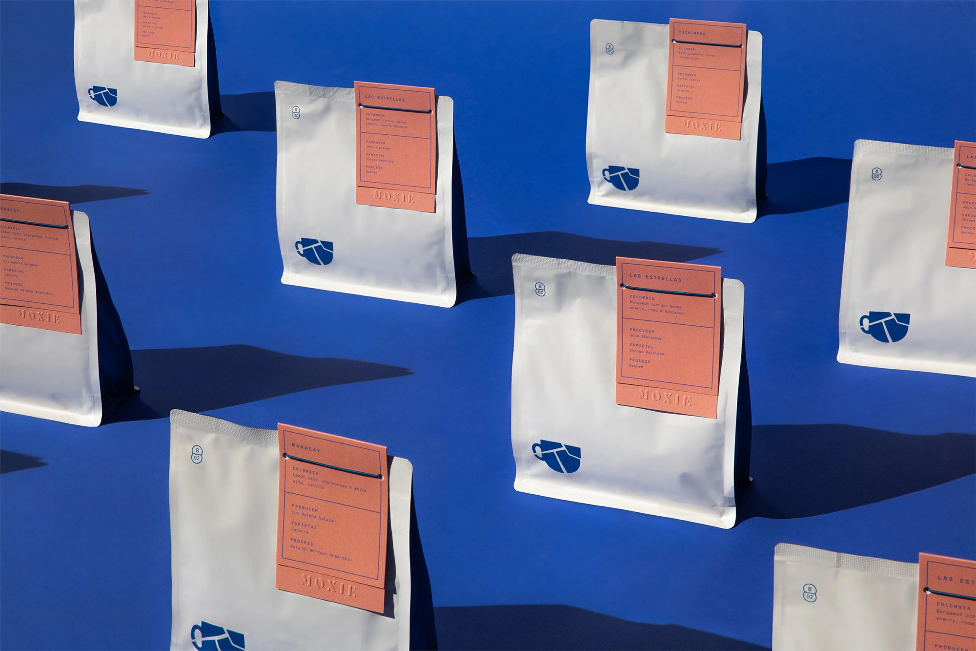
The rise of limited editions with deliberately varied packaging illustrates this trend. Craft distilleries release bottles with hand-painted labels where each one differs slightly. Boutique cosmetics companies collaborate with artists to create packaging with unique illustrations. Specialty food producers use letterpress printing that leaves visible texture and slight ink irregularities.
Material choices amplify freehand aesthetics: uncoated paper stock that shows fiber texture, natural substrates with visible grain, screen printing that allows controlled ink bleeds, embossing with intentional depth variations. These production choices transform packaging from perfect containers into tactile objects worth experiencing.
Packaging Design Applications: Where Imperfection Shines
Surface Treatments That Celebrate Irregularity
The shift toward imperfection has profound implications for packaging production. Techniques traditionally considered flaws are being reimagined as features:
Letterpress printing, once relegated to boutique wedding invitations, is experiencing revival in commercial packaging. The method’s inherent characteristics—visible debossing, ink density variations, slight impression irregularities—make it impossible to achieve pixel-perfect results. That’s exactly why brands choose it. Each letterpress piece bears physical evidence of analog production.
Screen printing offers similar opportunities. Unlike digital printing’s mathematical precision, screen printing introduces controlled variability: ink edges slightly softer, colors subtly richer, occasional texture from mesh patterns. These “imperfections” create visual warmth impossible to replicate digitally.
Risograph printing—a method combining screen printing and photocopying—produces distinctive grainy textures and slight color registration shifts. Originally used for cheap zine production, risograph’s aesthetic quirks now command premium pricing in packaging design.
Material selection intensifies imperfection strategies. Recycled paperboard shows visible fiber inconsistencies and color variations—characteristics brands once rejected, now embrace as proof of sustainability. Natural kraft paper varies subtly from batch to batch. Handmade paper with deckled edges creates organic, irregular shapes impossible in machine production.
Material Imperfection Guide:
| Material | Inherent Irregularities | Best Applications | Sustainability Bonus |
|---|---|---|---|
| Recycled Paperboard | Visible fibers, color variation | Food packaging, shipping boxes | High |
| Natural Kraft | Batch color differences, texture | Artisan foods, eco-brands | Medium |
| Cork | Unique grain patterns, texture | Wine closures, premium accents | High |
| Bamboo | Natural striations, color range | Natural beauty, wellness | Very High |
| Handmade Paper | Deckled edges, fiber visibility | Luxury gifts, limited editions | Medium |
| Reclaimed Wood | Weathering, patina, grain | Specialty packaging, displays | Very High |
Cork, wood, bamboo, and other natural materials offer inherent imperfection. No two pieces match exactly. Grain patterns, color variations, and textural differences make each package unique—precisely what brands targeting authenticity-seeking consumers want to communicate.
Typography That Breaks the Grid
Typography provides another arena for strategic imperfection. Designers are abandoning rigid baseline grids in favor of more organic arrangements:
Variable baselines create the impression of words dancing on the line—slightly rising, falling, or rotating as if placed by hand rather than algorithm. This technique works particularly well for brands wanting to communicate energy, playfulness, or creative freedom.
Hand-drawn lettering with deliberately wobbly strokes signals craft and individuality. Even when created digitally, designers introduce subtle irregularities that mimic the natural variation in human hand movement.
Mismatched font weights and mixed type families create dynamic visual tension. Rather than selecting harmonious type pairings according to traditional typography principles, designers intentionally combine fonts that clash—creating layouts that feel more like collage than coordinated system.
These approaches succeed when balanced against fundamental usability requirements. Legibility must remain intact—if consumers cannot read product information or brand names, strategic imperfection becomes counterproductive. The best imperfect typography walks a careful line: distinctive enough to stand out, functional enough to work.
Color as Emotional Honesty
Imperfection extends to color strategy. Rather than using perfectly matched Pantone swatches, brands are embracing:
Color Imperfection Strategies:
| Approach | Visual Characteristic | Emotional Signal | Industry Fit |
|---|---|---|---|
| Muted “Dusty” Tones | Hand-mixed appearance | Artisanal, organic | Beauty, wellness, food |
| Irregular Gradients | Uneven color transitions | Handcrafted, natural | Beauty, lifestyle products |
| Visible Variation | Batch-to-batch differences | Small-batch, authentic | Craft beverages, artisan foods |
| Painterly Bleeds | Colors mixing at edges | Artistic, creative | Fashion, creative services |
| Earth Tone Irregularity | Natural pigment feel | Sustainable, plant-based | Natural products, eco-brands |
Muted, “dusty” tones that feel painterly rather than digitally precise. These colors appear to have been mixed by hand, creating organic richness impossible in pure digital palettes.
Irregular gradients and color bleeds where hues transition imperfectly, with soft edges and uneven progressions. Digital tools can achieve mathematical gradient smoothness; intentionally rough transitions signal handcrafted aesthetic.
Visible color variation within single print runs. Traditionally considered quality defect, slight color shifts from package to package now communicate small-batch authenticity—particularly when paired with messaging about artisan production.
The psychology of imperfect color is subtle but powerful. Perfect color matching signals industrial production and scientific precision. Organic color variation suggests natural ingredients, handmade care, and human oversight. For brands in beauty, wellness, and natural products categories, this subliminal messaging reinforces core positioning.
Earth tones particularly benefit from imperfect treatment. Terracotta, clay, sage green, honey gold—these colors feel more authentic when rendered with slight irregularity, as if mixed from natural pigments rather than formulated in laboratories.
Structural Design: Organic Forms
Imperfection isn’t limited to surface graphics—it extends to package structure itself:
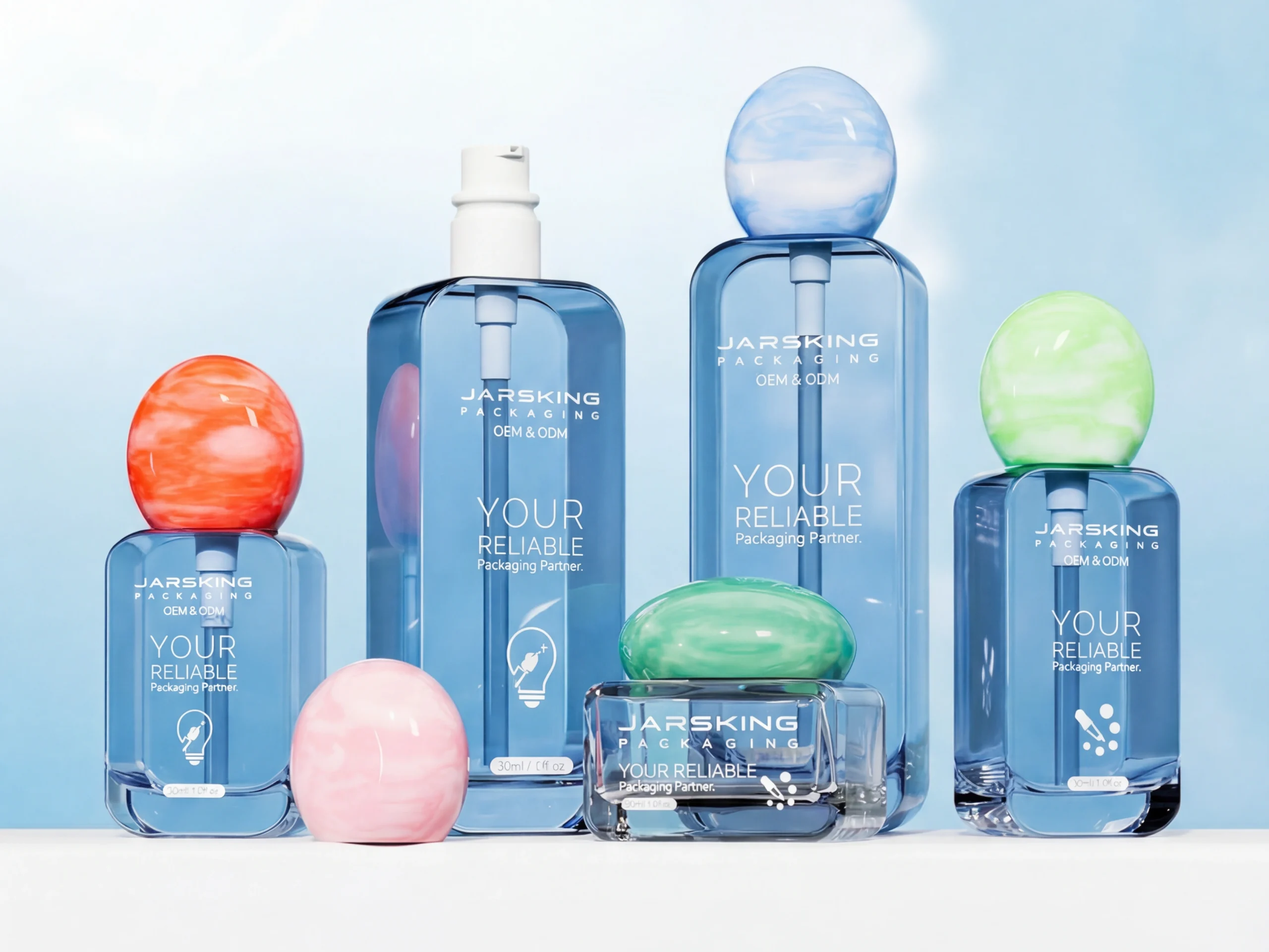
Asymmetrical shapes that deviate from standard rectangles and cylinders suggest handcraft. When packages don’t conform to efficient manufacturing standards, consumers perceive higher value and artistic intention.
Irregular closures—twine wraps, fabric ties, hand-folded elements—add tactile dimension while signaling human involvement in production. These details take longer to execute, communicating care and attention.
Uneven surfaces with deliberate texture transform functional containers into sensory experiences. Pottery-inspired vessels with visible throwing marks, boxes with rough-cut edges, bottles with organic surface variations—all communicate handmade values.
Some brands create modular packaging systems with mix-and-match aesthetics, where slight variations between components feel intentional rather than defective. This approach works especially well for gift sets and limited editions, where variation itself becomes desirable feature.

The Business Case: Why Imperfection Works
Differentiation in Saturated Markets
The primary business argument for imperfect design is simple: it creates differentiation in markets where competitors converge on similar aesthetics.
When every skincare brand uses the same clean-beauty visual language—white backgrounds, minimal sans-serif type, soft photography—standing out becomes nearly impossible. A brand that deliberately chooses hand-drawn illustrations and irregular typography immediately distinguishes itself on crowded retail shelves and digital marketplaces.
Social media amplifies this advantage. According to Dash Hudson’s 2024 Social Media Benchmarks Report, imperfect, distinctive packaging generates significantly more organic sharing than conventionally beautiful design. Consumers photograph and post products that feel unique, authentic, and visually interesting.
Social Media Engagement by Design Style:
| Design Approach | Average Engagement Rate | Shareability Score | User-Generated Content |
|---|---|---|---|
| AI-Perfect Minimalism | 2.1% | Low | Minimal |
| Strategic Imperfection | 3.8% | High | Significant |
| Naive Design | 4.2% | Very High | Abundant |
| Anti-Design | 3.5% | High | Moderate |
| Freehand Artistry | 3.9% | High | Significant |
Data synthesized from Dash Hudson, Later, and Hootsuite social media benchmarks 2024-2025
Unboxing experiences benefit particularly from imperfection strategies. When packages arrive with handwritten notes, irregular closures, or visible craft details, recipients perceive higher value and personal attention. This translates directly to repeat purchase rates and word-of-mouth recommendation.
Premium Pricing Justification
Strategic imperfection enables premium pricing by signaling small-batch production and artisan values—even when actual production happens at scale using modern manufacturing.
Consumer perception studies from the Journal of Consumer Psychology consistently show willingness to pay 20-30% premiums for products perceived as “handmade” or “artisanal.” The visual language of imperfection—hand-drawn elements, irregular surfaces, natural material variations—triggers these perceptions automatically.
Premium Pricing Impact by Imperfection Strategy:
| Strategy | Average Price Premium | Consumer Perception | Optimal Categories |
|---|---|---|---|
| Hand-Painted Elements | +35-45% | Unique, collectible | Luxury spirits, art collaborations |
| Letterpress Finishing | +25-35% | Craft-focused, quality | Premium foods, boutique beauty |
| Irregular Die-Cutting | +15-25% | Artisanal, small-batch | Natural products, indie brands |
| Natural Material Variation | +20-30% | Sustainable, authentic | Eco-conscious products |
| Limited Edition Variations | +40-60% | Exclusive, scarce | Collectibles, luxury goods |
Source: Pricing analysis from McKinsey & Company Consumer Research
The psychological mechanism involves perceived scarcity and effort. Perfect, uniform products suggest mass production and commodity pricing. Imperfect, varied products suggest limited quantities and skilled craftsmanship—justifying higher prices even when production costs remain comparable to conventional approaches.
Luxury markets particularly embrace this dynamic. When manufacturing excellence becomes accessible to all price points, wealthy consumers seek markers of genuine exclusivity. Imperfection—properly executed—provides that signal. Each irregularity suggests the product received individual attention rather than standardized processing.
Brand Storytelling Amplification
Imperfection creates natural opportunities for brand storytelling. When packaging features visible human touches, consumers become curious: Who made this? Why these specific choices? What’s the story behind this design?

This curiosity opens doors for deeper brand engagement. Companies can share maker stories, designer profiles, production processes, and cultural inspirations through content marketing strategies. The imperfections become conversation starters rather than details to hide.
Effective brand narratives frame imperfection as intentional choice reflecting company values: “Our labels are screen-printed by hand because we believe in supporting local artisans and preserving traditional crafts.” This positions production methods as values statement rather than technical specification.
The emotional connection built through these stories drives brand loyalty beyond functional product attributes. Consumers don’t just buy the item—they buy the values, story, and human connection the imperfect packaging represents.
Sustainability Messaging
Imperfection aligns naturally with sustainability positioning. Several factors drive this connection:
Sustainability + Imperfection Synergies:
| Connection Point | How It Works | Brand Benefit |
|---|---|---|
| Material Authenticity | Recycled materials show visible irregularities | Proof of sustainability claims |
| Waste Reduction | Accepting variation reduces “defective” rejects | Lower environmental impact |
| Psychological Association | Imperfection = natural = eco-conscious | Strengthened green positioning |
| Local Production | Small-batch methods introduce natural variation | Reduced carbon footprint messaging |
| Circular Design | Upcycled materials inherently imperfect | Visible circular economy commitment |
First, sustainable materials often exhibit inherent irregularities. Recycled paper shows visible fibers. Natural dyes produce color variations. Biodegradable plastics have different optical properties than virgin petroleum-based materials. Rather than treating these as limitations, brands embracing imperfection celebrate them as proof of environmental commitment.
Second, celebrating imperfection reduces waste in production. Traditional manufacturing rejects anything failing to meet strict uniformity standards. Embracing variation means fewer “defective” units, reducing material waste and environmental impact—a key principle in circular economy design.
Third, consumers psychologically associate imperfection with natural, eco-conscious values. Perfect, synthetic-looking packaging suggests chemical processing and environmental harm. Organic, irregular packaging suggests sustainability—even when actual environmental impact is similar.
This perception allows brands to turn sustainability constraints into marketing advantages. Package variations caused by recycled content become features worth highlighting rather than problems requiring solutions.
Implementation Guidelines: Doing Imperfection Right
The Strategic Imperfection Framework
Successfully implementing imperfect design requires careful framework:
Rule 1: Intentional, Not Accidental
Every imperfection must serve strategic purpose. Random messiness just looks unprofessional. Controlled imperfection that reinforces brand story creates value.
Documentation becomes crucial. Design teams should articulate exactly which imperfections are intentional, why they align with brand positioning, and how they should be maintained across production. Without clear guidelines, manufacturers default to “fixing” what appears broken.
According to AIGA’s Professional Practices, comprehensive design documentation should include:
- Rationale for each intentional imperfection
- Acceptable tolerance ranges for variations
- Production specifications ensuring consistency of inconsistency
- Quality control guidelines distinguishing strategic from accidental flaws
Rule 2: Brand-Aligned Authenticity
Imperfection styles must match actual brand characteristics. A massive corporation deploying naive design to seem “indie” will face authenticity challenges. A genuinely small-batch producer using hand-drawn aesthetics tells truth visually.
Brand Authenticity Assessment:
| Question | If Yes | If No |
|---|---|---|
| Does your production involve actual handcraft? | Lean heavily into visible imperfection | Use more subtle imperfection cues |
| Is your brand story rooted in artisan values? | Naive/Freehand approaches authentic | Consider anti-design or minimal imperfection |
| Does your target audience value uniqueness? | Strategic imperfection creates differentiation | May need different strategy |
| Can you credibly claim “small-batch”? | Variations strengthen positioning | Focus on material/texture imperfection |
| Are competitors using perfect aesthetics? | Imperfection provides clear contrast | Analyze what differentiates your category |
The alignment test: Could this brand credibly claim the values imperfection suggests? If not, different aesthetic approach probably serves better.
Rule 3: Functional First, Aesthetic Second
Imperfection cannot compromise core functionality. Packaging must still protect products, communicate necessary information clearly, and meet regulatory requirements. Strategic imperfection enhances these functions; it never replaces them.
Testing becomes essential. Before committing to production, brands should validate that imperfect designs still accomplish fundamental goals:
- Shelf visibility and recognition
- Information hierarchy and legibility
- Usability and ease of opening
- Product protection during shipping
- Regulatory compliance (ingredients, warnings, certifications)
The FDA’s packaging regulations and FTC’s labeling requirements don’t care about aesthetic trends—they mandate clear, accurate information regardless of design philosophy.
Industry-Specific Considerations
Different industries offer varying tolerance for imperfection:
Industry Imperfection Tolerance Guide:
| Industry | Tolerance Level | Recommended Strategies | Cautionary Notes |
|---|---|---|---|
| Beauty & Cosmetics | High | Hand-drawn botanicals, watercolor effects, irregular finishing | Maintain ingredient clarity |
| Food & Beverage | Very High | Letterpress, hand-applied closures, organic materials | Nutritional info must remain legible |
| Wellness & Cannabis | High | Natural textures, earth tones, botanical sketches | Medical claims require precision |
| Fashion & Lifestyle | Very High | Anti-design, naive graphics, experimental typography | Brand recognition still matters |
| Luxury Goods | Medium-High | Freehand artistry, unique variations, artist collaborations | Maintain premium perception |
| Tech Products | Medium | Subtle imperfection, humanized interfaces | Don’t compromise technical credibility |
| Healthcare | Low | Minimal, carefully controlled imperfection | Trust and clarity paramount |
| Financial Services | Very Low | Avoid unless targeting creative niche | Professionalism essential |
| Legal Services | Very Low | Not recommended | Conservative aesthetics signal competence |
Beauty and cosmetics can push boundaries significantly. The category celebrates artistry, self-expression, and craft values. Hand-drawn botanicals, watercolor effects, and irregular finishing work well—particularly for indie brands and natural product lines.
Food and beverage likewise embraces imperfection readily. Craft breweries, artisan food producers, and specialty beverage brands use letterpress, hand-applied closures, and organic materials extensively. The aesthetic reinforces quality and craft positioning.
Wellness and cannabis products benefit from natural, imperfect aesthetics that distance them from pharmaceutical associations. Earth tones with variation, botanical illustrations with sketchy linework, and recycled materials communicate plant-based medicine rather than synthetic drugs.
Luxury and limited editions use imperfection to signal exclusivity. Numbered series with unique variations, artist collaborations with signature styles, and collectible packaging celebrating imperfection create desirability through scarcity—a strategy documented by Luxury Institute research.
Technical and pharmaceutical products require more restraint. While some imperfect elements can humanize these categories, core design must prioritize clarity, precision, and professional authority. Safety information cannot be compromised for aesthetic experimentation.
Working with Production Partners
The biggest implementation challenge is achieving controlled imperfection at scale. Mass production systems optimize for uniformity—introducing deliberate variation requires careful production planning.
Production Methods for Strategic Imperfection:
| Method | Variation Achieved | Scale Feasibility | Cost Impact |
|---|---|---|---|
| Variable Data Printing | Unique designs per unit | High (digital) | Low (+5-10%) |
| Letterpress | Natural debossing variation | Medium | High (+30-50%) |
| Screen Printing | Controlled ink irregularity | Medium-High | Medium (+15-25%) |
| Hand-Applied Elements | Individual human touch | Low-Medium | Very High (+50-100%) |
| Natural Materials | Inherent substrate variation | High | Variable (sometimes lower) |
| Risograph | Grainy texture, registration shifts | Medium | Low-Medium (+10-20%) |
Cost impacts based on industry standard comparisons from Packaging Digest
Successful approaches include:
Variable data printing allowing different designs within single production run. Digital printing technology enables this economically, making it feasible to produce thousands of unique labels or packages.
Controlled analog techniques using letterpress, screen printing, or other methods that naturally introduce variation. Working with specialized production partners experienced in these techniques ensures quality while maintaining desired irregularity.
Post-production hand-finishing for premium products. Even mass-produced packages can incorporate hand-applied elements—twine, stamps, wax seals—that introduce final layer of imperfection and human touch.
Material selection prioritizing natural variation. Choosing substrates that inherently vary—recycled paper, natural fibers, sustainable materials—builds imperfection into supply chain rather than requiring special production accommodations.
Future Outlook: Where Imperfection Is Heading
Technology Enabling Intentional Variation
Ironically, technology will likely expand imperfection’s reach. Variable data printing costs continue dropping, making unique designs economically feasible at larger scales. AI tools—the very technology that triggered perfection fatigue—are being trained on imperfect aesthetics, helping designers quickly generate hand-drawn styles and irregular variations.

Augmented reality offers new opportunities for revealing maker stories behind imperfections. Scanning package with smartphone could trigger content explaining why specific design choices were made, who created particular elements, or how production methods contribute to brand values.
Digital printing eliminates traditional minimum order quantities, enabling smaller brands to experiment with artisan aesthetics without massive financial risk. This democratization means imperfection strategies won’t remain exclusive to well-funded companies—genuinely small producers can compete visually with larger competitors.
Sustainability Synergy
The circular economy movement will strengthen imperfection’s business case. As brands embrace recycled, upcycled, and biodegradable materials—all of which show natural variation—celebrating rather than hiding these irregularities becomes strategic necessity.
Carbon-conscious production increasingly favors local manufacturing over global supply chains. Working with local artisans and smaller production facilities naturally introduces more variation than massive industrial facilities. This variation becomes proof point for sustainability claims.
Future Sustainability Trends Supporting Imperfection:
| Trend | Impact on Design | Timeline | Adoption Rate |
|---|---|---|---|
| Mandatory recycled content | Visible material irregularities | 2025-2027 | Regulatory requirement |
| Carbon labeling requirements | Preference for local production variation | 2026-2028 | Growing voluntary adoption |
| Biodegradable mandates | Natural material aesthetics | 2027-2030 | Category-specific regulations |
| Right-to-repair movement | Modular, repairable packaging | 2025-2030 | Consumer-driven |
| Zero-waste retail | Refillable systems with variation | 2026-2029 | Pilot programs expanding |
Timeline projections based on Ellen MacArthur Foundation Circular Economy Reports
Consumer expectations are shifting. Younger generations particularly expect brands to demonstrate environmental commitment through tangible choices, not just marketing rhetoric. Imperfect packaging using sustainable materials provides visible evidence of these values.
The Pendulum Will Swing (But Not Fully Back)
Most likely outcome: hybrid approaches blending elements. “Warm minimalism” maintaining clean layouts but incorporating human touches. Refined imperfection that’s strategic rather than chaotic. The best future designs will probably use technology to scale authenticity rather than eliminate it—AI tools helping achieve imperfect aesthetics more efficiently, not replacing human decision-making entirely.
Brands will likely differentiate on type of imperfection rather than presence or absence. Just as today’s market includes minimalist brands and maximalist brands—both successful when executed well—tomorrow’s landscape will include various imperfection strategies serving different audiences and brand positions.
Design futurists at IDEO predict that by 2028, the most successful brands will be those that transparently show both AI assistance and human curation—making the technology-human collaboration itself part of the brand story rather than hiding it.
Conclusion: The Power of Perfectly Imperfect
In 2026, design perfection is no longer the ultimate goal—human authenticity is. Three interconnected movements—naive design, anti-design, and freehand artistry—converge on fundamental insight: in an AI-perfect world, imperfection builds trust.
This isn’t about accepting low quality or sloppy execution. It’s about recognizing that perfection itself has become problematic—a signal of algorithmic generation, mass production, and corporate distance rather than craft, care, and human connection.

The strategic opportunity is clear: brands willing to embrace controlled imperfection gain differentiation advantage in markets where competitors converge on polished sameness. Early adopters capture attention, justify premium pricing, and build emotional connections through visual honesty.
But success requires authenticity. Imperfection cannot be purchased or faked—it must align with genuine brand values and production realities. A massive corporation pretending to be indie artisan through naive design will face backlash. A genuinely small producer using hand-drawn aesthetics tells visual truth.
The deepest insight isn’t about style—it’s about strategy. In a world where AI can design perfection effortlessly, the most valuable thing brands can prove is that humans cared enough to make something imperfect. That care, translated visually through strategic imperfection, becomes the ultimate luxury: proof that this product, this brand, this moment received genuine human attention.
The future of design isn’t about choosing between perfect and imperfect. It’s about understanding when each serves strategic purpose—and having the courage to embrace imperfection when authenticity matters more than polish.
As Massimo Vignelli, the legendary designer, once noted: “The life of a designer is a life of fight: fight against the ugliness.” But perhaps in 2026, the real fight is against the inhuman perfection that makes everything look the same—and the courage to embrace imperfection is what makes design truly beautiful.
FAQs
Naive design is a packaging aesthetic featuring childlike illustrations, wobbly hand-drawn lines, and intentional imperfections that communicate approachability and authenticity. It works best for organic food brands, craft beverages, natural cosmetics, and products targeting consumers who value handmade aesthetics.
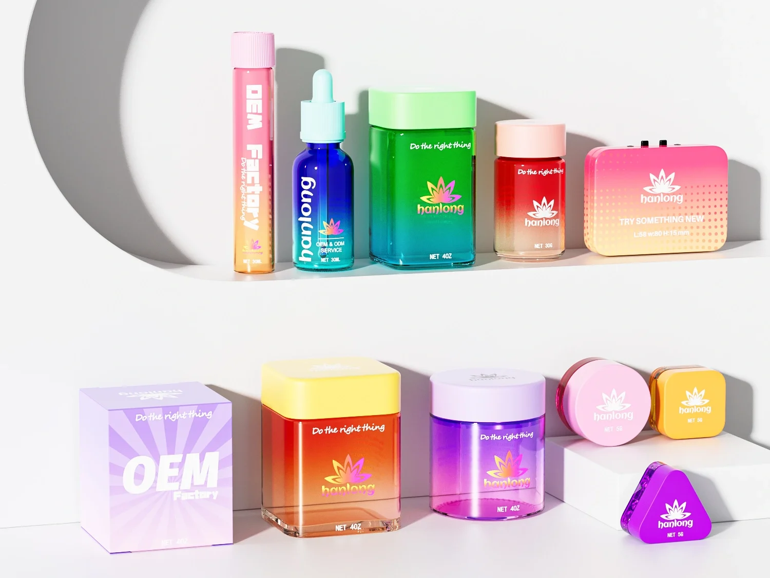
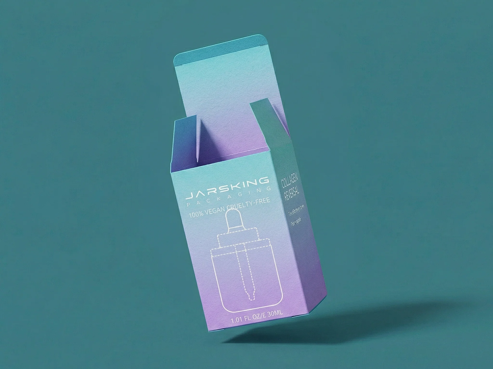
Brands can manufacture imperfect aesthetics at scale through digital variable printing, controlled screen printing techniques, uncoated materials with natural texture, and strategic finishing options like irregular embossing or hand-applied elements. Working with manufacturers experienced in artisan finishes (like Jarsking) ensures quality control while maintaining intentional variation.
No. Anti-design works best for creative agencies, fashion/streetwear brands, craft food & beverage, and companies targeting young, culturally aware consumers. It’s generally unsuitable for industries requiring trust signals like healthcare, finance, or legal services, where design clarity and professionalism are paramount.
Not necessarily. While some artisan techniques (letterpress, hand-applied elements) can increase costs, many imperfect aesthetics use simpler materials (kraft paper, uncoated stock) that offset finishing expenses. Strategic imperfection often justifies premium pricing, making the ROI favorable despite higher production costs.
Evaluate three factors: (1) Does your brand story emphasize craft, authenticity, or artisan values? (2) Are your competitors using polished, AI-perfect aesthetics you need to differentiate from? (3) Does your target audience value uniqueness over uniformity? If yes to 2+, imperfect design may strengthen your positioning.
Strategic imperfection is intentional, with clear rationale and controlled execution. It enhances brand story while maintaining functionality. Poor design is accidental, lacks purpose, and compromises usability. The key: every imperfection should have a documented reason and improve (not hinder) the user experience.
Absolutely. Many luxury brands embrace freehand artistry and wabi-sabi principles to signal exclusivity and craftsmanship. Limited editions with unique variations, artist collaborations, and materials with natural irregularities (marble, wood grain) communicate premium positioning through imperfection.
Imperfect aesthetics naturally align with eco-conscious values by celebrating recycled materials’ visible irregularities, reducing waste from “imperfect” production rejects, and supporting local artisan collaboration over mass manufacturing. Consumers perceive imperfection as proof of sustainable, handmade production processes.

