


In the competitive landscape of European medical cosmetology, packaging is far more than a container—it’s the visual embodiment of scientific credibility, the silent validator of premium quality, and often the deciding factor that transforms browsers into buyers. This is the story of how a Polish brand with ambitious visions and strong product development capabilities partnered with Jarsking to scale from modest beginnings of 3,000 units per SKU to an impressive 645,500 units annually, all while navigating the complex challenge of maintaining brand coherence across multiple demographics, price points, and product categories. Through strategic packaging design decisions, technical innovation, and a true partnership approach, this five-year collaboration demonstrates how the right packaging partner can become a catalyst for exponential growth in one of Europe’s most demanding beauty segments.
Explore the Journey: 3,000 to 645,500 Units in 5 Years
Discover how strategic packaging design powered a Polish medical cosmetology brand's explosive European expansion through an immersive, scroll-driven visual experience.
The Foundation: 2020-2021 – Where Scientific Credibility Meets Market Accessibility
When the Polish brand first approached Jarsking in 2020, they arrived with something many startups lack: a clear vision. As an established player with their own product development team, they understood that medical cosmetology demands a delicate balance—packaging must communicate scientific authority while remaining accessible enough to appeal to consumers across different age groups and income levels. Their goal was ambitious: to create comprehensive skincare lines covering all demographics, from young adults seeking preventative care to mature consumers requiring intensive anti-aging solutions, all positioned for the sophisticated European market.
The challenge wasn’t just about finding bottles and jars. The European beauty consumer, particularly in the medical cosmetology segment, is notoriously discerning. They scrutinize ingredients, demand transparent sourcing, and expect packaging that reflects both the efficacy of the formulation inside and the brand’s commitment to quality. For a brand planning to launch multiple SKUs spanning various price points—from accessible daily care to premium treatment products—every packaging decision carried strategic weight.
Design Strategy for Dual-Brand Architecture
What made this project particularly intriguing was the brand’s sophisticated approach to market segmentation through dual-brand architecture. Rather than forcing a single brand identity across all demographics and price points, they strategically developed two distinct brands, each with its own packaging design language:
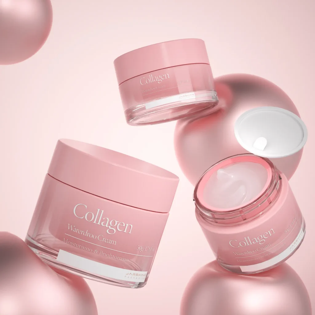
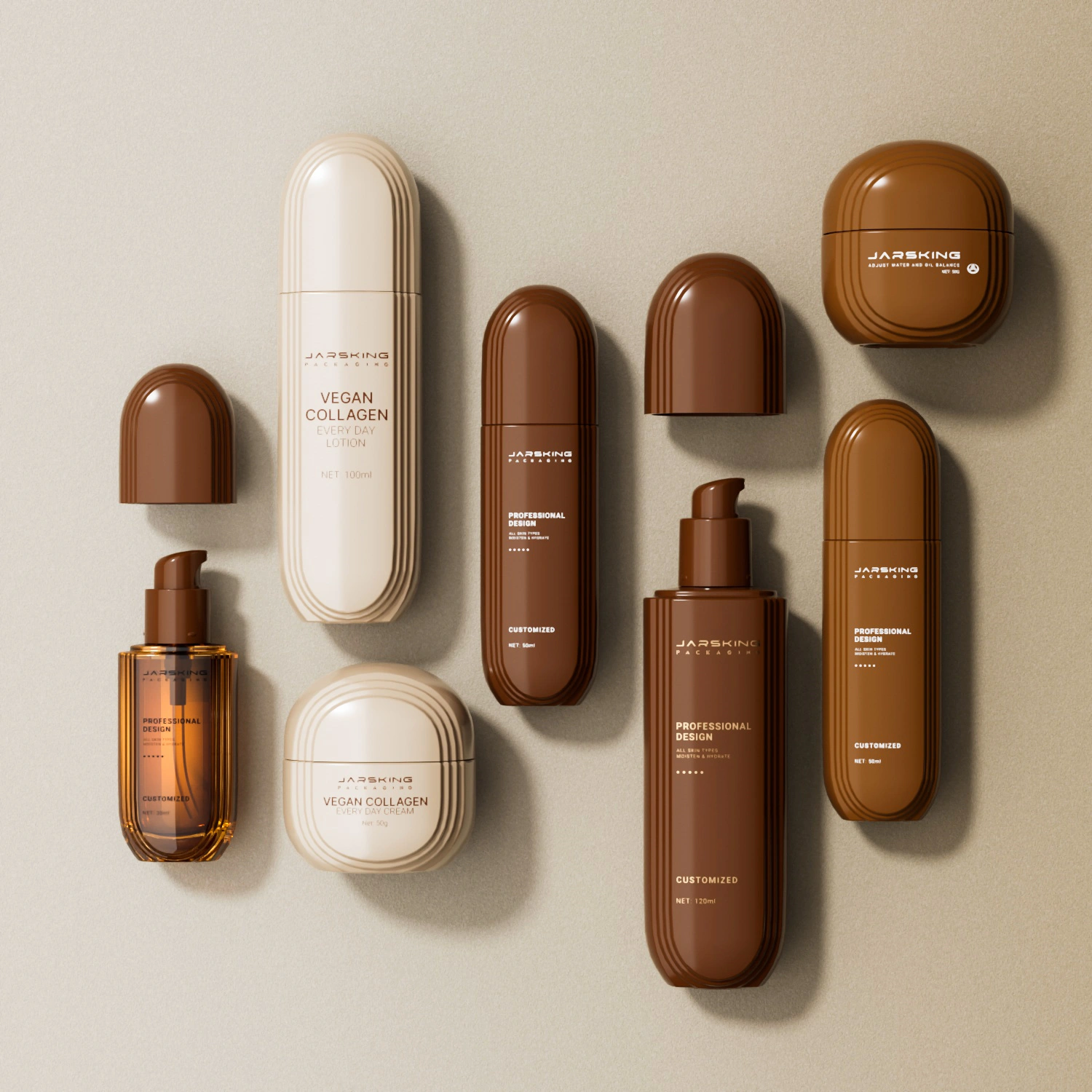
The Premium Medical Line positioned itself at the pinnacle of scientific skincare, targeting consumers aged 35+ who view skincare as a medical investment rather than a cosmetic indulgence. The packaging design philosophy here was uncompromising: premium glass materials exclusively, sophisticated color palettes dominated by platinum, gold, and deep jewel tones, and minimalist design that echoed the aesthetic of high-end dermatology clinics. Every element—from the weight of the jar in hand to the precise typography—was calibrated to communicate clinical excellence and luxury simultaneously.
The initial orders reflected this positioning: 50ml airless plastic bottles for intensive treatments, 30ml glass bottles for concentrated serums, and 50g glass jars for rich creams. These weren’t arbitrary choices. Airless technology communicated product preservation and scientific formulation, while glass materials signaled purity and premium quality—both essential for establishing credibility in the medical cosmetology space.

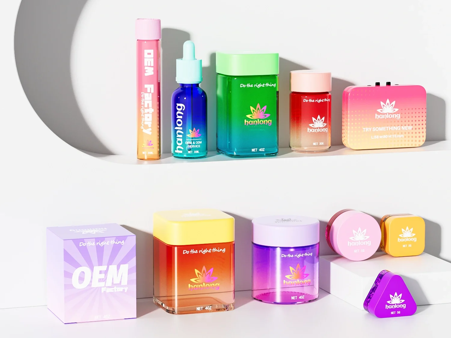
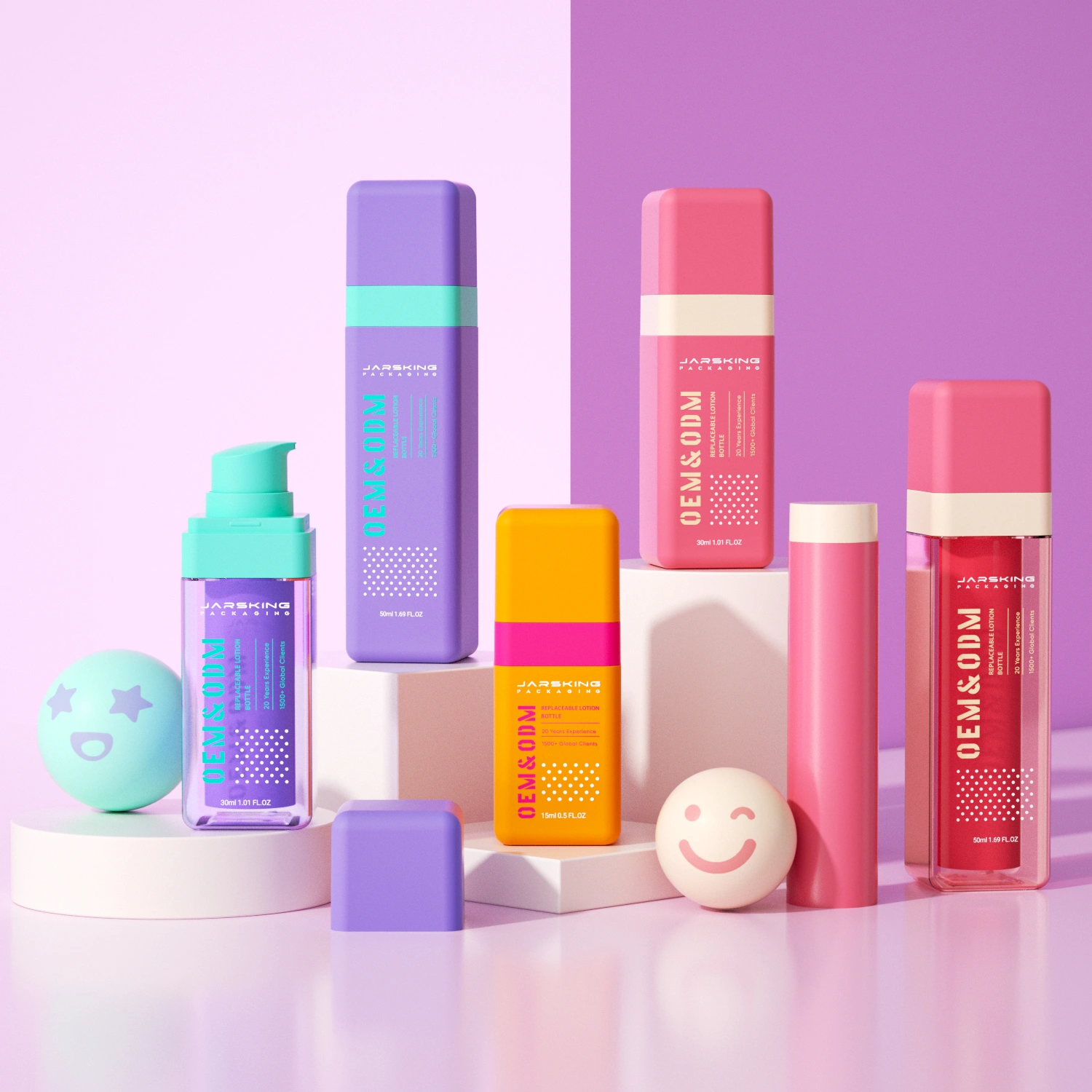
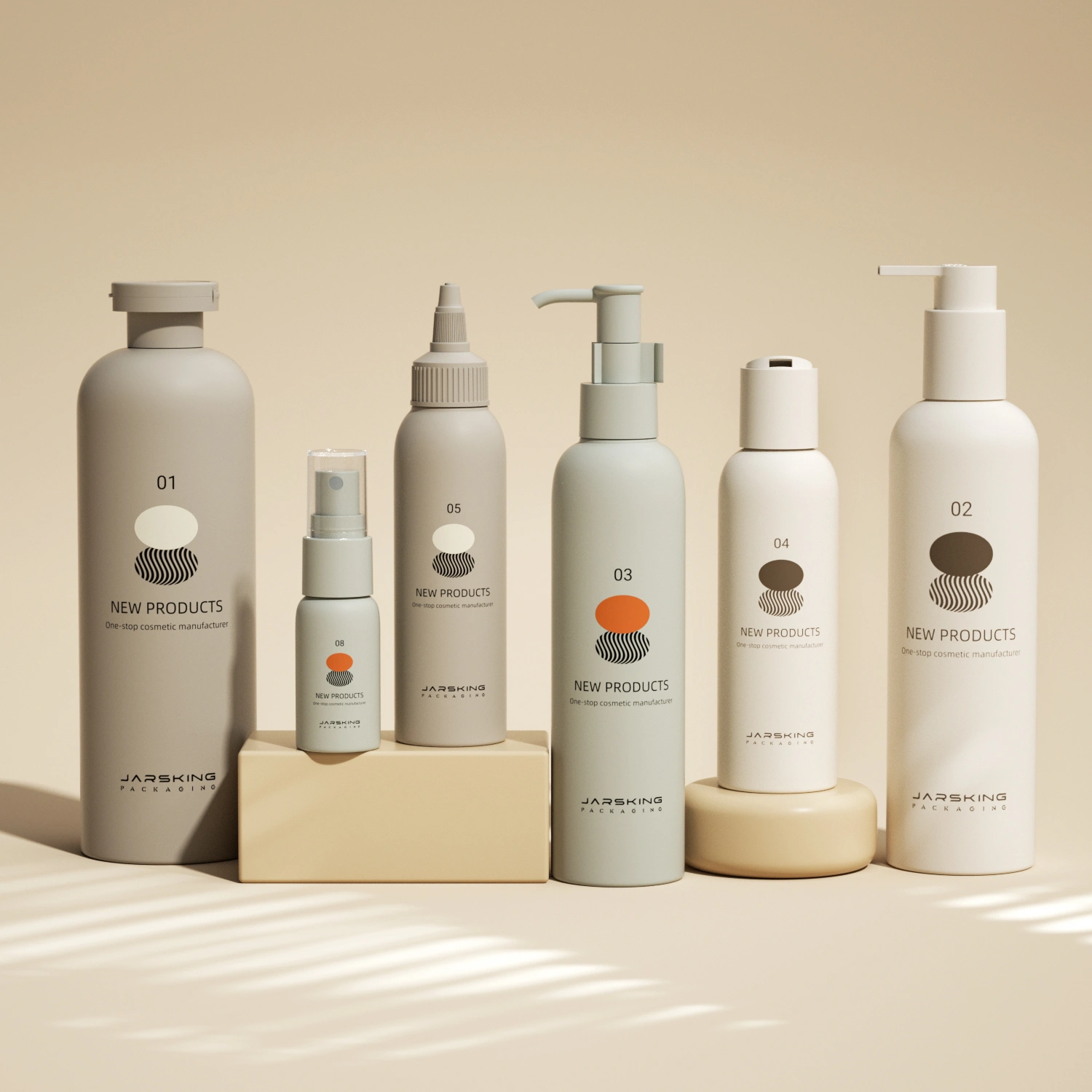
The Contemporary Lifestyle Line, by contrast, targeted a younger, more diverse demographic (20-35 years) with varying skincare needs and budgets. Here, the packaging design language shifted dramatically. Vibrant colors—from soft pinks for hydrating lines to bold purples for sensory body care—created emotional connections and shelf impact. The material strategy was more flexible, mixing glass for hero products with high-quality plastic for daily-use items, balancing premium perception with practical pricing. The typography became more contemporary and approachable, moving away from the clinical precision of the medical line toward a friendlier, lifestyle-oriented aesthetic.
This dual-brand strategy wasn’t just smart marketing—it was a packaging design challenge that required Jarsking to maintain completely different aesthetic languages while ensuring production efficiency and quality consistency across both brands.
Starting Small, Thinking Big
Jarsking’s initial collaboration strategy with the brand demonstrated a pragmatic approach to growth. Beginning with 3,000-5,000 units per SKU allowed both parties to establish workflows, refine quality standards, and test market reception without overcommitting resources. For the brand, this meant lower financial risk while launching multiple products simultaneously. For Jarsking, it meant the opportunity to demonstrate reliability and build trust that would pay dividends as volumes scaled.
The first year’s delivery of 40,000 units might seem modest, but it represented something more valuable than volume: it established the foundation for a partnership built on understanding the nuances of medical cosmetology packaging. Each product category demanded different considerations. Serum bottles needed to protect sensitive active ingredients from light and oxygen. Cream jars required materials that wouldn’t interact with oil-rich formulations. Cleansers needed ergonomic dispensing mechanisms for daily use. Jarsking’s ability to navigate these varied requirements while maintaining the distinct design identities of both brands set the stage for what would become a remarkable growth trajectory.
Acceleration Phase: 2022-2023 – Design Consistency Across Rapid Expansion
The second year marked a turning point. As the brand’s products gained traction in the Polish market and began expanding into neighboring European countries, order volumes nearly doubled to 71,500 units. But more significantly, the complexity of the packaging requirements escalated dramatically.
The Multi-SKU Design Challenge
By 2022, the brand was simultaneously managing:
- Premium Medical Line: P series serums in 30ml glass bottles, G treatment range in 50ml airless bottles, cleansing systems in 300ml plastic bottles, and cream formulations in 50g glass jars
- Contemporary Lifestyle Line: Complete skincare sets for different age groups (20+, 25+, 30+), each with distinct color coding and design elements
This explosion of SKUs presented a design challenge that goes to the heart of successful brand architecture: how do you create visual coherence across dozens of products while maintaining clear differentiation between product functions, target demographics, and price tiers?
Jarsking’s approach leveraged design system thinking. For the premium medical line, consistency came through material choice (predominantly glass), metallic accents (gold and silver caps), and restrained typography. The packaging communicated a unified brand experience while allowing individual product lines to express subtle variations through color gradients and cap finishes.
For the contemporary lifestyle line, the design system became more dynamic. Color became the primary differentiator: soft gradient pinks for the illuminating Glow Bright series (targeting 20+ consumers seeking that coveted “glass skin” effect), deep teals and blues for the Deep Hyal intensive hydration line (25+ consumers with more specific skincare concerns), and rich plums and golds for the Deep Regeneration anti-aging range (30+ consumers requiring more active intervention). Each color family was carefully calibrated to resonate with its target demographic’s aesthetic preferences while maintaining an overarching brand coherence that unified the entire lifestyle line.
Material Strategy and European Market Positioning
The choice between glass and plastic packaging was a strategic decision that reflected understanding of the European beauty consumer’s psyche and purchasing behavior.
For the premium medical line, glass was non-negotiable. European consumers aged 35+ shopping for medical-grade skincare associate glass with several key brand attributes: purity (glass doesn’t leach chemicals), luxury (the weight and feel signal premium quality), sustainability (glass is infinitely recyclable), and efficacy (serious formulations deserve serious packaging). The 30ml glass serum bottles from the P series exemplified this thinking—compact enough to signal concentrated formulations, heavy enough to feel substantial, and transparent enough to showcase the product’s clarity.
The contemporary lifestyle line demonstrated more nuanced material strategy. Hero products—face serums, sleeping masks, eye creams—used glass to signal quality and efficacy, creating aspiration within an accessible price point. Daily-use products—cleansing foams, toners, body care—utilized high-quality PET plastic, which offered practical advantages (shatterproof for shower use, lighter for travel, more affordable for larger formats) while maintaining premium aesthetics through sophisticated finishes and printing techniques.
This tiered material approach allowed the brand to hit multiple price points without compromising perceived quality, a critical capability when targeting diverse European demographics with varying purchasing power.
By 2023, the partnership hit full stride with 211,000 units delivered—a 195% increase from the previous year. The brand was now operating at a scale that demanded not just production capacity but sophisticated coordination across multiple product categories, packaging types, and design specifications.
The Innovation Breakthrough: 2023-2024 – Custom Engineering and Brand Differentiation
As the brand solidified its position in the Polish market and expanded throughout Europe, a strategic decision emerged: to invest in custom private molds. This was about creating packaging that could serve as a distinctive brand asset, something immediately recognizable on increasingly crowded retail shelves and in the endless scroll of e-commerce imagery.
The Design Evolution: From Stock to Signature
Working with stock molds, even with custom surface design, inherently limits differentiation potential. Competitors can access the same bottle shapes, and brand recognition relies primarily on graphics and labeling. Custom mold development, by contrast, allows brands to own their packaging architecture—the distinctive silhouette that becomes synonymous with the brand itself.
For the premium medical line, Jarsking’s design team collaborated with the brand to develop signature jar shapes that balanced clinical precision with tactile luxury. The 50g cream jars evolved from standard cylinders to subtly contoured forms with weighted bases, creating a more substantial feel in hand while maintaining the clean, minimalist aesthetic essential to the medical positioning. The jar proportions were carefully calculated: wide enough for easy product access (important for thick cream textures), heavy enough to convey premium quality, and stable enough to photograph beautifully for the brand’s growing e-commerce presence.
The contemporary lifestyle line’s custom molds took a different direction. Here, the design brief emphasized approachability and visual dynamism. Bottles developed gentle curves and soft-touch surfaces that felt pleasant during daily use. The 30ml serum bottles for the Pink Revolution range, for instance, featured a distinctive rounded shoulder that made them instantly recognizable while maintaining ergonomic comfort for the precise dispensing required of serum products.

The Technical Challenge: Debossing + Hot Stamping on Caps
But custom molds were just the beginning. The brand had a specific vision for their premium line caps: debossed logos filled with metallic hot stamping, creating a multi-dimensional effect that would photograph beautifully while communicating uncompromising attention to detail.
For those unfamiliar with packaging production, this request represents a significant technical challenge. Debossing creates recessed areas in plastic or metal surfaces through heat and pressure, requiring precision tooling. Hot stamping transfers metallic foil through heat and pressure, demanding different tooling and careful alignment. Combining these two processes on the curved surface of a small cap—where even minor misalignment is immediately visible—pushes manufacturing capabilities.
The challenge was compounded by the brand’s quality expectations. In the medical cosmetology space, packaging imperfections don’t just look unprofessional—they raise questions about the overall quality standards of the product inside. A cap with misaligned hot stamping or inconsistent debossing depth suggests carelessness that might extend to formulation and manufacturing. For a brand building its reputation on scientific credibility, this was unacceptable.
Jarsking's Engineering Solution
Solving this challenge required more than production expertise—it demanded true engineering innovation. Jarsking’s team approached it methodically:
Phase 1: Tool Development
Engineers designed specialized tooling that could perform sequential operations with precise registration. The debossing tool created perfectly consistent recessed areas, while the hot stamping die was engineered with alignment guides that referenced the debossed features, ensuring accurate foil placement.
Phase 2: Process Optimization
The production sequence was carefully choreographed. Caps underwent debossing first, creating the recessed brand elements. After cooling and quality inspection, they moved to hot stamping stations where the metallic foil was applied with micron-level precision. Temperature, pressure, and timing parameters were refined through iterative testing to achieve consistent results across high-volume production runs.
Phase 3: Quality Control Protocols
Recognizing that the dual-process caps would become a signature brand element, Jarsking implemented enhanced quality control. Each production batch underwent multi-point inspection: debossing depth measurement, hot stamping adhesion testing, and visual inspection under controlled lighting to catch any imperfections before caps were assembled onto bottles.
The successful implementation of this technical challenge transformed what could have been a production nightmare into a competitive advantage. The distinctive caps became a hallmark of the brand’s premium positioning, generating social media attention and customer comments about the “luxurious packaging” that “felt as premium as the product inside.”
Explosive Growth Through Design Differentiation
The impact was immediate and dramatic. In 2024, order volumes exploded to 645,500 units—a 206% increase from 2023 and more than 16 times the volume from the partnership’s first year. This growth wasn’t just about successful products; it was about packaging design that enhanced brand value at every touchpoint.
The custom molds and distinctive surface treatments created packaging that performed multiple strategic functions:
Retail Differentiation: On crowded pharmacy and beauty retail shelves, the distinctive bottle shapes and premium cap finishes made the brand immediately identifiable, even from a distance.
E-commerce Appeal: In online environments where consumers can’t touch or smell products, photography becomes critical. The dimensional quality of the debossed/hot-stamped caps, the sophisticated curves of custom bottles, and the carefully calibrated color palettes created compelling product imagery that converted browsers to buyers.
Social Media Amplification: Beauty consumers love to photograph their “shelfies”—curated displays of their skincare collections. Distinctive packaging drives this organic marketing, with consumers sharing images that essentially become unpaid brand advertising.
Perceived Value Enhancement: Sophisticated packaging justifies premium pricing. The same formulation in a generic bottle might sell for €30, but in distinctive, technically sophisticated packaging, it commands €45-50, with consumers perceiving the extra cost as justified by the overall quality signal.
Full-Spectrum Partnership: Beyond Manufacturing to Brand Building
What distinguished this partnership from a typical supplier relationship was Jarsking’s role as a strategic packaging advisor, not merely a manufacturer fulfilling orders. As the brand’s product portfolio exploded to encompass not just skincare but personal care, fragrance, and men’s grooming, the packaging challenges multiplied exponentially.
Design Coherence Across Category Expansion
By 2024, the brand was managing:
- Skincare: Serums, creams, cleansers, toners, sleeping masks, eye treatments
- Body Care: Body oils, lotions, scrubs, bath products (bubble baths, body butters)
- Hair Care: Shampoos, conditioners, treatment masks, styling sprays
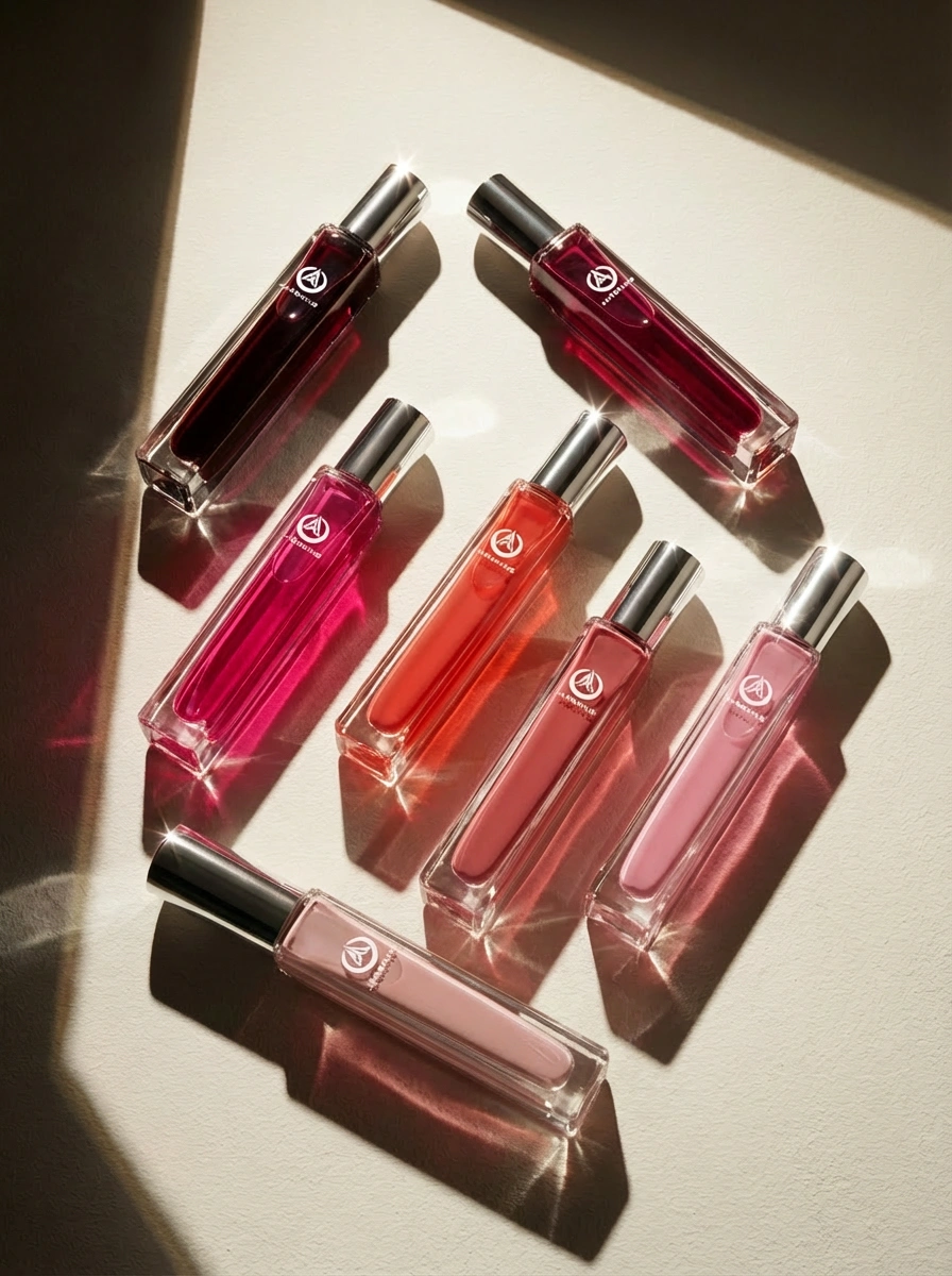
- Fragrance: Discovery sets (7 x 10ml) and full-size perfumes (50ml, 100ml)
- Men’s Grooming: Complete skincare line with dedicated design language
Each category required packaging that felt cohesive with the brand’s overall identity while meeting the specific functional and aesthetic requirements of its product type. A body scrub needs a wide-mouth jar with a secure seal and substantial wall thickness to withstand bathroom moisture. A facial mist needs a fine-spray mechanism and a bottle shape that’s both ergonomic and visually elegant. A perfume bottle needs to balance artistry with functionality, creating an object beautiful enough to display while practical enough for daily use.
The Men's Grooming Design Challenge
The introduction of a men’s grooming line presented a particularly interesting design challenge. Men’s skincare is a rapidly growing segment in Europe, but it requires a distinct aesthetic that respects traditional masculine preferences while appealing to younger, more adventurous male consumers who view grooming as self-care rather than vanity.
The packaging design solution demonstrated sophisticated gender-intelligent thinking. Bottle shapes became more architectural and geometric—clean lines, substantial bases, confident proportions that felt purposeful rather than decorative. Color palettes shifted to deeper tones—charcoal grays, navy blues, and olive greens—with metallic accents in gunmetal and bronze rather than gold or rose gold. Typography became bolder and more direct, emphasizing functional benefits over emotional promises.
Yet crucially, the men’s line maintained visual connection to the brand’s overall design system through subtle cues: the signature cap finish (debossed + hot stamped), similar bottle neck proportions, and consistent quality signals through material choices. A woman purchasing products from the main line and gifting men’s products to her partner could immediately recognize them as coming from the same brand family—an important consideration for European consumers who value design coherence and brand reliability.
The Fragrance Expansion: Packaging as Product
The launch of fragrance lines represented a fascinating evolution in packaging complexity. In fragrance, the bottle is an integral part of the product experience, often valued and displayed long after the perfume is gone.
The discovery set (7 x 10ml bottles) required micro-scale precision. Each 10ml bottle needed to feel substantial despite its small size, with perfectly aligned caps, flawless printing, and leak-proof seals. The set packaging needed to protect seven glass bottles during shipping while creating an unboxing experience that justified the premium positioning. Jarsking’s solution involved custom die-cut inserts that cradled each bottle individually, preventing contact during transit while creating a visually dramatic reveal when opened.
The full-size perfume bottles (50ml and 100ml) pushed custom design capabilities further. These aesthetic objects, with carefully considered proportions, weight distribution, and tactile qualities. The caps required substantial metal components with precise threading, while the bottle bodies needed flawless glass clarity and perfectly executed printing or etching for brand elements.
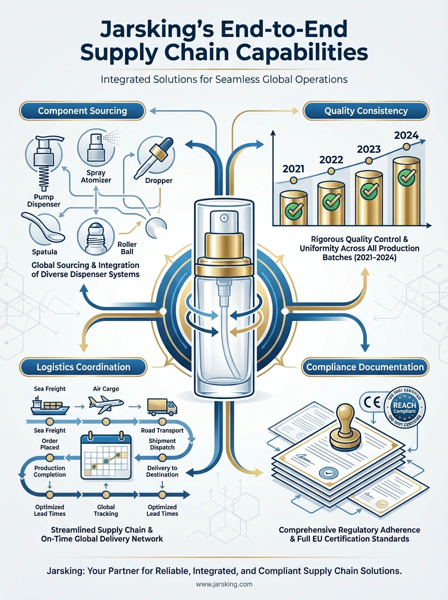
Supply Chain Integration: The Hidden Advantage
What made Jarsking’s support of this explosive category expansion possible was integrated supply chain capabilities that many packaging suppliers simply cannot match. Beyond bottle and jar manufacturing, Jarsking coordinated:
Component Sourcing: Pumps for lotions, sprayers for mists, droppers for serums, fine-mist atomizers for perfumes, spatulas for masks, specialized caps with complex finishes
Quality Consistency: Ensuring that a gold cap purchased in 2021 matched the gold cap ordered in 2024, despite coming from potentially different production batches
Logistics Coordination: Managing delivery schedules so bottles, caps, pumps, and components arrived simultaneously, preventing production delays on the brand’s filling lines
Compliance Documentation: Providing the extensive documentation required for EU cosmetic packaging regulations, including material certifications, safety testing, and compatibility confirmations
This comprehensive approach transformed what could have been a coordination nightmare—managing dozens of SKUs across multiple categories with hundreds of individual components—into a streamlined partnership where the brand could focus on product development and marketing while trusting packaging execution to Jarsking.
Strategic Insights: Design Principles Behind 16x Growth
Analyzing this five-year partnership reveals several packaging design principles that contributed directly to the brand’s remarkable growth trajectory:
1. Strategic Material Honesty
The brand’s material choices reflected authentic understanding of their target consumers’ values rather than attempting to fake premium positioning through superficial treatments. Glass for products where purity and luxury mattered, quality plastic for products where functionality and accessibility were priorities. European consumers, particularly in the medical cosmetology space, are sophisticated enough to recognize and appreciate this authenticity.
2. Design Coherence with Intentional Variation
Maintaining visual consistency across 100+ SKUs while allowing meaningful differentiation between product lines, demographics, and price points required sophisticated design system thinking. The recurring visual elements—typography hierarchy, cap treatment philosophy, proportion relationships—created brand recognition, while intentional variations in color, finish, and material created appropriate segmentation.
3. Technical Innovation as Brand Signature
The debossing + hot stamping challenge created a tactile signature that became associated with quality and attention to detail. Customers who experienced the premium line’s caps developed expectations about overall brand quality that influenced purchase decisions across all categories.
4. Packaging as Communication Architecture
Every packaging decision communicated specific messages to specific audiences. The premium medical line’s packaging whispered “clinical excellence and luxury” to mature, affluent consumers. The contemporary lifestyle line’s packaging declared “sophisticated fun and self-care” to younger, trend-aware consumers. The men’s line’s packaging announced “purposeful grooming and confidence” to male consumers navigating evolving masculine identity. Each message was encoded in material, form, color, and finish choices that Jarsking helped articulate and execute.
5. Scalability Through Partnership
Perhaps most critically, the brand chose a packaging partner capable of scaling with them—from 3,000 units to 645,000 units without compromising quality, consistency, or design integrity. This scalability came not just from manufacturing capacity but from Jarsking’s integrated capabilities: design services that could interpret brand vision, engineering expertise that could solve novel challenges, supply chain strength that could coordinate complex component requirements, and quality systems that could maintain standards across exponential volume growth.
Looking Forward: A Blueprint for Medical Cosmetology Success
This Polish brand’s journey from cautious market entry to confident European expansion offers valuable lessons for emerging brands in the medical cosmetology space and adjacent premium beauty segments.
Packaging is Strategy, Not Afterthought: The brand’s success stemmed partially from treating packaging as a strategic decision equal in importance to formulation, marketing, and distribution. Their packaging choices actively shaped brand positioning, influenced pricing power, and drove consumer perception.
Partnership Over Procurement: Choosing Jarsking wasn’t about finding the cheapest supplier or the fastest turnaround—it was about finding a partner with engineering capabilities, design sensibility, and operational flexibility to support long-term growth across multiple categories and price tiers.
Investment in Differentiation: The decision to invest in custom molds and complex surface treatments wasn’t frivolous vanity—it created brand equity that paid dividends through enhanced recognition, premium positioning, and competitive differentiation.
Design System Thinking: Sophisticated brand architecture—with clear design systems that allow both consistency and variation—enabled the brand to expand rapidly across multiple categories while maintaining coherent brand identity.
As European beauty consumers become increasingly sophisticated, demanding both scientific efficacy and aesthetic pleasure, packaging design will continue playing a decisive role in brand success. This partnership demonstrates that with the right approach—strategic thinking, technical capability, and true collaboration—packaging can transform from a necessary expense into a powerful driver of brand growth and market differentiation.
For brands aspiring to similar success in medical cosmetology or premium beauty segments, the message is clear: choose your packaging partner as carefully as you choose your formulations. In markets where credibility, quality perception, and brand recognition determine success, exceptional packaging isn’t optional—it’s essential.