In the global marketplace, a tea package adorned with traditional Chinese calligraphy sits alongside a minimalist Scandinavian design, each telling a distinct cultural story through visual elements alone. This striking contrast illustrates one of the most powerful forces shaping modern commerce: cultural influence on packaging aesthetics. Culture profoundly shapes packaging design through color psychology, symbolic imagery, typography choices, and visual storytelling techniques that resonate deeply with specific consumer groups. From the auspicious red and gold combinations dominating Chinese markets to the clean, understated lines preferred in Nordic countries, packaging serves as a cultural bridge between brands and consumers, communicating values, heritage, and identity in ways that transcend language barriers.
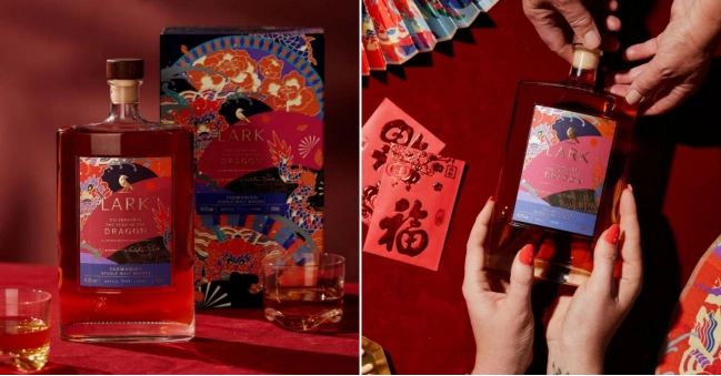
Lark Distillery’s Chinese New Year Release – The Year of the Wood Dragon celebrates 2024’s zodiac with a limited-edition whisky. The packaging features vibrant dragon-inspired artwork, blending cultural symbolism with luxury design to create a collectible, festive release for enthusiasts. Designed by Ben Galbraith.
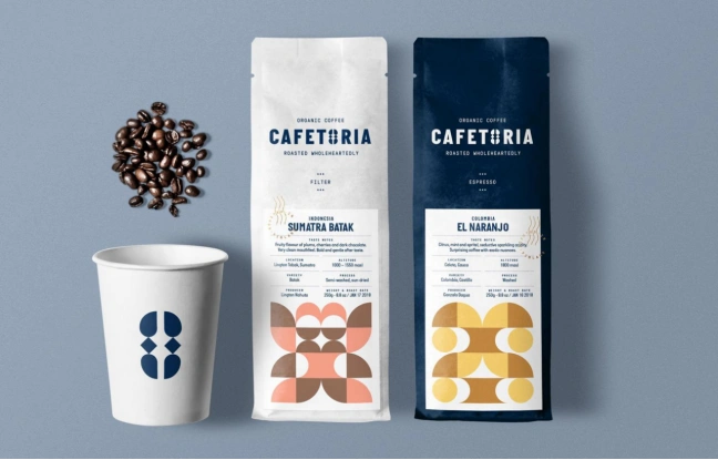
Latin American and Scandinavian Elements Come Together In This Coffee Packaging, Designed By Natalie Mouradian.
This comprehensive exploration examines how cultural factors influence packaging decisions across geographic regions, traditional design applications, and industry sectors. As brands expand globally, understanding these cultural nuances becomes essential for market success, consumer connection, and authentic brand representation. The stakes are significant: research shows that cultural motifs and traditional designs account for the most substantial impact on consumer preferences, with visual elements collectively accounting for 93.5% of the variance in consumers’ purchase intentions. This data underscores the critical importance of culturally informed packaging strategies in today’s competitive landscape.
The scope of cultural influence extends beyond mere aesthetic preferences to encompass deeper psychological and emotional connections. Packaging design elements function as cultural codes, instantly communicating product authenticity, quality perceptions, and brand values to target audiences. Whether through the strategic use of traditional patterns, culturally significant color palettes, or region-specific typography, effective packaging design must navigate the complex interplay between global consistency and local relevance to achieve market penetration and consumer loyalty.
The Psychology of Cultural Aesthetics in Packaging
Color Psychology Across Cultures
Color serves as one of the most immediate and powerful cultural communicators in packaging design, with identical hues conveying drastically different meanings across cultural contexts. In Chinese culture, red symbolizes fortune, happiness, and prosperity, making it the dominant choice for celebratory packaging and premium products. This cultural association runs so deep that Chinese consumers instinctively connect red packaging with positive outcomes and authentic cultural values. Conversely, Western markets often interpret red as signaling danger, urgency, or boldness, leading to its frequent use in promotional packaging and attention-grabbing designs.
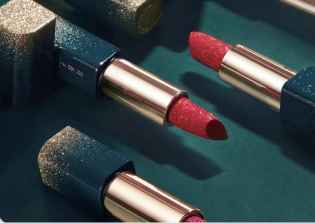
The strategic application of gold in Chinese packaging reinforces themes of affluence, luxury, and auspiciousness, particularly when combined with red elements. Premium tea producers and alcohol brands consistently leverage this color combination to enhance perceived value and cultural authenticity. Research demonstrates that gold is frequently employed by brands to create visually appealing and culturally rich aesthetics that resonate with Chinese consumers’ deeply held cultural beliefs.
Florasis (花西子), a Chinese cosmetic brand, is renowned for its ornate, artistic packaging that blends traditional Chinese aesthetics with modern beauty design. Using motifs like peonies, phoenixes, and intricate engraving, the brand transforms makeup into collectible art pieces, reinforcing cultural heritage while appealing to global consumers seeking elegance and storytelling in beauty packaging.
White presents another fascinating cultural divide in color interpretation. While Western cultures associate white with purity, cleanliness, and minimalism—making it ideal for health and wellness products—many Asian cultures traditionally connect white with mourning and death. This fundamental difference requires careful consideration when developing global packaging strategies, as a color choice that signals premium quality in one market may create negative associations in another.
European and North American markets demonstrate distinct preferences for color psychology in packaging. Scandinavian design traditions favor muted, natural color palettes that communicate sustainability and authenticity, while American packaging often employs bold, high-contrast color schemes designed to command attention on crowded retail shelves. These regional preferences reflect deeper cultural values: Scandinavian minimalism emphasizes environmental consciousness and quality craftsmanship, while American packaging psychology prioritizes visibility and immediate impact.
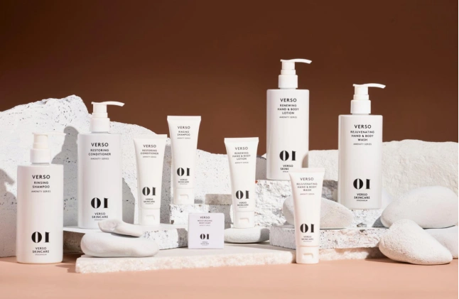
Verso Skincare’s packaging embraces Scandinavian minimalism with monochrome palettes, bold oversized numbers, and clean typography. The sleek design emphasizes science, simplicity, and efficiency, reinforcing its identity as a modern, results-driven skincare brand.
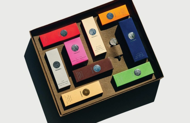
Monastery’s Everything Box combines a bold color palette with refined layout and textured materials.
Cultural Symbolism and Visual Language
Beyond color, cultural symbols embedded in packaging design create instant recognition and emotional connection with target audiences. Dragons, phoenixes, and lotus flowers represent prosperity, good fortune, and purity in Chinese packaging design, with brands like Modern China Tea Shop successfully integrating these traditional motifs into contemporary packaging formats. The brand’s use of oriental motifs, such as dragon and lotus flower symbols, positions products as trustworthy, prosperous, and authentic while appealing to consumers’ cultural identity.
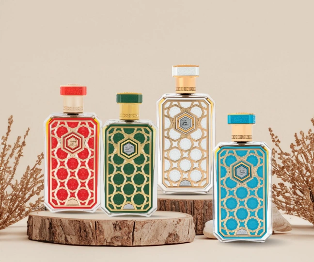
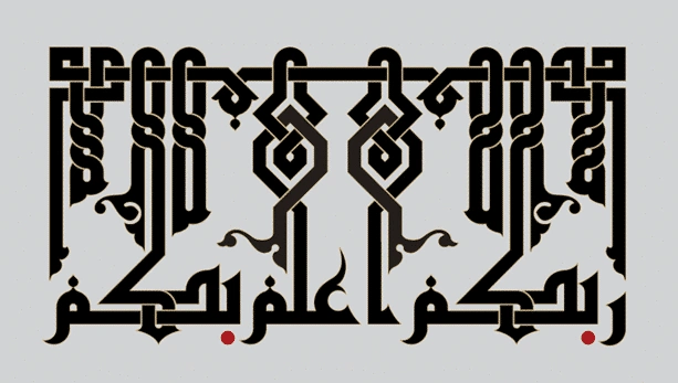
Islamic geometric patterns dominate Middle Eastern packaging design, reflecting religious and cultural values while creating sophisticated visual appeal. These intricate mathematical patterns communicate precision, spirituality, and cultural authenticity, making them particularly effective for luxury goods, perfumes, and food products targeting Islamic markets. The patterns’ infinite nature symbolizes the eternal and divine, creating deeper emotional connections beyond mere aesthetic appeal.
Rasasi (Dubai, UAE) uses bold geometric borders and pattern overlays in limited-edition perfume collections.
Western markets increasingly incorporate nature-inspired imagery to communicate environmental consciousness and organic authenticity. Tree silhouettes, leaf patterns, and earth tones signal sustainability values that resonate with environmentally conscious consumers. This symbolic language reflects Western cultures’ growing emphasis on environmental responsibility and natural product preferences.
Animal symbolism varies dramatically across cultures, requiring careful consideration for global brands. While eagles represent freedom and strength in American markets, they may lack cultural resonance or even create negative associations in other regions. Similarly, owls symbolize wisdom in Western cultures but may represent death or misfortune in some African and Asian cultures.
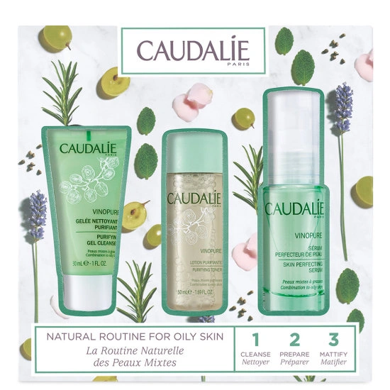
Caudalie – Grapevines, vineyards, and botanical motifs are central to its branding, underscoring natural beauty derived from plants.
Typography and Script Influence
Typography choices carry significant cultural weight, with script selection immediately signaling product origin, authenticity, and target market. Chinese calligraphy integration in packaging design creates instant cultural connection, with Modern China Tea Shop demonstrating how traditional calligraphic patterns fused with modern design result in strong ethnic appeal. The brand’s text-themed packaging series strategically incorporates auspicious phrases that align with consumer psychological needs while maintaining cultural authenticity.
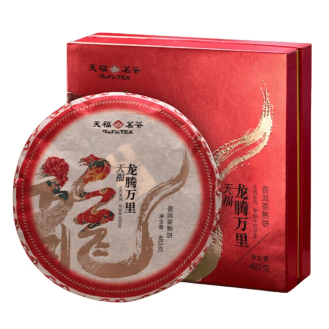
TenFu’s Tea packaging uses bold Chinese calligraphy fused with dragon and floral motifs, symbolizing vitality and prosperity. The brushstroke design merges tradition with modern luxury, creating cultural resonance while highlighting the brand’s heritage, authenticity, and premium positioning in tea culture.
Arabic script in Middle Eastern packaging communicates cultural respect and local market understanding, particularly crucial for food, beauty, and pharmaceutical products. The flowing, artistic nature of Arabic calligraphy transforms packaging into cultural art pieces that resonate deeply with target audiences while demonstrating brand commitment to local markets.
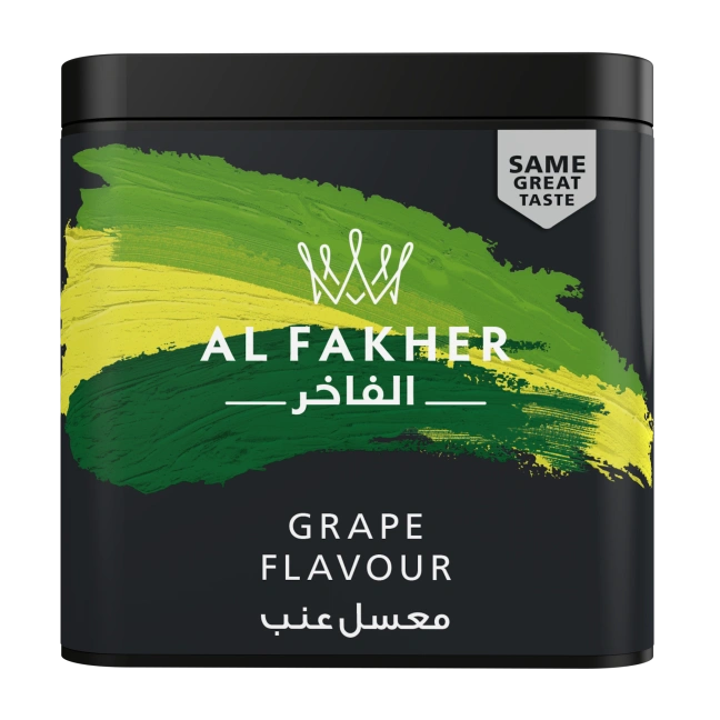
Al Fakher Tobacco (Shisha) – Uses bold Arabic calligraphic logotypes across its packaging to reinforce cultural origin and authenticity.
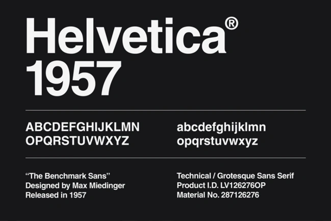
European typography traditions demonstrate profound regional variations that reflect each country’s cultural values, industrial heritage, and aesthetic philosophy. German packaging typography prioritizes Bauhaus-influenced design principles, emphasizing clean sans-serif fonts like Helvetica and Univers that communicate engineering precision and industrial reliability. This preference stems from Germany’s manufacturing heritage, where clarity and functionality take precedence over decorative elements. German consumers associate systematic, grid-based typography with quality assurance and technological advancement, making fonts with consistent spacing and geometric proportions particularly effective for automotive, pharmaceutical, and industrial packaging.
Helvetica Font
Italian typography embraces expressive, humanistic letterforms that celebrate the country’s Renaissance artistic legacy and contemporary design innovation. Italian packaging frequently incorporates custom calligraphic elements, flowing serif typefaces, and artistic flourishes that reflect the culture’s emphasis on beauty, craftsmanship, and individual expression. Brands like high-end fashion houses and gourmet food producers leverage ornate typography with classical proportions to communicate artisanal quality and cultural authenticity. The preference for dramatic contrast between thick and thin strokes, reminiscent of traditional Italian calligraphy, creates packaging that functions as miniature art pieces.
Italian pasta label design set
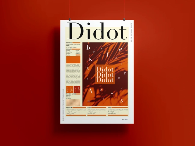
French packaging typography demonstrates sophisticated restraint through carefully selected elegant serif fonts and refined script typefaces that reinforce the country’s luxury and cultural refinement associations. French design tradition favors classical typography with subtle sophistication, often incorporating delicate ligatures, refined spacing, and premium font families like Didot and Trajan that communicate exclusivity without ostentation. This approach reflects French cultural values of intellectual sophistication and understated luxury, making typography choices that whisper rather than shout premium positioning.
Didot Font
Regional reading patterns further influence typographic choices across Europe. Northern European countries tend to favor left-aligned, systematic text hierarchies that reflect Protestant work ethics emphasizing order and efficiency, while Mediterranean countries embrace more dynamic text arrangements with varied sizing and placement that reflects their cultures’ emphasis on visual drama and emotional expression.
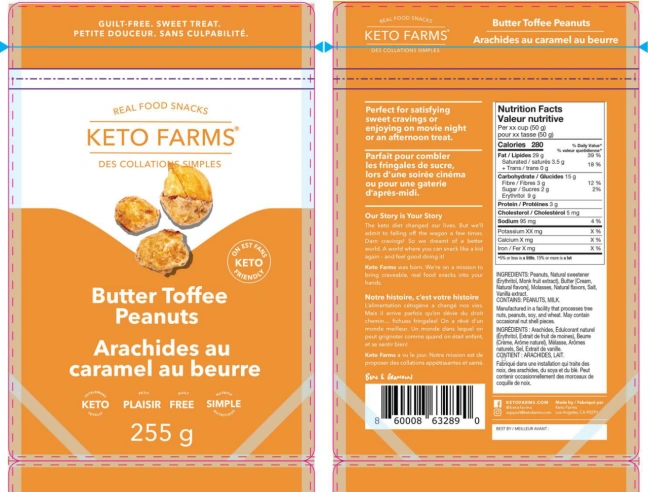
Bilingual packaging presents multifaceted challenges requiring sophisticated design solutions that go beyond simple translation. Cultural sensitivity demands understanding that languages carry different emotional weights and cultural significance, requiring careful hierarchy decisions that demonstrate equal respect for both linguistic communities. For example, Canadian packaging featuring English and French must navigate the political and cultural sensitivities surrounding language equality, ensuring that neither language appears subordinate through placement, font size, or design treatment.
Transcreation challenges in bilingual design require adapting brand messages to evoke equivalent emotional responses across languages and cultures. This process extends far beyond literal translation to encompass cultural fluency and localized storytelling that maintains brand integrity while respecting linguistic nuances. Professional transcreation involves understanding how humor, metaphors, and cultural references translate between languages, often requiring complete reimagining of messaging rather than direct translation.
Keto Farms Snacks' Canadian Packaging
Visual hierarchy balance in bilingual packaging demands sophisticated design systems that maintain readability and aesthetic appeal across different script characteristics. Latin and Arabic script combinations require designers to accommodate right-to-left and left-to-right reading patterns while maintaining visual harmony. Similarly, Asian character-based languages paired with Latin alphabets present unique spacing and sizing challenges, as character density differs significantly between writing systems.
Legal compliance adds complexity to bilingual packaging, as different regions have specific requirements for language prominence, font sizes, and information placement. European Union regulations mandate equal treatment of official languages in certain contexts, while Canadian bilingual requirements specify precise ratios for English and French text sizing. These regulations influence design decisions and require ongoing legal consultation to ensure compliance across jurisdictions.
Market research validation becomes essential for bilingual packaging success, requiring testing with native speakers from each target linguistic community to ensure cultural appropriateness and message effectiveness. This process often reveals subtle cultural preferences that influence purchasing decisions, such as color associations with specific languages or typographic styles that signal authenticity to particular cultural groups.
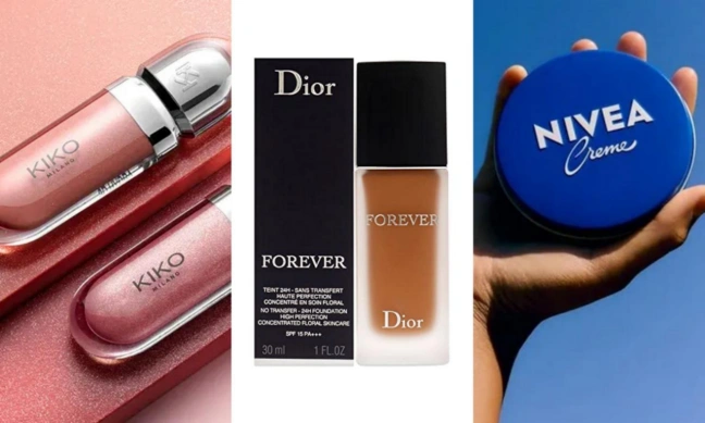
KIKO Milano (Italian) vs. Dior (French) vs. Nivea (German)
Regional Aesthetic Preferences and Design Philosophy
East Asian Minimalism and Harmony
Japanese packaging design philosophy centers on the concept of wabi-sabi, finding beauty in imperfection and impermanence. This aesthetic approach emphasizes clean lines, natural materials, and understated elegance that communicates quality through simplicity rather than ornamentation. Japanese tea packaging exemplifies this philosophy, using minimal color palettes, natural textures, and careful negative space to create sophisticated, meditative visual experiences.
Wabi-Sabi Packaging Design
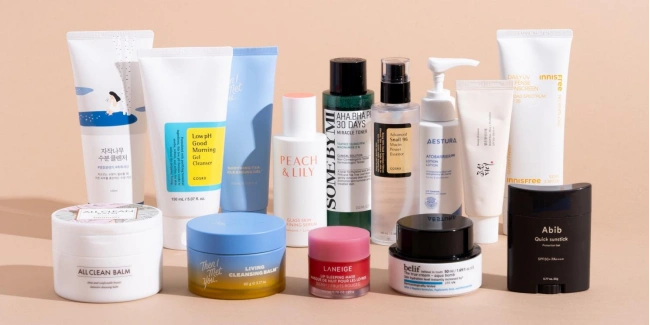
Korean beauty packaging has revolutionized global cosmetics through its distinctive minimalist approach combined with functional innovation. K-beauty brands consistently employ clean, geometric designs with subtle color gradations that communicate scientific precision and gentle effectiveness. This design language reflects Korean cultural values of technological advancement and aesthetic refinement, creating packaging that appears both modern and trustworthy.
K-Beauty Brands
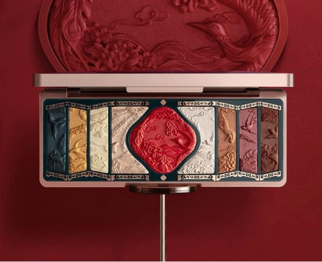
Chinese luxury packaging blends traditional cultural elements with modern design, creating products that feel both authentic and contemporary. Phoenix motifs from Chu culture, for example, are reinterpreted in geometric layouts and minimalist colors, symbolizing renewal, harmony, and feminine power. These appear widely in luxury teas, cosmetics, and gift sets, showing how heritage can enhance modern product appeal.
Research shows that Chinese buyers link culturally resonant packaging with quality and authenticity, with visual design driving over 90% of purchase intention. Dragons and phoenixes are especially powerful—dragons symbolize strength, fortune, and exclusivity, while phoenixes represent renewal and harmony, making them popular for wellness and beauty products. For Gen Z consumers, authenticity and cultural pride are essential, rewarding brands that understand psychology while honoring tradition.
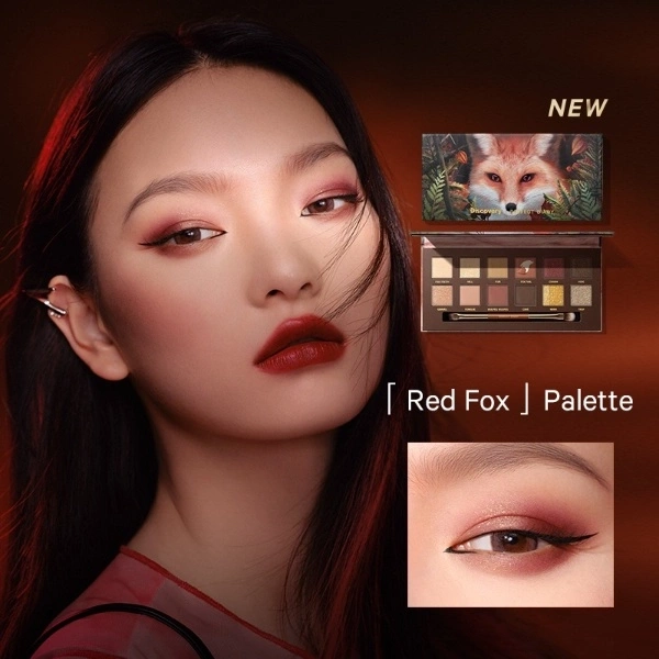
The Perfect Diary “Red Fox” palette features a vibrant, eye-catching design with a realistic fox illustration, blending natural and playful elements. Its compact, rectangular packaging highlights the luxurious and thematic concept.
Middle Eastern and Islamic Design Principles
Islamic geometric patterns represent the intersection of mathematical precision and spiritual philosophy, embodying the Islamic concept of tawhid (divine unity) through infinitely repeating designs that suggest the eternal nature of creation. These patterns are constructed using the polygonal technique, where underlying geometric grids of polygons—including pentagons, hexagons, octagons, and decagons—serve as frameworks for creating complex star-and-polygon compositions. Twelve-fold and sixteen-fold star patterns are particularly prized in luxury packaging applications, as they demonstrate the highest level of mathematical sophistication while maintaining visual harmony. The interlacing principle ensures that pattern lines weave over and under each other without creating T-junctions, creating the illusion of continuous, unbroken flow that symbolizes divine perfection.
Modern luxury brands in the Middle East leverage these principles in packaging for premium products, with perfume houses, jewelry brands, and gourmet food companies incorporating authentic geometric frameworks that communicate cultural legitimacy and sophisticated craftsmanship. The mathematical complexity of these patterns—some containing over 100 individual geometric elements arranged in perfect symmetrical harmony—immediately signals premium positioning while creating packaging that functions as collectible art pieces.
Arabic calligraphy integration in packaging design involves multiple traditional scripts, each carrying distinct aesthetic and cultural associations that enhance brand messaging. Kufic script, characterized by angular, geometric letterforms, works particularly well with geometric patterns and modern luxury aesthetics, making it ideal for high-end cosmetics and fashion packaging. Naskh script offers flowing, curved lines that create elegant contrast against geometric backgrounds, while Diwani script provides dramatic, ornamental flourishes suitable for premium gift packaging and celebratory products.
Kufic script
Naskh script
Diwani script
Modern calligraphic applications often employ metallic foil stamping in gold or silver to create embossed Arabic text that serves dual functions as both readable information and decorative element. Successful luxury packaging demonstrates hierarchical calligraphy, where Arabic text receives equal or greater prominence than Latin script, reflecting cultural respect and market understanding. Contemporary Islamic-inspired luxury packaging frequently incorporates bilingual calligraphy layouts that integrate Arabic and English text seamlessly, using complementary font pairings that maintain visual harmony while ensuring cultural authenticity. The geometric precision of Arabic letterforms naturally complements Islamic geometric patterns, creating cohesive designs where text and pattern elements share mathematical relationships and proportional systems.
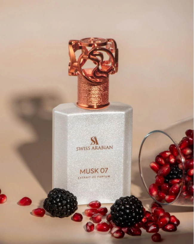
Color symbolism in Islamic culture extends beyond aesthetic preference to encompass spiritual significance and historical associations that inform luxury packaging strategies. Deep ultramarine blue represents divine infinity and spiritual depth, making it particularly effective for premium religious products, luxury dates, and spiritual wellness items. Emerald green carries sacred associations with Prophet Muhammad and paradise imagery, creating powerful emotional connections for halal food products and Islamic lifestyle brands. Gold represents divine light and earthly prosperity, while silver symbolizes purity and moon-blessed guidance, both colors frequently appearing in embossed foil applications that create tactile luxury experiences.
Cultural sensitivity requirements demand careful avoidance of imagery depicting living beings, inappropriate color combinations (such as certain red-green pairings that may conflict with regional political sensitivities), and design elements that could be interpreted as religious symbols without proper context. Regional variations include North African preferences for warm terracotta and saffron tones, Gulf states’ affinity for rich purples and deep burgundies, and Levantine markets’ appreciation for subtle pastels combined with metallic accents. Successful Middle Eastern luxury packaging often incorporates traditional craft references through color choices that evoke hand-woven textiles, precious stone inlays, and historical architectural elements, creating packaging that serves as cultural storytelling medium while maintaining commercial effectiveness and religious appropriateness.
The perfume packaging of Swiss Arabian beautifully blends modern sophistication with an elegant touch of tradition, creating a timeless design that appeals to both contemporary and classic sensibilities.
Western Design Evolution
Scandinavian minimalism has profoundly influenced global packaging design through its emphasis on functionality, sustainability, and understated elegance. This design philosophy reflects cultural values of environmental responsibility, quality craftsmanship, and democratic accessibility, creating packaging that communicates premium quality without ostentation. Swedish design principles embrace “lagom” (balance) and functionalism, prioritizing clean lines, natural materials like amber glass and recyclable components, and minimal color palettes that emphasize product authenticity. Viking cruise line exemplifies this approach with their signature Scandinavian design that provides guests with “elegant and familiar feelings of home” through maximized space utilization while avoiding unnecessary features. The philosophy extends beyond aesthetics to encompass sustainability through material reduction and reusable designs that minimize environmental impact.
Scandinavian minimalism
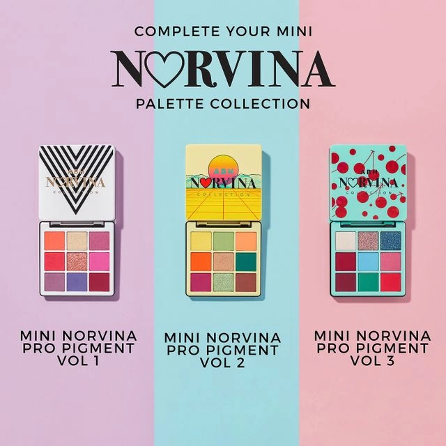
American bold branding employs high-impact visuals, vibrant colors, and attention-grabbing typography designed to succeed in competitive retail environments. This maximalist approach reflects American cultural values of entrepreneurship, competition, and individual expression, creating packaging that demands consumer attention and communicates brand confidence. American packaging psychology prioritizes visibility and immediate shelf impact through high-contrast color schemes, dramatic typography, and bold graphic elements that command attention in crowded retail spaces. This approach stems from the competitive nature of American markets where products must distinguish themselves among thousands of alternatives, leading to packaging strategies that favor maximum visual impact over subtle sophistication. Brands employ saturated colors, oversized logos, and promotional messaging that immediately communicates product benefits and brand personality to time-pressed consumers making rapid purchasing decisions.
Anastasia Beverly Hills (Norvina Collection), a cosmetic brand from the US, features Neon palettes and packaging with loud, colorful aesthetics.
European sophistication manifests differently across regions: French packaging emphasizes elegance and luxury through refined typography like Didot and Trajan fonts, sophisticated color palettes featuring muted tones and metallic accents, and classical design proportions that whisper rather than shout premium positioning. Italian design celebrates artistic expression and visual beauty through custom calligraphic elements, flowing serif typefaces with dramatic thick-thin stroke contrasts, and ornate flourishes that reflect Renaissance artistic legacy and contemporary design innovation. German packaging prioritizes functional clarity and systematic organization through Bauhaus-influenced design principles, clean sans-serif fonts like Helvetica, and grid-based typography that communicates engineering precision and industrial reliability. Each regional approach reflects deeper cultural values: French intellectual sophistication, Italian artistic passion, and German systematic efficiency.
Sustainability messaging increasingly dominates Western packaging design, with nature-inspired aesthetics communicating environmental responsibility and organic authenticity. This trend reflects growing consumer consciousness about environmental impact and preference for brands demonstrating ecological commitment. Eco-design principles emphasize material reduction, reusability, and minimal environmental impact through corrugated cardboard, biodegradable materials, and structural designs requiring no gluing or excessive printing. Tree silhouettes, leaf patterns, and earth tones signal sustainability values that resonate with environmentally conscious consumers, while minimalist design reduces production waste and material usage without sacrificing aesthetic appeal. Interactive elements like QR codes replace traditional printing to provide product information while reducing environmental impact, creating packaging that functions as both protective container and environmental statement.
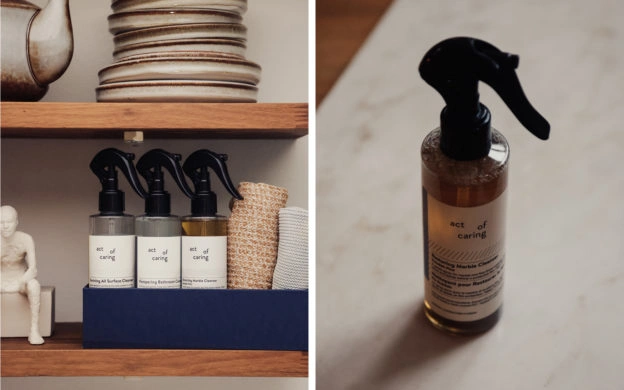
Brands like Lush uses Kraft paper packaging to deliver sense of eco-friendly and natural ingredients in their products.
Latin American and African Vibrancy
Bold graphics celebrating color and community characterize Latin American packaging design, reflecting cultural values of celebration, family, and vibrant expression. These designs often incorporate intricate patterns reflecting local traditions and folklore, creating packaging that serves as cultural celebration while communicating product authenticity.
Festival and celebration themes appear frequently in seasonal packaging, connecting products to cultural celebrations and community traditions. This approach creates emotional connections that transcend mere product utility, positioning brands as participants in cultural life rather than external commercial entities.
African packaging design embraces rich color palettes, traditional patterns, and symbolic imagery that celebrate cultural heritage while communicating product authenticity. These designs often incorporate traditional textile patterns, natural motifs, and symbolic animals that create immediate cultural recognition and emotional connection.
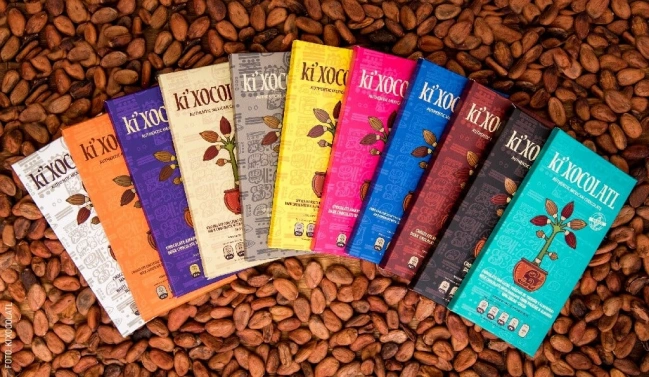
Xocolatl Mexica (Mexico) – Chocolate brand that uses Aztec/Mayan-inspired graphics, earthy colors, and indigenous motifs.
About the Author
Isabella translates brand identity into tangible art. Specializing in surface design and 3D rendering, she ensures every package visually communicates a powerful and cohesive brand image from concept to reality.