


The skincare industry is witnessing one of the most profound credibility shifts in beauty history. According to 2025 Google Trends data, breakout searches for “dr rs skincare” and “skincare clinic” highlight an era where consumers increasingly seek medically credible skincare solutions, not influencer hype. The pandemic ignited this movement. People became researchers—cross-referencing ingredient lists, looking for peer-reviewed dermatological support, and judging packaging as the first sign of scientific legitimacy.
This is no fleeting TikTok swell. Reports from Kline Group and McKinsey’s State of Beauty 2025 confirm a lasting “clinical turn,” where consumer decisions pivot around perceived efficacy, safety, and authenticity, not brand personality. These buyers are more discerning than ever—educated, cautious, and “claim fatigued.” They have heard every buzzword—clean, natural, anti-aging—so many times that the language has lost influence. What they truly crave now is proof—not marketing fizz, but sensory cues of rigor and results.
Here lies the paradox: before reading your ingredient list or trying your product, they’re already forming an impression of your credibility through your packaging. In the skincare aisle, packaging is the “white lab coat.” It’s your first handshake and sometimes your only chance to tell the world: We mean business.
This article dissects that handshake—the visual language of the clinical aesthetic—through five strategic pillars. Each combines psychology, material science, and brand philosophy to help B2B brands move from decorative design to trust design—a language that builds instant authority.

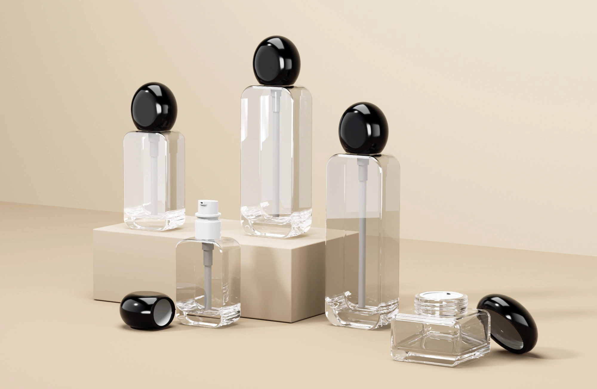
Pillar 1: The Eloquence of Emptiness
The Psychology Behind “Less Is More”
In an age of overstimulation, simplicity isn’t just a design preference—it’s a strategic act of power. Packaging that is sparse, structured, and intentional invokes calm authority. Cognitive design studies show that clutter increases consumer uncertainty, while clean designs trigger perceptions of transparency and higher-quality ingredients.
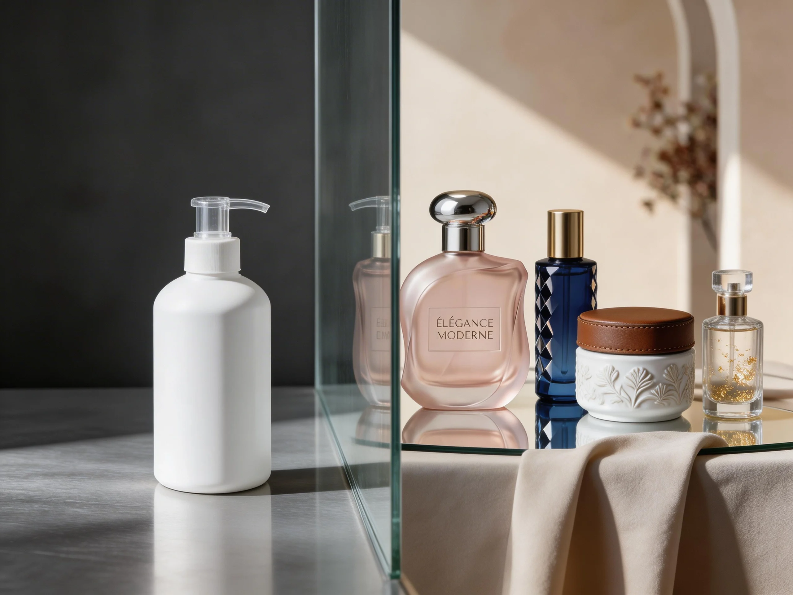
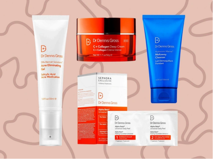
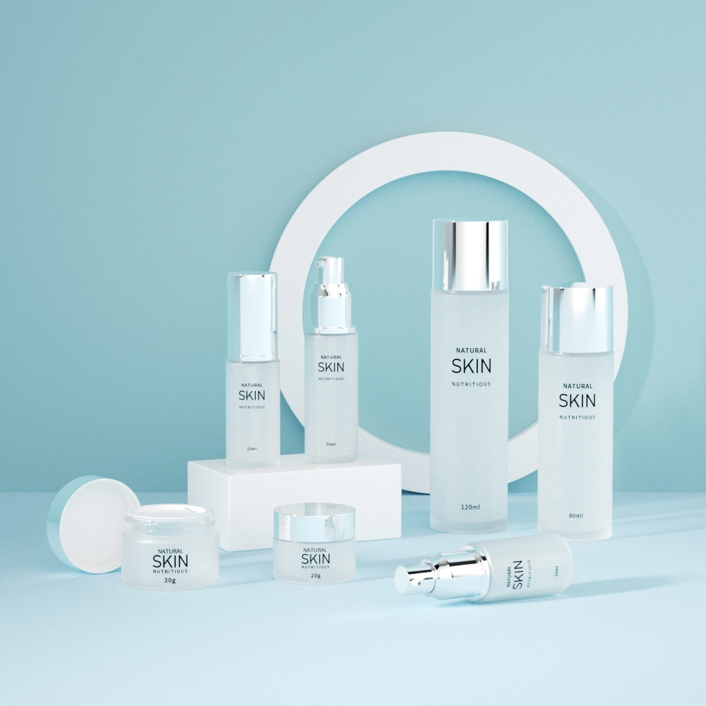
Minimalist packaging—the backbone of the clinical aesthetic—signals that the brand has nothing to hide. It reassures shoppers: Our science stands on its own. Brands like The Ordinary, Dr. Dennis Gross, and La Roche-Posay leverage this aesthetic masterfully. Their clean layouts, single-font labels, and minimal decoration make the packaging itself a statement of credibility.
This “restrained confidence” aligns with the tenets of cognitive fluency—the principle that our brains trust information we can process easily. A consumer scanning a crowded shelf is drawn to clear architecture and predictable order, precisely because it feels professional, rational, and authentic.
White Space: The Oxygen of Trust
White space is often misunderstood as “empty.” In reality, it’s a designer’s precision tool—creating harmony, structure, and emotional breathing room. White space directs the eye exactly where the designer wants it, reducing cognitive friction.
On skincare labels, this means allowing critical proof-points—like active ingredient percentages and medical endorsements—to stand tall. In luxury and clinical sectors alike, brands using generous margins and sparse layouts report higher perceived quality and willingness to pay, according to design impact studies by Packaging Digest and SmashBrand.
White space is therefore not passive; it’s performative—a signpost that your product belongs in a clinical setting, not a cosmetics counter.
Typography: The Silent Voice of Clinical Credibility
Typography is visual tone. In the clinical sphere, the tone is assertive clarity. Sans-serif fonts like Helvetica, Futura, and Univers dominate medical-adjacent markets because they eliminate bias. Their neutrality conveys function over fashion. Every letter feels engineered, not embellished.
A hierarchy-driven typographic system strengthens this clarity:
Brand Name – understated yet steady; an anchor.
Product Name – the heart, clear and unembellished.
Key Ingredient/Benefit – the visible proof (e.g., “5% Lactic Acid”).
Usage and Details – precisely formatted secondary text, minimal punctuation, smaller size.
This structured rhythm gives packaging readability and composure—a trait linked to both scientific professionalism and luxury restraint.
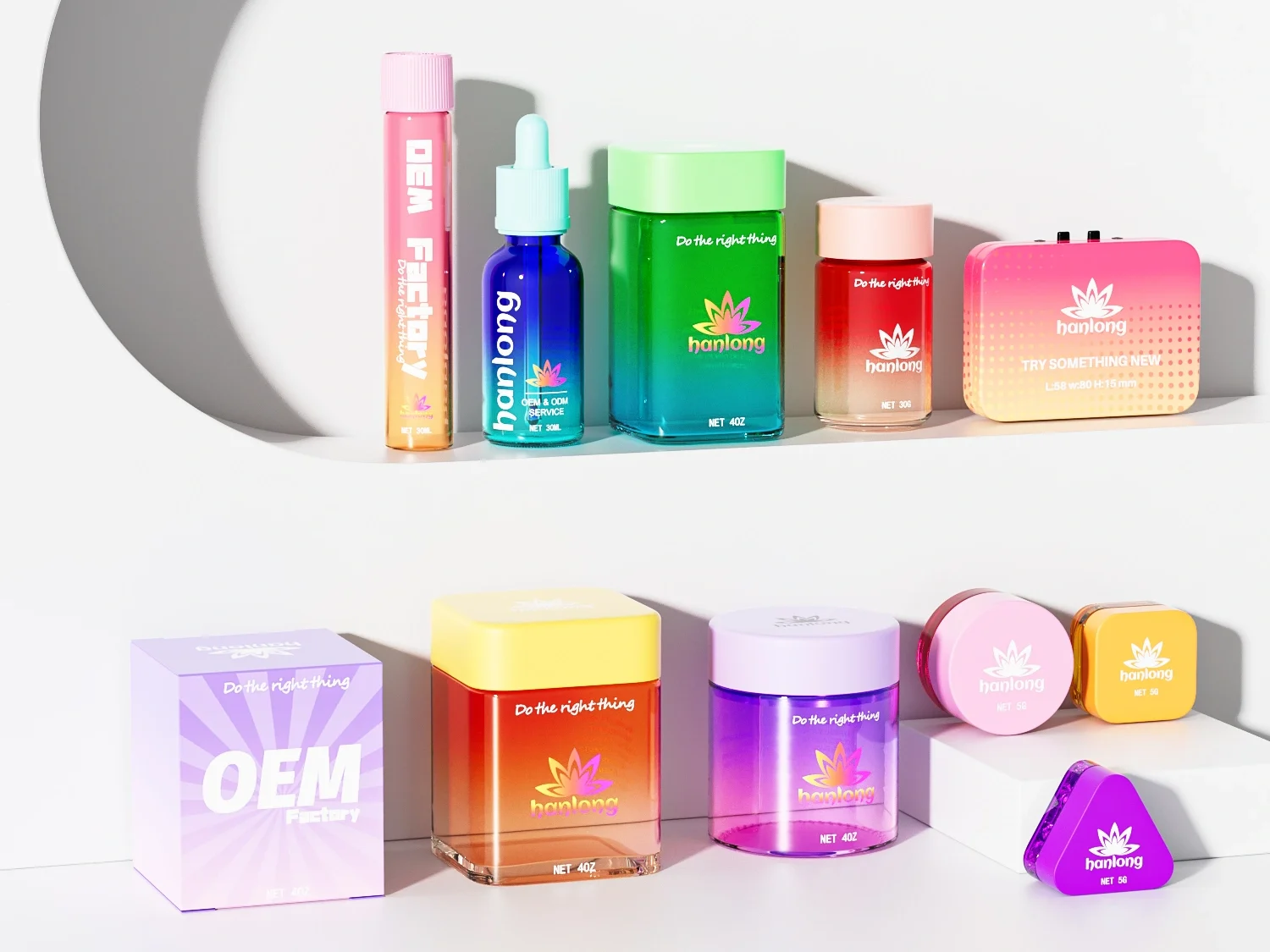
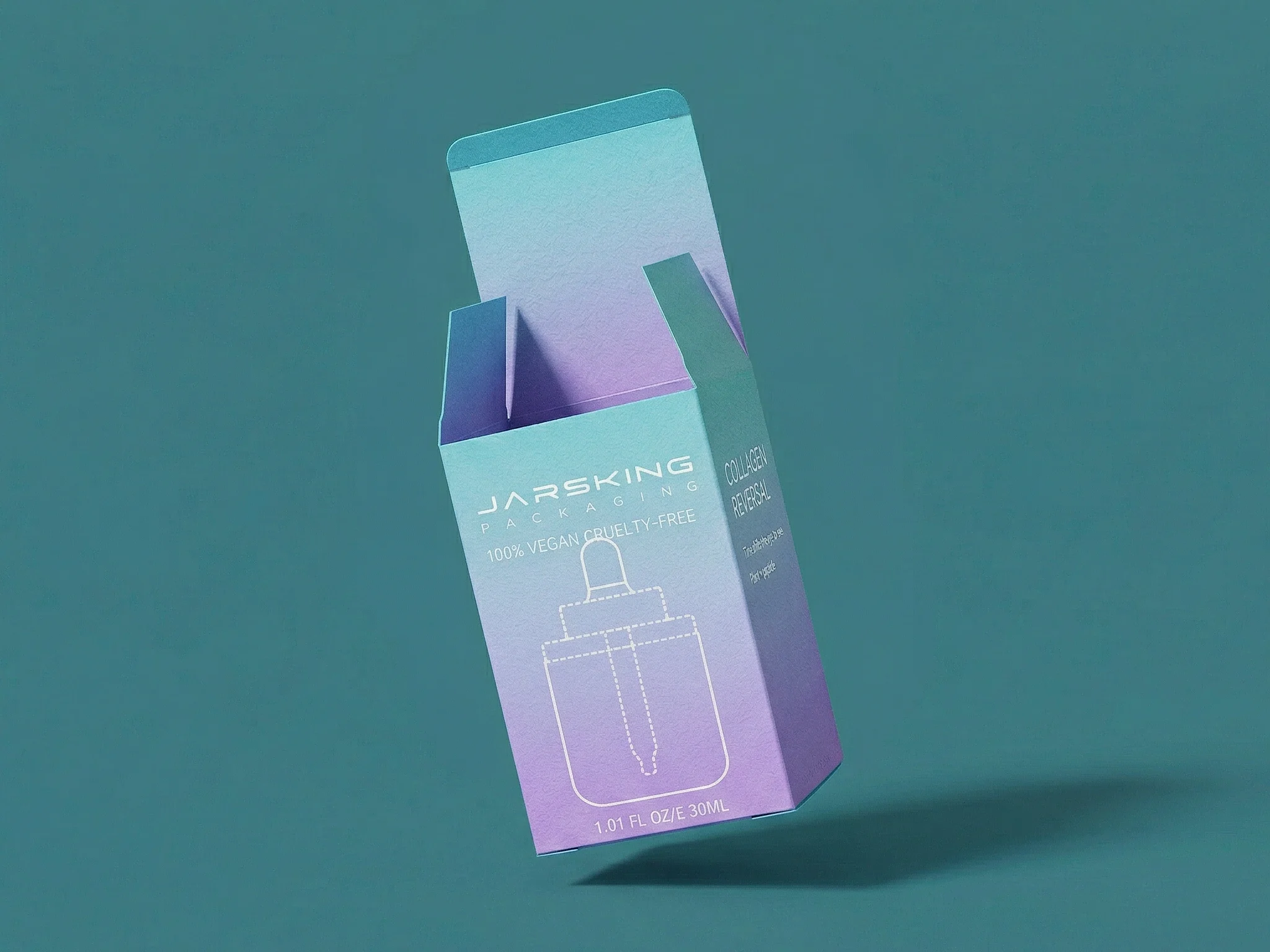
Jarsking’s Role: The Ideal Canvas
A minimalist philosophy requires perfection beneath it. Jarsking’s high-clarity glass, polished PET, and airless pump lines provide the cleanest surface for minimalist printing. The smoother the substrate, the more refined the silence between design elements appears. When the form itself communicates integrity, even emptiness feels eloquent.
Pillar 2: Material as a Message—The Scientific Authority of Glass
The Material Mindset: Non-Verbal Proof of Value
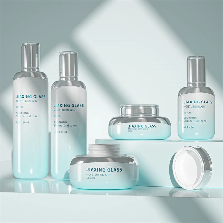
Material isn’t neutral—it’s language. In clinical skincare, glass is the dialect of credibility. Across markets, consumer research consistently ranks glass-packaged skincare as more “effective,” “luxurious,” and “trustworthy” than identical formulas in plastic.
This is no coincidence. Everything about glass—from its heft to its shine—communicates substance. When customers feel the cool weight of a glass serum bottle, they subconsciously equate it with laboratory precision. Premium cues like weight, density, and sound—when the cap clicks onto the rim—activate psychological triggers for authenticity and permanence.
The Science: Purity and Preservation
Glass is chemically inert and nonporous; it neither absorbs nor releases compounds into your formula. This ensures actives like retinoids, peptides, and ceramides remain unchanged over time. In a market moving toward transparency and lab-grade solutions, this scientific truth doubles as an emotional value proposition. Brands can literally market stability—an increasingly powerful claim in the results-driven demographic.
Plastic degradation or leaching concerns—especially under sunlight or oxygen exposure—contrast sharply with glass’s laboratory origins. Glass thus becomes a metaphor for scientific integrity.
Transparency as Honesty
The clear flint glass trend isn’t merely aesthetic. It’s psychological transparency—inviting the consumer to inspect the product. In a post-greenwashing, post-influencer age, showing what’s inside is the new form of luxury. As McKinsey notes in its State of Beauty 2025 report, transparency and authenticity are now among the top three decision drivers for skincare consumers.
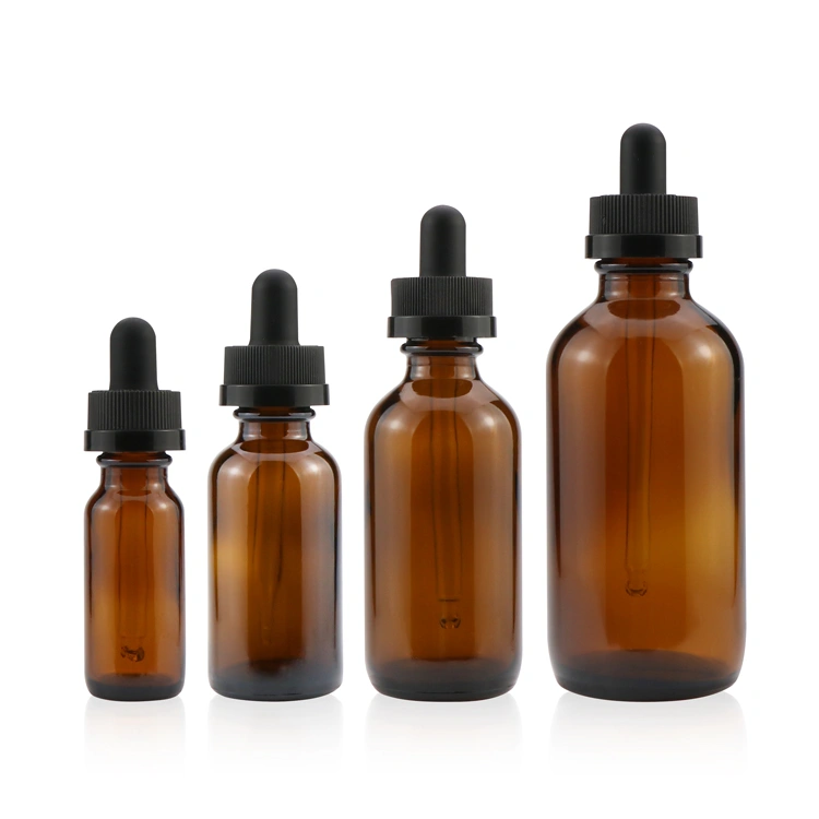
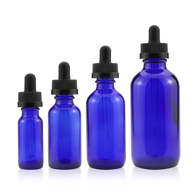
The Apothecary Code: Color as Function, Not Decoration
Amber Glass – Historic pharmaceutical packaging used amber to filter harmful UV rays. Today, brands use it strategically for actives like Vitamin C, signaling both scientific literacy and formula protection.
Cobalt Blue Glass – Traditionally used in hospital laboratories for UV resistance and distinct brand differentiation. It evokes heritage science, now reimagined by brands targeting modern luxury with medical confidence.
Opaque White or Black Glass – Suggests cutting-edge biotech. Such bottles conceal formulas entirely, implying protection and technological prowess—ideal for retinoids or enzymatic products.
Jarsking’s Role: Steward of Formulation Integrity
Jarsking champions purity in form and function. Its portfolio includes heavy-wall flint glass for high-clarity products, UV-blocking amber glass for actives, and robust cobalt options for aesthetic distinction. Each vessel is rigorously tested to meet cosmetic-grade inertness standards, ensuring your formula’s stability mirrors your brand’s scientific integrity.
Pillar 3: The Dispenser as a Tool—Precision, Hygiene, and Dosing
The clinical customer expects more than elegant packaging—they expect precision. The dispenser transforms perception: when a cream dispenses smoothly, a serum doses precisely, or an airless pump clicks with haptic accuracy, the consumer feels engineering, not marketing. Packaging thus evolves from container to instrument.
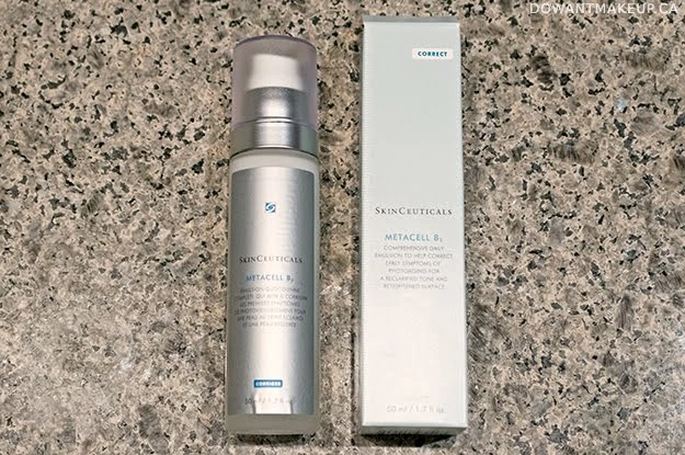
Airless Pumps: Preservation Meets Precision
Modern airless systems protect formulations from oxidation and contamination by creating a vacuum-sealed environment. The benefits are triple-tiered:
Preservation – No air admission; antioxidants and retinoids remain active.
Hygiene – Eliminates fickle dipping or product exposure.
Dosing Accuracy – Ensures every pump releases exactly the intended amount, reinforcing clinical claims about concentration and consistency.
Airless bottles are central in derma skincare’s premium tier—think SkinCeuticals, CeraVe Clinical, and PCA Skin. Their precision aligns with medical professionalism and sustainability—total evacuation means zero waste.
Glass Droppers: The Ritual of Efficacy
Droppers personify control and concentration. They evoke precision-driven science and tactile engagement. Graduated pipettes signal dosage understanding, while calibrated droppers with measurement ticks elevate user confidence.
Beyond utility, they ritualize skincare. Applying drops feels like part chemistry, part treatment—a reinforcing gesture that transforms consumers into participants in self-care science.
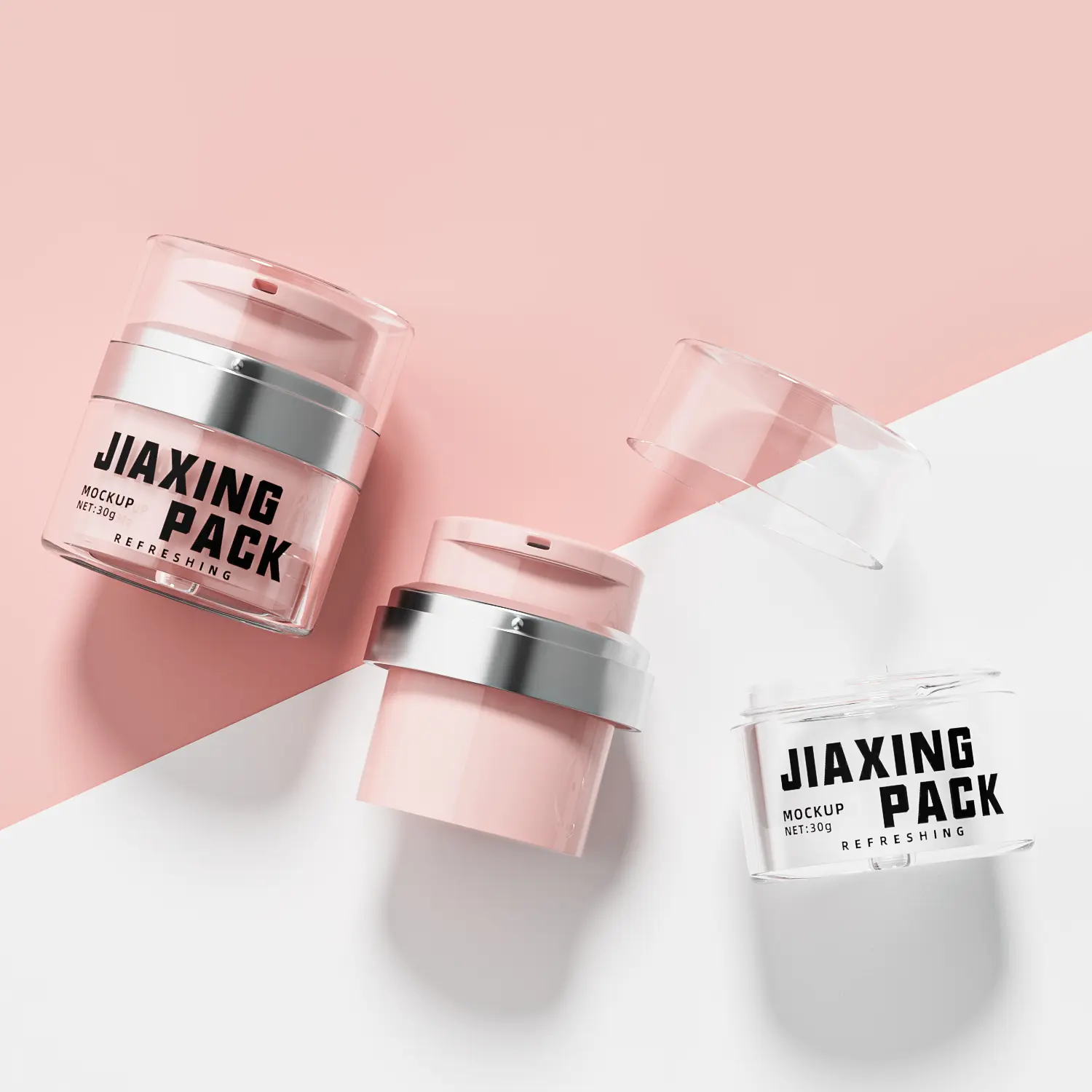
Enhanced Applicators: The Hidden Layer of Trust
Even subtler elements—like treatment pumps for lotions or custom spatulas for jars—communicate meticulous care. Spatulas transform a common jar into a medical-grade container by eliminating touch contamination while reinforcing luxurious ritual.
Such touches cost little, yet multiply perceived clinical value and legitimacy. Forbes research notes that “elevated hygienic design” directly boosts customer retention among premium dermacosmetic buyers by 28%.
Jarsking’s Role: The Systemic Solution
Jarsking integrates packaging and delivery into a single-performance architecture. Their precision-molded airless pumps cross-test with glass vessels to ensure seamless compatibility across viscosity levels and climates. For serums, their droppers are calibrated for accurate dosing, with precision-matched bulb and pipette diameters.

Pillar 4: The Psychology of a Controlled Color Palette
Color, more than any other visual element, governs brand emotion. In the clinical skincare sphere, disciplined color execution signals scientific seriousness, cleanliness, and calm. Research by the Journal of Cosmetic Science and color theory experts confirms that balanced, desaturated tones increase perceived product safety and brand authority.
Deconstructing the Core Palette
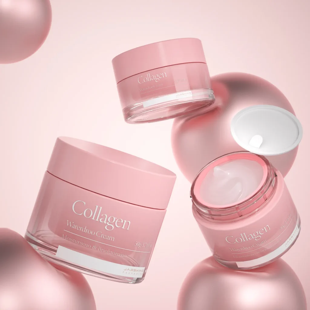
White: Universally associated with purity, sterility, and care. It dominates dermatology and medical laboratory environments for that reason. Using matte white—or frosted glass white—transmits sense of calm precision.
Blue: The most trusted color in healthcare branding. From light aqua (hydration and wellness) to deep cobalt (trust and intelligence), blue remains the core hue of both hydration and expertise.
Gray/Silver: Speaks of innovation, neutrality, and high-tech engineering. Silver foil embossing layers a scientific modernism over white minimalism.
Muted Green: Bridges the worlds of nature and science, perfect for “clean-clinical” hybrid positioning. A desaturated sage communicates the same trust as a lab coat with a subtle nod to botanical efficacy.
Strategic Application: From Monochrome to Accents
Monochrome black-and-white packaging exudes timeless confidence and forces the viewer’s attention on typography and structure—the backbone of the clinical aesthetic.
Meanwhile, using a single accent color—a tiny line of cobalt blue, a silver rim, or a sage pipette—creates a brand signature without compromising the scientific tone. This harmony between restraint and recognition builds long-term visual memory and category authority.
Jarsking’s Role: Fidelity in Color Execution
Jarsking ensures color consistency across lines. Through spray frosting, UV coating, and advanced screen-printing, every unit matches within tight chromatic tolerance—paramount when building multinational brand identities. Their ability to translate hex codes to physical pigments across glass, PET, and dispensing components eliminates one of the most common pitfalls in clinical branding: inconsistency.
When a consumer sees exact tonal harmony from jar to box to pump, they instinctively sense that the brand is exacting—precisely the quality that defines clinical authority.
Cohesion—Turning Design Into Behavior
All four design pillars—simplicity, material integrity, dispensing precision, and color control—align not as isolated decisions but as a unified psychological system. Together, they choreograph consumer trust.
When executed as a single consistent experience, the result is more than visual appeal—it’s behavioral. The customer feels safe touching the product, confident reading the label, and assured using it daily. It reduces “purchase anxiety,” the crucial psychological hurdle that often prevents first-time buyers from trying a higher-priced clinical product.
Clinical aesthetics remove that barrier. They visually answer the consumer’s deepest unspoken questions: “Is this safe? Does it work? Can I trust it on my skin?”
In a digitally saturated world, packaging becomes the ultimate analog moment of truth—the difference between being scrolled past or added to cart. Jarsking plays a pivotal B2B role in that transformation. For brands aspiring to become synonymous with scientific excellence, the journey begins before launch—on the drawing board, where clarity meets credibility.
FAQs
The clinical aesthetic is a design philosophy that uses minimalist layouts, scientific materials (particularly glass), precision dispensing systems, and controlled color palettes to communicate credibility, efficacy, and safety.
For B2B skincare brands, this approach is critical because modern consumers are experiencing “claim fatigue” and actively seek visual signals of scientific legitimacy before making purchase decisions.
Clinical packaging reduces purchase anxiety by non-verbally answering consumers’ most pressing questions about product safety and effectiveness, ultimately building trust that translates into customer loyalty and higher conversion rates.
Glass is the gold standard for clinical skincare packaging for several scientific and psychological reasons. Chemically, glass is inert and non-porous, meaning it will not react with or degrade sensitive active ingredients like retinoids, peptides, or vitamin C—ensuring formula stability from first use to last.
Psychologically, the weight and transparency of glass convey premium quality, purity, and brand confidence. Consumer research consistently shows that glass-packaged products are perceived as more effective and trustworthy than identical formulas in plastic containers.
Additionally, amber and cobalt glass options provide UV protection for light-sensitive actives, combining functional science with visual authority.
Airless pump systems represent the intersection of scientific preservation and clinical credibility. Unlike traditional pumps or jars, airless bottles use vacuum technology to prevent air from ever entering the container, which protects sensitive ingredients from oxidation and bacterial contamination—two primary causes of formula degradation.
This technology delivers three distinct benefits: preservation of active ingredient potency, hygienic touchless dispensing, and precise dosage control.
For B2B brands, airless packaging becomes a marketable proof point—demonstrating commitment to formulation integrity while reinforcing the professional, results-oriented positioning that clinical consumers demand. Studies show airless packaging can extend product potency 2-3 times longer than conventional packaging.
Clinical skincare packaging relies on a disciplined, restrained color palette rooted in color psychology. The core clinical colors include white (representing purity, sterility, and scientific honesty), blue in light to medium tones (conveying trust, intelligence, and calm—deeply associated with medicine), gray and silver (suggesting sophistication, technology, and modern luxury), and muted, desaturated greens (signaling clean-clinical or derma-botanical positioning).
The most effective clinical designs use either monochrome palettes (black and white for timeless confidence) or a neutral base with a single accent color that becomes a brand signature.
This restraint communicates professional focus rather than marketing hype, directly addressing educated consumers’ desire for substance over style.
For clinical and professional skincare brands, minimalist design is significantly more effective because it aligns with consumer psychology and purchase behavior in this category. Cluttered packaging triggers subconscious skepticism, suggesting the brand lacks confidence or is attempting to distract from formula weaknesses.
Minimalist layouts with ample white space reduce cognitive load, allowing consumers to focus on what matters—active ingredients, concentrations, and proof points. Industry data shows that brands using minimalist clinical aesthetics enjoy stronger consumer trust, higher perceived quality, and increased repeat purchases, particularly in anti-aging and sensitive skin categories.
The key is that simplicity must be paired with flawless execution—premium materials, perfect typography hierarchy, and intentional white space usage—to avoid appearing cheap or incomplete.
Small brands can achieve clinical credibility through strategic prioritization rather than expensive execution across all touchpoints. Start with the foundational elements that have the highest impact: choose glass over plastic (even if starting with smaller sizes), invest in clean sans-serif typography and a restrained color palette (both low-cost design choices), and ensure perfect label printing quality on a simple substrate.
Consider starting with treatment pumps or standard glass droppers before investing in custom airless systems. Focus your budget on the primary packaging (what touches the product) rather than elaborate outer boxes initially.
Many successful clinical brands like The Ordinary built authority through radical simplicity and transparency rather than premium finishes—proving that clinical credibility comes from design discipline and material honesty, not necessarily high costs. As revenue grows, progressively upgrade to airless pumps, heavier glass, and custom color coatings.
Packaging consistency is fundamental to clinical brand authority because it signals organizational rigor, quality control, and professional standards—all attributes consumers associate with medical-grade or science-backed products. When typography, color tones, material choices, and structural elements remain consistent across an entire product line, consumers subconsciously register the brand as systematic and reliable.
Inconsistency, conversely, suggests disorganization or cost-cutting, undermining clinical positioning. For B2B brands, this means establishing strict brand guidelines covering exact color specifications (down to PMS or hex codes), approved fonts and hierarchies, glass specifications, and dispensing mechanisms—then ensuring manufacturing partners can deliver these specifications with tight tolerances across production runs.
Clinical packaging design is ideal if your brand positioning emphasizes efficacy, scientific formulation, active ingredients, dermatologist development, results-oriented benefits, or problem-solving for specific skin concerns (acne, aging, sensitivity, hyperpigmentation). It’s particularly effective for brands targeting educated consumers who research ingredients, compare concentrations, and prioritize performance over trends.
However, clinical design may not suit brands positioned around sensory luxury, aromatherapy experiences, holistic wellness, or emotional self-care—where warmer colors, ornate details, and expressive typography better communicate brand values.
Ask yourself: Do my customers want a prescription or a pampering experience? If your answer leans toward efficacy and trust over indulgence and emotion, clinical aesthetic packaging will strengthen your market position and differentiate you in an increasingly science-driven beauty landscape.