


For decades, the fragrance aisle was a binary world. On one side: pink curves, floral motifs, and gold script for her. On the other: dark glass, heavy chrome, and bold angularity for him. Today, that division is rapidly becoming a relic of a bygone marketing era. As cultural conversations around identity evolve and consumer purchasing power shifts to younger generations, the visual language of luxury perfume is undergoing its most radical transformation in a century.
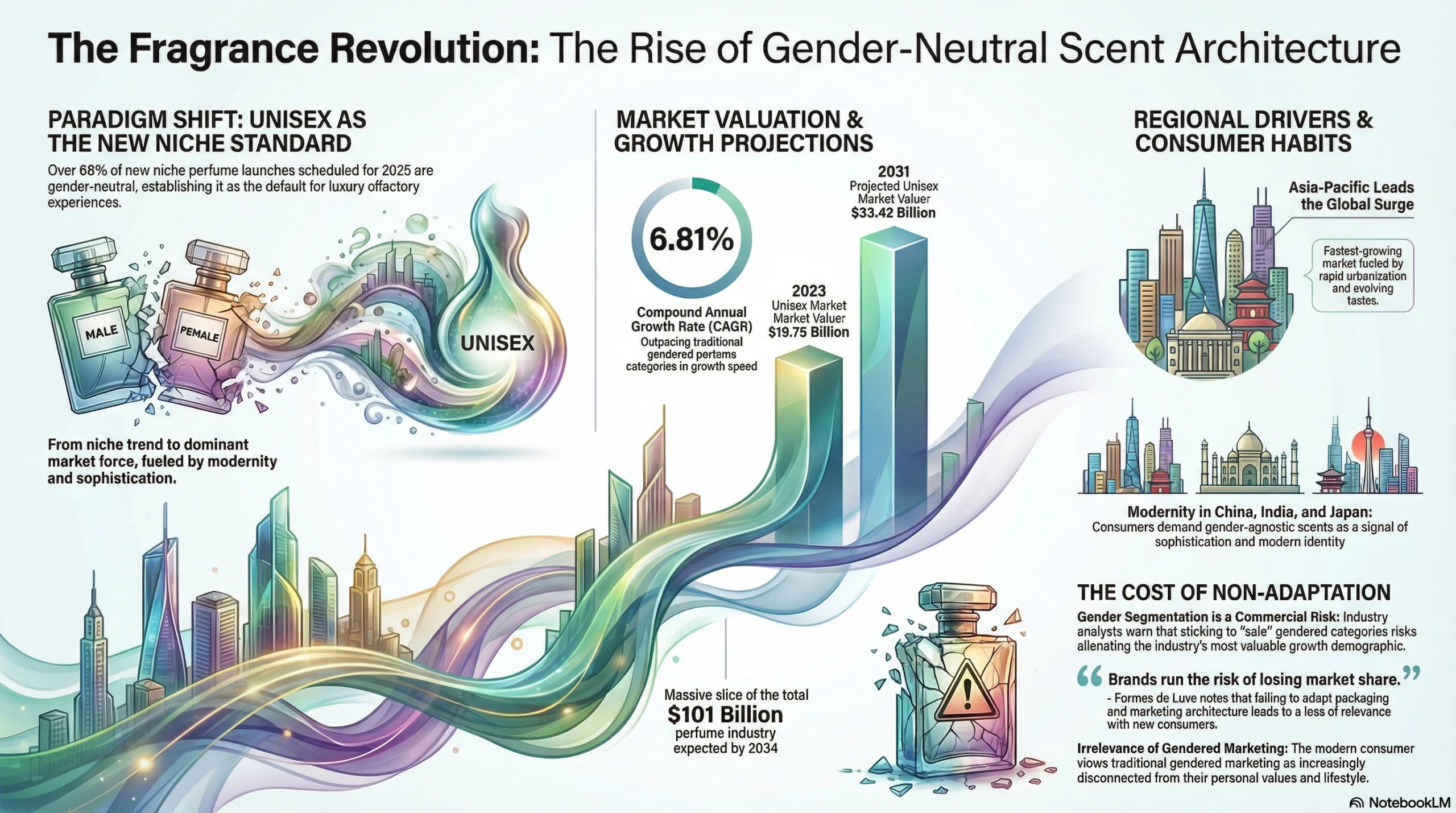
The signal is loud and unmistakable: over 60% of new niche perfume launches in 2025 are classified as unisex. This is not merely a passing design trend or a niche social statement; it is a fundamental restructuring of the commercial landscape. The rise of gender-neutral fragrance packaging represents a massive $33 billion opportunity for brands willing to dismantle the old rules of seduction and rewrite them for a consumer who values individuality over gender performance.
Brand owners and product developers are now facing a critical pivot point. The “shrink it and pink it” strategy is dead. In its place is a new aesthetic of architectural minimalism, sustainable materiality, and radical inclusivity. This shift is driving the fastest growth in the industry, redefining what luxury looks like on the shelf. This article explores the data behind this $33 billion shift, decodes the new visual grammar of gender-neutral design, and provides a strategic framework for brands ready to capitalize on the future of fragrance.
Why Unisex Fragrance Is the Fastest-Growing Category
To understand the urgency of this packaging shift, one must first look at the numbers. The global unisex fragrance market was valued at $19.75 billion in 2023 and is projected to reach $33.42 billion by 2031, growing at a robust CAGR of 6.81%, according to Markets and Data. While the overall global perfume market is on a trajectory to surpass $101 billion by 2034, the unisex segment is outpacing traditional gendered categories, driven largely by the exploding niche and artisanal sectors.
The dominance of gender-neutral scents is particularly visible in the launch calendar. Industry data reveals that over 60% of new niche perfume launches in 2025 are unisex, creating a new default standard for luxury olfactory experiences. This growth is geographically diverse, with the Asia-Pacific region emerging as the fastest-growing market for unisex fragrances. Rapid urbanization and changing consumer habits in China, India, and Japan are accelerating the demand for premium, gender-agnostic scents that signal modernity and sophistication.
For heritage brands and new entrants alike, the business implications are stark. Staying rigidly attached to gender segmentation is no longer a “safe” play; it is a commercial risk. As noted by industry analysts at Formes de Luxe, “By remaining firmly attached to gender segmentation, brands run the risk of losing market share, particularly with new consumers.” The modern consumer views gendered marketing as increasingly irrelevant, and brands that fail to adapt their packaging architecture risk alienating the most valuable growth demographic in the industry.
From Apothecary to Pink and Blue: A Brief History of Gendered Packaging
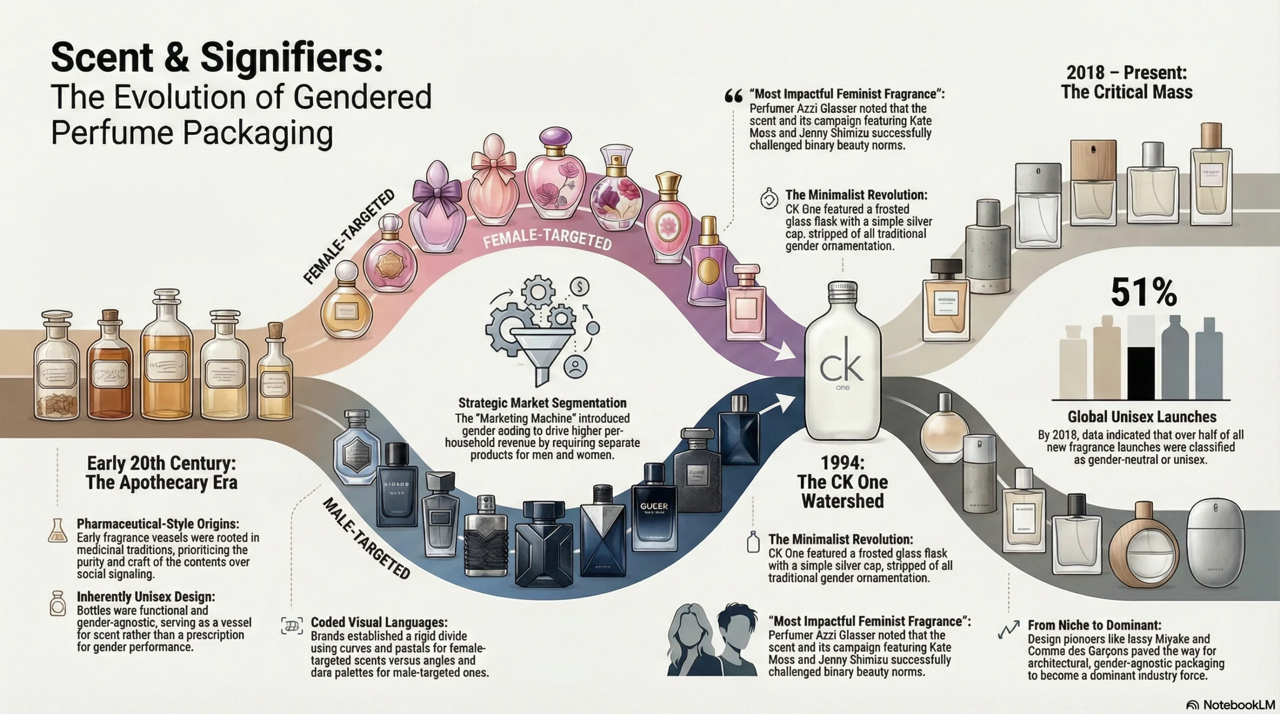
The gender-binary packaging system we are dismantling today is, historically speaking, a modern invention. In the early 20th century, perfume bottles were largely unisex, rooted in apothecary and medicinal traditions. Fragrances were sold in functional, pharmaceutical-style vessels that prioritized purity, craft, and material quality over social signaling. A bottle was a vessel for scent, not a prescription for gender performance.
It was the mid-century marketing machine that introduced deliberate gender coding as a strategy for market segmentation. By creating distinct visual languages for “men” and “women”—the now-ubiquitous divide of curves/pastels versus angles/dark palettes—brands discovered they could drive higher per-household revenue. This binary system became the industry standard for fifty years, turning packaging into a rigid signifier of identity.
The first major crack in this facade appeared in 1994 with the launch of CK One. It was a watershed moment: a frosted glass flask with a simple silver cap, stripped of all ornamentation. The bottle was spare, clean, and aggressively androgynous, supported by a campaign featuring Kate Moss and Jenny Shimizu that challenged binary beauty norms. Perfumer Azzi Glasser has famously called CK One “the most impactful feminist fragrance of the 20th century.” Yet, despite its massive commercial success, the industry largely reverted to its old habits for the next two decades.
The true inflection point arrived around 2018, when data from Packaging Strategies indicated that 51% of global fragrance launches were classified as unisex or gender-neutral. This marked the moment when gender-neutrality moved from a niche rebellion to a dominant industry force. Brands like Issey Miyake and Comme des Garçons had long pioneered architectural, gender-agnostic design, but the shift had finally reached critical mass, setting the stage for the current transformation.
The Consumers Rewriting the Rules: Gen Z, Millennials, and the End of "For Him / For Her"
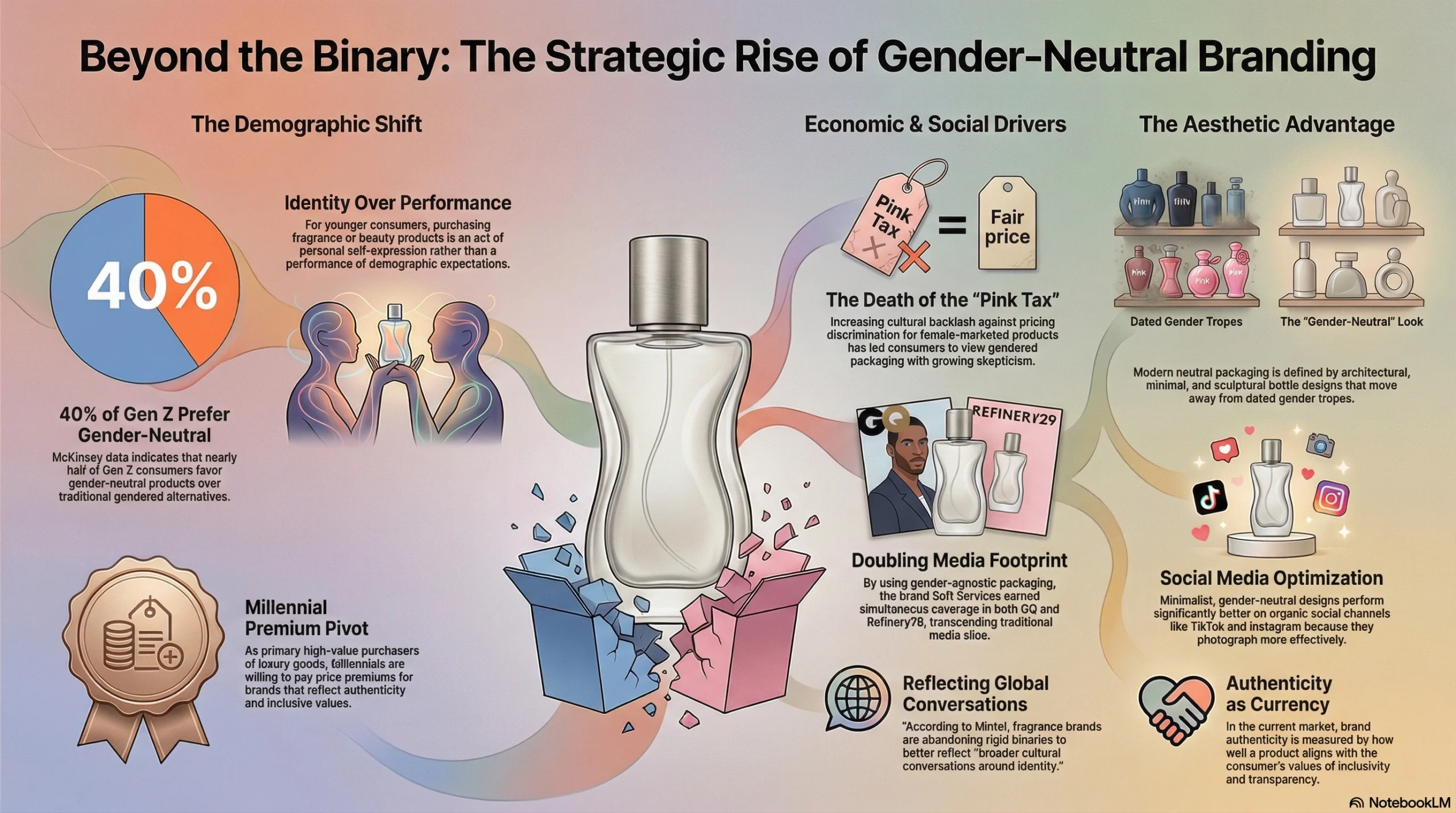
The driving force behind this packaging revolution is not the brands themselves, but the consumers who buy them. Gen Z and Millennials are radically reshaping the beauty landscape, demanding products that align with their fluid understanding of identity. According to McKinsey data cited by MedPak Solutions, approximately 40% of Gen Z consumers prefer gender-neutral products over gendered alternatives. For this generation, purchasing a fragrance is an act of self-expression, not gender performance. They buy scent for who they are, not for the demographic box they are expected to check.
Millennials, now the primary high-value purchasers of luxury goods, are similarly driving this premium pivot. They are willing to pay significant price premiums for brands that reflect their values of inclusivity and authenticity. A compelling example is the body care brand Soft Services, which achieved simultaneous editorial coverage in GQ and Refinery29 by embracing a completely gender-agnostic packaging philosophy. Their success proves that good design transcends gender categories and expands a brand’s media footprint across traditional divides.
Furthermore, the cultural backlash against the “Pink Tax”—the pricing discrimination where products marketed to women cost more than identical products for men—has created a hyper-aware consumer base. Brands that persist with gratuitously gendered packaging are increasingly viewed with skepticism. Authenticity is the new currency. According to Mintel, fragrance brands are stepping away from rigid binaries to reflect “broader cultural conversations around identity.” Additionally, in the visual-first era of TikTok and Instagram, gender-neutral bottles—often architectural, minimal, and sculptural—simply photograph better, performing significantly higher on organic social channels than their dated, gendered counterparts.
Decoding the Visual Language: What Makes a Perfume Bottle Truly Gender-Neutral?
Designing for gender neutrality isn’t a matter of taste — it’s a precise exercise in visual semiotics, the study of how shapes, colors, and textures communicate meaning before a single word is read. The most successful fragrance brands in 2025 aren’t simply removing pink from their packaging. They’re constructing an entirely new design language: one rooted in restraint, material honesty, and architectural clarity. Understanding the four core levers of this language is essential for any brand looking to compete in today’s inclusivity-driven market.
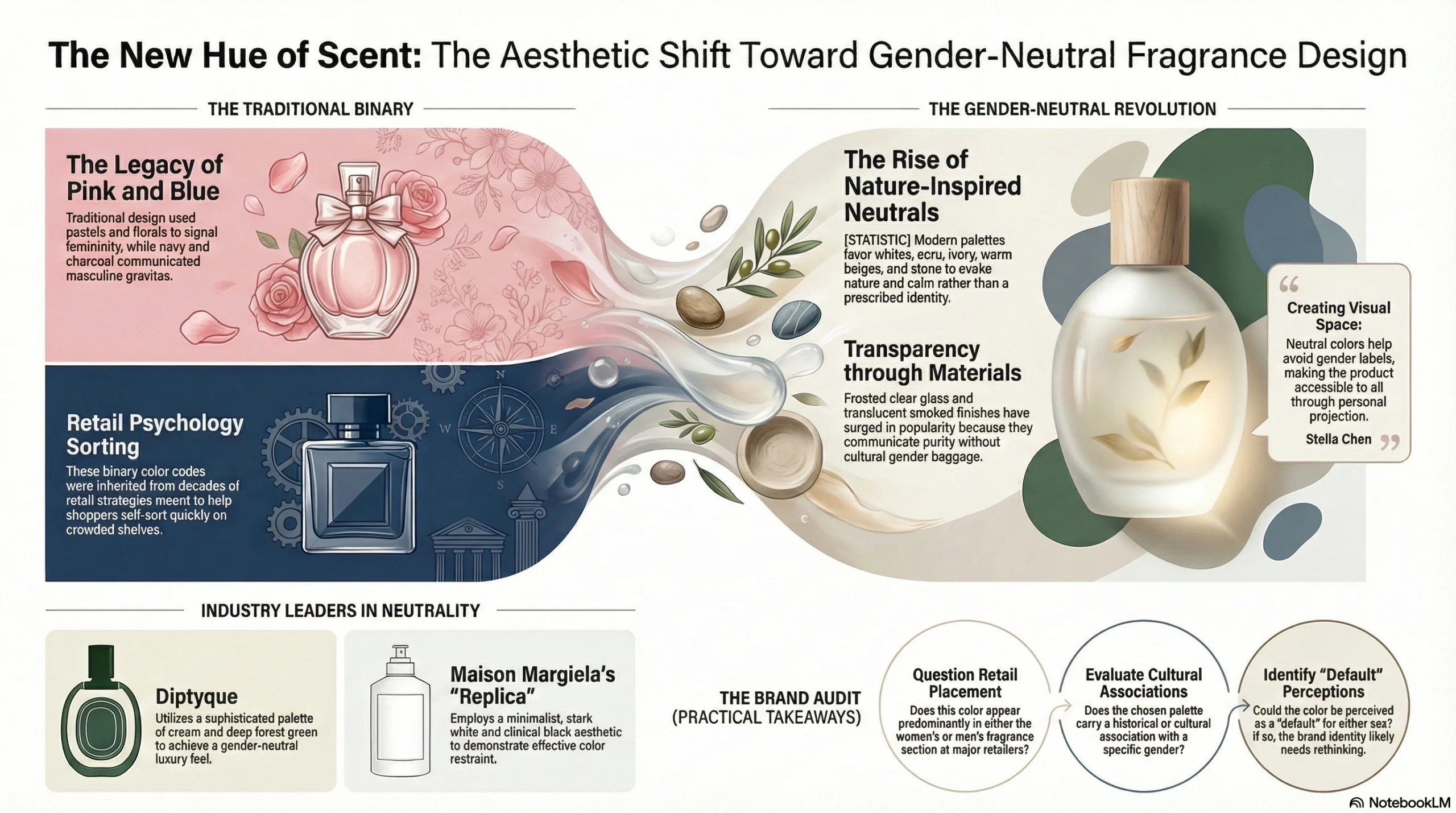
Color: The Death of Pink and Blue
The traditional fragrance color code was blunt and binary. Pastels, blush pinks, and floral watercolors signaled femininity. Deep navy, black, and charcoal communicated masculine gravitas. These conventions weren’t accidental — they were inherited from decades of retail psychology designed to help shoppers self-sort quickly on a crowded shelf.
The gender-neutral revolution dismantles this system entirely, replacing it with a far more sophisticated palette. The dominant hues are whites, off-whites (ecru, ivory), warm beiges, sand, and stone — colors that evoke nature, neutrality, and calm rather than a prescribed identity. Frosted clear glass and translucent smoked finishes have surged in popularity because they communicate transparency and purity without any cultural gender baggage. Muted forest greens and deep slate blues have also emerged as powerful neutrals, drawing associations with the natural world rather than the cosmetics aisle.
As Stella Chen notes on LinkedIn, “Neutral colors like gray, white, and black help avoid gender labels, making the product accessible to all.” The key mechanism at work here is personal projection: neutral palettes don’t tell the consumer who they are. They create visual space for the consumer to decide for themselves. Diptyque’s palette of cream and deep forest green, and Maison Margiela’s Replica line with its stark white and clinical black, both demonstrate how color restraint can feel profoundly luxurious.
Practical takeaway for brands: Before finalizing a colorway, audit your palette against three questions: Does this color appear predominantly in either the women’s or men’s fragrance section at major retailers? Does it carry a cultural or historical association with a specific gender? Could it be perceived as a “default” for either sex? If any answer is yes, it likely needs rethinking.
Shape and Form: From "Curves vs. Angles" to Pure Architecture
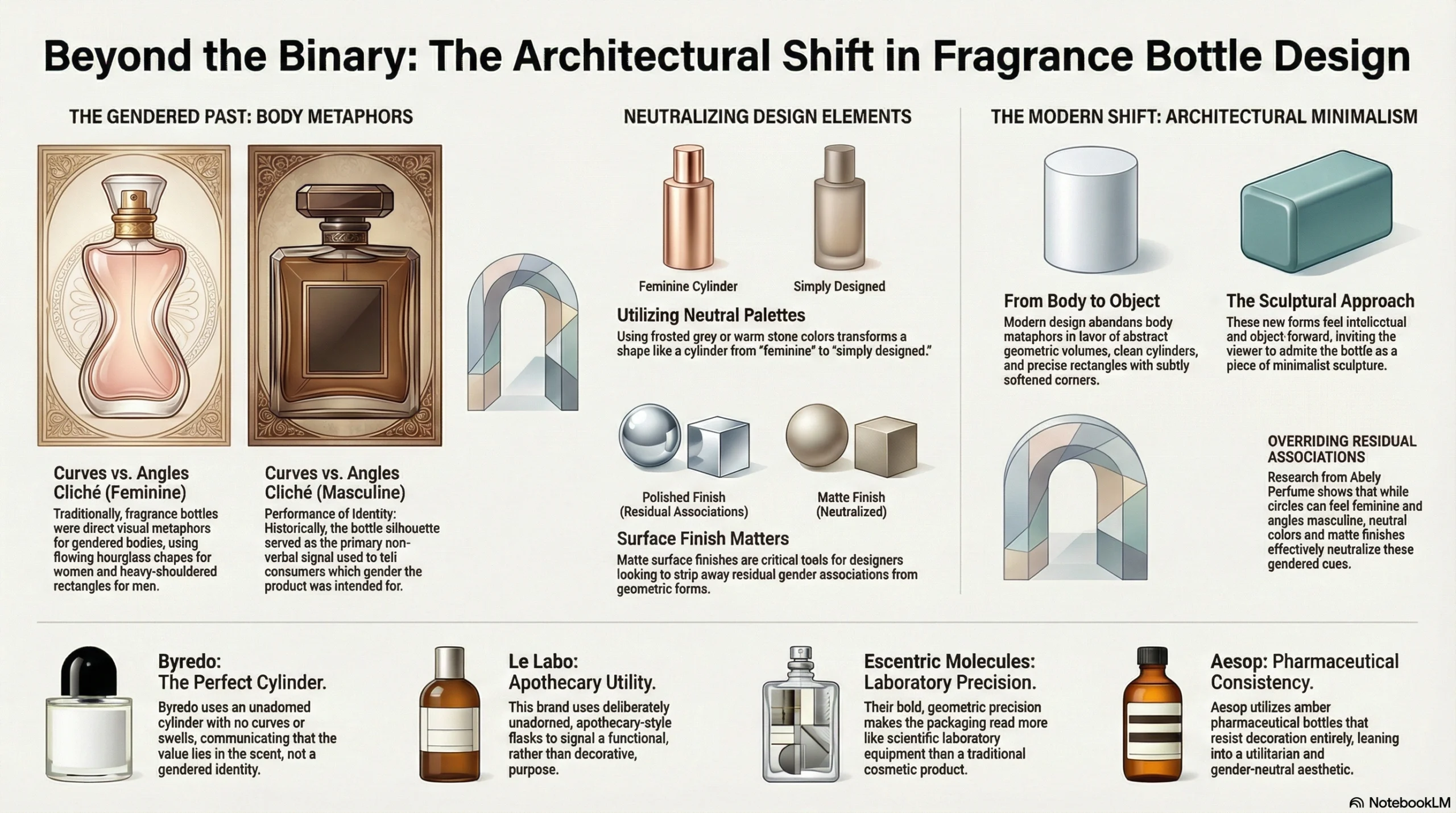
Bottle silhouette has historically been the primary non-verbal signal of gender in fragrance packaging. The pattern was so consistent it became a visual cliché: flowing, rounded, hourglass-inspired curves for women’s fragrances; broad, heavy-shouldered rectangles and hard angles for men’s. These shapes weren’t neutral choices — they were direct visual metaphors for gendered bodies.
The new design language breaks this binary by abandoning body metaphors altogether and turning instead to architecture and sculpture. Clean cylinders, precise rectangles with subtly softened corners, and abstract geometric volumes have become the dominant forms in gender-neutral fragrance. These shapes feel intellectual, tactile, and object-forward — they invite you to admire them as you would a piece of minimalist sculpture, not to identify with them as a body type.
Research from Abely Perfume offers a nuanced insight here: circular forms do still carry residual feminine associations, and angular forms carry masculine ones, but these associations can be effectively overridden by neutral color palettes and matte surface finishes. This means a cylinder doesn’t have to be “feminine” — a frosted grey or warm stone-colored cylinder reads as simply designed, not gendered.
Byredo has perhaps mastered this more than any other contemporary brand. Their signature bottle is an unadorned, perfect cylinder — no curves, no swells, no concession to gender convention whatsoever. It communicates that the object’s value lies in what’s inside, not in performing an identity.
Brands to study for shape innovation:
Byredo — the perfect cylinder as a design statement
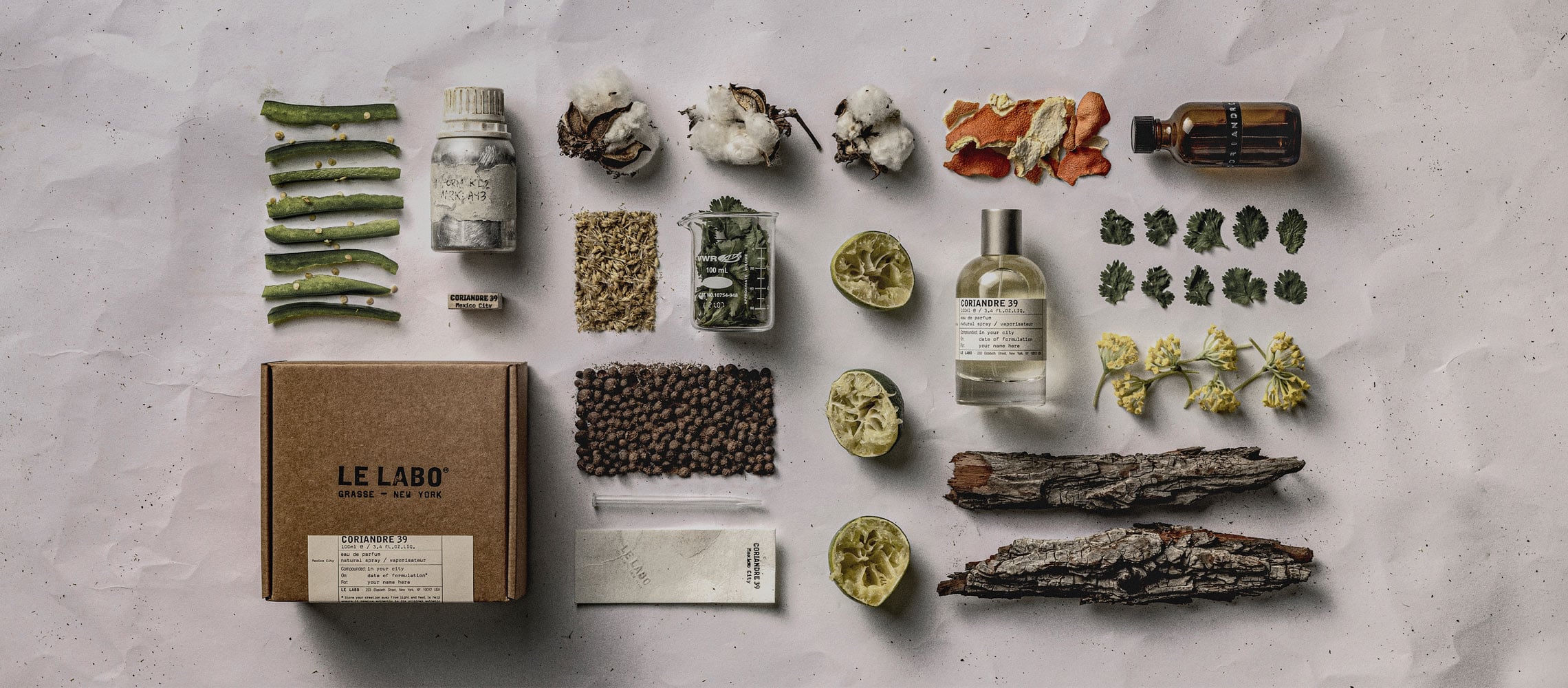
Le Labo — deliberately unadorned, apothecary-style flasks
Escentric Molecules — bold, geometric precision that reads more like laboratory equipment than a cosmetics product
Aesop — consistent use of amber pharmaceutical bottles that resist decoration entirely
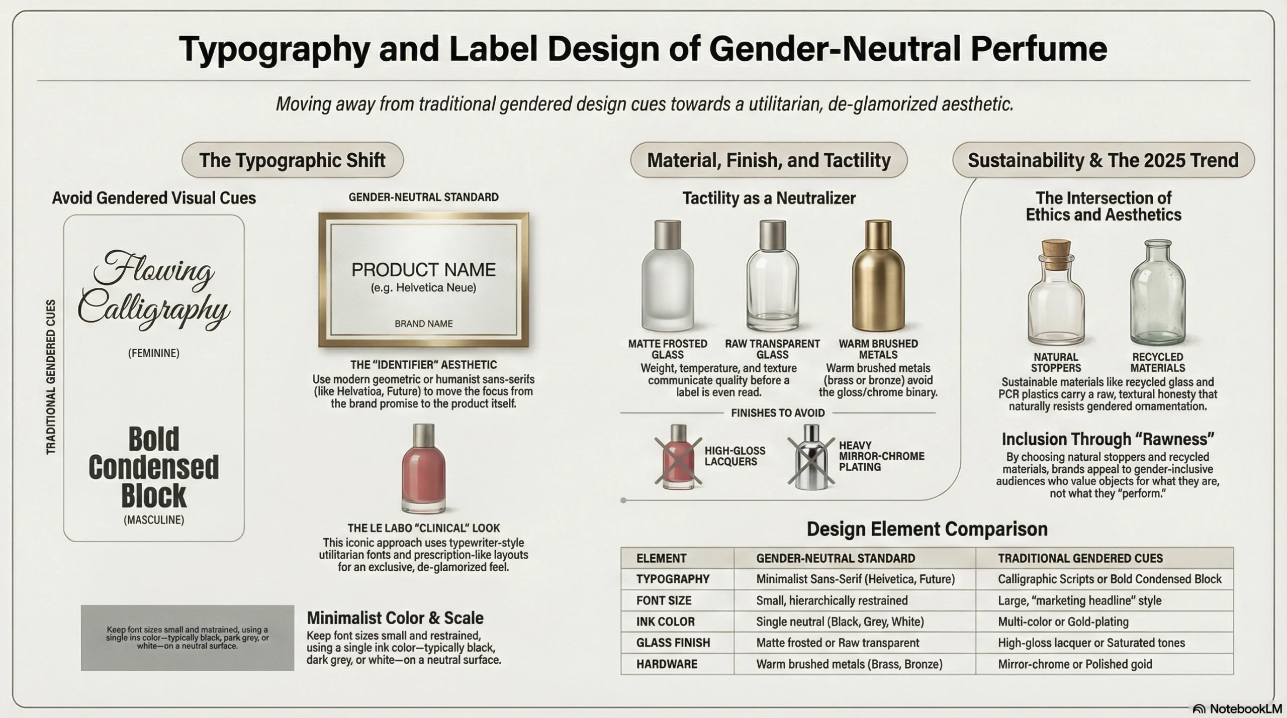
Typography and Label Design
Typography is where many fragrance brands unknowingly undermine an otherwise gender-neutral design. A bottle can be a perfect matte cylinder in warm stone, but if the label uses a flowing gold calligraphic script, it immediately signals the feminine tradition of luxury beauty. Conversely, heavy bold-condensed block lettering echoes the visual language of men’s sport fragrance.
The gender-neutral typographic shift is toward clean, minimal sans-serif typefaces — often small, restrained, and printed in a single neutral color. The visual message is deliberate: the label is an identifier, not a marketing headline. The luxury communicates itself through the object’s physical presence, materials, and scent — not through large ornate text. This typographic restraint is also philosophically aligned with the anti-marketing aesthetic that resonates strongly with millennial and Gen Z consumers, who are increasingly skeptical of overt brand messaging.
Le Labo made this approach iconic with its typewriter-aesthetic labels — borrowing visual codes from the pharmaceutical and clinical worlds. The fonts are utilitarian; the layout looks almost like a prescription label. This isn’t accidental minimalism. It’s a deliberate act of brand de-glamorization that paradoxically makes the product feel more exclusive. The message is: this fragrance doesn’t need to perform for you. It simply exists.
Typography principles for gender-neutral fragrance labels:
Use modern geometric sans-serif fonts (Helvetica, Futura, Aktiv Grotesk) or humanist sans-serifs
Keep font sizes small and hierarchically restrained — the fragrance name should lead, not the brand promise
Avoid scripts, serifs with strong historical associations (like didone typefaces used in prestige women’s cosmetics), or condensed display fonts associated with sport/men’s categories
Use a single ink color, typically black, dark grey, or white, on the neutral bottle surface
Material, Finish, and Surface Treatment
Tactility is the most underrated dimension of gender-neutral design — and perhaps the most powerful. Before a consumer reads the label or consciously processes the bottle’s shape, they pick it up. The weight, temperature, and texture of the object in hand communicate quality and character instantly. This is where many brands lose the gender-neutral battle even after winning the visual one.
Finishes that successfully neutralize gender associations share a common quality: they feel honest and material-forward rather than ornamented or processed. The leading finishes are:
Matte frosted glass — tactile, premium, and completely free of the gloss that signals high-glamour femininity or the heavy chrome that signals masculine prestige
Raw or lightly tinted transparent glass — communicates simplicity and lets the liquid color speak for itself
Warm brushed metals for caps and collars — the “warmth” of brushed brass or bronze avoids both the coldness of chrome and the softness of gold-plating
Sustainable materials — recycled glass and PCR (post-consumer recycled) plastics carry an inherent rawness and textural honesty that naturally resists heavy ornamentation, and they align with the sustainability values that gender-inclusive audiences often hold strongly
Conversely, high-gloss lacquers (particularly in warm pinks, reds, or saturated tones) and heavy mirror-chrome plating remain strongly coded as gendered — the former feminine, the latter masculine. These finishes can be used in gender-neutral design, but only with exceptional care in controlling every other visual variable.
The intersection of sustainable materials and gender-neutral aesthetics is worth noting as a significant 2025 trend. Brands choosing recycled glass or natural stoppers aren’t just making an environmental statement — they’re incidentally landing on a material aesthetic that feels inclusive by nature. Raw, honest, and undisguised materials ask the consumer to value the object for what it is, not what it performs.
In Practice: 5 Brands That Are Mastering Gender-Neutral Perfume Packaging
The shift to gender-neutral packaging is not theoretical; it is being led by some of the most successful and influential brands in the luxury market today. These case studies demonstrate how diverse design approaches can achieve the same goal of inclusivity.
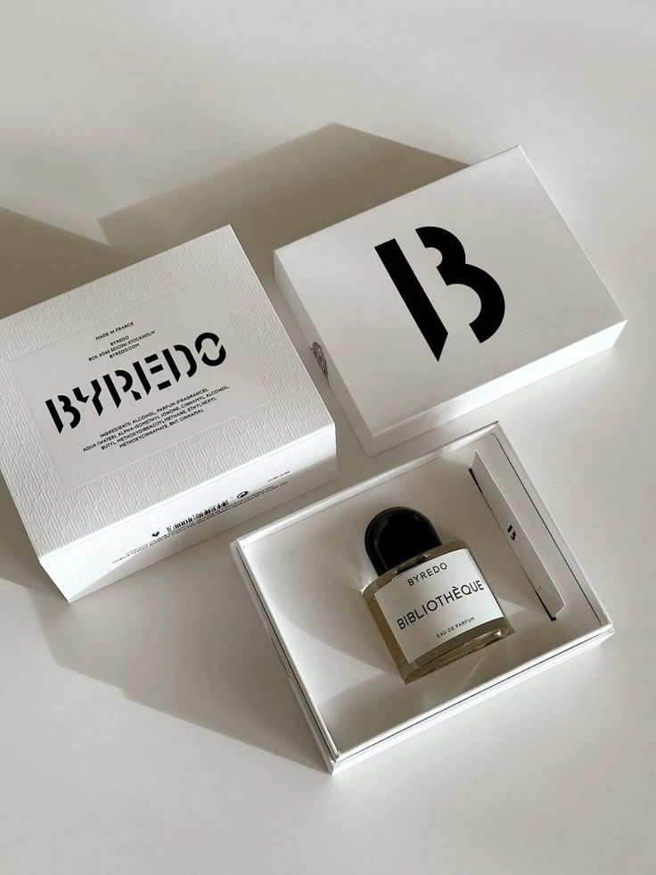
Byredo: The Minimalist Archetype
Byredo arguably established the modern template for gender-neutral luxury. The brand’s bottle is a study in restraint: a perfect glass cylinder, a simple magnetic black cap, and a minimalist label with a clean serif font. There is absolutely nothing about the vessel that signals “for him” or “for her.” This consistency across the entire range makes gender neutrality a core pillar of the brand’s identity, allowing scents like Gypsy Water and Mojave Ghost to become cult favorites across all demographics. Byredo proves that neutral design can command top-tier luxury pricing.
Le Labo: The Anti-Bottle Bottle
Le Labo revolutionized the market by designing a bottle that looks like laboratory equipment—functional, medicinal, and rooted in the pre-marketing era of perfumery. Their masterstroke was the label: a personalized, typewriter-style sticker printed on-demand at the point of sale. By putting the customer’s name and the date of compounding on the bottle, Le Labo replaces gender labels with personal identity. The packaging belongs to you, making “for men” or “for women” entirely obsolete.
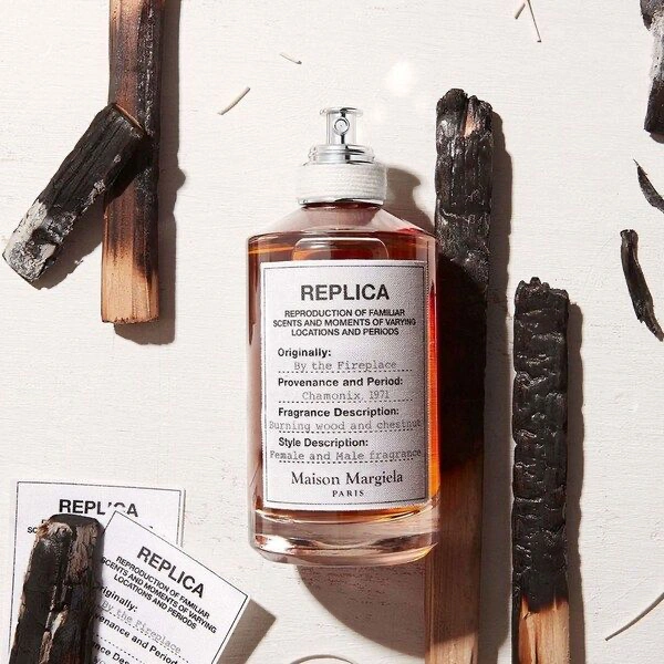
Maison Margiela Replica: Storytelling Through Neutrality
The Replica collection uses bottles designed to look like apothecary jars found in a memory box. With cotton labels and a simple silhouette, the packaging is nostalgic but ageless. The genius of Margiela’s approach is that narrative replaces gender. Fragrances are named after moments and places—Jazz Club, Beach Walk, Lazy Sunday Morning. The scent captures a memory, and since memories are universal, the packaging requires no gender coding.
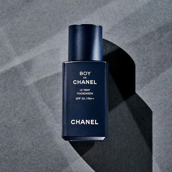
Boy de Chanel: Luxury's Most Powerful Gender-Flip
Even the most heritage-coded luxury brands are moving in this direction. Chanel launched Boy de Chanel, a line explicitly for men, but utilized the same minimalist, gender-fluid design language that defines the brand’s modern era. Launched first in China, where acceptance of gender-fluid beauty is growing rapidly, the line demonstrates that even historic houses recognize the commercial necessity of dismantling rigid gender barriers.
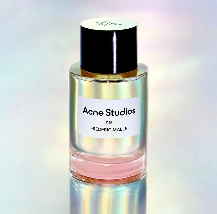
Acne Studios × Frédéric Malle: Fashion-Fragrance Convergence
In 2024, Swedish fashion house Acne Studios collaborated with Frédéric Malle to launch its first fragrance. The bottle design is perfectly consistent with Acne’s gender-neutral fashion ethos: clean, architectural, and completely devoid of traditional gender signals. Retailing at a luxury price point ($295–$470), as noted by Markets and Data, this collaboration highlights how cross-industry partnerships are accelerating the normalization of inclusive design in the ultra-premium tier.
The Double Win: Why Gender-Neutral and Sustainable Packaging Are the Same Strategy
One of the most compelling strategic insights for 2025 is that the move toward gender-neutral packaging and the push for sustainability are not separate initiatives—they are mutually reinforcing strategies. Eco-friendly design is inherently gender-neutral.
Sustainable materials, such as recycled glass and PCR (Post-Consumer Recycled) plastics, naturally lend themselves to neutral tones, natural textures, and minimal decoration. A bottle made from 15% recycled glass has a slight tint and imperfection that feels raw and authentic—qualities that align perfectly with the “unvarnished” aesthetic of gender-neutral branding. Refillable packaging systems, which are becoming a standard requirement for premium brands, require durable, high-quality engineering. This necessitates a move away from trendy, ornate gendered decoration toward timeless, architectural forms that can endure years of use.
Crucially, the consumer overlap is significant. The same Gen Z and Millennial consumers driving the demand for inclusive products are also the most eco-conscious. According to Mintel, “Sustainability and performance go hand in hand” for modern fragrance buyers. Brands like Bella Hadid’s ‘Ôrəbella—which is alcohol-free, vegan, cruelty-free, and sustainably packaged—naturally adopt a gender-neutral visual language because it communicates “clean” and “modern” more effectively than gendered codes. With the sustainable fragrance market poised to help drive the industry to $52.4 billion in 2025 (Free Yourself), adopting a gender-neutral, eco-forward packaging strategy allows brands to target two massive value drivers simultaneously.
What Every Fragrance Brand Owner Needs to Know About This Shift in 2026
For brand owners and product developers, the shift to gender-neutral packaging is no longer an optional “creative choice”—it is a strategic imperative. The risks of remaining rigidly attached to gender segmentation are becoming tangible. Brands that persist with binary marketing risk alienating the fastest-growing consumer segments and appearing culturally out of touch. In a niche market where 60% of launches are unisex, a gendered bottle can inadvertently signal “old world” values that do not resonate with the modern premium buyer.
Conversely, the opportunity cost calculation is overwhelmingly positive. Redesigning for gender neutrality does not mean losing an existing audience; it means expanding the addressable market. A bottle designed exclusively for women has a capped audience. That same scent, presented in a beautifully designed gender-neutral vessel, becomes accessible to men, women, and non-binary consumers alike. The potential customer base effectively doubles without the need for scent reformulation.
There are three clear signals that a brand is ready for this shift: if your existing customers are primarily Millennials or Gen Z; if you are launching a new line intended to have longevity; or if you are entering the niche or artisanal market. However, speed is critical. In the fast-moving world of fragrance trends, the window to establish leadership in this space is narrowing. Brands that can move quickly from concept to shelf with high-quality, inclusive packaging will secure a significant competitive advantage.
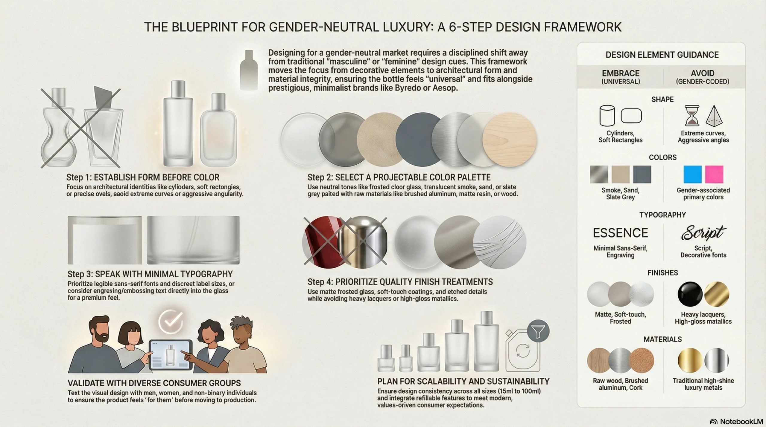
The Blueprint: How to Design a Gender-Neutral Luxury Perfume Bottle From Scratch
Designing a truly gender-neutral bottle requires a disciplined approach that prioritizes form and material over decoration. Here is a practical framework for brands looking to build an inclusive luxury packaging system.
Step 1: Start With Form, Not Color
Establish the architectural identity of the bottle first. Universal forms include cylinders, soft rectangles with rounded corners, and precise ovals. Avoid extreme curves (which code feminine) or aggressive, heavy-shouldered angularity (which codes masculine). A good litmus test: does this shape feel like it belongs on a shelf next to Byredo or Aesop?
Step 2: Select a Neutral, Projectable Color Palette
Choose colors that invite interpretation. Frosted clear glass, translucent smoke, warm white, sand, and slate grey are excellent primary choices. For caps, opt for brushed aluminum, matte resin, or raw wood. Avoid any color that triggers an immediate gender association in its unmodified state.
Step 3: Choose Typography That Speaks, Not Shouts
Select a minimal, legible sans-serif typeface. Keep label sizes discreet—let the bottle’s material quality do the heavy lifting. Consider removing the label entirely in favor of text engraved or embossed directly into the glass, which feels premium and timeless. Avoid script fonts or highly decorative typography.
Step 4: Select Finish Treatments That Signal Quality
Prioritize matte frosted glass, soft-touch coatings, and etched details. These finishes feel sophisticated and modern. Avoid heavy lacquers in gendered tones or high-gloss metallics. Sustainable finish options like natural cork or recycled aluminum caps can further enhance the gender-neutral narrative.
Step 5: Validate with Your Target Consumer
Before committing to production, test the design visually. Show the bottle to equal groups of men, women, and non-binary individuals to ensure it feels “for them.” Social media offers a low-risk environment to soft-launch design concepts and gauge reaction before manufacturing.
Step 6: Plan for Scalability and Sustainability
Ensure the design maintains its character across all sizes (15ml, 50ml, 100ml). Design for refillability from the start, as this is increasingly a standard expectation for gender-neutral, values-driven brands.
Conclusion: The Future of Luxury Fragrance Packaging Belongs to Everyone
The perfume bottle has always been a mirror of its cultural moment. In the 1950s, it reflected a binary world of rigid roles and distinct market segments. In 2026, it reflects a world that has moved beyond those categories. The brands that will define the next decade of fragrance are those that understand that the bottle is not just a container—it is a statement about who the fragrance is for. And the answer, increasingly, is: everyone.
The commercial case is undeniable: a $33 billion market growing at nearly 7% annually, driven by the most brand-loyal and values-conscious generations in history. The design case is equally strong: the move toward minimalist, architectural, material-led bottles is not a compromise of luxury, but its highest modern expression. By dismantling the walls of gendered packaging, brands are opening the door to a more inclusive, sustainable, and profitable future. The rules of luxury have been rewritten. The only question remaining is which brands will be bold enough to play by them.
FAQs
Gender-neutral perfume packaging uses design elements—such as neutral color palettes, architectural bottle forms, minimal typography, and quality-forward finishes—that avoid traditional masculine or feminine visual coding. This makes the fragrance visually accessible and appealing to consumers of any gender identity.
The global unisex fragrance market is projected to grow from $19.75 billion in 2023 to $33.42 billion by 2031. This shift is driven by Gen Z and Millennials who prefer products that prioritize personal identity over gender labels. Brands that adopt gender-neutral packaging can access a significantly larger addressable market.
Neutral, projectable tones work best: frosted clear glass, matte white, warm sand/beige, pale grey, translucent smoke, and matte earth tones. These colors invite personal identification without triggering gender associations. Avoid pinks, rose gold (codes feminine), and heavy black/chrome (codes masculine) as primary choices.
Leading examples include Byredo (known for minimalist cylinders), Le Labo (apothecary-style with personalized labels), Maison Margiela Replica (clean archival aesthetic), Boy de Chanel (luxury heritage with gender-fluid identity), and Acne Studios × Frédéric Malle (fashion-fragrance crossover).
The two trends are naturally aligned. Sustainable materials like recycled glass and PCR plastics tend toward neutral tones and minimal decoration, which matches the aesthetic language of gender-neutral design. Brands pursuing both simultaneously satisfy the same consumer segment (values-led Gen Z and Millennials) with a coherent product identity.
Architectural, sculptural, and neutral-form bottles work best: cylinders, clean rectangles with rounded edges, precise ovals, and abstract geometric volumes. These forms feel design-forward rather than gender-coded, especially when paired with matte or frosted finishes.
Absolutely. Some of the most premium fragrance brands in the world—such as Byredo and Le Labo, with price points exceeding $300—use gender-neutral packaging. Luxury is communicated through material quality, precision manufacturing, refined finishes, and restrained design, none of which require gender coding.