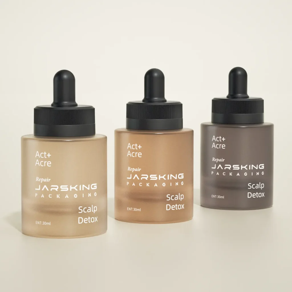
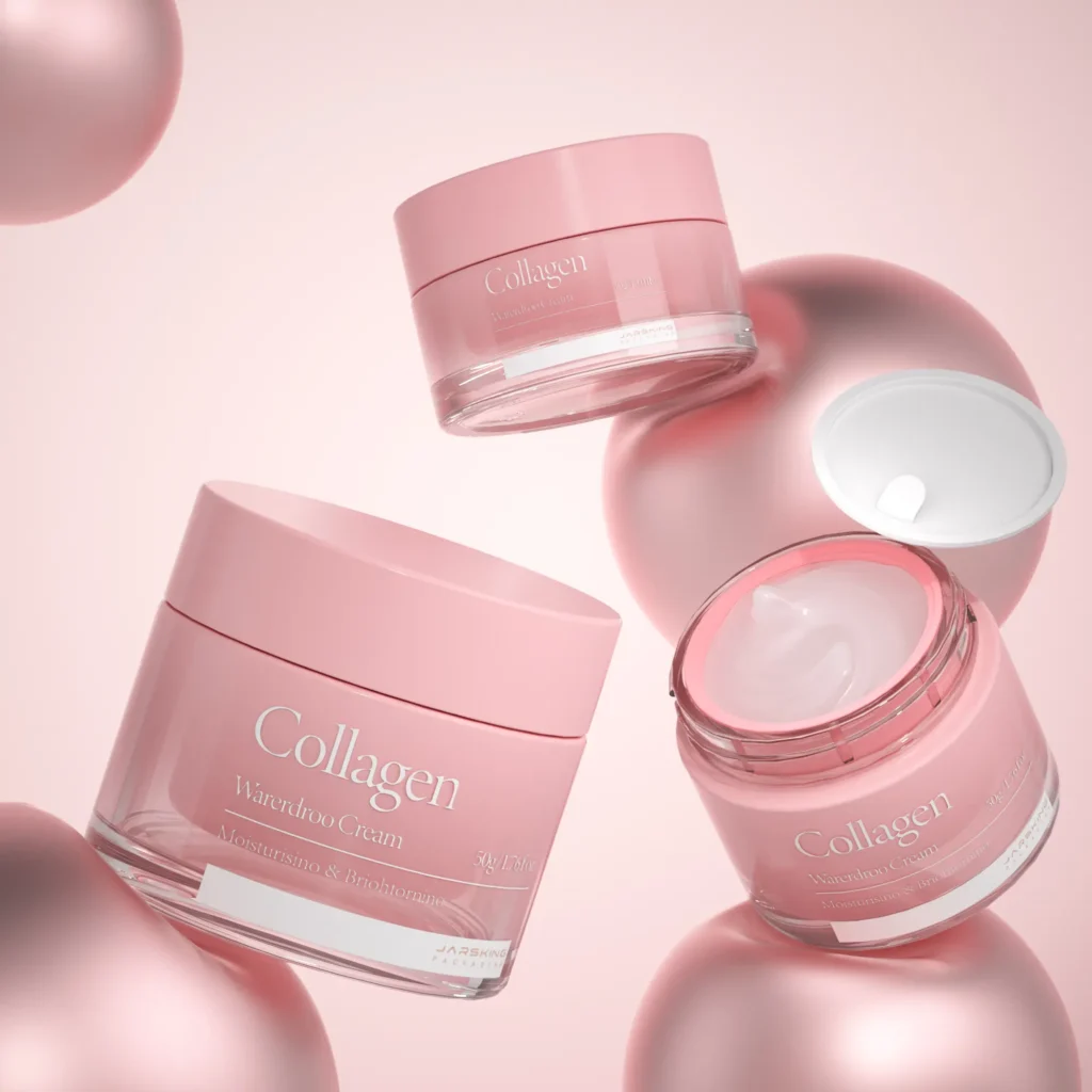
Fragrance has always been a design-driven category—but in 2026, the brief changes. Consumers are still buying aspiration, but they now want evidence: evidence of craft, evidence of circularity, evidence of authenticity, and evidence that a brand’s “story” is more than a campaign. That’s why the strongest 2026 work is not only visual; it is system design—where bottle engineering, refill logistics, typography legibility, material choices, and retail activation all reinforce each other.
Macro trend signals point to the same direction: a push for human imperfection, tactility, and emotional warmth as a counterbalance to AI-polished sameness. Canva’s 2026 forecast positions the year as “Imperfect by Design,” backed by global creator data and survey insights, with multiple trend clusters pointing to texture, DIY signals, and storytelling formats that feel made by people—not just software. Adobe’s 2026 forecast similarly elevates tactile/sensory impact, playful type, collage/layering, and warmer personal aesthetics as the “winning” creative direction.
For fragrance brands and OEM/ODM packaging partners like Jarsking, this isn’t abstract. It has direct implications for:
- bottle weight, wall thickness, and glass spec choices
- decoration techniques (frosting, acid-etch, metallization, ceramic ink, deboss/emboss, tactile varnishes)
- refill compatibility (crimp/neck finish decisions, pump replacement logic, leakage testing)
- secondary packaging structure (mono-material goals, accessibility typography, tamper evidence)
- “phygital” touchpoints (QR, authentication, refill education, servicing)
This guide breaks down the 2026 trends with real cases and translates them into packaging + marketing design decisions you can implement globally.
Trend 1 — “Imperfect by Design”: authenticity as the new luxury signal
The core 2026 shift: brands want to look less generated and more authored. That doesn’t mean messy. It means intentional imperfection—the cues that a human hand, a studio process, or a craft lineage exists behind the object.
Canva frames 2026 as a creative rebellion where “Imperfect by Design” becomes the new standard; its trend clusters highlight DIY textures, zine energy, and tactile realism as rising aesthetics. Adobe echoes this with “organic and imperfect design,” collage, and warm personal style signals.
Guerlain Bee Bottle craft as brand equity
Guerlain’s Bee Bottle demonstrates how imperfection becomes provenance. The narrative isn’t “a bottle that looks handmade”; it’s a bottle tied to legacy, with craft details that are difficult to fake at scale. Even modern production blends hand finishing and automation depending on format, protecting the “hand” where it matters most to the story. Source
A practical 2026 takeaway: if your brand claims artisanal value, then your packaging needs one or two undeniable craft moments—a tactile print, a hand-feel label, a signature decorative technique, or a micro-detail that rewards close inspection. In 2026, consumers are trained to doubt perfection; the “too smooth” look reads like template design.
What this means for fragrance packaging execution
Imperfect-by-design can be engineered without looking low-end:
- micro-embossed textures on cartons (paper grain amplified)
- debossed brand marks with soft-touch or matte varnish
- ceramic inks with slightly organic edge (controlled “human” bleed)
- textured coatings that diffuse reflections (anti-“CGI” look)
- “studio label” aesthetics (like lab stickers) but with premium paper + crisp type
This is where Jarsking’s advantage is not only aesthetics—it’s the ability to prototype finish choices quickly and validate them under real lighting and retail conditions.

Trend 2 —Texture-first design: the fastest way to communicate “quality” in 0.5 seconds
When people say “texture is the anti-scroll,” they’re describing a very practical behavior pattern: on fast-moving feeds (TikTok, IG Reels, Shorts, Pinterest), flat visuals get cognitively filtered as “more of the same,” while micro-detail visuals trigger a pause because the brain needs an extra half-second to resolve what it’s seeing. In other words: texture creates visual friction—and that friction is what earns attention.
In fragrance, texture does even more: because the audience cannot smell through a screen, texture becomes a stand-in for the sensory promise—it’s how you visually signal “this will feel soft / cold / mineral / creamy / airy / woody.” That’s why 2026 trend forecasters are pushing “tactile” so hard.
A. It creates “verification behavior.”
With tactile-looking visuals (frosted glass, paper grain, condensation, waxy coatings), viewers often pause to confirm: “Is that real? What material is that?” That moment of checking is exactly what you want in a crowded feed.
B. It upgrades perceived value without adding complexity.
A simple bottle silhouette with a strong tactile surface reads more premium than a complex silhouette with a flat finish. This matters for fragrance because your bottle often appears as a 2cm thumbnail—texture scales down better than “clever details.”
C. It simulates touch and temperature.
Humans have strong learned associations:
- Frosted/etched glass → cool, clean, airy, “fresh shower”
- Soft-touch matte → skin scent, intimacy, comfort
- Uncoated paper grain → artisanal, natural, “slow perfume”
- Metallic micro-sparkle → nightlife, glamour, “projection”
So even before notes are read, texture is already “selling” an olfactive direction.
Fragrance has an unusual marketing problem: it’s an invisible product in digital channels. You’re selling:
- a feeling (mood)
- a memory (association)
- a promise (identity)
- a sensory experience (smell)
Texture is one of the only cues that can carry that sensory promise online because it helps the viewer “imagine” physicality.
That’s why brands that win digitally often show perfume as a material object, not a cutout packshot: you see glass thickness, reflections, micro-scratches, embossed logos, paper fibers—small evidence that the product exists in the real world.
Ffern uses materials as story, not decoration
Ffern treats packaging as part of the concept: plastic-free outer packaging, recyclable kraft tubes, FSC-certified paper, and materials tied to its sustainability message. This is not “texture for aesthetics”; it’s texture as proof of values—where the substrate becomes the campaign.
This is crucial: texture in 2026 isn’t just “tactile luxury.” It’s also ethical texture—natural fibers, recycled pulp, uncoated papers, and material honesty that communicates restraint.
What fragrance brands can copy
- choose one hero material that matches the scent story (e.g., mineral, botanical, coastal, nocturnal)
- amplify it via finish choices (frosting, etch, uncoated carton, fiber flecks)
- use limited color and let texture do the talking
- design the unboxing so the hand feels the concept before the nose confirms it

Trend 3 —Lightweight luxury: in 2026, engineering restraint becomes a prestige badge
Luxury fragrance packaging is entering an era where weight becomes a design decision with a spreadsheet attached. Heavy glass once signaled value, but today the value signal can also come from engineering discipline: the ability to deliver an object that feels precise, stable, and elevated while using less material and shipping more efficiently. A key reason: global fragrance brands now manage complex shipping lanes, more e-commerce volume, and higher expectations for sustainability reporting, making “packaging mass per unit” a practical KPI.
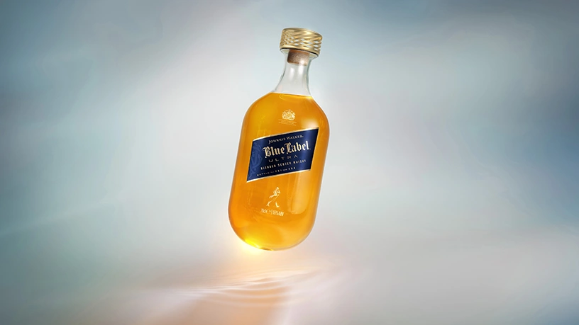
A clear cross-category reference point is Johnnie Walker Blue Label Ultra: the bottle reached ~180g (without closure), promoted as a luxury achievement rather than a cost-cutting exercise, and developed through years of testing and iterative learning. That messaging matters: the bottle becomes an innovation artifact, and the weight becomes part of the product story. Fragrance can use the same narrative structure—“engineered elegance” and “precision glassmaking”—especially for prestige launches and limited editions where craftsmanship and R&D are part of the brand’s cultural capital. Source
The fragrance translation: lightweight without “cheap”
- A lightweight bottle that still feels expensive typically relies on geometric stability (base diameter, center of gravity) and controlled thickness zones (thicker where fingers grip, thinner where volume doesn’t affect hand-feel).
- “Luxury feel” shifts into closure engineering: cap weight distribution, fit tolerance, a clean click-on/off action, and consistent spray force.
- Secondary packaging becomes part of the system: when glass weight goes down, cartons and inserts need structure-led protection rather than more mass. This is where dielines, crush strength targets, and drop-test logic become key parts of the design brief—especially for global shipping.
Lightweighting plays differently by region. In high-temperature lanes (MENA, SEA), adhesive and material behavior changes; in Europe, recyclability narratives and regulations amplify lightweighting value. Packaging teams can pre-empt this by creating “regional readiness” specs: tested temperature range, carton compression targets, and transit simulation outcomes.
Trend 4 —Refillable prestige: design the refill experience like a service, not a container
Refill in fragrance scales when the brand designs the entire experience: the bottle architecture, the retail ritual (or online logistics), the education assets, and the trust signals. Brands that treat refill as “a cheaper way to buy again” miss the bigger opportunity: refill builds habit, repeat visits, and a sense of membership.
Case logic: Dior Sauvage—refill as quantified sustainability + controlled ritual
Dior’s Sauvage refill program provides a strong template for how to communicate refill at scale: a controlled refill process, and clear impact comparisons. Dior describes a refill mechanism designed for quick, clean use, paired with quantified environmental savings when combining one bottle with a larger refill versus repeatedly buying new bottles. That combination—process control plus measurable impact—turns refill into a premium promise (“clean, precise, engineered”) rather than a compromise. Source
Case logic: Mugler—refill as a global retail ritual
Mugler’s Fountain positions refill as an iconic service moment, anchored in the brand’s long-term commitment to refillability. Large networks of fountains and a consistent retail format reinforce trust and normalise refilling in luxury contexts, which helps overcome consumer hesitation (“Will it leak?” “Will it feel authentic?”). Source
Case logic: Le Labo—refill as a loyalty mechanism with price advantage
Le Labo’s program makes the economic logic explicit by stating refills are about 20% off retail and tied to the brand’s lab identity (freshly blended by technicians, new label with refill date). That frames refill as a “members-only benefit” without needing a formal membership program—valuable in premium fragrance where repeat purchase is high and brand affinity is strong. Source
Case logic: Diptyque—refill as operational design (machines, outlets, product scope)
Diptyque’s “new lease of life” positioning shows another scalable approach: formalizing refill as a boutique service supported by specialized equipment and a broadened refillable assortment. It signals that the brand designed refill to be repeatable in real retail conditions, not just as a concept. Source
Packaging/engineering implications
- Refillable perfume packaging succeeds when the bottle and pump strategy anticipate multiple life cycles: seal integrity, neck finish consistency, and parts that survive repeated handling.
- Consumer error becomes a hidden cost; clear, brand-designed instructions reduce returns and damage.
- Refill also changes labeling logic: many brands treat the refill label/date as part of the ritual, which can be designed as a collectible or personalization moment (especially important in gifting).
Trend 5 —Mono-material simplification: the “right kind” of sustainability for fragrance packaging
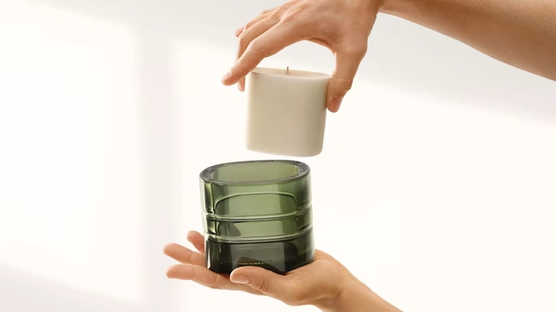
Perfume packaging has unavoidable complexity: a glass bottle, a pump with multiple components, and often a decorative cap. Mono-material goals still matter, but the practical strategy in 2026 focuses on simplification where it produces real recycling and operational gains—especially in secondary packaging and component standardization.
A strong high-level explanation appears in Berlin Packaging’s mono-material overview: using a single material simplifies sorting and recycling, while multi-material structures create friction for recycling systems and often lead to lower recovery. The same source also acknowledges functional constraints that sometimes require multiple materials. That framing matches fragrance reality: simplification works best when applied thoughtfully to the parts of the system that cause the most waste or confusion. Source
Concrete moves fragrance brands can implement without breaking premium aesthetics
- Carton design: remove mixed laminations where possible, shift toward fiber-based structures that remain premium via emboss/deboss, high-quality paper, and controlled ink coverage.
- Inserts: replace plastic vac trays with molded pulp when feasible, or redesign structure to eliminate inserts through better inner geometry.
- Component architecture: reduce part count in caps/closures and standardize materials across SKUs when the brand runs a range. That unlocks procurement and recyclability improvements.
How to talk about this in marketing without greenwashing
- Communicate specific changes (“reduced mixed materials in secondary packaging,” “optimized inserts,” “designed for refill longevity”) rather than claiming a universal mono-material solution.
- Tie the change to a consumer-visible benefit: easier disposal, lighter shipping, reduced waste over repeated refills.
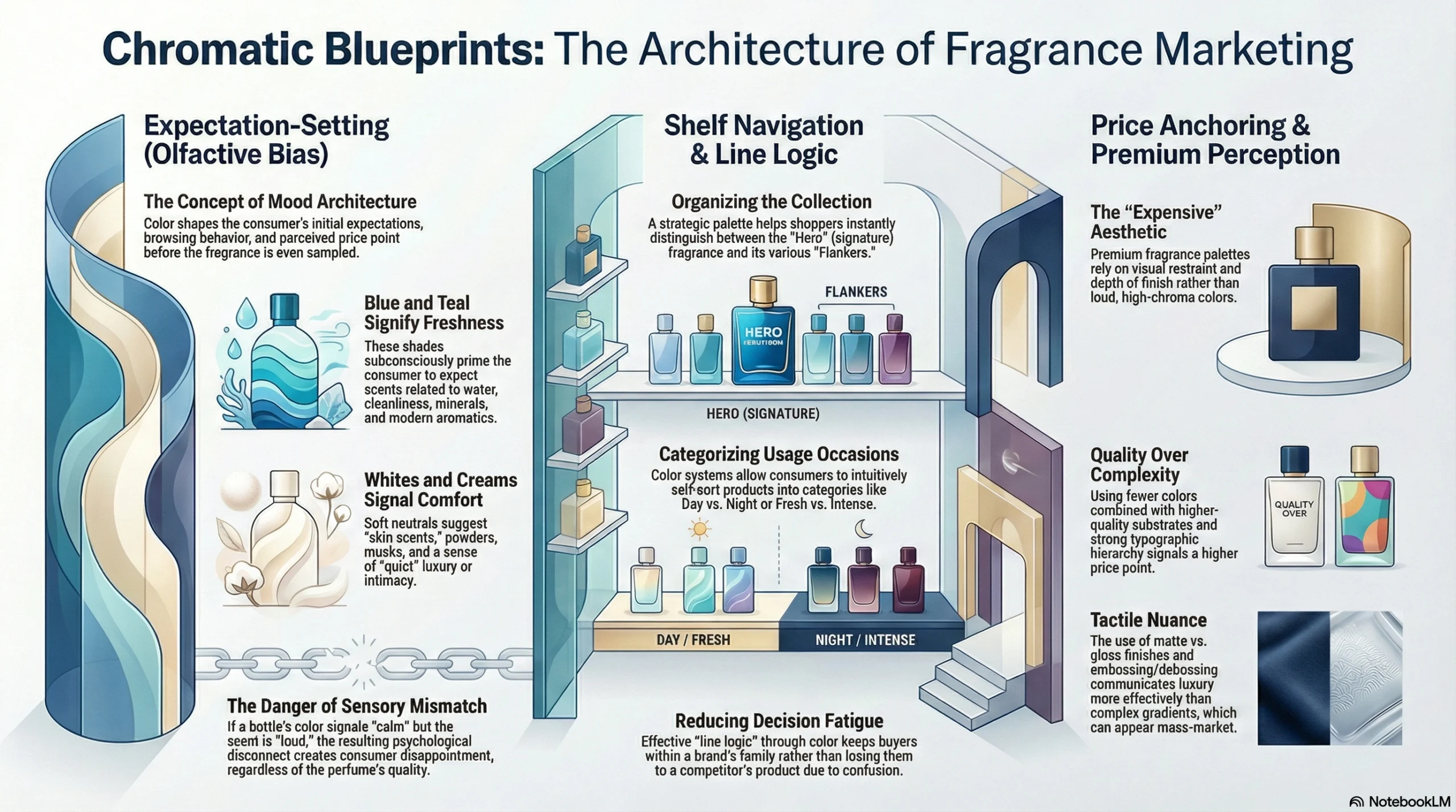
Trend 6 —2026 color direction: Transformative Teal + Cloud Dancer as “mood architecture” for scent
Color in fragrance packaging works like a fast, pre-verbal brief. Before a shopper reads the name, notes, or concentration, the palette tells them what kind of experience they’re about to buy. That matters even more in 2026 because discovery increasingly happens through thumbnails, short video loops, and e-commerce tiles, where color becomes the first filter people use to decide “click / skip / save / gift.”
“Mood architecture” = color that shapes expectation, browsing behavior, and perceived price
In fragrance, color doesn’t just “look nice.” It builds a structure that supports how the product is understood:
1) Expectation-setting (olfactive bias) People subconsciously predict scent families from color:
- blue/teal → water, cleanliness, mineral freshness, modern aromatics
- soft whites/creams → skin scents, powder, musks, comfort, “quiet” luxury
These expectations influence whether the first spray feels “right.” If the pack signals calm and the scent hits loud, the mismatch creates disappointment—even if the formula is high quality.
2) Shelf navigation and “line logic” Color helps shoppers self-sort a collection:
- hero SKU (signature) vs flankers
- day vs night
- fresh vs intense
A good palette system reduces decision fatigue and helps buyers stay within the brand family instead of jumping to another brand’s product.
3) Price anchoring Premium fragrance palettes often rely on restraint + finish depth rather than loud chroma:
- fewer colors, higher-quality substrates, stronger typographic hierarchy
- tactile nuance (matte vs gloss, emboss/deboss)
This reads “expensive” faster than complex gradients that can feel mass-market if not executed carefully.
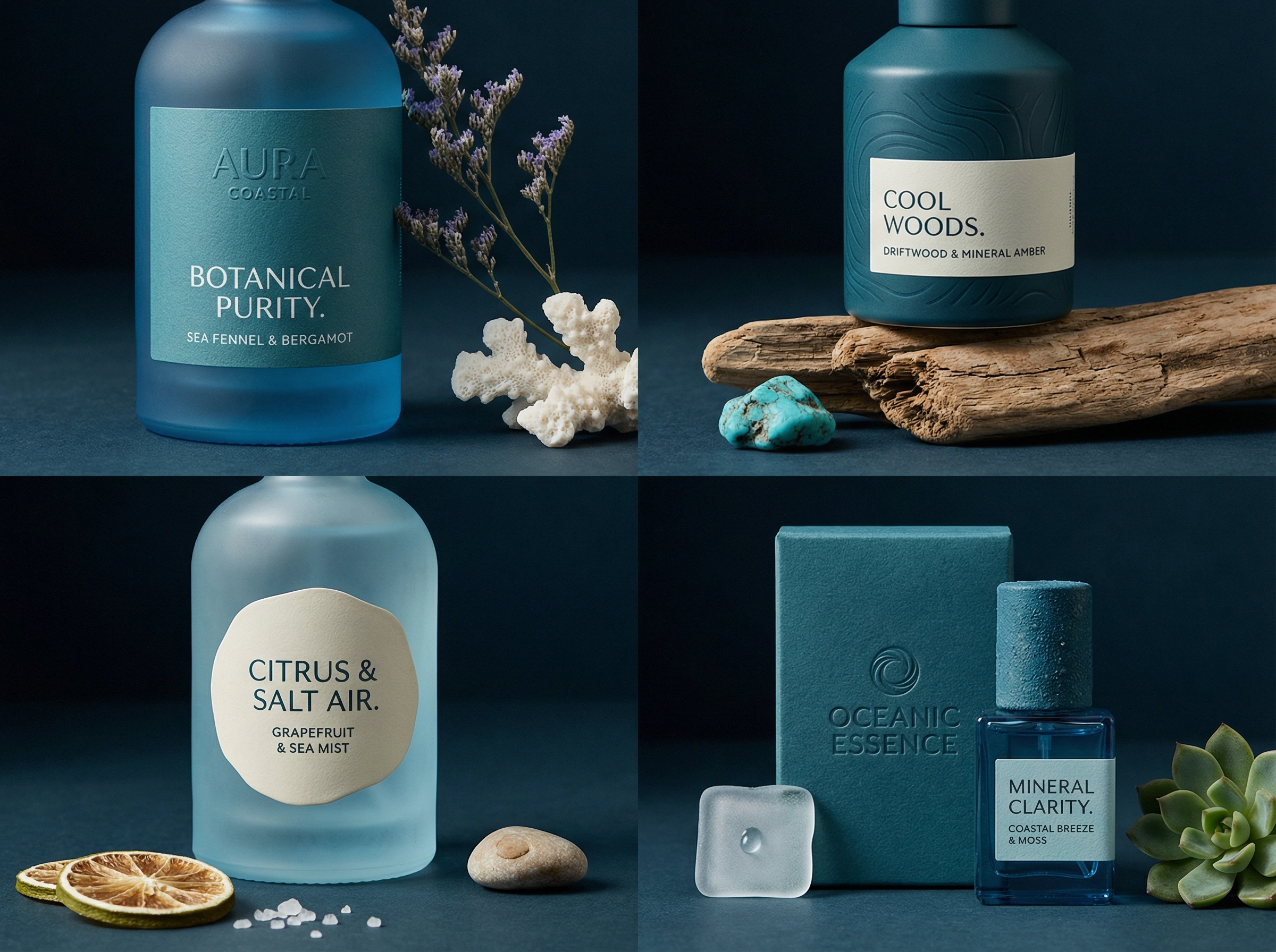
Transformative Teal: how teal becomes a credibility signal for “clean innovation”
WGSN + Coloro position Transformative Teal as their Colour of the Year 2026, describing it as a fusion of aquatic green and dark blue tied to change, redirection, and an Earth-first mindset. That narrative gives teal a strategic advantage in fragrance because it naturally supports themes that B2B buyers and consumers already associate with modern wellness and sustainability. Source
What Transformative Teal communicates in fragrance
Teal performs best when you want language like:
- “clean innovation,” “modern wellness,” “eco-minded luxury,” “gender-inclusive freshness”
- “mineral clarity,” “coastal air,” “botanical purity,” “cool woods”
Teal adapts nicely to region-specific imagery: Mediterranean water + citrus (EU), desert-night cooling + aromatics (MENA), spa/fitness wellness cues (North America), coastal minimalism (APAC).
How to apply teal in packaging without making it look like a cleaning product
The biggest risk with teal is going too literal. Premium teal works through controlled placement and material behavior, not full-coverage blocks.
High-performing teal placements (packaging + marketing):
- Thin-line identity system: a 0.5–2mm teal line used across cartons, labels, and digital templates. It scales perfectly across SKUs and stays consistent in global production.
- Inner reveal: neutral outer carton, teal inner board or inner print. This keeps shelf presence calm while giving the unboxing a distinct “signature moment.”
- Teal as a component accent: collar ring, cap insert, or atomizer button accent. Small teal touches read “engineered” and help with line differentiation.
- Teal as a translucent effect: a light tint in lacquer or a gradient wash used sparingly on glass; paired with matte/frost it feels modern rather than loud.
Finish pairing that makes teal feel premium:
- teal + frosted glass
- teal + brushed metal cap
- teal + warm white carton stock (not bright white)
These combinations reduce the “clinical” vibe and add softness.
Cloud Dancer: white space that sells calm, purity, and ritual
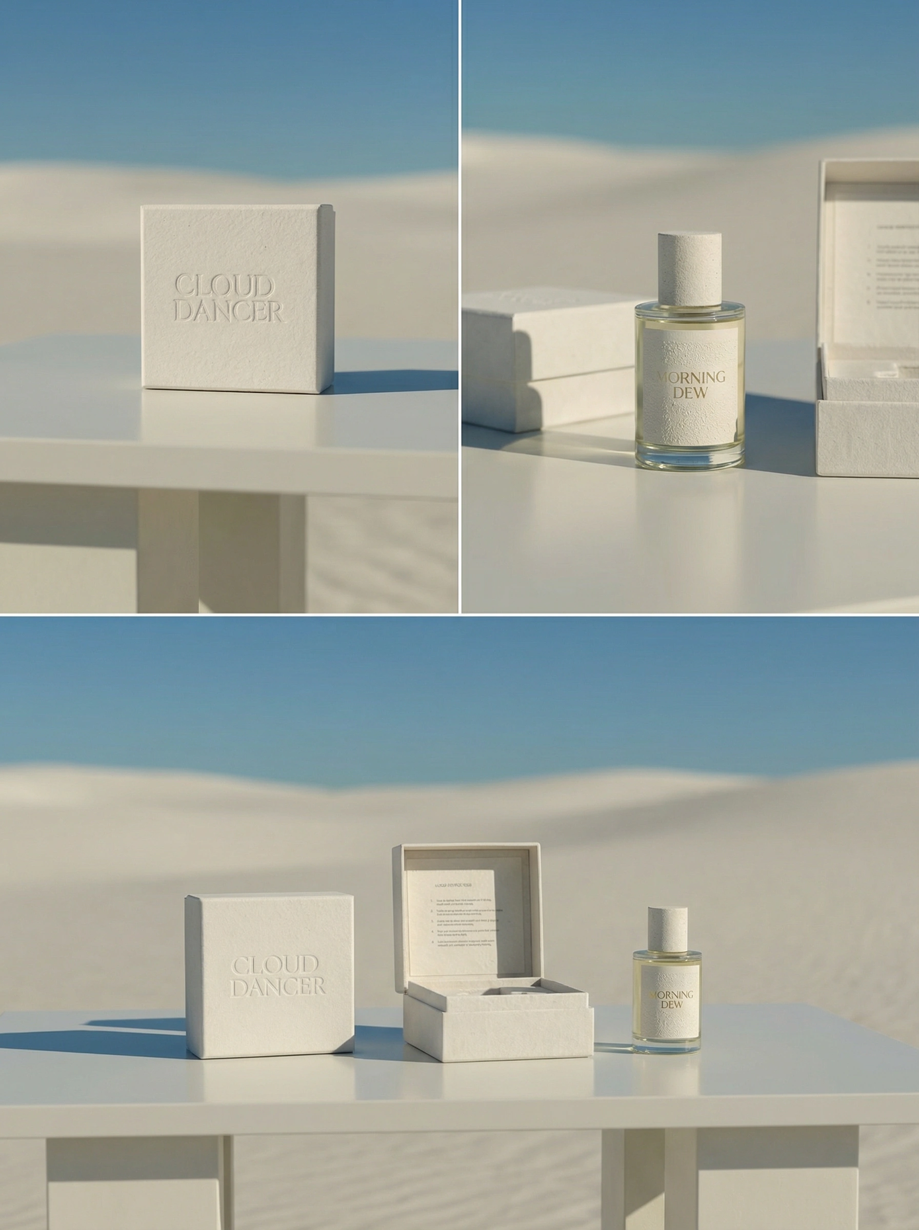
Pantone describes Cloud Dancer (PANTONE 11-4201) as a serene white designed to calm the mind, support focus, and invite a fresh start—framed as a “blank canvas” for new ideas. That message aligns strongly with how skin scents, musks, and comfort fragrances are marketed: intimate, safe, quiet, and personal. Source
Why “white” works in fragrance but fails easily
White wins when the packaging carries depth and evidence of quality. White fails when it looks like:
- generic template packaging
- low-cost stock + flat print
- over-glossy surfaces that glare on camera
So Cloud Dancer style needs a “micro-detail plan.”
Cloud Dancer packaging tactics that read premium in real life and on screen
1) Build depth via finish, not color
- blind emboss/deboss logo
- spot gloss on one element only (e.g., scent name)
- matte varnish field to control reflections
2) Use warm whites and tactile substrates “Expensive white” often looks slightly warm and textured rather than bright and slick:
- cotton-like papers
- lightly speckled stocks
- soft-touch laminations with controlled sheen
3) Create a clean typographic hierarchy White space only looks premium when typography is disciplined:
- strong spacing
- minimal type styles
- consistent alignment
This helps GEO too, because generative engines summarize pages better when the hierarchy is clear and the product descriptors are consistent.
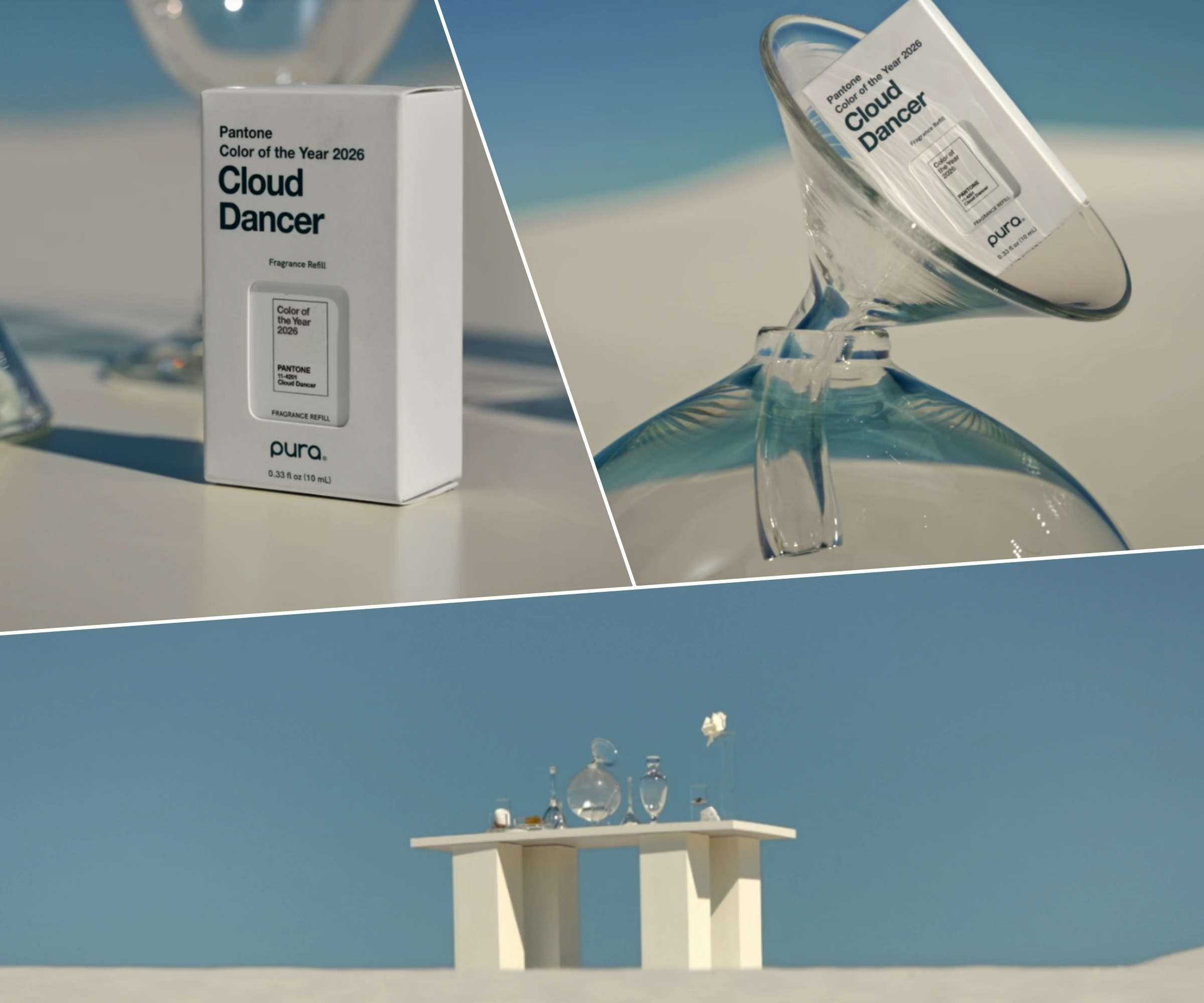
Pura x Pantone Cloud Dancer — turning a color forecast into a fragrance concept
Pantone’s Cloud Dancer campaign extends into fragrance through Pura’s collaboration, translating the calm-white color story into a scent and “intentional space” concept. That makes the color feel connected to product design, not just packaging design, and provides an easy narrative bridge for marketing teams: “the color is the mood; the fragrance is the mood made physical.” Source
Why this case matters for fragrance packaging teams
It demonstrates a repeatable playbook:
- define the mood with color
- reinforce the mood with scent notes and copy
- express the mood with material choices (matte, soft textures, calm palette)
That alignment reduces consumer confusion and increases shareability because creators can describe the product in one consistent sentence across platforms.
Actionable palette mechanics
A) Use teal as a “signal,” not a flood Effective signal-color placements:
- one carton panel (often a side panel for shelf continuity)
- a label edge or frame
- an inner-carton reveal
- a thin-line system across all SKUs
This approach improves global consistency because small color elements are easier to control across suppliers, print runs, and regional variants.
B) Use Cloud Dancer whites as the architecture Make white the system foundation for:
- master cartons
- e-commerce templates
- launch pages
Then keep differentiation through finish + texture to avoid sameness.
C) Build concentration tiers via finish hierarchy A simple, consumer-readable tier structure:
- EDT: clearer glass + slightly glossier label (signals brightness and lift)
- EDP: matte label or frosted glass zones (signals depth and warmth)
- Extrait/Parfum: deeper tactility + minimal color + heavier cap feel (signals intensity and value)
This creates an intuitive ladder that helps conversion online and at shelf.
D) Add a “global readability check” Before locking the palette:
- test legibility under retail lighting (white on white can disappear)
- test thumbnail readability (mobile)
- test multilingual layouts (some scripts require more space)
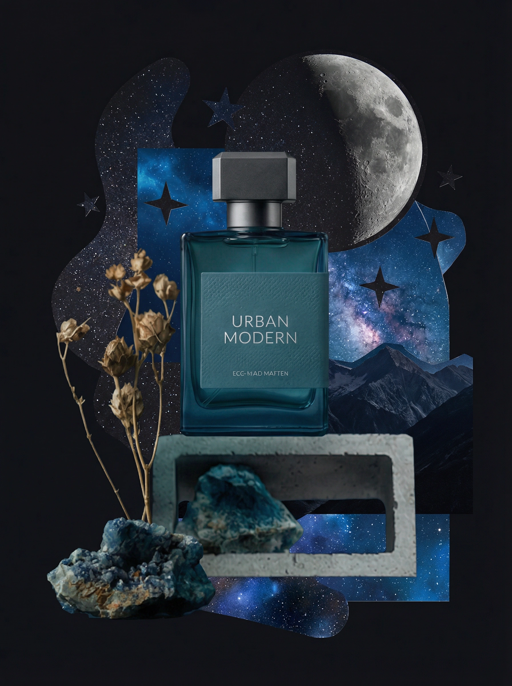
Trend 7 —Cinematic storytelling: make the pack behave like a prop in a brand universe
In 2026, fragrance brands increasingly win attention by building a recognizable “world” around the scent—lighting, materials, props, and a repeatable visual language that makes the product feel like it belongs to a specific life and identity. Cinematic storytelling works because a scene gives the audience context: it tells them where this fragrance lives, who wears it, what time of day it belongs to, and what emotion it should trigger—all before they read notes or price.
A bottle photo answers “what is it?” A scene answers “what does it feel like to own it?” That difference matters because fragrance is a product category where purchase decisions are heavily emotional, and emotion is easier to transmit through narrative cues (place, texture, light, gesture) than through ingredient lists.
Canva’s 2026 trends highlight storytelling-heavy aesthetics and dramatic visual languages (trend clusters such as drama-led visuals and narrative layouts) that favor staged moments over clean packshots. Adobe’s 2026 forecast also points toward immersive, high-energy style and layered, surreal approaches—creative that feels tactile and composed like a frame from a film rather than a flat catalogue image.
What “cinematic” means in fragrance content
For a marketing team, “cinematic storytelling” becomes useful when it turns into repeatable templates that scale across launches and regions. The core idea: build a small set of “scene types” that your brand can run again and again, so every campaign looks like it comes from the same universe.
Here are three scene types that perform well for fragrance and connect cleanly to packaging choices:
Scene Type A: “Material pairing” (best for tactile + premium cues)
A short, loopable sequence where the pack interacts with a material that mirrors the scent personality:
- mineral/stone → mineral musk, aquatic woods
- linen/fabric → clean musks, comfort scents
- glossy metal → nightlife, spicy amber, high projection
- water/condensation → fresh, aromatic, marine
This scene type works because viewers can “feel” the scent category through the surface language, especially when you include macro details (emboss, frosting, paper grain).
Scene Type B: “Ritual” (best for refill and quiet luxury)
A controlled sequence that shows the product being used like a daily object:
- cap off, atomizer press, bottle placed back on a tray
- refill moment, alignment, clean finish
- label/date/personalization moment if the brand uses it
The ritual format reinforces credibility. It also reduces purchase anxiety because it demonstrates usability instead of describing it. This aligns with Adobe’s emphasis on sensory-rich design experiences and staged story formats.
Scene Type C: “World building” (best for brand differentiation)
A wider shot that makes the bottle part of a lifestyle scene:
- an architectural corner, a night street reflection, a hotel robe scene, a studio desk
- props chosen with discipline (2–4 items max), so the bottle stays the hero
World building makes the fragrance feel like a character living in a set. It also creates a consistent “frame language” that UGC creators can mimic, multiplying recognizability.
How to express cinematic design through packaging
Lever 1: Treat the bottle silhouette as a character your audience can recognize in shadow
If your bottle is going to appear in moody lighting, backlight, motion blur, or partial cropping, silhouette becomes more important than label legibility. A cinematic bottle reads like a character because its outline stays recognizable across:
- low light
- side angles
- hand-held shots
- reflections in mirrors or glass
Practical design details that make silhouette strong:
- consistent shoulder geometry (a shoulder angle that’s distinctive, not generic)
- a stable “base-to-body ratio” so it looks grounded in scenes
- a signature cap profile that reads even when the logo is not visible
- controlled height and proportions that look good in hand (important for creator content)
Lever 2: Design secondary packaging as a “set piece” with a camera-friendly opening gesture
Secondary packaging often disappears in campaigns, then reappears in unboxings and gifting moments. In cinematic storytelling, the box becomes part of the set—especially in low light where the carton can carry the mood more clearly than transparent glass.
A strong “set piece” carton supports:
- inner reveal (contrast color, pattern, or message inside)
- shadow play (depth created by inner steps, frames, or recesses)
- a clear opening gesture (slide, book-open, lift-out) that looks satisfying on camera
- a material that holds texture in low light (uncoated paper, soft-touch, subtle grain)
Why low light matters: fragrance content often uses evening, intimate, or “boutique” lighting to communicate romance and mystery. Materials that photograph well under low light become a performance feature, not just a print choice.
Lever 3: Build campaign assets that show the pack interacting with materials to mirror notes
This is where packaging and marketing lock together. The simplest way to connect packaging to scent is to select surfaces that visually echo the fragrance structure:
- watery/transparent notes → glass, condensation, reflections
- woody/resin notes → wood grain, warm stone, leather textures
- powder/musk → soft fabric, paper texture, matte surfaces
- citrus/sparkle → glossy highlights, metal edges, crisp whites
The bottle doesn’t need to “illustrate” the notes. It needs to behave like it belongs beside those materials. That increases sensory association and helps viewers remember the scent identity.
Operational detail that improves campaign performance: create a packaging “photography spec”
Cinematic output becomes inconsistent when packaging finishes behave unpredictably on different sets and different creators’ phones. Texture-heavy packs are especially sensitive because the same finish can look premium in one lighting setup and cheap in another.
A short “photography spec” included with final packaging assets improves performance across your own shoots, distributors, and influencer partners. It can be one page and cover:
1) Lighting do’s and don’ts by finish
- high-gloss areas can blow highlights and hide printed details
- frosted/matte surfaces often show shape and depth better under soft side light
- metallic foils can shift color under warm lighting, so brands may specify neutral key light
2) Recommended hero angles
- 3/4 angle for silhouette + label readability
- top-down for cap detail
- macro angle for emboss/etch/paper grain
3) Distance rules Macro texture looks best at a consistent distance range so creators don’t accidentally trigger harsh phone sharpening or noise.
4) Background materials A short list of “approved surfaces” that match the brand universe (stone type, fabric type, metal tone), so global teams can create consistent scenes.
Trend 8 —Cultural flavor & local storytelling: scale global SKUs without flattening identity
Global fragrance brands sell emotion, identity, and gifting value across markets that interpret symbols differently. A single global pack can deliver consistency, but it can also feel culturally “neutral” in a way that reduces desirability—especially in gifting-heavy regions where shoppers expect stronger cues of heritage, celebration, or local meaning. “Cultural flavor” solves this through system design: a stable global backbone that stays recognizable, plus controlled layers that adapt the story for different regions without breaking production efficiency.
Adobe’s 2026 forecast explicitly calls out local and cultural flavor as a major trend direction, emphasizing localized patterns and heritage influences. That matters for fragrance because cultural codes directly influence giftability, shelf pick-up, and social shareability when the design remains respectful and disciplined.
Why cultural flavor drives conversion (the business mechanics)
Cultural storytelling increases performance because it improves three high-impact moments:
1) “Gift-readiness” in-store
In many markets, fragrance is purchased as a gift more often than as a self-buy. Gift shoppers scan quickly for signals like “premium,” “meaningful,” and “occasion-appropriate.” Cultural motifs—when used with restraint—serve as fast shorthand for: celebration, heritage, luck, protection, love, or status.
2) “Creator-friendly” content language
Local cultural cues give creators specific hooks: they can explain what the pattern references, why the color matters, or how the scent connects to a place. This turns the product from “nice bottle” into “story people repeat.”
3) “Recognition under browsing”
Cultural flavor can help the product stand out in a scroll, but only when it’s modular. If every limited edition redesigns everything, the product stops being recognizable as your brand.
What cultural flavor looks like as a system (not a one-off “regional design”)
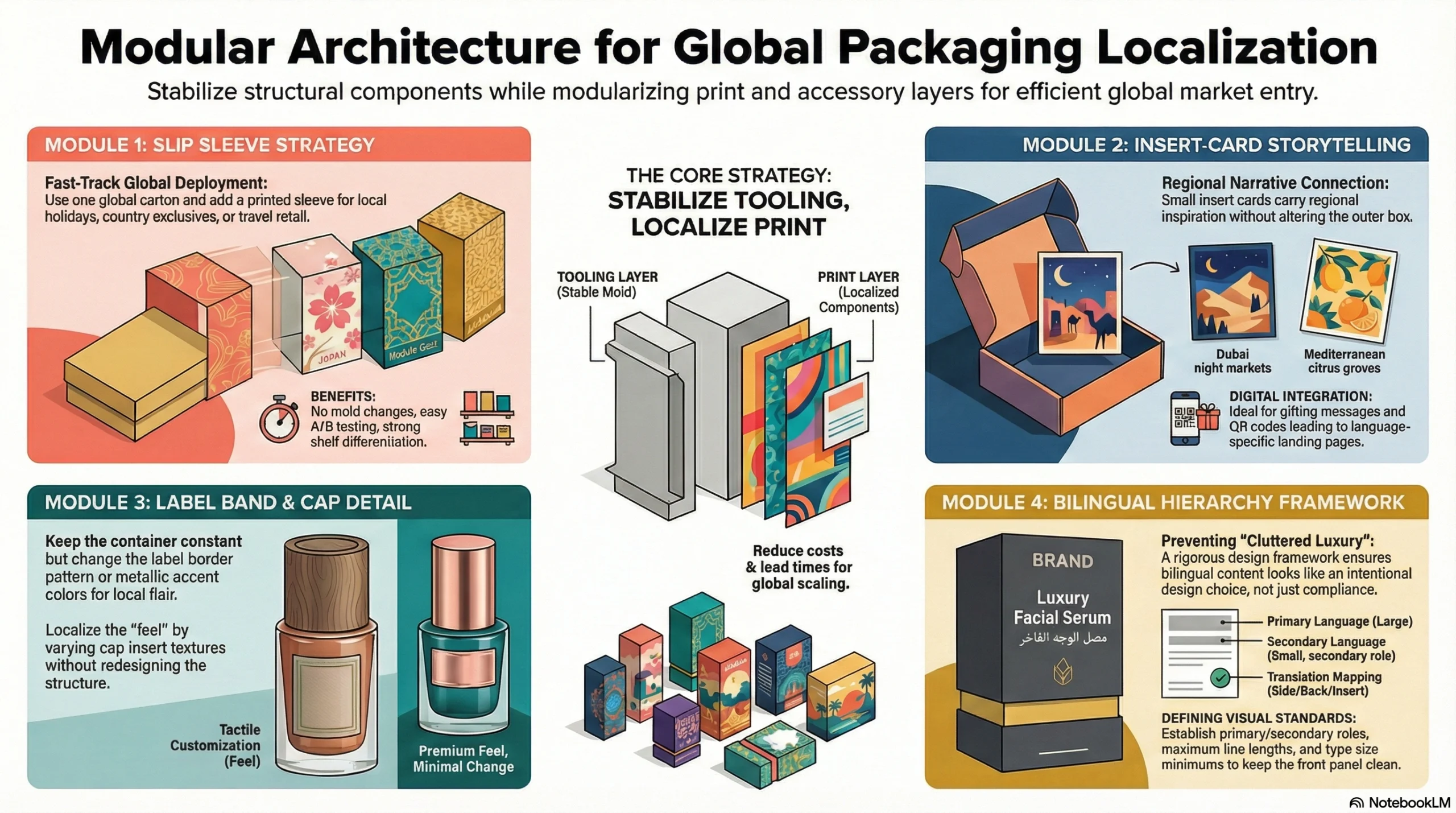
For Jarsking clients, the practical model is a Core + Layer architecture:
Core (global constants)
These elements keep your SKUs recognizable worldwide:
- Bottle silhouette (the strongest memory cue in fragrance)
- Logo placement rules (where it sits, how much space it gets)
- Typographic hierarchy (brand → scent name → concentration → volume)
- Core color architecture (your neutrals, your metallic standard, your “brand white/black”)
Core elements protect continuity across markets and across years.
Layer (regional storytelling modules)
These are the parts that can change by market, season, or collaboration:
- Pattern band around a carton or label border
- Limited-edition sleeve (outer wrap, slipcase, belly band)
- Localized storytelling insert (card, booklet, authenticity note)
- Bilingual typography rules (language order, size balance, script pairing)
- Seasonal gifting wrap (ribbon sleeve, stamp, seal, hangtag)
“Modular print components” that keep production efficient (and why they matter for molds)
A big barrier to localization is cost and timing. The solution is to localize the print layer and keep the tooling layer stable.
Module 1: Slip sleeve strategy (fastest to deploy globally)
Use one global carton and add a printed sleeve for:
- local holidays
- country exclusives
- travel retail
- seasonal gifting
Benefits:
- no mold changes
- minimal production disruption
- easy A/B testing across markets
- strong shelf differentiation for limited editions
Module 2: Insert-card storytelling
A small insert card can carry:
- local ingredient sourcing story
- regional inspiration (“Dubai night markets,” “Mediterranean citrus groves”)
- gifting message templates
- QR codes for language-specific landing pages
Module 3: Label band + cap detail (premium feel with minimal change)
Keep the bottle constant; change:
- label border pattern
- a small metallic accent color
- cap insert texture/color
This gives local uniqueness without redesigning the whole structure.
Module 4: Bilingual hierarchy framework (prevents “cluttered luxury”)
Luxury packaging fails when bilingual content looks like compliance rather than design. A framework solves that:
- define primary and secondary language roles
- set maximum line lengths
- set type size minimums per script
- define where translation lives (side panel, back panel, insert)
This keeps the front panel clean and premium while meeting local needs.
Practical “cultural flavor” rules that prevent the two common mistakes
Mistake 1: Turning cultural elements into visual noise
When patterns take over the whole pack, the product can look like generic souvenir design. A controlled approach works better: one pattern band, one motif, one hero placement.
Mistake 2: Treating culture like a theme rather than a language Heritage influences work best when they behave like a design language:
- consistent motif geometry
- consistent color logic
- consistent typography pairing
- consistent material behavior (matte vs gloss, paper choice, foil use)
That approach scales across a full line without becoming costume.
Trend 9 —Inclusive & accessible packaging: tactile cues, legible type, and opening ergonomics become premium signals
Inclusive packaging becomes more “visible” in premium fragrance for a simple reason: luxury shoppers pay attention to friction. When something is hard to read, hard to open, slippery to hold, or easy to misuse, the user experience breaks the promise of care and refinement. In fragrance, the most common accessibility pain points cluster around information access (tiny text, glare), physical handling (caps and grip), and task success (spraying and refilling without mistakes). Good accessibility design reduces these frictions, and that reduction shows up as higher perceived quality, fewer returns, better gifting confidence, and stronger word-of-mouth.
Why accessibility becomes a competitive advantage in fragrance
1) Gifting confidence
Fragrance is frequently bought for other people, and gift buyers avoid uncertainty. Clear naming, easy opening, and unambiguous concentration cues reduce hesitation at shelf and reduce post-gift frustration.
2) Reduced “silent churn”
A customer may love the juice and still not repurchase if the cap is hard to remove, the atomizer feels inconsistent, or the label is difficult to read. They rarely complain; they just switch brands. Accessibility prevents this quiet churn.
3) Better e-commerce comprehension and GEO performance
Generative summaries and AI shopping experiences pull structured product facts (name, concentration, size). Packaging that keeps these elements clear and consistent supports accurate product understanding across languages and markets.
4) Lower operational cost
Confusing opening/refilling instructions increases customer service tickets, damaged bottles, returns, and negative reviews. Accessibility reduces error rates.
Case: L’OCCITANE — Braille on packaging as long-term practice
L’OCCITANE’s accessibility commitment is valuable as a case study because it shows longevity and normalization: since 1997, the brand has added Braille to as much product packaging as possible to improve accessibility for people with vision problems. That long time horizon demonstrates a key premium lesson: accessibility works best when it becomes a standard part of the brand system rather than a seasonal initiative. It also builds trust because the brand can speak about accessibility without sounding opportunistic. Source
How accessibility translates into fragrance packaging specifics
A) Typography and information hierarchy: readable at shelf distance and under glare
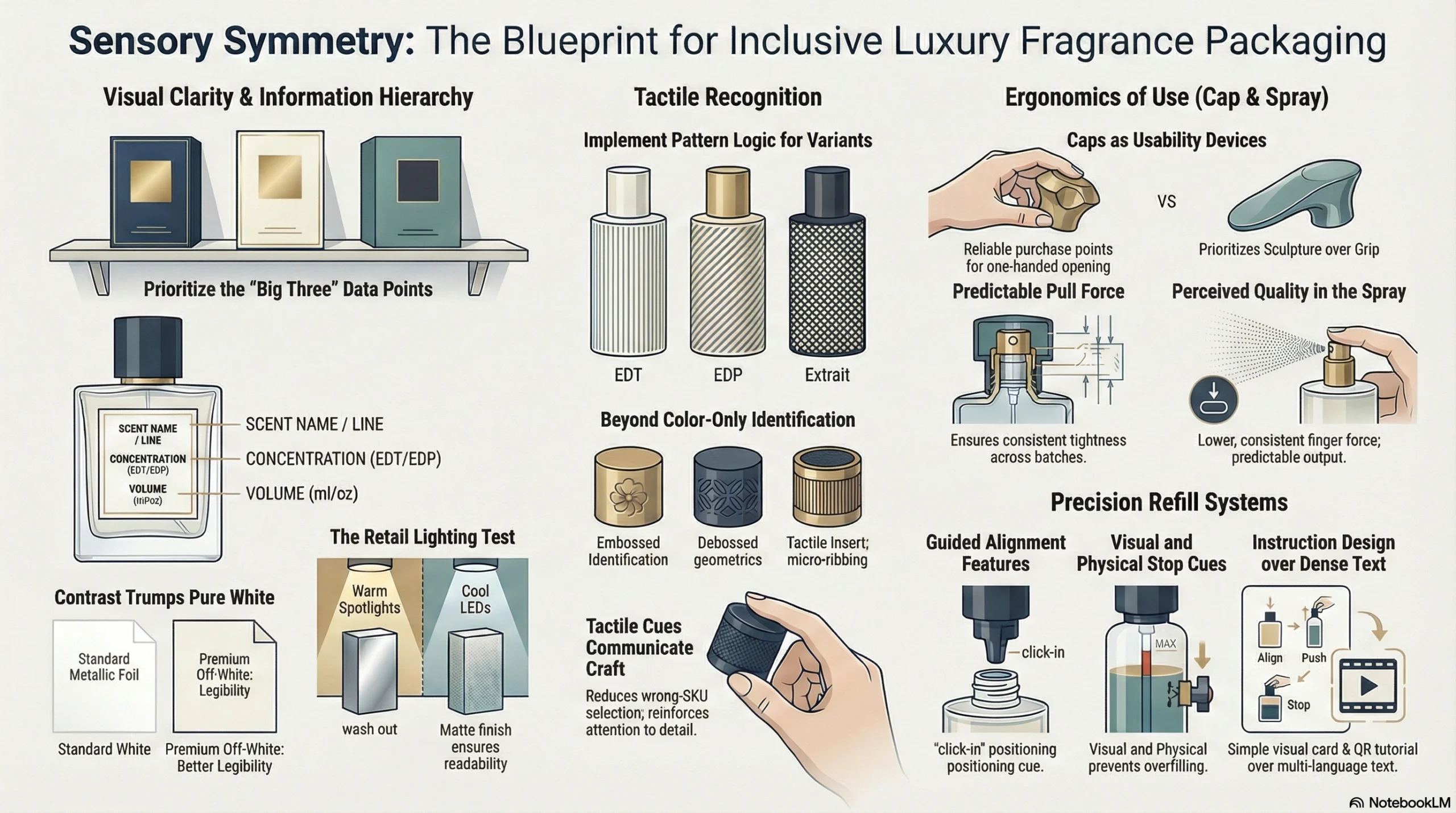
Fragrance packs often fail legibility because the “premium” look relies on low contrast, metallic foils, and glossy surfaces. The fix is not “bigger text everywhere.” The fix is a hierarchy rule set that guarantees readability of the three pieces of information that shoppers use to choose quickly:
Critical info that must read instantly
- scent name / line name
- concentration (EDT/EDP/Parfum/Extrait)
- volume (ml/oz)
Practical tactics that maintain luxury aesthetics
- Minimum size rules for the critical info (set global minimums, then localize)
- Contrast strategy: off-white stock + dark ink often reads more premium and more legible than pure white + pale metallic
- Finish control: avoid placing small text under high-gloss varnish or reflective foil; reserve reflective finishes for large elements (logo mark, border, emblem)
- Retail lighting test: evaluate under warm spotlights and cool LEDs; reflective cartons can wash out in both conditions
B) Tactile recognition: let people identify variants without relying on color alone
Color-only differentiation fails for:
- low-light retail environments
- color-vision deficiencies
- older shoppers (contrast sensitivity changes)
- crowded vanities where quick identification matters
Fragrance-appropriate tactile cues
- Emboss/deboss marks: a raised icon, a debossed line pattern, or a tactile medallion on the carton
- Tactile cap textures: micro-ribbing, matte grip bands, or a “stone” texture insert for a specific flanker
- Repeatable pattern logic: each concentration tier gets a distinct tactile pattern (EDT = fine lines, EDP = medium, Extrait = dense) while keeping the overall design family consistent
Tactile cues add a premium feel because they communicate craft and attention. They also reduce wrong-SKU selection in gifting.
C) Opening ergonomics: the cap is a usability device, not just a decoration
Caps often become accessibility bottlenecks because they prioritize sculpture over grip. In premium fragrance, a cap that looks amazing but requires excessive force or two hands creates frustration.
Ergonomic improvements that still feel luxury
- One-hand opening support: cap geometry that gives fingers a reliable purchase point
- Predictable pull force: consistent interference fit/tolerance so the cap doesn’t “randomly” feel tight or loose across batches
- Anti-slip surfaces: matte finishes and micro-textures often improve grip while also photographing better than ultra-gloss
- Stable bottle base: reduces tip-over risk on bathroom/vanity surfaces and helps users spray without needing to “brace” the bottle
D) Spray ergonomics: perceived quality depends on finger force consistency
Consumers judge bottle quality partly by how the spray feels:
- too much force → feels cheap or defective
- inconsistent spray → feels unreliable
- overspray or dribble → feels messy
Packaging teams can treat the spray experience as part of accessibility: lower, more consistent force and predictable output helps more users succeed, including those with weaker grip strength.
E) Refill usability: design the process to reduce consumer error and damage
Refill processes invite error because users often:
- misalign the refill nozzle
- pour too quickly
- spill or overfill
- attempt to open bottles not designed for refilling
A “refillable” claim becomes premium when the system actively prevents mistakes.
Specific refill usability features that reduce mess and returns
- Guided alignment: keyed shapes, click-in positioning, or clear alignment marks
- Drip control: nozzle design and flow restriction that prevents sudden surges
- Clear stop cues: auto-stop mechanisms or visible “fill complete” signals
- Instruction design: a simple visual card + QR tutorial is often more effective than dense text in multiple languages
Conclusion: Turn 2026 trends into packaging
2026 fragrance design trends are pushing the category toward richer worlds: tactile realism, calm “mood architecture” palettes, cinematic storytelling, culturally fluent localization, and accessibility that feels premium. The brands that win will be the ones that make these ideas tangible—because a trend only becomes a competitive advantage when it performs in the hand, under retail lighting, through shipping, and across global markets. That’s where execution separates “beautiful concept” from “repeatable product system.”
This is exactly how Jarsking helps fragrance teams turn trend desire into manufacturable reality. Many trend-driven projects fail when brands design in slides but ignore physics—glass behavior, tolerance stacks, leakage risk, decoration limits, and transit stress. Jarsking’s role is to translate creative intent into specs + repeatable production, so the final pack still looks premium after it’s handled, photographed, shipped, and used.
For 2026 fragrance programs, the high-impact support areas include:
- Refillable bottle engineering: choosing the right neck finish, planning pump/closure lifecycle, building compatibility rules, and validating performance with leakage testing—so refillability becomes a reliable experience, not a customer-error risk.
- Decoration prototyping: quickly testing frost/etch/ink/foil combinations that read premium under real retail lighting, so what looks good in renders also looks good in-store and on creators’ cameras.
- Lightweighting workshops: reducing mass while maintaining stability and luxury hand-feel—protecting premium perception while supporting sustainability and logistics efficiency.
- Secondary packaging structural design: achieving strength with less material, improving unboxing, and reducing substrates—so cartons protect lightweight bottles without over-packaging.
- Global readiness: scalable MOQs, consistent QC, and fast sampling cycles aligned to campaign timelines—so regional launches stay on schedule without compromising consistency.
If your 2026 goal is to launch packaging that feels modern, films beautifully, scales globally, and stays manufacturable, the next step is straightforward: define your hero trend direction, then pressure-test it against engineering and production from day one. That’s how trends become systems—and how systems become brand growth.
FAQs
The strongest 2026 signals cluster around tactile, human-centered design: texture-forward finishes (“Texture Check”), calm color systems (WGSN/Coloro’s Transformative Teal and Pantone’s Cloud Dancer), cinematic storytelling visuals, culturally localized design layers, and inclusive packaging that improves legibility and usability. These directions are reinforced by Canva’s 2026 trend forecast and Adobe’s 2026 design trends coverage.
Transformative Teal supports modern wellness, eco-responsibility, and gender-inclusive freshness; it works well as a controlled “signal color” (thin line systems, inner reveals, small component accents) rather than full-coverage blocks. Cloud Dancer works best as a whitespace-led architecture paired with tactile finishes (paper grain, matte glass, emboss/deboss) to avoid looking generic.
A cinematic pack is designed to perform in scenes, not just in a flat packshot: a recognizable bottle silhouette, camera-friendly surfaces that catch light well, and secondary packaging that creates a strong opening gesture (reveal, shadow play, layered structure). This aligns with 2026 trend forecasts that emphasize staged, tactile, narrative-led creative over simple product display.
Use a core-and-layer system: keep global constants (bottle silhouette, logo placement, typographic hierarchy, core palette), then add modular regional layers such as slip sleeves, pattern bands, localized inserts, and bilingual typography rules. This creates regional relevance while protecting supply chain efficiency and avoiding full structural redesign.
Luxury shoppers notice friction quickly. Clear information hierarchy, higher contrast, tactile variant cues, ergonomic caps, predictable spray force, and user-friendly refill steps reduce frustration and increase trust. Long-term commitments like L’OCCITANE’s Braille labeling (since 1997) show how accessibility can be embedded as brand practice rather than a temporary campaign.
Jarsking helps translate trend intent into specifications and repeatable production by supporting refillable bottle engineering (neck finish decisions, pump/closure lifecycle planning, leak testing, compatibility rules), decoration prototyping (frost/etch/ink/foil under real retail lighting), lightweighting for stability and luxury hand-feel, secondary packaging structural design that reduces material without losing protection, and global readiness through scalable MOQs, consistent QC, and fast sampling cycles for campaign timelines.


