


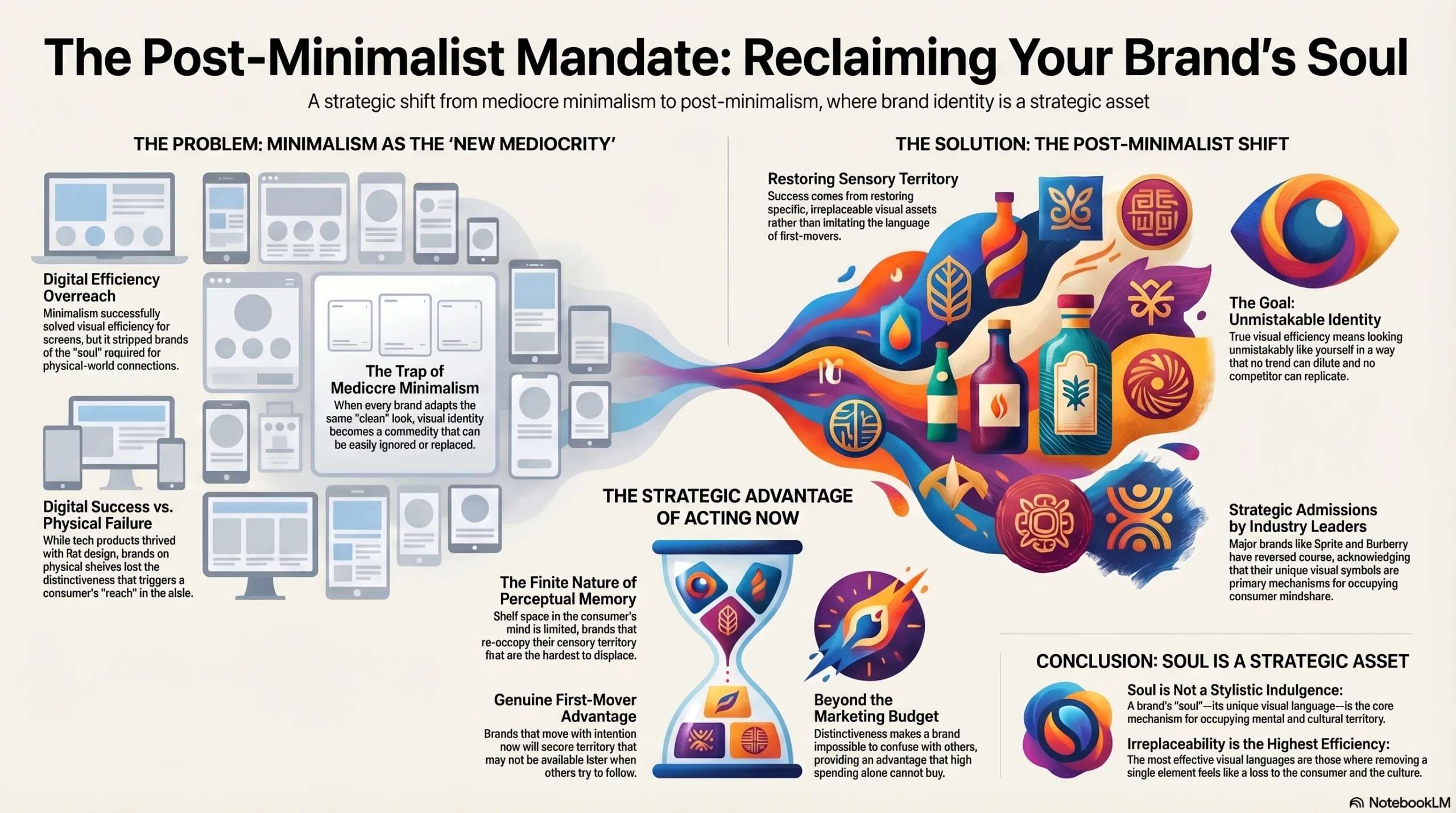
For ten years, “clean” was the highest compliment a brand could receive. Then Sprite put a lemon back on its can — and the design world exhaled.
We are living through one of the most significant reversals in modern commercial design history. The post-minimalism packaging era is not a rumor circulating in design studios — it is a strategic reality being confirmed by some of the world’s most valuable consumer brands. Sprite. Burberry. A quiet but accelerating wave of CPG and luxury companies that are publicly, deliberately, and expensively undoing redesigns they completed just years ago.
For a decade, the mandate was ruthless simplicity. Flatten the logo. Delete the mascot. Replace the illustration with a geometric shape. Strip the serif. The goal was efficiency — a visual language optimized for the three-inch screen and the two-second scroll. The result, for many brands, was something nobody planned for: invisibility.
Because there is a place where your packaging does not live on a Retina display. It lives on a shelf. Under fluorescent lights. Surrounded by thirty competitors. Glimpsed in under half a second by a shopper in motion who is thinking about what to cook for dinner. And in that environment, “clean” does not cut through. Soul does.
This post unpacks exactly why minimalism failed physical packaging, how the world’s most strategically sophisticated brands are course-correcting right now, and what concrete steps you can take to build packaging that doesn’t just look modern — it cuts through, lodges in memory, and becomes impossible to replace.
A Decade of Minimalism — How We Got Here
Where It Started: The Tech Contagion
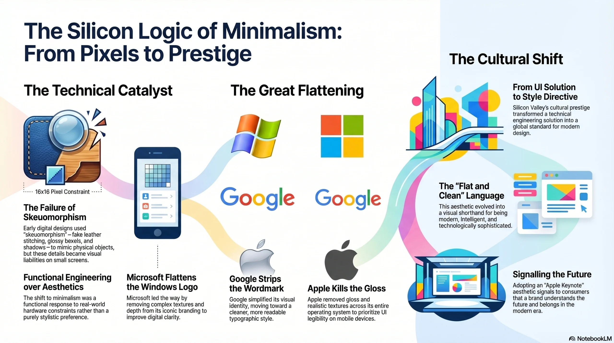
Minimalism did not originate in packaging design. It began with a genuinely practical engineering problem: user interface design in the early 2010s.
Tech giants needed icons that could render legibly at 16×16 pixels on the first generation of high-density mobile screens. Skeuomorphic textures — the fake leather stitching, the glossy bevels, the drop shadows that made digital buttons look like physical objects — became visual liabilities at small sizes. Microsoft flattened its iconic Windows logo. Google stripped its wordmark. Apple killed gloss across its entire operating system. This was not purely aesthetic preference. It was functional engineering in response to a real constraint.
But Silicon Valley carried enormous cultural prestige in that period, and the aesthetic consequence of a technical decision became a global style directive. “Flat and clean” stopped being a UI engineering solution and became the visual language of being modern, intelligent, and forward-thinking. If your brand looked like it belonged in an Apple keynote, it signalled that you understood the future.
The Contagion Spreads to Physical Brands
Luxury fashion moved first, and it moved fast. Within a five-year window, Burberry, Saint Laurent, Balmain, and Celine all adopted stripped-back, geometric sans-serif logotypes — erasing decades of typographic personality in a single redesign cycle. FMCG followed without much resistance. Cereal boxes, skincare, beverage cans, household cleaning products — entire shelf categories began converging on the same aesthetic vocabulary: maximum white space, muted palettes, flat geometric shapes, and weightless sans-serif type.
The implicit logic was seductive: if it looks like an Apple product, it signals premium modernity. The explicit brief, in boardroom after boardroom, was a single word: efficiency. Efficiency for digital production. Efficiency for global scaling. Efficiency for multi-format adaptation across every touchpoint from app icon to billboard.
The Hidden Cost Nobody Measured
What brand teams were not measuring — because it was not in the redesign brief — was narrative capital. This is the accumulated visual equity stored in mascots, illustrations, heritage crests, and ornate symbolic systems that brands had built, in some cases, over a century.
These visual elements were not decoration. They were memory architecture — physiological cues that told consumers what to feel, what to taste, and what to trust before they processed a single word of copy. Stripping them away in the name of efficiency was the visual equivalent of gutting a building’s interior to make the floor plan more flexible, then discovering that what made people want to be in the building was precisely the richness you removed.
The deepest irony of the minimalism era: in racing toward a shared definition of “modern,” an entire generation of brands accidentally became anonymous. When everyone whispers, nobody is heard.
The Shelf Is Not a Screen — The Physics of Packaging Perception
How Shoppers Actually Experience Packaging
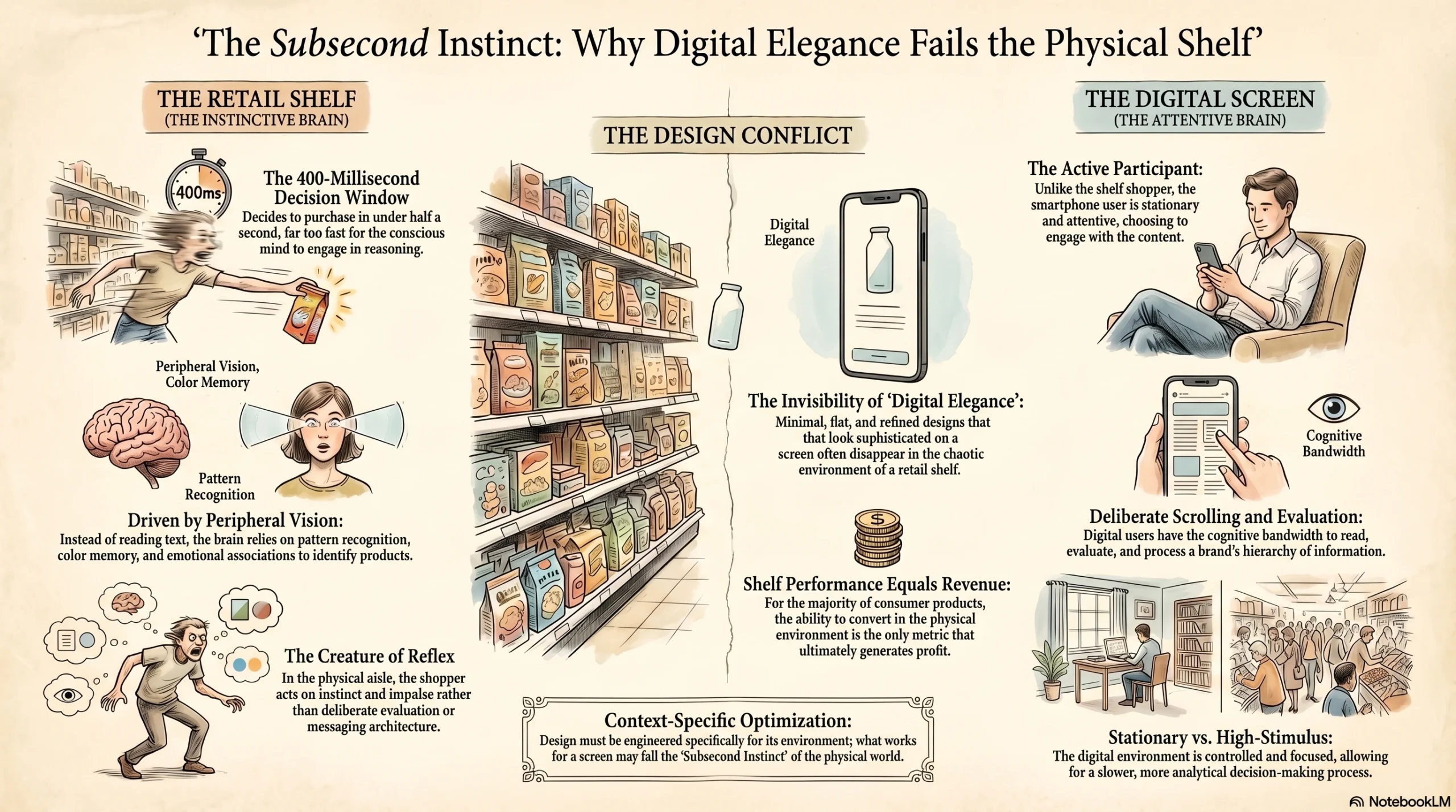
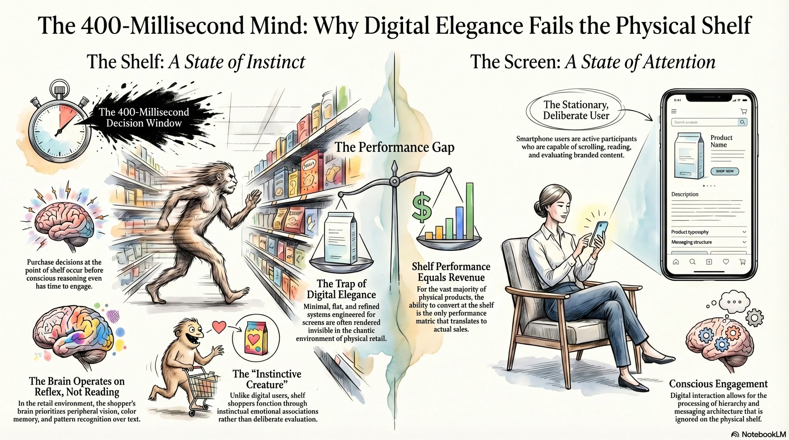
The average grocery shopper makes a purchase decision in under 400 milliseconds at the point of shelf — before conscious reasoning has time to engage. In that window, the brain is not reading. It is not processing hierarchy or evaluating messaging architecture. It is operating on peripheral vision, pattern recognition, color memory, and emotional association.
This is a profoundly different cognitive state from how people interact with branded content on a phone screen, where they are stationary, attentive, deliberately scrolling, and capable of reading and evaluating. The smartphone user is an active participant. The shelf shopper is a creature of instinct and reflex.
Design optimized for one context is not automatically optimized for the other. A packaging system that has been engineered for digital elegance — minimal, flat, refined — may be entirely invisible in the chaotic, high-stimulus, sub-second environment of physical retail. And for the vast majority of physical consumer products, shelf performance is the only performance that ultimately converts to revenue.
The Physiology of Sensory Triggers
Neuroscience has established with considerable consistency that certain visual elements activate sensory-specific memory — meaning they do not merely remind you of a product intellectually, they actually simulate the sensory experience of using or consuming it.
A cross-sectioned lemon illustration activates the salivary glands and the taste cortex. It fires associations of acidity, freshness, and citrus flavor before a single conscious thought has formed. A flat green circle does not. It is visually processed as an abstract geometric shape — noted and moved past.
A hand-engraved crest or intricate illustrated border signals craftsmanship in a way that a clean vector mark cannot, because the human brain interprets complexity of linework as evidence of skill, time, and attention. Subconsciously, it communicates that someone cared enough to invest in this. A flat shape communicates the opposite: that the fastest, most economical visual solution was chosen.
This is not a metaphor or a matter of aesthetic taste. It is biology. And it has enormous, underappreciated implications for how packaging should be designed for the physical world.
The Sprite Experiment: A Billion-Dollar Sensory Mistake, Corrected
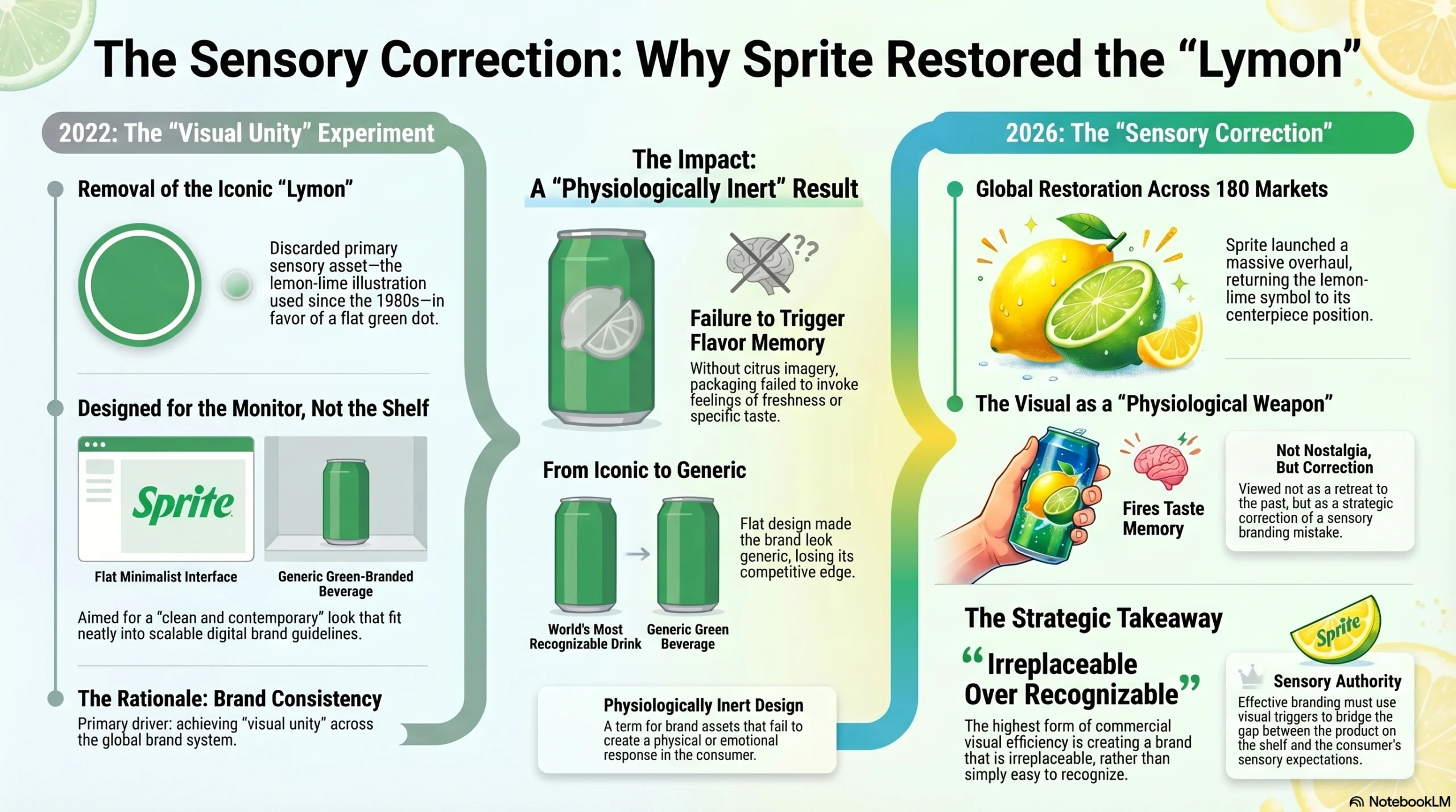
In 2022, Sprite removed its iconic yellow lemon-lime “Lymon” illustration — the brand’s primary sensory asset since the 1980s — and replaced it with a flat green dot. The rationale was “visual unity” across the brand system.
On a designer’s monitor, the result was clean, contemporary, and consistent. The green dot fit neatly into a scalable design system. It looked excellent in brand guidelines presentations.
On shelf, it was physiologically inert. The green dot could not trigger flavor memory. It could not invoke freshness or citrus. It could not differentiate Sprite from any other green-branded beverage in the same aisle. It made Sprite, one of the world’s most recognizable soft drink brands, look like a generic product.
In March 2026, Sprite launched a major global rebrand across 180 markets — restoring the lemon-lime symbol as the centerpiece of a complete visual and cultural overhaul. The design industry’s response was swift and unified: this was not a retreat into nostalgia. It was a sensory correction — the explicit acknowledgment that the lemon was never decoration. It was the brand’s primary physiological weapon: a visual trigger that could fire the consumer’s taste memory and create desire for the product before a word was read or a price was checked.
The lesson is not subtle: the highest form of commercial visual efficiency is not being easy to recognize. It is being irreplaceable.
When Prestige Brands Lead the Way — The Burberry Reversal
The Rebrand That Divided the Industry
When Burberry adopted a minimal sans-serif logotype and quietly retired its equestrian knight emblem in 2018, the design press largely applauded. It was bold. It was contemporary. It had the kind of confident restraint associated with the best modern fashion branding.
But in the years that followed, a persistent unease settled in — not just among design critics, but among consumers and, critically, within the brand itself. Without the knight, Burberry looked like any number of contemporary fashion labels operating in the same minimalist register. The visual language that had encoded 120 years of British heritage — the craftsmanship, the military provenance, the unmistakable sense of a brand with deep roots and a genuine story — had been reduced to a typeface.
A typeface that, however elegant, could belong to almost anyone.
The Return of the Equestrian Knight
When a new creative director came on board, restoring the 1901 equestrian knight crest was among the first creative decisions made. The knight — a rider on horseback that had first appeared on Burberry’s products over a century earlier — returned not as a concession to sentimentality, but as a deliberate strategic act.
The public and critical response was remarkable in its emotional register. Consumers who had grown up with the brand described a genuine sense of relief. Design journalists used language that went beyond aesthetic evaluation: “Finally, Burberry looks like an English brand with a history, not a Silicon Valley company.” The accompanying typographic choice reinforced the move intelligently — a slightly elongated, gently rounded serif that balanced classical authority with contemporary refinement, avoiding the trap of pure archivism.
This is post-minimalism executed with precision: not a wholesale rejection of what the minimalism era taught about system and scale, but a surgical restoration of the irreplaceable — the visual assets that encode brand soul and cannot be substituted without loss.
What Burberry Proved for Every Category
The Burberry story matters beyond luxury fashion because it demonstrates something universal: if a brand with that level of cultural weight, heritage depth, and design sophistication could become visually indistinguishable from its contemporaries, then any brand in any category can make the same mistake.
The corrective principle Burberry’s story offers is equally universal: ask not “is this clean?” but “is this ours alone?”
The Post-Minimalism Design Philosophy — What It Actually Means
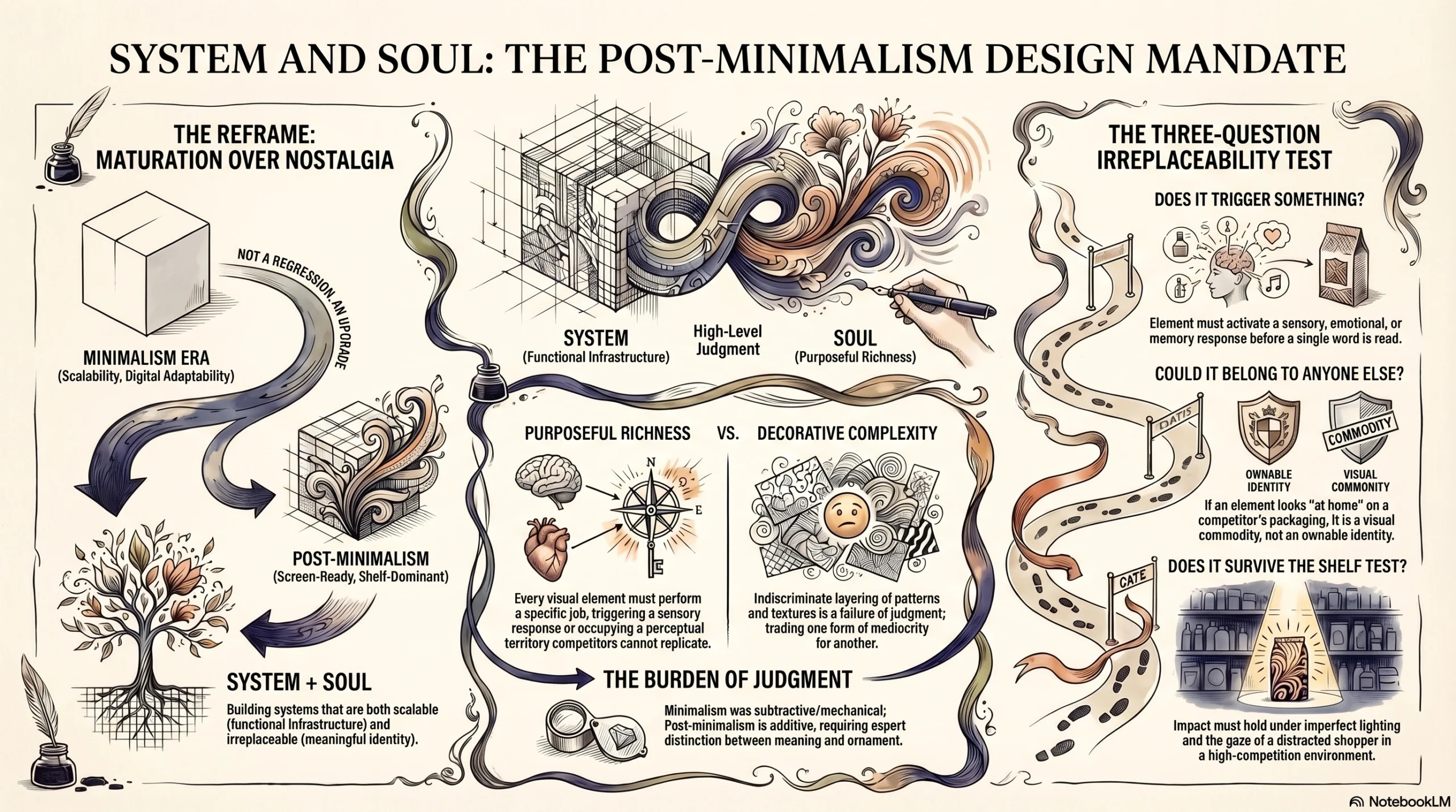
This Is Not Nostalgia. It's an Upgrade.
The most important reframe for any brand manager or creative director approaching this shift: post-minimalism packaging is not a pendulum swinging backward. It is a maturation.
The minimalism era was not a mistake to be undone — it was a necessary phase that taught the industry real and lasting lessons about digital adaptability, system thinking, and scalability across an increasingly fragmented media landscape. Those lessons are worth keeping.
What post-minimalism adds to those lessons is meaning — the understanding that a design system without soul is infrastructure without a reason to exist. The new mandate is not “choose between system and soul.” It is: build systems that are scalable AND irreplaceable. Screen-ready AND shelf-dominant.
Purposeful Richness vs. Decorative Complexity
A critical distinction must be made here, because it determines whether a brand’s post-minimalism evolution succeeds or merely trades one form of mediocrity for another.
Post-minimalism does not mean maximalism. It does not mean adding back everything that was removed. The worst possible response to the failures of minimalism is the indiscriminate layering of visual complexity — pattern over pattern, illustration over typography over texture — in the hope that more will feel like meaningful.
The governing principle of post-minimalism is purposeful richness. Every additional visual element must earn its place by performing a specific, identifiable job: triggering a sensory or emotional response, communicating a distinct brand value, or occupying a perceptual territory that competitors cannot replicate. If an element cannot justify its presence in functional terms, it does not belong — regardless of how beautiful it might be in isolation.
This is, frankly, harder than minimalism. Minimalism is a subtractive practice — you keep removing until something breaks, then stop just before. Purposeful richness requires judgment: the ability to distinguish between what is meaningful and what is merely ornamental. That judgment is where genuine design expertise lives.
The Three-Question Irreplaceability Test
Before investing in any new visual direction for your packaging, apply this framework to every element under consideration:
Does it trigger something? Does this visual element activate a sensory, emotional, or memory response in your target consumer — before they read a word?
Could it belong to anyone else? If this element appeared on a competitor’s packaging tomorrow, would it feel wrong — or would it feel perfectly at home? If the latter, it is not ownable.
Does it survive the shelf test? Does this element hold its full meaning and impact when surrounded by competing products, viewed in motion, under imperfect retail lighting, by a shopper who is half-paying attention?
Elements that pass all three questions are worth investing in, protecting legally, and building your system around. Elements that fail are visual commodities — they contribute to tidiness but not to identity.
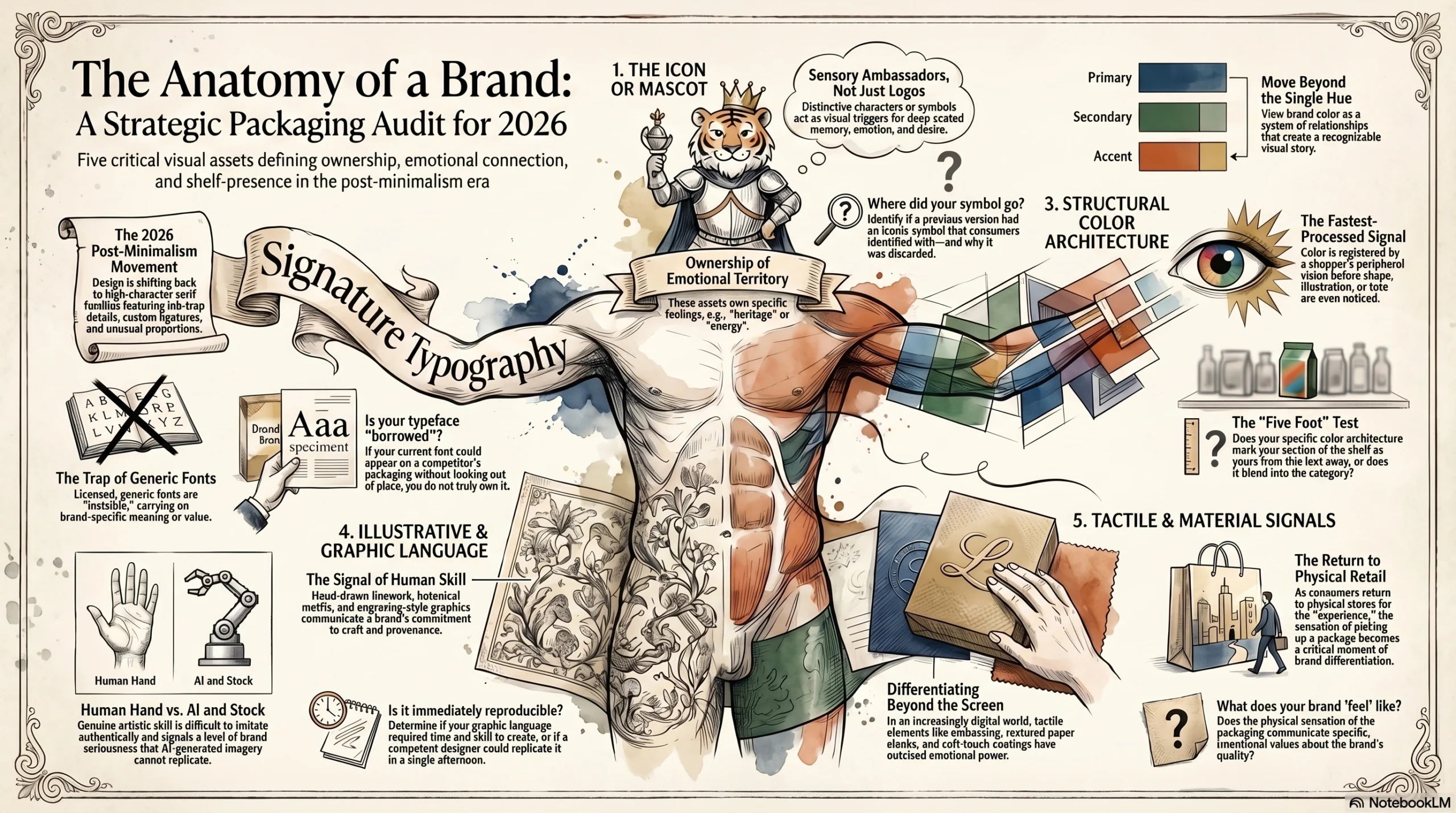
The 5 Visual Assets Worth Auditing on Your Packaging Right Now
Before you can rebuild, you need to know what you are working with — and what you may have already inadvertently discarded.
1. The Icon or Mascot
A distinctive character, creature, illustrated symbol, or proprietary mark that owns a specific sensory or emotional territory is among the most powerful assets a consumer brand can hold. The Sprite lemon owns freshness and citrus. Burberry’s equestrian knight owns heritage and craftsmanship. The Michelin Man owns confidence and trust. Tony the Tiger owns energy and morning ritual.
These are not logos. They are sensory ambassadors — visual elements with the capacity to trigger whole constellations of memory, emotion, and desire before the rational mind engages.
Audit question: Did a previous version of your brand carry a symbol, character, or illustration that consumers emotionally identified with? Where did it go — and why?
2. The Signature Typography
A proprietary or highly customized typeface is one of the most consistently undervalued assets in packaging design. Generic licensed fonts are, by definition, invisible — they appear on thousands of products across dozens of categories and carry no brand-specific meaning whatsoever.
The post-minimalism typography movement in 2026 is characterized by a return to serif families with genuine character — slightly unusual proportions, ink-trap details, custom ligatures, or letterforms that feel as though they were drawn rather than selected from a menu. These typographic choices communicate investment, taste, and confidence. They are also extremely difficult to imitate without direct reproduction.
Audit question: Could your current typeface appear on a competitor’s packaging without looking out of place? If yes, you do not own it in any meaningful sense.
3. The Structural Color Architecture
Most brands think about brand color as a single hue. The more powerful frame is color architecture — a system of primary, secondary, and accent color relationships that together tell a coherent visual story and occupy recognizable shelf real estate.
Color is the fastest-processed visual signal at the point of shelf. Before shape, before illustration, before text, your color combination is what the shopper’s peripheral vision registers as “that brand.” Owning a distinctive color combination — not just a single hue, but a specific set of relationships — compounds recognizability dramatically over time.
Audit question: From five feet away, in motion, does your color palette mark your section of shelf as distinctly yours — or does it blend into the category?
4. The Illustrative and Graphic Language
Hand-drawn illustration, engraving-style linework, botanical motifs, heritage map graphics, or proprietary graphic systems that communicate craft, provenance, and personality belong in this category. These elements are among the hardest for competitors to copy authentically, because they require significant creative investment, accumulated aesthetic taste, and often years of refinement. Their very difficulty signals brand confidence and seriousness.
An illustration that looks like it was drawn by a specific, skilled human hand communicates something no AI-generated or stock image can: this brand made a choice, committed resources, and cared about the result.
Audit question: Does your packaging contain any graphic language that required genuine artistic skill and time to create — or is every element on it immediately reproducible by any competent designer in an afternoon?
5. The Tactile and Material Signal
Embossing, debossing, soft-touch coating, textured paper stocks, unusual material choices, or structural packaging forms that communicate quality before the product is opened represent a dimension of brand expression that the digital era made easy to overlook — because it does not translate to a screen.
But in 2026, as consumers increasingly return to physical retail as a deliberate and pleasurable experience rather than a necessity, tactile packaging has outsized emotional power. The moment a shopper picks up a package and it feels different from everything around it is a moment of genuine brand differentiation that no amount of digital advertising can replicate.
Audit question: What does your packaging feel like — and does that sensation communicate something specific and intentional about your brand’s values and quality?
A Practical Roadmap for the Transition
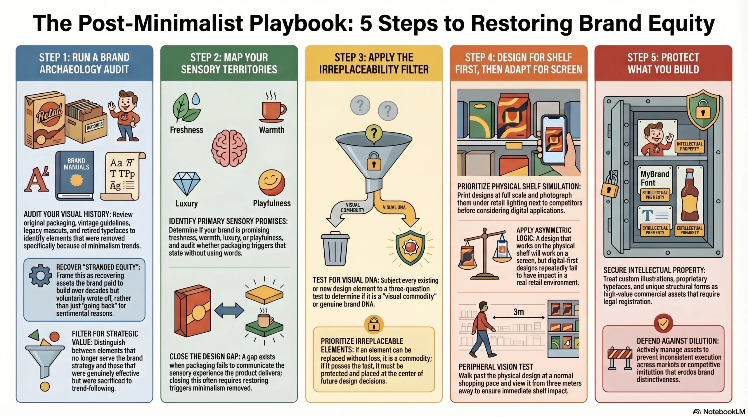
Step 1: Run a Brand Archaeology Audit
Go back through your brand’s visual history: original packaging photography, vintage brand guidelines, legacy mascots, retired typefaces, archived color systems, old point-of-sale materials. Identify visual elements that were removed specifically because of minimalism trends versus elements that were genuinely retired because they no longer served the brand strategy.
The former are candidates for restoration and strategic reactivation. The latter are not. This distinction is critical — not everything old is worth recovering, and the act of recovery must be strategic, not sentimental. Frame this process internally not as “going back” but as recovering stranded equity: assets that the brand paid to build over years or decades and then voluntarily wrote off.
Step 2: Map Your Sensory Territories
For each product in your range, identify the primary sensory experience your brand is promising: freshness, warmth, energy, calm, indulgence, security, playfulness, luxury. Then audit your current packaging with this question: does it trigger that sensory state, purely through visual and tactile means, without any words?
If it does not, you have a gap between what your product delivers and what your packaging communicates. That gap is your design brief — and closing it is almost always a matter of restoring sensory triggers that minimalism removed. [Link to: Relevant Service/Product Page]
Step 3: Apply the Irreplaceability Filter
For every design element under consideration — existing or new — run it through the three-question test from earlier. Elements that are replaceable without loss are visual commodities. Elements that pass all three questions are your brand’s genuine visual DNA. Protect them, invest in them, and make every future design decision in their service.
Step 4: Design for Shelf First, Then Adapt for Screen
This is the most disruptive process change most brand teams will need to make — because it reverses the workflow that the past decade normalized.
Begin every packaging design concept with physical shelf simulation. Print at full scale. Photograph under retail lighting conditions. Place the design next to actual competitive products. Walk past it at normal shopping pace. Look at it with peripheral vision from three metres away. Only after a design proves its shelf impact should it be adapted for digital applications. [Link to: Authoritative Industry Study / Nielsen shelf impact data]
The logic is asymmetric: if a design works on shelf, it will work on screen. The reverse is demonstrably, repeatedly, and expensively not true.
Step 5: Protect What You Build
Post-minimalism visual assets — custom illustrations, proprietary typefaces, distinctive color systems, unique structural forms — are intellectual property with genuine commercial value. They are worth registering, actively defending, and managing with the same rigor as any other brand asset.
Brands that invest in building irreplaceable visual languages and then fail to protect them through consistent application and legal registration often discover those assets gradually diluted — through inconsistent execution across markets, through licensing failures, or through competitive imitation that erodes their distinctiveness over time.
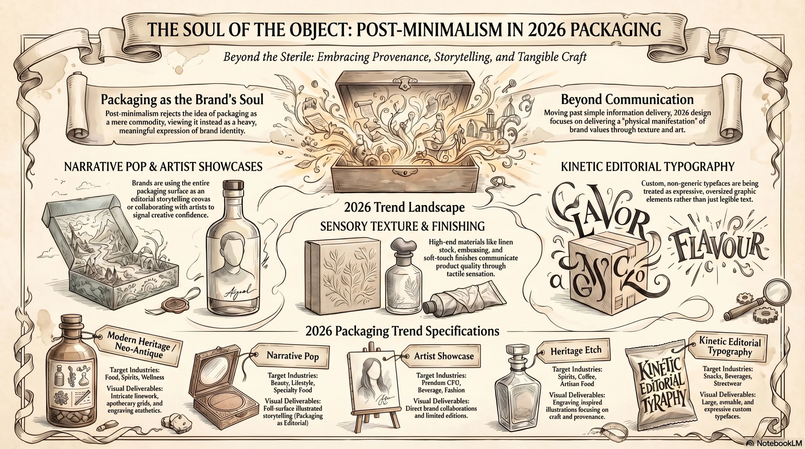
2026 Packaging Trends Embodying the Post-Minimalism Philosophy
The market has already begun to move. These are the packaging trend categories in 2026 where the post-minimalism philosophy is most powerfully expressed:
| Trend | Category Relevance | What It Delivers |
|---|---|---|
| Modern Heritage / Neo-Antique | Food, spirits, wellness | Intricate linework, apothecary grids, engraving aesthetics restore brand provenance |
| Narrative Pop | Beauty, lifestyle, specialty food | Full packaging surface used as illustrated storytelling canvas — packaging as editorial |
| Artist Showcase | Premium CPG, beverage, fashion retail | Brand collaborations signal cultural irreplaceability and creative confidence |
| Sensory Texture Finishing | Luxury, beauty, spirits | Tactile materials — emboss, soft-touch, linen stock — communicate quality before opening |
| Heritage Etch | Spirits, coffee, artisan food | Engraving-inspired illustration brings tangible craft and provenance to modern brands |
| Kinetic Editorial Typography | Snacks, beverages, streetwear | Custom typefaces treated as expressive graphic elements — large, ownable, non-generic |
The Competitive Advantage of Acting Now
The post-minimalism shift is real, it is accelerating, and the strategic window it opens will not remain open indefinitely.
As more brands restore their visual identities and reclaim their sensory territories, the “restored heritage” aesthetic will itself risk becoming a trend that everyone chases — which is precisely the mechanism by which minimalism became the new mediocrity in the first place. The brands that benefit most from this moment will be those that move with genuine strategic intent rather than aesthetic trend-following: restoring their own specific, irreplaceable visual assets, not imitating the visual language of whoever acted first.
The goal is never to look post-minimalist. The goal is to look unmistakably like you — in a way that no competitor can replicate, no design trend can dilute, and no future redesign brief can accidentally delete.
First-mover advantage in this space is genuine and measurable. Shelf space in the consumer’s perceptual memory is finite. The brands that re-occupy their sensory territories first, with intention and craft, will be the hardest to displace — not because they are the biggest spenders, but because they will be the most impossible to confuse with anyone else.
Conclusion: Soul Is a Strategic Asset
Let’s be direct about what the past decade taught us and what it cost.
Minimalism was a logical response to a real problem — the demand for visual efficiency on digital screens. It solved that problem effectively. The brands that benefited most from minimalism were digital platforms, tech products, and services that lived primarily on screens. For those brands, flat and clean was exactly right.
The brands that suffered were the ones that had always lived and died on physical shelves — whose primary customer relationship was formed not through a screen, but through a hand reaching for a product in a brightly lit aisle. For those brands, the decade of minimalism was an experiment in solving the wrong problem with the right tools.
Sprite and Burberry did not simply reverse their redesigns. They made a public, expensive, strategically significant admission: soul is not a stylistic indulgence. It is a strategic asset. The visual symbols that trigger memory, desire, and identity are not clutter to be optimized away. They are the primary mechanism through which a brand occupies territory in a consumer’s mind — territory that, once vacated, is not guaranteed to still be available when you decide you want it back.
Post-minimalism packaging is not about decoration, nostalgia, or aesthetic preference. It is about building a visual language so distinctively, irreplaceably yours that removing any element of it would feel like loss — to your consumers, to your team, and to the culture your brand has earned the right to be part of.
The highest form of commercial visual efficiency has never been easy to recognize. It has always been impossible to replace.
Your packaging carries more brand equity than you may realize — and some of it may be buried in redesigns you’ve already forgotten. Jarsking Packaging helps consumer brands audit their visual DNA, identify their most irreplaceable assets, and build packaging that commands the shelf. Book a free packaging strategy session today and find out what your brand has been missing.
FAQs
Post-minimalism packaging is a design philosophy that restores meaningful visual complexity — icons, illustrations, heritage typography, and tactile finishes — to brand packaging after a decade of over-simplified, flat design. It is fundamentally different from maximalism, which layers visual elements for decorative impact. Post-minimalism is governed by purposeful richness: every design element must earn its place by triggering a sensory response, communicating a brand value, or owning a perceptual territory no competitor can replicate. The goal is not “more” — it is “irreplaceable.”
Minimalism solved a genuinely real problem: the need for brand visuals to render cleanly on small, high-density digital screens. When tech giants like Google, Apple, and Microsoft flattened their visual identities for UI efficiency, the aesthetic carried enormous cultural prestige — and brands across fashion, food, beauty, and household goods followed. The mistake was applying a screen-first design logic to products that live and compete in physical retail environments, where the rules of perception are entirely different. Shelf performance and digital elegance require different — sometimes opposing — design decisions.
The key question is not “is this old?” but “is this irreplaceable?” Audit your brand’s visual history and identify elements that were removed because minimalism was fashionable, versus elements that were retired because they genuinely stopped serving the brand strategy. Elements worth restoring are those that: (1) trigger a sensory or emotional response without any supporting words, (2) are specific enough that they could not comfortably appear on a competitor’s packaging, and (3) carry accumulated consumer recognition built over years or decades. Anything that passes all three criteria is stranded equity — and it is worth recovering.
Absolutely. Post-minimalism is not a strategy reserved for legacy brands reclaiming lost symbols. For new brands, it is an invitation to build a visual language with soul from day one — to make deliberate, considered design choices that are distinctive and ownable rather than defaulting to the minimalist aesthetic because it feels safe or contemporary. New brands that invest in custom illustration, proprietary typography, and sensory-driven visual language at launch build equity faster, because they are occupying perceptual territory in the consumer’s memory rather than blending into the category wallpaper.
The most effective approach is to reverse the design workflow that the past decade normalized: design for the physical shelf first, then adapt for digital — not the other way around. A packaging design that commands attention under retail lighting, in peripheral vision, surrounded by competitors, will perform even more strongly in the controlled, high-contrast environment of a digital screen. The reverse has been proven false, repeatedly and expensively. Your digital brand guidelines should be derived from your shelf identity — not the other way around. A strong icon, a distinctive color architecture, and an ownable typeface all translate powerfully to digital contexts while remaining rooted in physical performance.
Several major trends emerging in 2026 embody post-minimalism thinking directly. Modern Heritage and Neo-Antique aesthetics restore intricate linework and engraving-style illustration to communicate provenance. Narrative Pop treats the entire packaging surface as an illustrated storytelling canvas. Heritage Etch brings craft and hand-drawn detail back to spirits, coffee, and artisan food categories. Sensory Texture Finishing — embossing, soft-touch coatings, and textured paper stocks — adds a tactile dimension that communicates quality before the product is even opened. Artist Showcase collaborations signal cultural irreplaceability and creative confidence. Together, these trends point toward a shared conviction: that packaging is not a container. It is the physical manifestation of a brand’s soul.