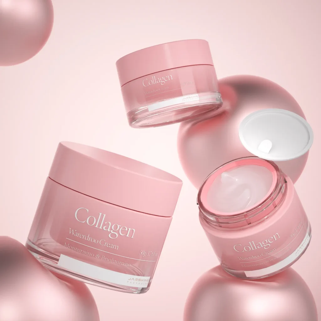
Aesop’s packaging is renowned for its distinctive and minimalist design, which reflects the brand’s commitment to quality, sustainability, and aesthetic simplicity. Here is a comprehensive analysis of Aesop’s packaging and the brand’s influences in beauty industry, focusing on the materials used, design elements, and other brands’ approaches:

1. Materials Used in Aesop Packaging
Aesop is known for its thoughtful selection of packaging materials, which are chosen for both functionality and sustainability:
Amber Glass:
– Usage: Aesop uses amber glass for many of its liquid products, such as cleansers, toners, oils, and serums.
– Benefits: Amber glass is both durable and protective. It effectively shields products from UV rays, which can degrade ingredients over time, thus preserving the integrity and efficacy of the formulations. Glass is also inert, meaning it doesn’t react with the product, ensuring that the quality remains intact.
– Sustainability: Glass is fully recyclable and can be reused multiple times, aligning with Aesop’s sustainability goals. The choice of amber glass further emphasizes a classic, apothecary aesthetic, which enhances the brand’s image of heritage and quality.

Aluminum:
– Usage: Aluminum is used for packaging some of Aesop’s creams, lotions, and balms. For example, their hand balm and body cream come in aluminum tubes.
– Benefits: Aluminum is lightweight, highly durable, and resistant to corrosion, making it ideal for protecting products, especially those with oils or reactive ingredients. It provides a protective barrier against light, air, and moisture, which helps in maintaining the product’s shelf life.
– Sustainability: Aluminum is one of the most sustainable packaging materials as it is 100% recyclable without losing quality. Aesop’s use of aluminum reflects their commitment to reducing environmental impact through recyclable packaging solutions.

Recycled Paper and Cardboard:
– Usage: Aesop uses recycled paper and cardboard for outer packaging, including product boxes, labels, and shipping materials.
– Benefits: These materials are biodegradable and sourced sustainably, ensuring minimal environmental impact. The use of simple, uncoated paper also aligns with Aesop’s minimalist aesthetic.
– Sustainability: By using recycled paper and cardboard, Aesop reduces waste and supports a circular economy. The brand also avoids using unnecessary plastic or laminated finishes, further emphasizing its eco-friendly approach.
Plastic :
– Usage: Aesop uses plastic primarily for certain product dispensers, caps, and pump mechanisms, particularly where these components require flexibility, durability, or precision in application (e.g., pump dispensers for lotions or liquid soap).
– Benefits: While plastic is not the primary material for Aesop, its use in pumps and caps is crucial for functionality and user experience. Plastic can be molded into precise shapes needed for specific dispensing mechanisms.
– Sustainability: Aesop is selective in its use of plastic and strives to minimize its environmental footprint by using recyclable plastics where possible. The brand encourages customers to recycle these components and often designs them for easy separation and recycling.

2. Design Elements of Aesop Packaging
Aesop’s packaging design is a critical component of its brand identity, focusing on simplicity, functionality, and aesthetic appeal:
Minimalistic and Functional Design:
– Aesthetic: Aesop’s packaging is characterized by a minimalist, utilitarian design that avoids flashy colors and elaborate graphics. The simplicity of the design is purposeful, aiming to reflect the brand’s commitment to quality and the purity of its formulations.
– Typography: Aesop’s packaging features clean, sans-serif typography in black ink on white or cream labels. The text is often straightforward and informative, with a focus on essential product information such as ingredients, usage instructions, and benefits.
– Labeling: The labels are typically minimal, with a clear and concise layout that enhances readability and reflects transparency. This approach aligns with Aesop’s philosophy of educating customers about their products rather than relying on marketing gimmicks.
Apothecary-Inspired Design:
– Heritage Feel: The choice of amber glass bottles and simple labels evokes a sense of vintage apothecary, giving the brand an old-world charm that appeals to customers seeking authenticity and heritage in their skincare products.
– Consistency: Aesop maintains a consistent design language across all products, which enhances brand recognition and builds trust. This consistency also extends to their retail stores and online presence, creating a cohesive brand experience.

3. Brands Inspired by Aesop
The brand’s approach has inspired numerous other beauty brands to rethink their packaging strategies to appeal to a more discerning, eco-conscious, and design-savvy consumer base. Let’s examine other beauty brand’s unique approach while drawing parallels to Aesop’s influence:
- Le Labo
Le Labo has effectively taken Aesop’s minimalist aesthetic and infused it with a sense of personalization and exclusivity, making it highly distinctive in the beauty market:
– Custom Labeling: Le Labo’s practice of labeling each product with the customer’s name and the date of formulation adds a unique, personal touch. This custom approach not only enhances the consumer experience but also creates a sense of ownership and connection with the product. It aligns with Aesop’s personalized, high-touch service, yet takes it a step further by making the packaging itself a personal keepsake.
– Fragrance Focus: Unlike Aesop, which offers a broad range of skincare and personal care products, Le Labo centers its brand around perfumes. This focus on the art of scent allows Le Labo to specialize deeply and develop a strong niche following. By emphasizing artisanal craftsmanship in perfume-making, Le Labo echoes Aesop’s dedication to quality and natural ingredients, but with a specific focus on olfactory experiences.
– Localized Scents: The introduction of city-exclusive fragrances ties Le Labo’s brand to specific locations, creating a unique narrative around each scent. This approach adds an element of storytelling and place-based identity to their brand, contrasting with Aesop’s more universal, global appeal. It allows Le Labo to create a deeper connection with customers by tying their products to personal or geographical significance.

- Grown Alchemist
Grown Alchemist closely mirrors Aesop’s aesthetic but carves out its niche by emphasizing organic ingredients and scientific innovation:
– Organic Focus: While Aesop is known for its natural ingredients, Grown Alchemist pushes this further by focusing on organic and biologically advanced formulations. This not only appeals to consumers looking for more natural skincare options but also positions the brand as a leader in organic and clean beauty. Grown Alchemist’s commitment to organic ingredients reflects a deep respect for natural beauty, akin to Aesop, but with a stricter emphasis on organic certification.
– Scientific Approach: Grown Alchemist heavily markets the scientific backing of its formulations, which is evident in its clinical-looking packaging. This emphasis on science and technology sets it apart from Aesop, presenting an image of precision and efficacy. The clinical packaging design, with its straightforward, almost pharmaceutical style, reinforces the brand’s focus on scientifically validated skincare solutions.
– Expanded Product Range: By extending its offerings beyond skincare into body care and hair care, Grown Alchemist maintains a cohesive aesthetic while catering to a broader range of consumer needs. This mirrors Aesop’s strategy of providing comprehensive personal care solutions but differentiates Grown Alchemist as a brand with a wider scope within the beauty and wellness market.

- Malin+Goetz
Malin+Goetz incorporates Aesop’s simplicity while adding a modern, unisex appeal and a distinct urban identity:
– Color Coding: By using color to differentiate product lines, Malin+Goetz adds a practical and visually engaging element to their minimalist design. This not only makes it easier for consumers to navigate their products but also adds a subtle pop of personality and fun, which contrasts with Aesop’s more uniform, apothecary-inspired aesthetic.
– Synthetics and Naturals: Unlike Aesop, which focuses heavily on natural ingredients, Malin+Goetz openly blends natural and synthetic ingredients to enhance efficacy. This pragmatic approach appeals to consumers who value results and are less concerned about whether ingredients are natural or synthetic, providing a modern take on efficacy in skincare.
– New York Identity: Malin+Goetz’s branding is infused with a distinctly urban, New York sensibility, which contrasts sharply with Aesop’s more neutral, globally applicable branding. This urban identity appeals to a city-dwelling, cosmopolitan audience and adds a sense of place and lifestyle to the brand.

- Byredo
Byredo draws inspiration from Aesop’s minimalist design but takes it in a more abstract and artistic direction:
– Storytelling Through Scent: By tying each fragrance to specific memories or concepts, Byredo adds depth and narrative to its minimalist packaging. This approach transforms each product into a sensory storytelling experience, distinguishing Byredo from Aesop’s more straightforward, ingredient-focused narrative. The storytelling element allows Byredo to create emotional connections with customers, making each fragrance a personal journey.
– Expansion into Lifestyle: Byredo’s expansion beyond beauty into lifestyle products such as leather goods and eyewear, while maintaining a cohesive aesthetic, showcases the brand’s versatility and creative vision. This broadening of product categories allows Byredo to become more of a lifestyle brand, extending its minimalist, artistic sensibility beyond skincare and fragrance.
– Collaborations: Byredo frequently partners with artists and designers, infusing its minimalist approach with fresh perspectives. These collaborations not only keep the brand’s offerings dynamic and engaging but also reinforce its position at the intersection of beauty, art, and fashion. This creative edge differentiates Byredo from Aesop, adding an element of exclusivity and cultural relevance.

- The Ordinary
The Ordinary represents a radical reinterpretation of Aesop’s influence, focusing on extreme minimalism and democratization:
– Extreme Minimalism: The Ordinary’s packaging strips away almost all design elements, focusing solely on ingredient information. This hyper-minimalist approach emphasizes transparency and functionality, echoing Aesop’s focus on ingredient honesty but taking it to an extreme by eliminating any unnecessary design or marketing elements.
– Democratization of Skincare: By offering single-ingredient formulations at low price points, The Ordinary makes high-quality skincare accessible to a broader audience. This approach democratizes the skincare industry, allowing more consumers to benefit from advanced skincare solutions. It contrasts with Aesop’s more premium pricing and positions The Ordinary as a disruptor in the market.
– Education-First Approach: The Ordinary, like Aesop, prioritizes educating consumers about their products. However, The Ordinary assumes a higher level of consumer knowledge, often presenting products in a clinical, scientific manner that appeals to skincare enthusiasts and those well-versed in skincare science. This approach empowers consumers to make informed choices, enhancing their skincare regimen based on specific needs.

Conclusion
Beauty brands that prioritize authenticity, quality, and sustainability should consider adopting Aesop’s positioning and packaging philosophy. Aesop’s success lies in its ability to communicate these values through minimalist, functional packaging that emphasizes the integrity of its ingredients and a commitment to environmental responsibility. Brands aiming to appeal to discerning consumers who value transparency, clean beauty, and ethical practices can benefit from Aesop’s approach.
By adopting Aesop’s packaging philosophy, beauty brands can cultivate a perception of premium quality and sophistication while aligning with the growing demand for eco-friendly packaging solutions. Aesop’s use of recyclable materials like glass and aluminum, combined with a simple, apothecary-inspired design, conveys a timeless elegance that appeals to both luxury and environmentally conscious markets.
Moreover, this minimalist packaging allows brands to focus on the efficacy and purity of their formulations, attracting consumers who prioritize ingredient integrity over elaborate packaging. Brands in the niche, luxury, or clean beauty segments, especially those targeting a mature, well-informed audience, can leverage this approach to differentiate themselves in a crowded market. Ultimately, by mirroring Aesop’s philosophy, beauty brands can enhance their market positioning, foster customer loyalty, and align with a sustainable future in the beauty industry.

About Othilapak, Jarsking
Throughout the year, Othilapak, a brand from Jarsking Group, has served clients from beauty industries all over the world. Many of our clients adopt minimalism as their brands’ design norm. Inspired by the timeless and elegant packaging philosophy of brands like Aesop, we collaborate closely with our clients to bring their minimalist design concepts to life, from the initial stages of brainstorming and design to the final stages of production. Our expertise in creating high-quality, sustainable packaging solutions ensures that each product not only meets aesthetic and functional expectations but also aligns with the growing demand for environmentally responsible practices. At Jarsking, we pride ourselves on delivering innovative, custom packaging that reflects our clients’ unique brand values and enhances their presence in the competitive beauty market.


