


Jarsking covers all cosmetics,cannabis and perfume markets. Ask custom solutions here!
The world’s go-to cosmetic packaging factory for custom branding. Talk to Jarsking Team

Creative Director of Design
Stand in any retail aisle for just a few seconds, and you’ll witness the power of packaging in action. Shoppers pause, scan, reach—often without conscious thought. This isn’t random behavior. It’s neuroscience at work. Research consistently shows that over 70% of purchase decisions are made in-store, with consumers spending merely 3 seconds evaluating products on shelves before making their choice. In this blink-and-you-decide moment, packaging becomes your brand’s most persuasive salesperson.
Welcome to the world of neuroaesthetics—the scientific study of how our brains respond to beauty, design, and visual stimuli. For B2B brands in beauty, perfume, and cannabis industries, understanding neuroaesthetics isn’t just fascinating science; it’s a competitive necessity. This comprehensive guide explores how brain science is revolutionizing packaging design and why working with manufacturers like Jarsking, who combine aesthetic insights with manufacturing excellence, gives brands an unbeatable edge.
Neuroaesthetics emerged in the late 1990s when renowned neuroscientist Semir Zeki coined the term to describe the intersection of neuroscience and aesthetic experience. As documented in the NIH’s comprehensive review of neuroaesthetics research, Zeki proposed that art and design are fundamentally “brain experiences”—that beauty isn’t merely subjective but rooted in measurable neural responses. This groundbreaking perspective shifted design evaluation from purely artistic judgment to empirical, brain-based analysis.
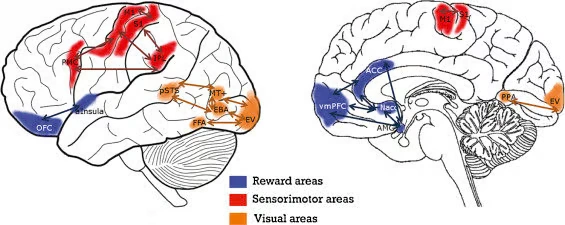
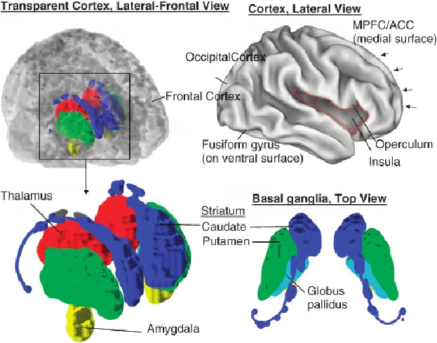
At its core, neuroaesthetics examines how specific brain regions activate when we encounter visual stimuli. The prefrontal cortex directs attention, the occipital lobe processes visual information, the amygdala generates emotional responses, and the hippocampus consolidates memories. Research published in the International Journal of Consumer Studies provides a comprehensive systematic review of how consumer neuroscience has transformed our understanding of branding and packaging effectiveness. When packaging design aligns with how these regions naturally function, it creates powerful, often subconscious, consumer attraction.
Understanding the speed of brain processing is crucial for packaging designers. When a consumer’s eyes land on your product, their brain initiates a rapid-fire sequence:
50-100 milliseconds: Initial visual processing begins in the occipital cortex
150-300 milliseconds: Pattern recognition and emotional tagging occur
300-500 milliseconds: Decision-making circuits activate in the prefrontal cortex
This lightning-fast processing explains why first impressions are everything in packaging design. More remarkably, studies indicate that 85-95% of consumer decisions happen subconsciously—driven by automatic neural responses rather than deliberate reasoning. Effective packaging taps directly into these unconscious pathways.
Human brains are hardwired to prefer symmetrical patterns. Evolutionary psychologists theorize this stems from our ancestors associating symmetry with health, genetic fitness, and safety. In packaging design, symmetry creates visual harmony that the brain processes with minimal cognitive effort, generating positive emotional responses.
Research in consumer neuroscience demonstrates that symmetrical packaging designs activate reward-related brain regions, particularly the ventral striatum, which processes pleasure and positive expectations. A systematic literature review of consumer neuroscience on packaging confirms that approximately 90% of consumers choose purchase options based on visual examination of packaging, with symmetrical designs consistently outperforming asymmetrical alternatives in both preference studies and actual purchase behavior.
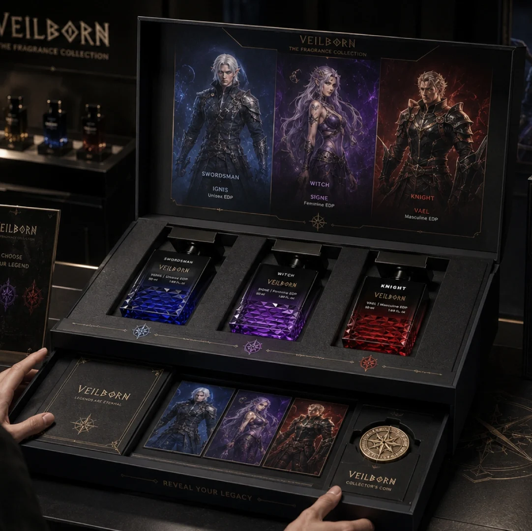
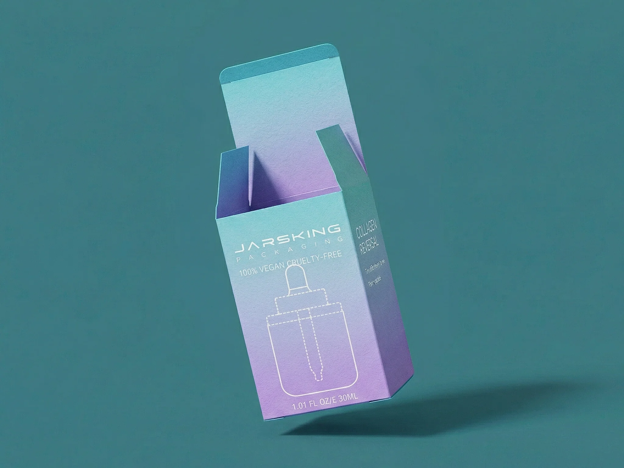
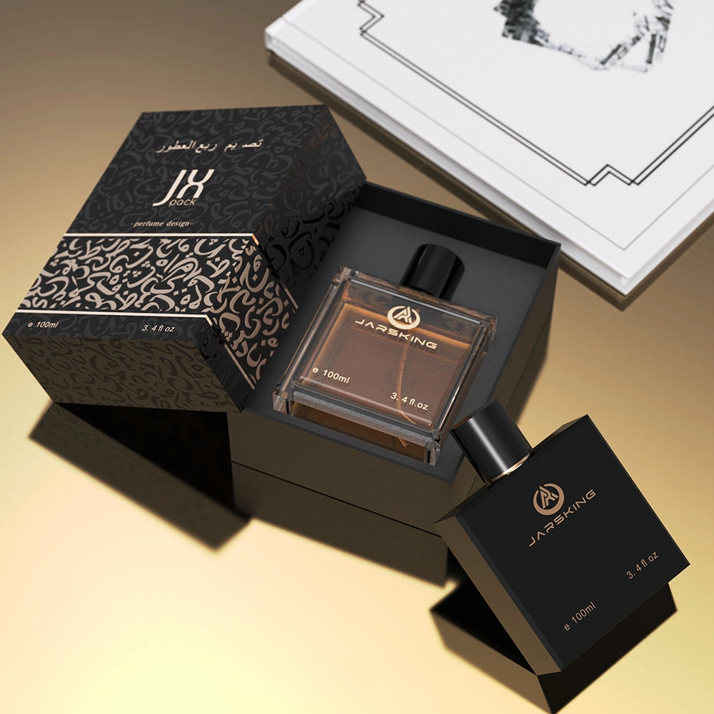
For luxury cosmetic packaging—a specialty of Jarsking’s custom design services—symmetrical layouts communicate sophistication, quality, and trustworthiness. Think of high-end perfume bottles with centered logos and balanced proportions; their appeal isn’t accidental but neurologically strategic.
However, strategic asymmetry can also work when executed deliberately. Slight asymmetrical elements create visual tension that captures attention, provided the overall composition maintains balance. The key is intentionality—random imbalance confuses the brain, while purposeful asymmetry intrigues it.
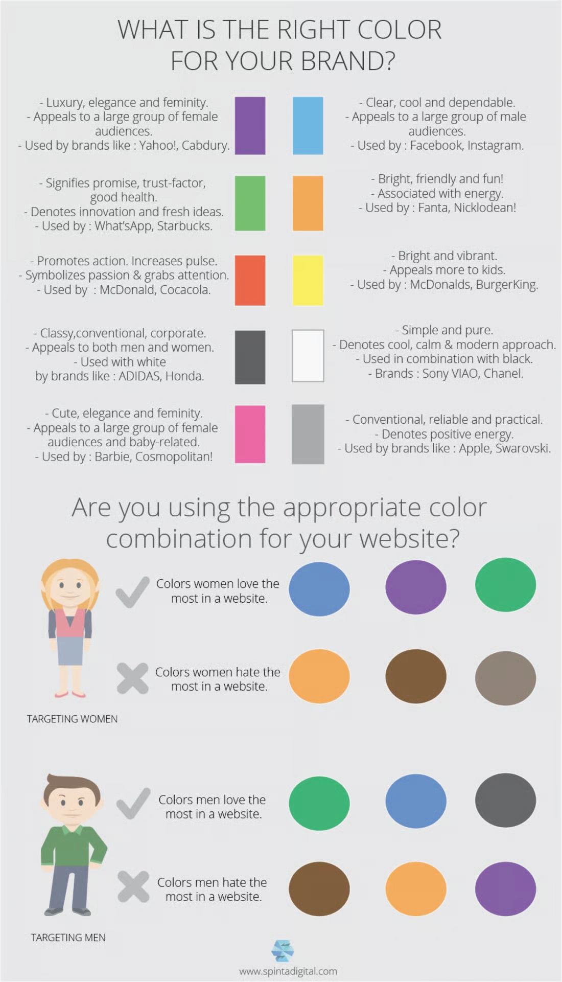
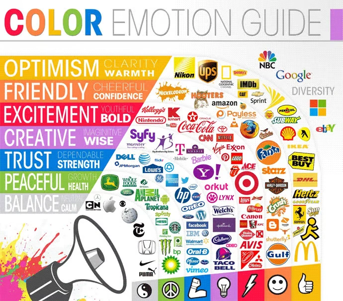
Color isn’t just aesthetic—it’s neurological. Different wavelengths of light trigger distinct patterns of neural activation, influencing emotion, attention, and even purchasing behavior. fMRI studies reveal that colors activate specific brain networks:
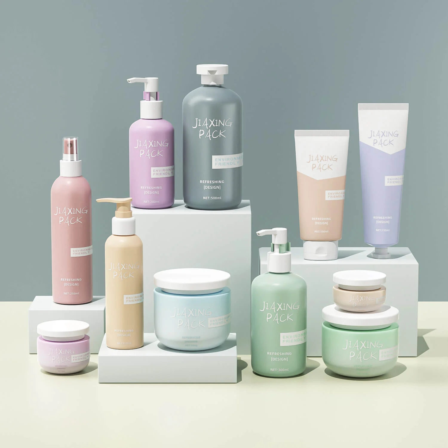
For B2B brands, color strategy must align with both product category and target consumer psychology. A cannabis brand seeking to overcome stigma might choose sophisticated deep greens and blacks to signal professionalism, while a vitamin supplement could leverage clean whites and blues to communicate purity and scientific credibility. Jarsking’s color matching expertise ensures perfect execution of these neurologically-informed choices across glass, plastic, and specialty materials.
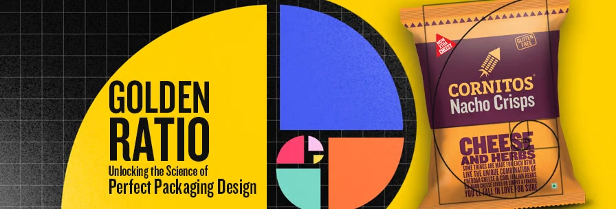
The golden ratio (approximately 1:1.618) has captivated mathematicians, artists, and designers for millennia. This proportion appears throughout nature—in seashells, flower petals, and even human facial features—making it inherently pleasing to our pattern-seeking brains.
Research published in the Journal of Marketing found that packaging shapes adhering to the golden ratio generated significantly higher consumer preference ratings compared to other proportions. Recent neuroscience research inNature Scientific Reports further validates this finding, demonstrating that graph neural networks can predict packaging aesthetic quality based on compositional features including symmetry, the rule of thirds, and proximity relationships—with the golden ratio consistently emerging as a key predictor of positive aesthetic evaluation. One study specifically examining cosmetic packaging discovered that containers with golden ratio dimensions increased purchase intent by 18% and commanded premium pricing without consumer resistance.
The neuroscience explains why: when the brain encounters golden ratio proportions, it experiences reduced cognitive load and increased processing fluency. This ease of perception translates to positive affect—we literally feel better looking at well-proportioned designs. Jarsking’s design team incorporates these mathematical principles into bottle shapes, label layouts, and overall package architecture, creating products that feel “just right” even when consumers can’t articulate why.
Harvard Professional Development research on neuromarketing emphasizes how brain science is revolutionizing consumer behavior prediction and marketing strategy. These techniques have proven particularly valuable in packaging design, where milliseconds of visual processing determine purchase outcomes.
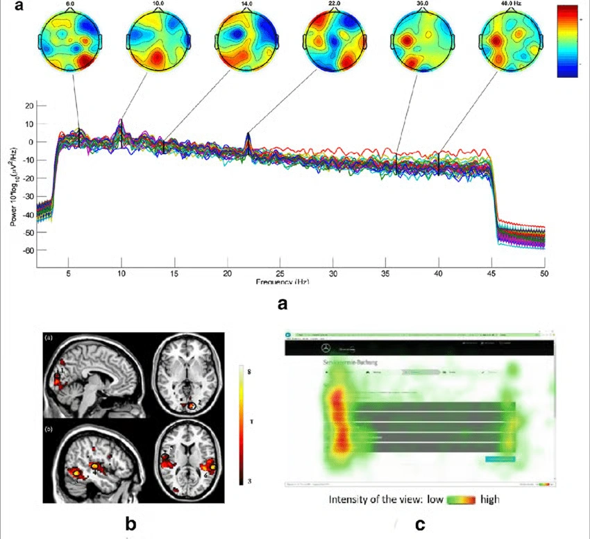
fMRI technology measures brain activity by detecting changes in blood oxygenation. When specific neural regions activate, they require more oxygen—a signal fMRI captures with remarkable precision. In packaging research, fMRI reveals which design elements trigger reward processing, emotional engagement, and purchase motivation.
Notable fMRI findings include:
Harvard researchers note that fMRI brain scanning during packaging prototype testing has enabled marketers and designers to optimize packaging elements before costly production runs, improving packaging effectiveness while reducing development costs.
While fMRI provides deep insights, it’s expensive and constraining—subjects must remain still inside large machines, limiting real-world applicability. Nevertheless, the technique has fundamentally validated that packaging design creates measurable neurological responses that predict purchasing behavior.
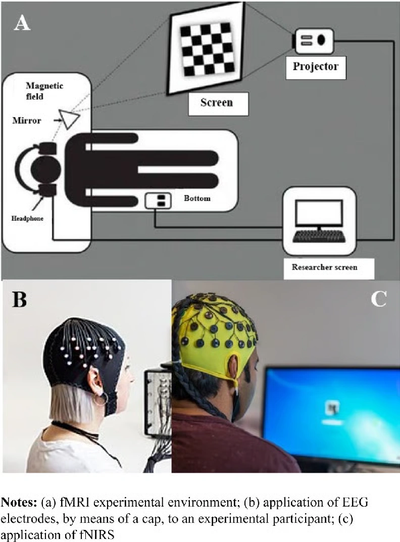
EEG measures electrical brain activity through electrodes placed on the scalp, offering real-time monitoring as consumers view packaging. Unlike fMRI’s spatial precision, EEG excels in temporal resolution—tracking brain responses millisecond by millisecond.
EEG research has revolutionized packaging optimization by measuring:
A systematic review of EEG-based neuromarketing studies found that brain responses to packaging predicted actual purchase behavior more accurately than self-reported preferences, confirming that consumers often don’t consciously know what influences their choices.
Eye-tracking records exactly where, when, and for how long consumers look at packaging elements. Heat maps visualize attention patterns, revealing what catches the eye and what gets ignored. This technique directly informs visual hierarchy decisions—the strategic arrangement of logos, product names, imagery, and information.
Research using eye-tracking demonstrates that:
For B2B brands working with manufacturers like Jarsking, eye-tracking insights guide strategic placement of brand elements, ensuring critical information lands exactly where consumer attention naturally flows.
| Technique | What It Measures | Advantages | Limitations | Best Use Case |
|---|---|---|---|---|
| fMRI | Brain activation patterns via blood flow | High spatial resolution; identifies specific active regions | Expensive; restrictive environment; limited ecological validity | Deep emotional response studies; understanding subconscious motivations |
| EEG | Electrical brain activity via scalp electrodes | Real-time data; portable; relatively affordable | Lower spatial resolution; sensitive to movement | Attention and engagement testing; comparing design alternatives |
| Eye-Tracking | Visual attention patterns and fixation duration | Easy to interpret; non-invasive; naturalistic settings | Doesn’t measure emotion or subconscious processing | Visual hierarchy optimization; shelf visibility testing |
Typography does more than convey information—it triggers distinct neural responses. The brain’s ventral visual stream processes letter shapes, while the fusiform gyrus specifically recognizes words. Font selection influences processing fluency, emotional tone, and brand personality perception.
Neuroaesthetic research on typography reveals:
Research published inNature Scientific Reports demonstrates that compositional elements including text-image balance and visual hierarchy significantly impact aesthetic perception scores, with the brain’s reward centers activating more strongly for well-organized information architecture.
Critically, legibility affects cognitive load. When text is difficult to read, the prefrontal cortex works harder, creating negative associations with the product. Jarsking’s design team prioritizes typographic hierarchy and readability, ensuring information architecture aligns with how the brain naturally processes visual information.
Visual imagery activates multiple brain networks simultaneously—object recognition, emotional response, and narrative construction. The most powerful packaging imagery tells a story that consumers intuitively understand within milliseconds.
Human faces possess unique neurological power. The fusiform face area (FFA) in the temporal lobe specifically processes faces, and mirror neurons fire when we observe facial expressions, creating empathic responses. Packaging featuring human faces—especially smiling faces—triggers faster brain processing and increased trust. Research by the Packaging Digest found that human faces on packaging boost product appeal by 23% in physical retail environments.
However, imagery strategy must align with product positioning:
Packaging isn’t just visual—it’s tactile. The somatosensory cortex processes touch sensations, and these tactile experiences profoundly influence product perception. Neuroscience research demonstrates that:
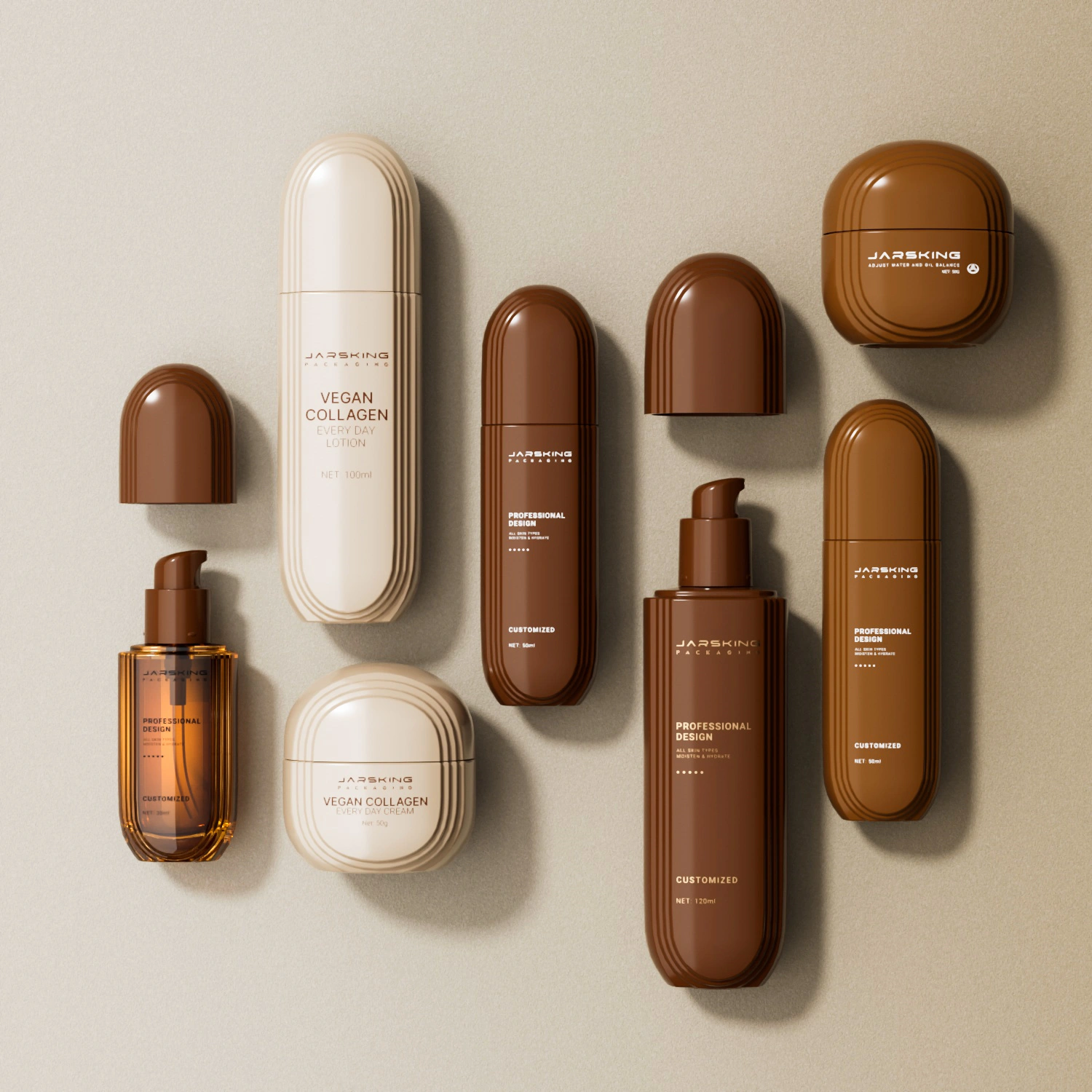
Jarsking’s expertise spans diverse materials—from sleek glass bottles to sustainable PCR plastic and innovative biodegradable options. This material versatility allows brands to strategically design tactile experiences that align with desired neural responses. A luxury skincare brand might choose substantial glass with soft-touch coatings, while an eco-conscious supplement brand could leverage textured recycled cardboard that communicates environmental commitment through both visual and tactile channels.
The amygdala, an almond-shaped structure deep in the temporal lobe, serves as the brain’s emotional processing center. Neuroaesthetics research published by the National Institutes of Health confirms that the amygdala rapidly evaluates stimuli as positive, negative, or neutral—often before conscious awareness occurs. Packaging design that triggers positive amygdala activation creates emotional connections that transcend rational product evaluation.
Neuroaesthetic studies identify specific design elements that generate positive amygdala responses:
For cannabis packaging, this neuroscience is particularly valuable. The industry faces stigma requiring sophisticated design to reposition products as premium wellness solutions. Jarsking works with cannabis brands to create packaging that triggers positive emotional responses—using refined color palettes, elegant typography, and premium materials that activate reward processing rather than outdated stereotypical associations.
When something appears attractive or desirable, the brain releases dopamine, a neurotransmitter associated with pleasure, motivation, and reward anticipation. The nucleus accumbens, part of the brain’s ventral striatum, plays a central role in this reward circuitry.
fMRI research demonstrates that aesthetically pleasing packaging activates the nucleus accumbens before purchase, predicting buying behavior. Essentially, beautiful packaging literally makes products more desirable by triggering the same neural circuits activated by other rewards like food, money, or social approval.
Strategic design elements that maximize dopamine response include:
Jarsking’s custom manufacturing capabilities—including electroplating, UV coating, hot stamping, and specialty finishing—enable brands to incorporate these reward-triggering elements. Their extensive library of over 30,000 ready molds also accelerates the design-to-production process, bringing neuroaesthetically optimized packaging to market rapidly.
The hippocampus consolidates short-term experiences into long-term memories. For packaging, this means creating designs memorable enough to influence future purchase decisions. Neuroscience reveals that memory formation strengthens when:
Consistency reinforces memory. When consumers repeatedly encounter cohesive brand packaging, the brain strengthens neural pathways associated with that brand, making recognition faster and more automatic. This neurological reality underscores the importance of distinctive, consistent packaging architecture across product lines—something Jarsking facilitates through systematic design services and quality control processes.
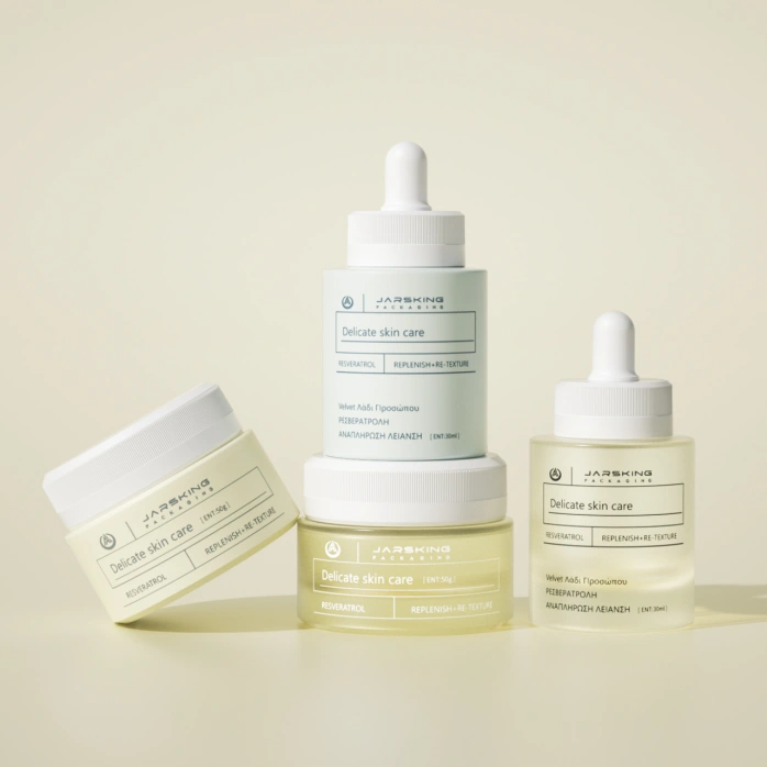
The beauty industry exemplifies neuroaesthetic design principles in action. Current trends toward minimalist luxury—clean lines, muted colors, ample negative space—reflect deep understanding of how the brain processes visual information.
Minimalist design reduces cognitive load, allowing the prefrontal cortex to process information effortlessly. This ease of perception translates to positive affect and premium positioning. Color strategies matter enormously: soft pinks activate femininity associations, pure whites signal clinical efficacy, and black communicates sophistication and luxury.
Jarsking’s custom solutions for beauty brands leverage these insights across diverse products—from elegant perfume bottles with precision-crafted glass to innovative airless pump systems in sustainable PCR plastic. Their rapid prototyping capability (3-day samples, 15-day molds) allows beauty brands to test neuroaesthetic hypotheses quickly, optimizing designs based on consumer response before full production.
Pharmaceutical packaging faces unique challenges: building trust while maintaining approachability. Neuroscience research shows that blue dominates pharmaceutical color strategies because it activates brain regions associated with trust, safety, and scientific credibility. White reinforces purity and cleanliness associations.
Typography matters critically. Sans-serif fonts communicate clarity and modernity, while carefully balanced information hierarchy ensures critical details (dosage, warnings) receive appropriate attention without overwhelming consumers. Jarsking’s pharmaceutical packaging solutions meet rigorous regulatory requirements while incorporating neuroaesthetic principles that build consumer confidence and compliance.
Cannabis packaging represents fascinating neuroaesthetic territory. The industry must overcome decades of stigma while complying with stringent regulations. Successful brands use sophisticated design to reposition products as premium wellness solutions.
Effective cannabis packaging strategies include:
These design choices trigger neural responses associated with wellness, luxury, and legitimacy—fundamentally reshaping how consumers perceive cannabis products. Jarsking’s experience in cannabis packaging combines compliance expertise with neuroaesthetic sophistication, creating solutions that stand out in dispensaries while meeting all regulatory requirements.
Consumer brains respond powerfully to sustainable packaging—but not always as brands expect. While conscious attitudes favor eco-friendly options, neuroscience research reveals nuance. A study using fMRI found that while participants reported preferring sustainable products, their brain activity patterns showed opposite responses—regular packaging activated stronger reward signals.
This apparent contradiction reflects the “green gap”—the disconnect between stated environmental values and actual purchasing behavior. However, when sustainable packaging also delivers neuroaesthetic appeal, this gap narrows dramatically.
Research demonstrates that well-designed sustainable packaging creates multiple positive neural responses:
Jarsking’s sustainability commitment directly addresses these neurological realities. Their eco-friendly materials—PCR plastic, PLA, biodegradable options—combined with innovative refillable systems create packaging that satisfies both environmental values and aesthetic expectations. Recent consumer research found that 70% of consumers choose products based on packaging sustainability, but critically, the packaging must still deliver visual and tactile appeal that activates reward processing.
| Design Element | Neural Response | Consumer Perception | Business Impact |
|---|---|---|---|
| Recyclable symbols | Increased prefrontal activity (value alignment) | Trust, responsibility | 23% higher purchase intent |
| Natural textures | Positive amygdala response (biophilic effect) | Authenticity, quality | 18% premium pricing tolerance |
| Minimalist design | Reduced cognitive load (processing fluency) | Clarity, sophistication | 31% improved brand recall |
| Green color palette | Temporal lobe activation (nature association) | Health, environmental care | 27% stronger eco-conscious brand perception |
Before optimizing, assess your existing packaging through a neuroaesthetic lens:
Honest evaluation often reveals opportunities for neurologically-informed optimization without complete redesigns.
Implementing neuroaesthetic principles requires both scientific understanding and manufacturing excellence. This is where partnerships with specialized manufacturers prove invaluable.
Jarsking exemplifies this integrated approach:
Their end-to-end capabilities—from concept to delivery—mean neuroaesthetic insights translate seamlessly into manufactured reality. With 10+ factories, 30,000+ molds, and global logistics expertise, Jarsking delivers both scientific sophistication and production efficiency.
Even scientifically-informed design benefits from validation:
Neuroaesthetics transforms packaging design from artistic intuition to scientific strategy. When you understand how the brain processes symmetry, responds to color, engages with tactile materials, and forms memories, you gain unprecedented power to create packaging that doesn’t just look beautiful—it literally activates the neural circuits that drive purchasing decisions.
The science is clear: effective packaging design works because it aligns with fundamental brain processes evolved over millennia. Symmetry signals quality. Colors trigger emotions. Materials communicate values. Composition guides attention. Together, these elements create powerful neurological responses that happen in milliseconds, beneath conscious awareness, yet profoundly influence consumer behavior.
For B2B brands in beauty, pharmaceuticals, and cannabis industries, the competitive advantage lies in partnering with manufacturers who understand this science and possess the technical capabilities to execute it flawlessly. Jarsking combines aesthetic sophistication with manufacturing excellence—30,000+ molds, 10+ factories, international certifications, sustainable materials, and rapid prototyping capabilities that bring scientifically-optimized designs to market at unprecedented speed.
The question isn’t whether to incorporate neuroaesthetic principles into your packaging strategy—it’s how quickly you can implement them before competitors do. In the 3-second battle for consumer attention, brain science separates products that sell from products that sit on shelves.
Neuroaesthetics in packaging design is the application of brain science to understand how consumers respond to visual, tactile, and compositional elements. It examines how specific design features—color, symmetry, typography, materials—activate neural pathways associated with attention, emotion, memory, and decision-making.
By designing packaging that aligns with natural brain processing, brands create stronger consumer attraction and increased purchase likelihood. This scientific approach transforms packaging from subjective artistic choices to data-driven strategies based on measurable neurological responses.
When consumers encounter packaging, their brains process information in rapid stages. Within 50-100 milliseconds, the occipital lobe begins visual processing. At 150-300 milliseconds, pattern recognition occurs and the amygdala tags emotional responses. By 300-500 milliseconds, the prefrontal cortex activates decision-making circuits. This entire sequence happens largely unconsciously—research shows 85-95% of purchase decisions involve subconscious processing.
Effective packaging optimizes for this rapid evaluation by creating clear visual hierarchy, triggering positive emotional responses, and minimizing cognitive load, making products feel intuitively appealing within the critical 3-second window consumers spend evaluating shelf options.
Three primary neuromarketing techniques validate packaging design.
fMRI (functional Magnetic Resonance Imaging) measures brain activation patterns by tracking blood oxygenation, revealing which neural regions respond to specific design elements—though it’s expensive and requires restrictive laboratory settings.
EEG (Electroencephalography) monitors real-time electrical brain activity through scalp electrodes, tracking attention levels and emotional engagement as consumers view packaging—it’s more affordable and portable than fMRI.
Eye-tracking technology records exactly where, when, and how long consumers look at packaging elements, creating heat maps that visualize attention patterns and validate visual hierarchy decisions. Together, these techniques provide comprehensive insights into conscious and unconscious packaging responses.
Color selection should align with neurological responses appropriate for each product category.
Blue activates brain regions associated with trust and calmness, making it ideal for pharmaceuticals, healthcare products, and financial services.
Red stimulates the amygdala and creates excitement and urgency, perfect for attention-grabbing beauty products and food items.
Green triggers associations with nature, health, and sustainability through temporal lobe activation—essential for organic products, wellness brands, and eco-conscious positioning.
Gold and silver activate reward circuits in the nucleus accumbens, signaling luxury and premium value for high-end cosmetics and spirits.
Black communicates sophistication and modernity, favored by luxury brands across categories. Strategic color psychology ensures packaging triggers the precise neural responses that support brand positioning.
Sustainable packaging creates complex neural responses. Research shows that while consumers consciously report preferring eco-friendly options, brain imaging sometimes reveals weaker reward circuit activation compared to conventional packaging—a phenomenon called the “green gap.”
However, when sustainable packaging also delivers strong aesthetic appeal, this gap disappears. Well-designed eco-friendly packaging activates multiple positive neural responses: social approval circuits engage (moral satisfaction), biophilic responses trigger (positive reactions to natural materials and textures), and authenticity signals register.
Studies demonstrate that sophisticated sustainable packaging can command 18% premium pricing while improving brand recall by 31%. The key is ensuring sustainability enhances rather than compromises neuroaesthetic appeal.
Absolutely. While large corporations invest in expensive fMRI studies, small brands can leverage neuroaesthetic principles through established research findings and strategic manufacturing partnerships. Many core principles—symmetry, color psychology, visual hierarchy, golden ratio proportions—cost nothing to implement, requiring only design knowledge. Partnering with manufacturers offering free design services dramatically reduces barriers.
Jarsking, for example, provides complimentary design consultation, 2-hour 3D rendering, and 3-day sampling, allowing brands to test neuroaesthetically optimized designs without significant upfront investment. Additionally, their extensive mold library (30,000+ options) eliminates expensive custom tooling for many projects.
Texture profoundly influences packaging perception through somatosensory cortex activation. Neuroscience research demonstrates that tactile experiences create distinct neural responses that shape product valuation.
Smooth, soft textures activate brain regions associated with luxury, delicacy, and premium quality—ideal for high-end cosmetics and skincare.
Rough, natural textures trigger authenticity associations and biophilic responses—perfect for organic, eco-conscious brands.
Heavy packaging literally feels more valuable due to learned associations between weight and quality processed through integrated sensory and cognitive circuits.
Material choices—glass versus plastic, matte versus glossy finishes, soft-touch coatings versus textured surfaces—should strategically align with desired brand positioning, as tactile experiences combine with visual information to create holistic neural impressions that influence both immediate appeal and long-term brand memory.
Isabella translates brand identity into tangible art. Specializing in surface design and 3D rendering, she ensures every package visually communicates a powerful and cohesive brand image from concept to reality.
17th Floor, East Tower, Building 2,
Yiyun Tech Innovation Center,
No. 33-13, Jinshi Third Road, Dayuan Street,
Baiyun District, Guangzhou City,
Guangdong Province, China
Office 10, 24th Floor,
The One Tower,
943 Sheikh Zayed Road,
Barsha Heights (Al Thanyah First),
Dubai, United Arab Emirates
© Copyright 2026 Jarsking Packaging All Rights Reserved.