


When a fast-growing Russian natural skincare brand set out to compete in one of the most visually demanding retail categories in the world, it faced a challenge that goes far beyond formulation: the packaging had to work as hard as the product inside. It needed to look premium, feel modern, reflect an eco-conscious identity, and — critically — support a growing range of products without losing visual cohesion. The problem was not simply finding a supplier who could produce bottles. The real challenge was building an entire packaging architecture that could carry the brand from early-stage growth into a scalable, retail-ready business.
That is exactly what happened. Over a five-year partnership that began with a cold inquiry in 2021, Jarsking helped transform a fragmented packaging approach into a cohesive family of products defined by a signature soft-tone aesthetic, stronger shelf presence, and a level of operational support that went well beyond the original brief. This is the full story.
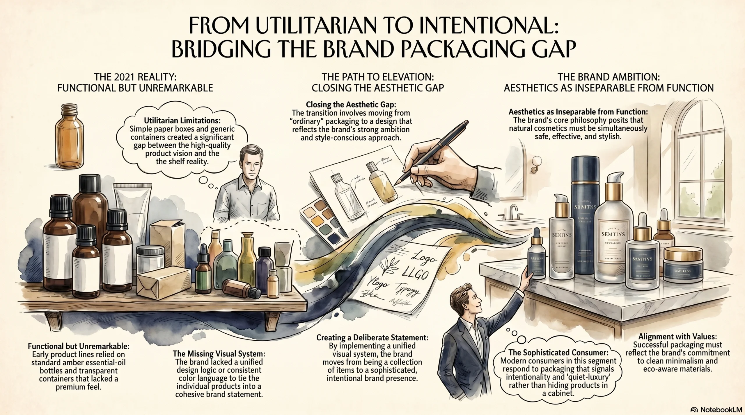
The Brand's Starting Point: Strong Ambition, Ordinary Packaging
The Russian natural cosmetics market is competitive, image-driven, and increasingly sophisticated. Consumers in this segment respond to packaging that signals quality, intentionality, and alignment with brand values — whether that means clean minimalism, eco-aware materials, or a quiet-luxury visual language that makes products look worth displaying rather than hiding in a cabinet.
This brand had all the right instincts. Its positioning centered on natural ingredients, safe and effective formulations, and a style-conscious approach to beauty that treated aesthetics as inseparable from function. The brand’s philosophy was clear: natural cosmetics should be safe, effective, and stylish.
But in 2021, the packaging did not yet reflect that ambition. The early product line relied on standard amber essential-oil-style bottles, some transparent containers, and simple paper boxes — functional, utilitarian, and entirely unremarkable on a shelf. There was no unified visual system, no consistent color language, and no design logic that tied the products together into something that looked like a deliberate brand statement. The gap between the brand’s product vision and its packaging reality was significant.
That gap was also an opportunity — and it is exactly what Jarsking moved to close.
How the Relationship Really Started: Persistence, Research, and Proactive Follow-Up
The story did not begin smoothly. The brand’s founder sent an initial inquiry to Jarsking in 2021, and then the lead went quiet. Many packaging suppliers would have moved on at that point. Jarsking did not.
Instead of closing the file, Jarsking’s account team took a different approach. They researched the founder, reviewed the brand’s public online presence, found the business on social media, and kept following up at considered intervals until the conversation eventually restarted. That persistence was not accidental — it reflected a commercial mindset focused on identifying brands worth investing in and staying the course until the moment was right.
What this section of the story reveals is something that gets lost in most case studies: genuine client development is not passive. It requires reading the market, understanding who is building something interesting, and doing the work to reconnect with people before they become easy wins. The trust that eventually made this partnership possible did not begin at the point of order placement. It began in that early period of patient follow-up and brand research, long before the first RMB changed hands.
For beauty brands evaluating packaging partners, this matters. A supplier who takes the time to understand your brand before you’ve committed to working with them is a supplier who is likely to think strategically rather than transactionally throughout the relationship.
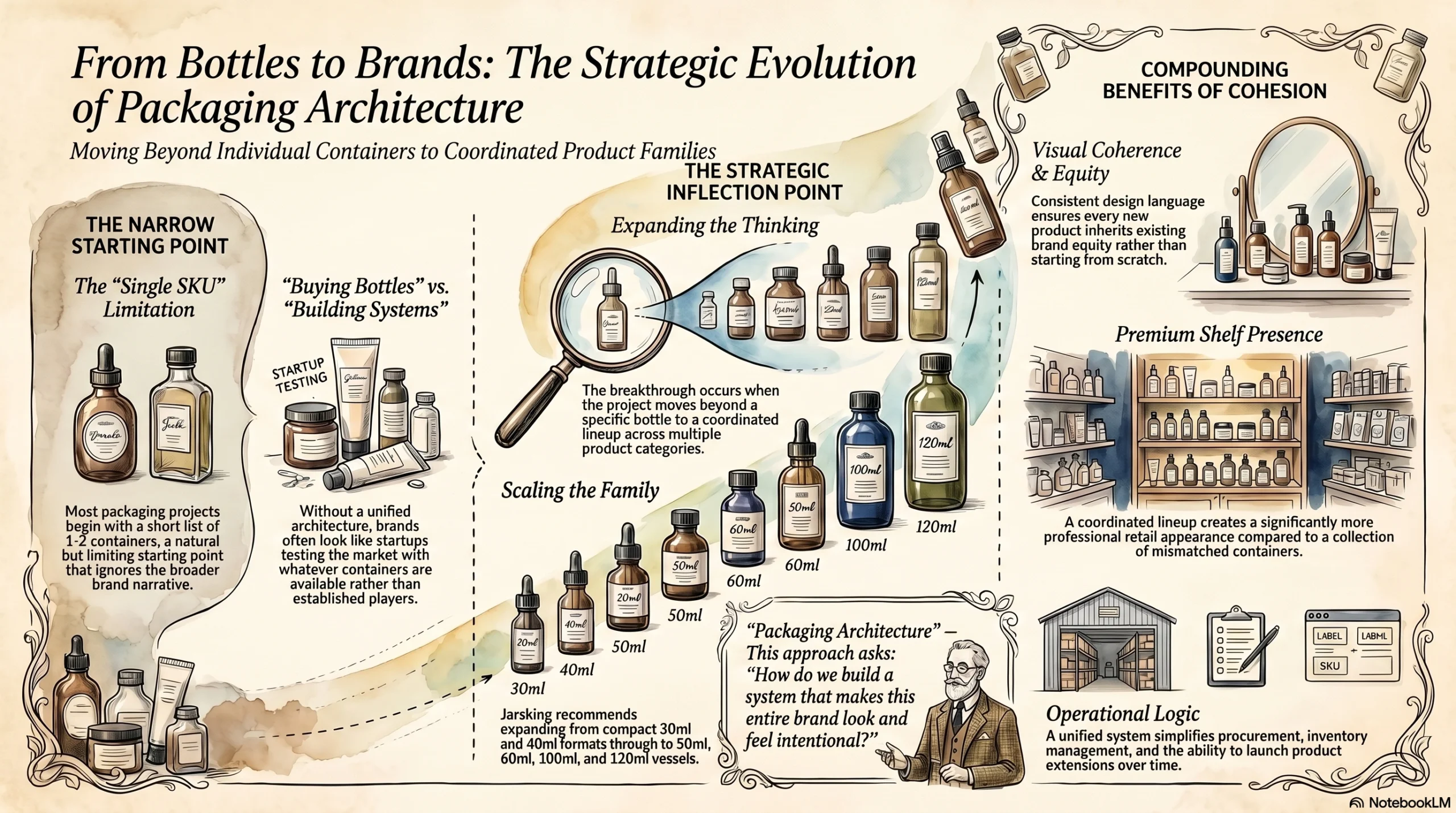
Turning Two Bottle Ideas into a Full Packaging Family
When the conversation restarted, the customer had something concrete in mind: a limited selection of bottles for a specific set of products. This is how most packaging conversations begin — one SKU, two SKUs, a short list of containers. It is a natural starting point. But it is also a limiting one.
The breakthrough came when the project stopped being about one bottle and became about a product family.
Jarsking expanded the thinking from a narrow bottle selection into a coordinated lineup spanning multiple capacities — from compact 30 ml and 40 ml formats through to 50 ml, 60 ml, 100 ml, and 120 ml vessels across different product categories. That single shift changed the entire conversation. The question was no longer “which bottle fits this product?” It became: “How do we build a packaging architecture that makes this entire brand look and feel intentional?”
A well-designed packaging family delivers several compounding benefits that single-SKU decisions cannot. First, visual coherence — when containers share a consistent design language, every new product automatically inherits brand equity rather than starting from scratch. Second, shelf presence — a coordinated lineup looks significantly more premium in a retail environment than a collection of mismatched containers, even if the individual pieces are the same quality. Third, operational logic — a unified system simplifies procurement, inventory management, and product extensions over time.
For this brand, moving from “buying bottles” to “building a packaging system” was the strategic inflection point that set everything else in motion. The expanded family made the brand look like a serious player from the moment new products hit shelves — not like a startup testing the market with whatever container was available.
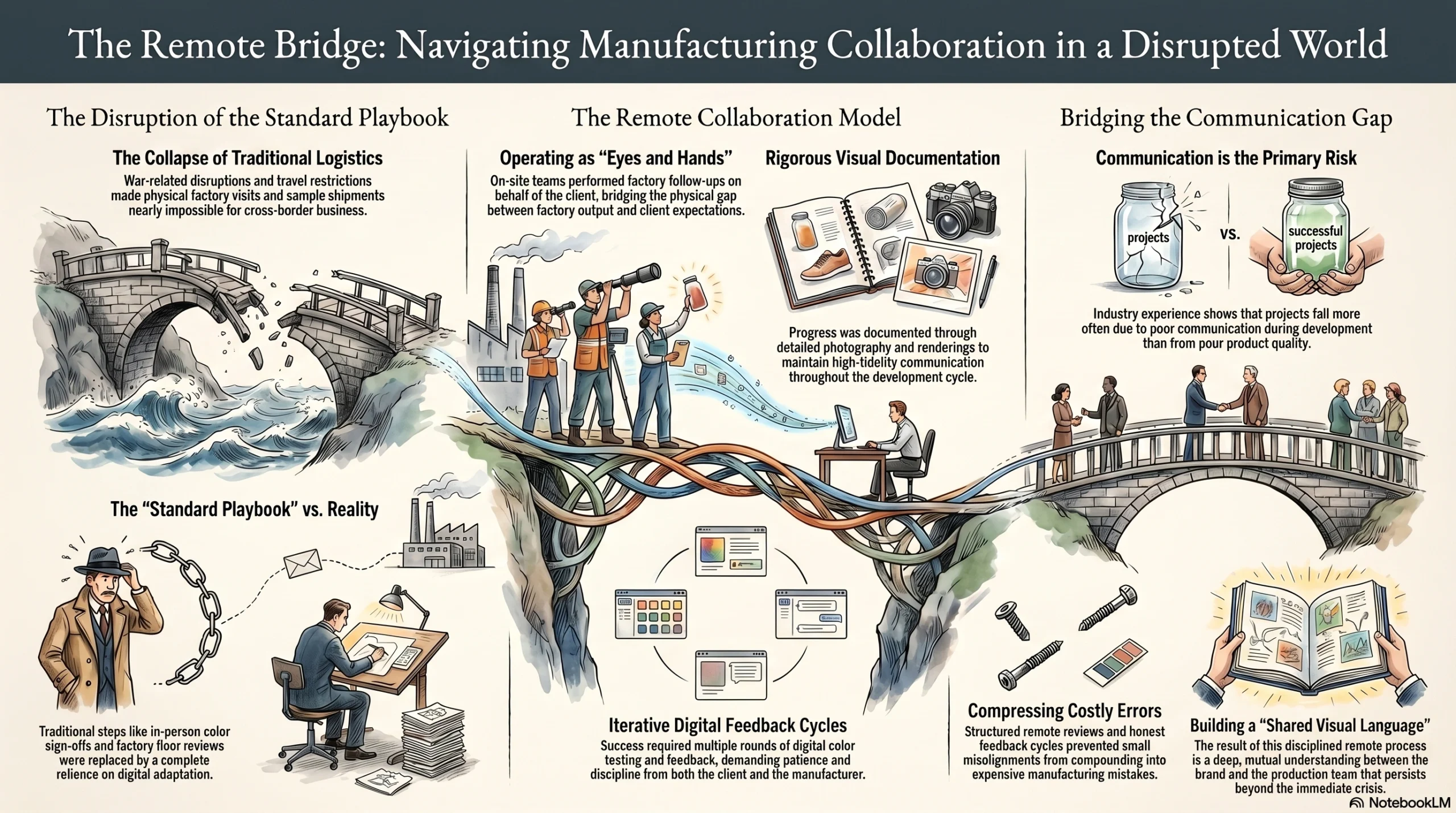
Remote Development During a Difficult Period
The project unfolded during one of the most operationally challenging periods in recent memory for cross-border business. Travel restrictions, war-related disruption affecting supply chains and logistics in and out of Russia, and shipping complications all made the standard playbook — visit the factory, review samples in person, sign off on colors face-to-face — essentially impossible.
The customer could not travel to China. Physical sample shipments were difficult to arrange and slow to arrive. The timeline and the method had to adapt.
Jarsking handled this by operating as the customer’s eyes and hands on the factory floor. The account team conducted follow-up visits to the manufacturing facility, documented color progress through photography and rendering, and maintained disciplined visual communication throughout the development cycle. What might otherwise have been a project stalled by logistics became a proof of concept for remote collaboration done properly.
This matters beyond the immediate story. Based on industry experience, one of the most common reasons cross-border packaging projects fail is not poor product quality — it is poor communication during development. When a supplier does not bridge the gap between factory output and client expectation with rigorous documentation and honest feedback, small misalignments compound into costly errors. Jarsking’s approach of on-site factory follow-up combined with structured remote review compressed those risks significantly.
The process required patience on both sides — multiple rounds of review, color testing, and feedback cycles carried out entirely through digital channels. But the discipline of that process built something important: a shared visual language between the Jarsking team and the brand that would prove essential in the next phase.
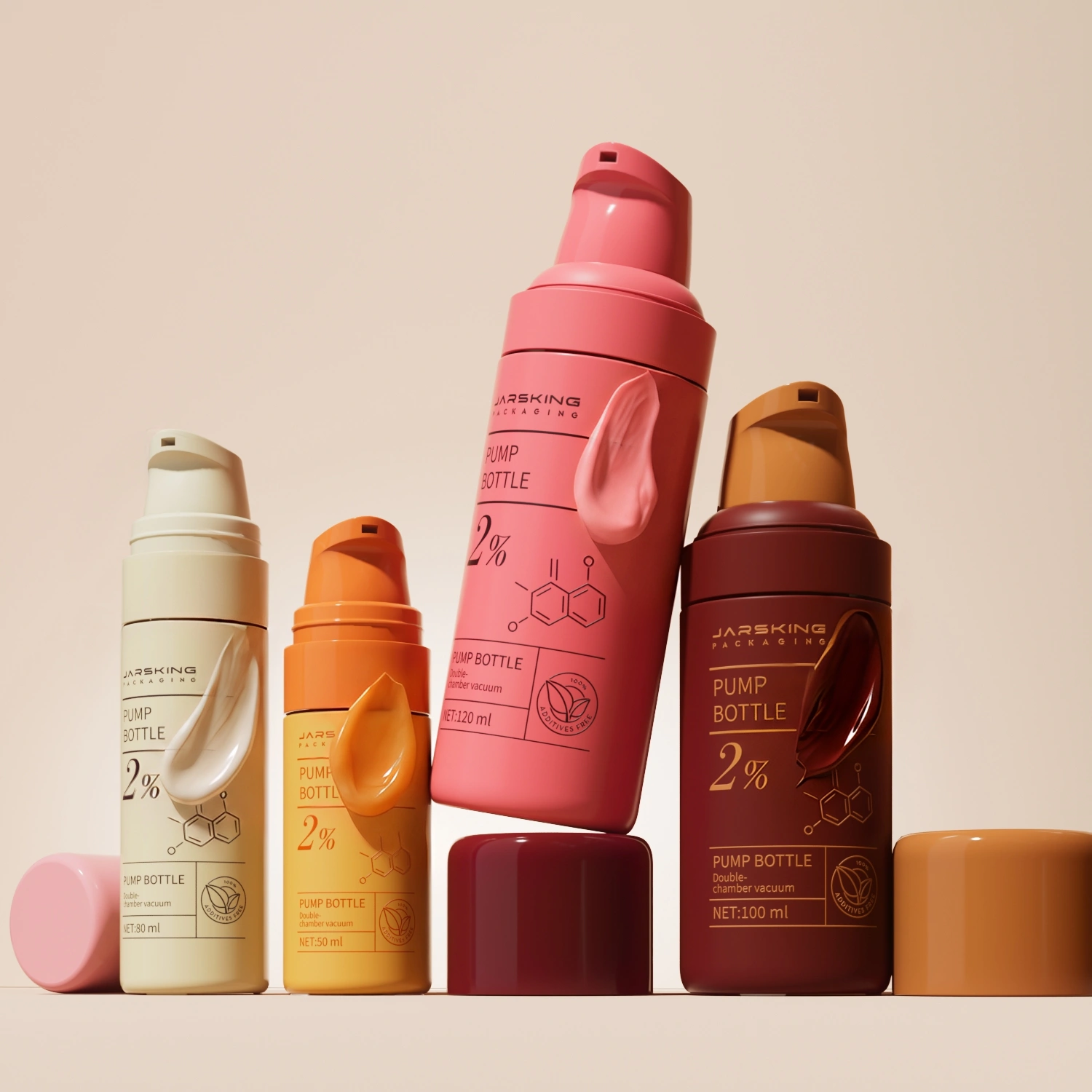
The Color Breakthrough: From Complex Ideas to a Signature Soft-Tone System
If the packaging family decision was the structural turning point in this story, the color development was the creative one.
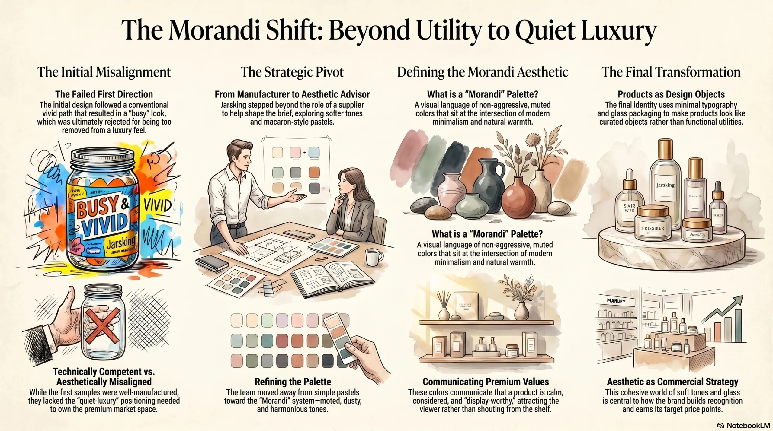
The customer arrived at the project with a design direction in mind. The first round of color development followed that direction closely. When the samples came back, the result was technically competent but aesthetically misaligned: too busy, too vivid, too removed from the quiet-luxury positioning the brand needed to own.
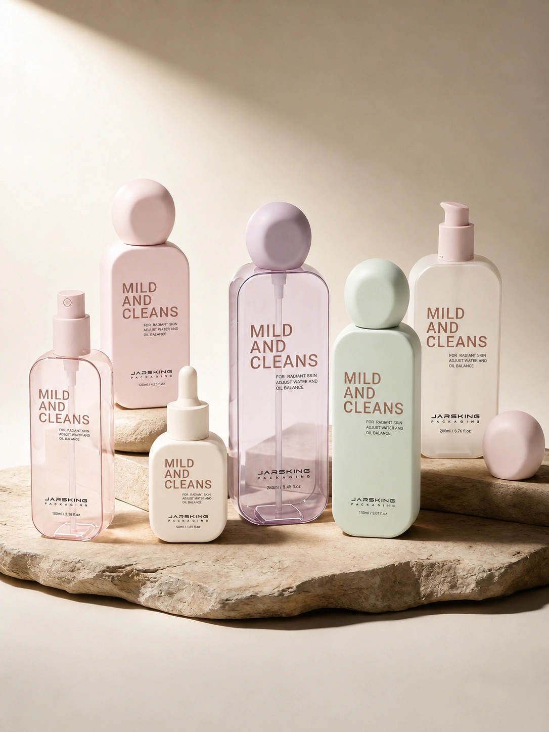
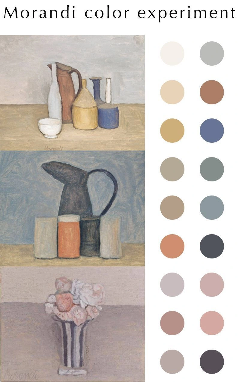
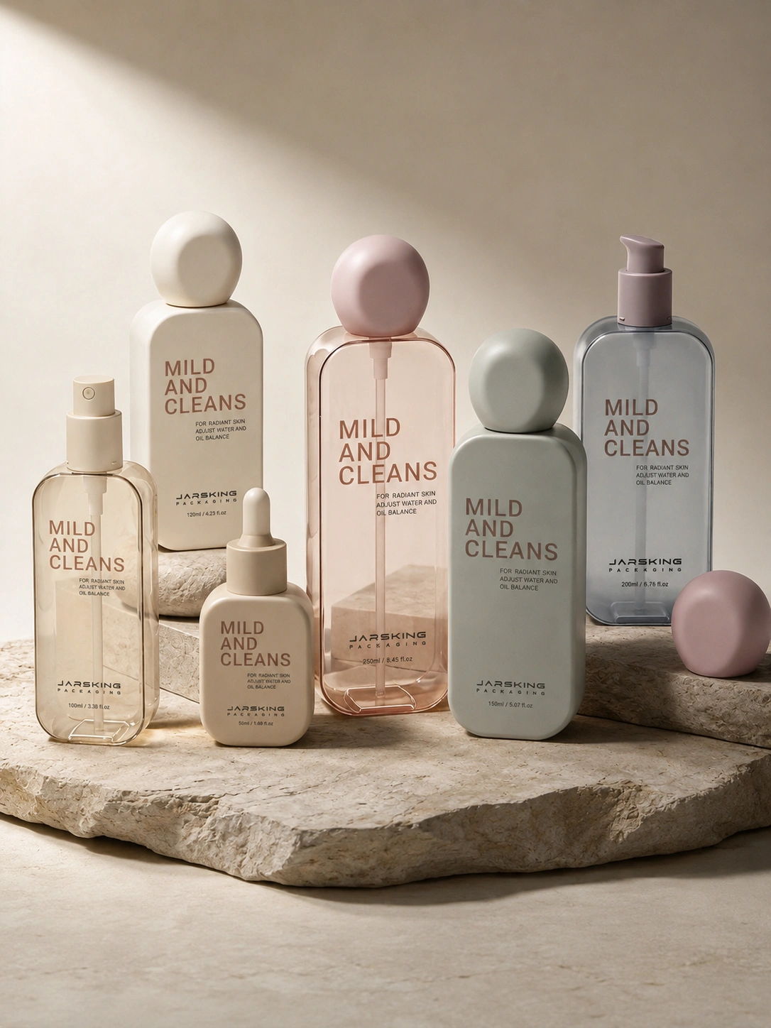
The first direction was rejected. And rather than simply iterate on the original concept, Jarsking stepped into a role that goes beyond packaging manufacturing into something closer to commercial aesthetic judgment. The team introduced a new direction: softer tones, initially exploring macaron-style pastel shades before refining toward the more restrained and sophisticated Morandi color palette — muted, dusty, harmonious tones that sit at the intersection of modern minimalism and natural warmth.
Morandi colors are not an accident. They have become a defining visual language in premium natural beauty because they communicate exactly the qualities the market values: calm, considered, non-aggressive, display-worthy. A product in a Morandi-palette bottle does not shout from the shelf. It attracts. It implies that what is inside is worth taking seriously. For a brand positioned around natural ingredients and functional efficacy, that visual register is exactly right.
The brand’s current public presentation confirms how decisively this direction landed. Its online channels showcase a cohesive world of soft pastel tones, glass packaging, minimal typography, and products that look more like design objects than utility containers. That visual identity is not cosmetic — it is central to how the brand communicates quality, builds recognition, and earns the price points it targets.
Getting there required Jarsking to do more than execute a brief. It required genuine involvement in shaping the brief — the kind of aesthetic contribution that most packaging suppliers are neither positioned nor motivated to offer.
The First Order That Proved the Partnership Was Real
Once the color system clicked, the customer moved quickly. A mid-six-figure RMB opening order was placed — a serious commercial commitment that validated everything the two teams had built together during the development phase.
The significance of that order goes beyond its size. It was placed almost entirely on the basis of remote collaboration. No factory visit, no in-person sample review, no trade show handshake. The trust that drove the decision was built through disciplined communication, creative problem-solving, and a demonstrated ability to listen, adapt, and deliver something that matched the brand’s vision more precisely than the original brief had described.
For Jarsking, this order marked the transition from a promising lead to a real long-term account. For the brand, it marked the beginning of a packaging system that would define its visual identity for years to come. The partnership had moved from exploration to commitment — and the real work of scaling was about to begin.
Expanding from a Packaging Project into a Full Packaging Ecosystem
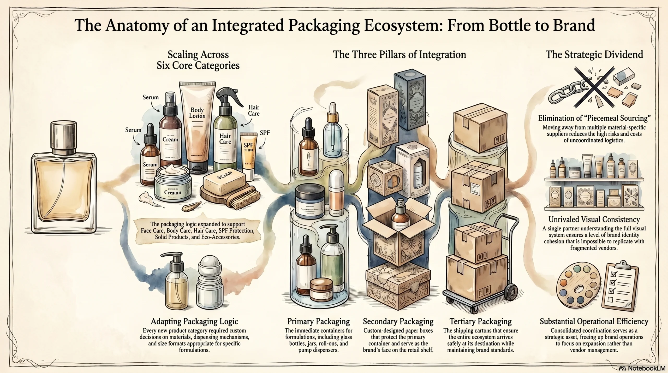
What started as a bottle selection conversation grew, year by year, into something considerably broader. As the brand’s product range expanded — adding new SKUs across its face care, body care, hair care, SPF protection, solid products, and eco-accessory categories — Jarsking’s role expanded alongside it.
The brand’s current catalog illustrates the scale of that expansion. Products span cleansing gels and toners, hyaluronic acid and vitamin C serums, retinol and bakuchiol night creams, SPF 30 and SPF 50 sunscreens, body shower gels, deodorant serums, solid shampoo bars, enzyme powder cleansers, body scrubs, candles, and giftable eco product sets. Each category requires its own packaging logic — appropriate materials, the right dispensing mechanisms, size formats that make sense for the formulation, and a visual treatment that connects back to the brand system.
Jarsking’s support extended across primary packaging (glass bottles, jars, roll-ons, pump dispensers), secondary packaging (custom paper boxes), and tertiary packaging (shipping cartons). That breadth turned the relationship from a supplier arrangement into something much closer to a full-solution packaging partnership — a single point of coordination for the majority of the brand’s packaging requirements.
From a brand operations perspective, this kind of consolidation carries real strategic value. Coordinating multiple packaging suppliers across different material categories is time-intensive, risk-prone, and expensive. When one trusted partner understands the full visual system and has demonstrated the ability to execute across categories, the operational efficiency gains are substantial — and the visual consistency that results is impossible to replicate by sourcing piecemeal.
Why the Packaging Matched the Brand So Well
The alignment between this brand’s packaging and its market positioning was not accidental. It reflected a deliberate set of choices that Jarsking helped develop and refine over multiple project cycles.
The brand’s core identity is built around three pillars: natural ingredients, functional efficacy, and a visual style that makes beauty feel considered rather than indulgent. Glass packaging reinforced all three simultaneously. Glass communicates purity and premium quality in a way that plastic cannot. It signals that the formula inside is worth protecting properly. It photographs beautifully, which matters enormously for a brand building its audience through digital channels. And for a brand with eco-conscious positioning, glass is a more defensible material choice than single-use plastic.
The soft Morandi-influenced color palette added another layer of differentiation. In a category where competitors frequently default to white, black, or aggressively bright accent colors, the brand’s quiet tonal system makes it instantly recognizable at a glance. Experts in visual brand strategy consistently note that color consistency is one of the most powerful drivers of brand recall — consumers recognize color before they read a name. The packaging system that emerged from Jarsking’s development process gave the brand an immediate visual identity that worked across every channel: retail shelf, e-commerce imagery, social media, and gift presentation alike.
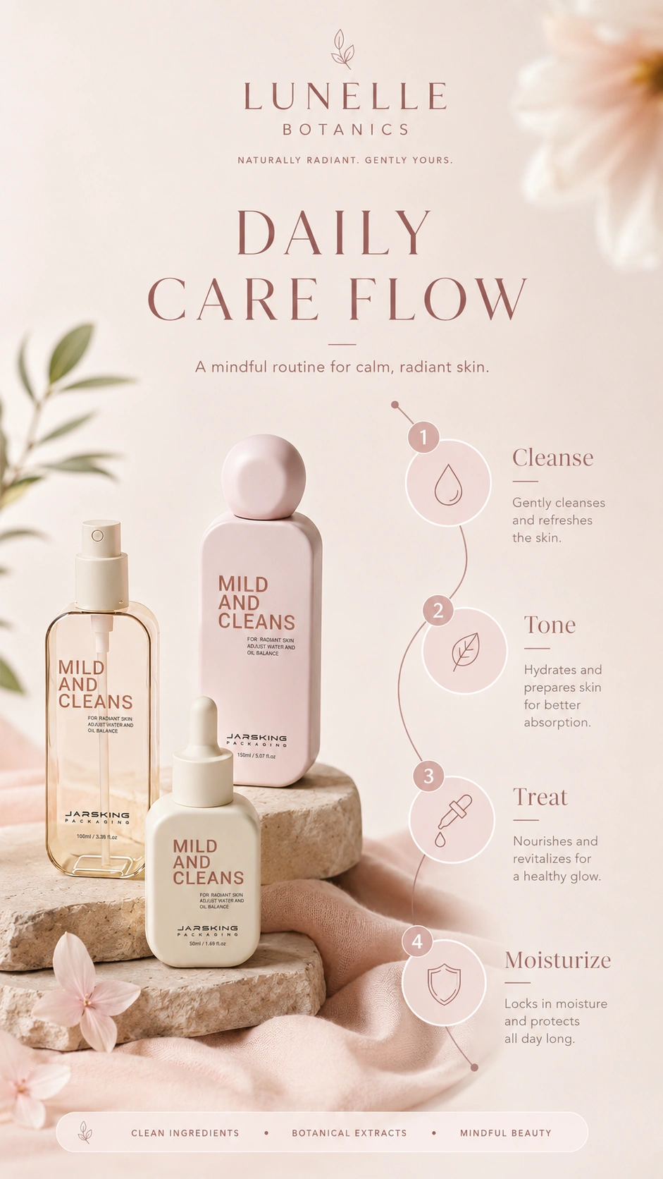
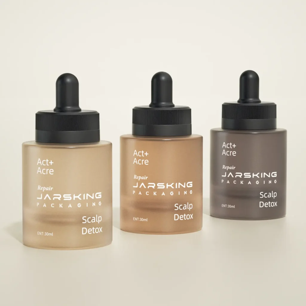
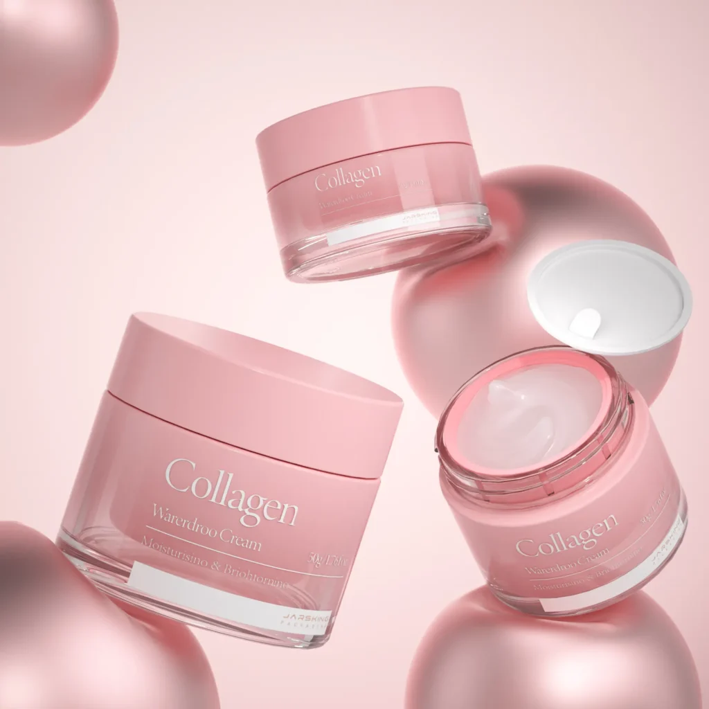
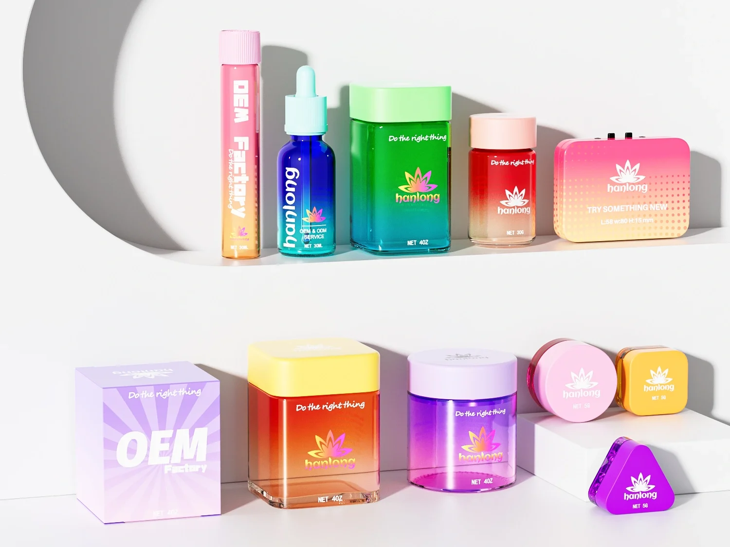
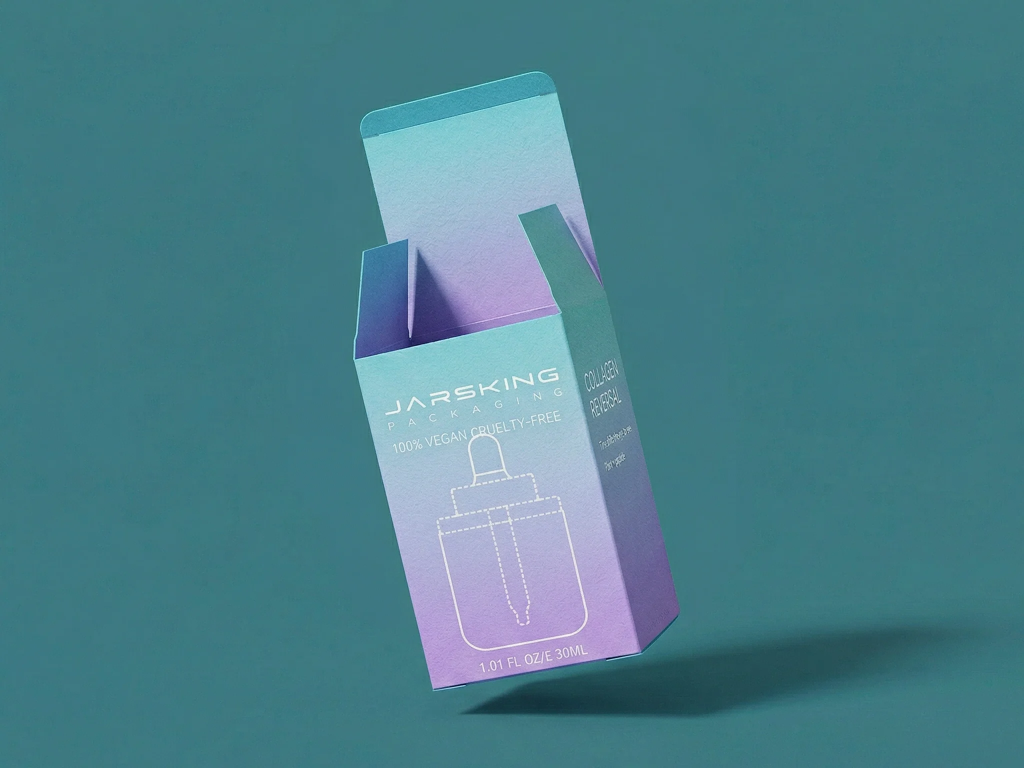
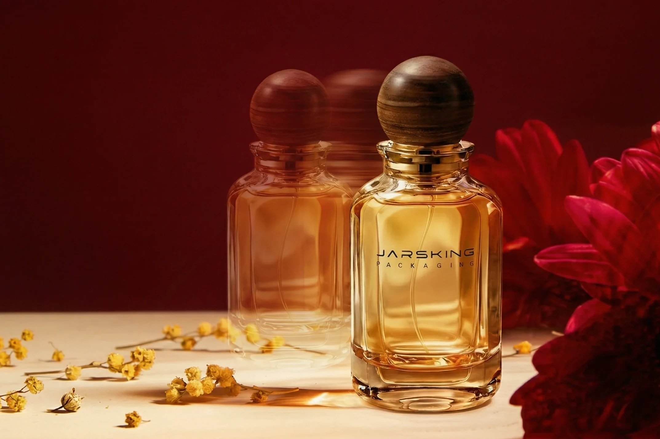
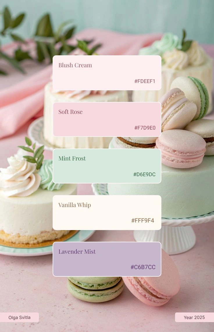
Attention: these images here just visualize the idea from the blog, not the actual brand in this case study.
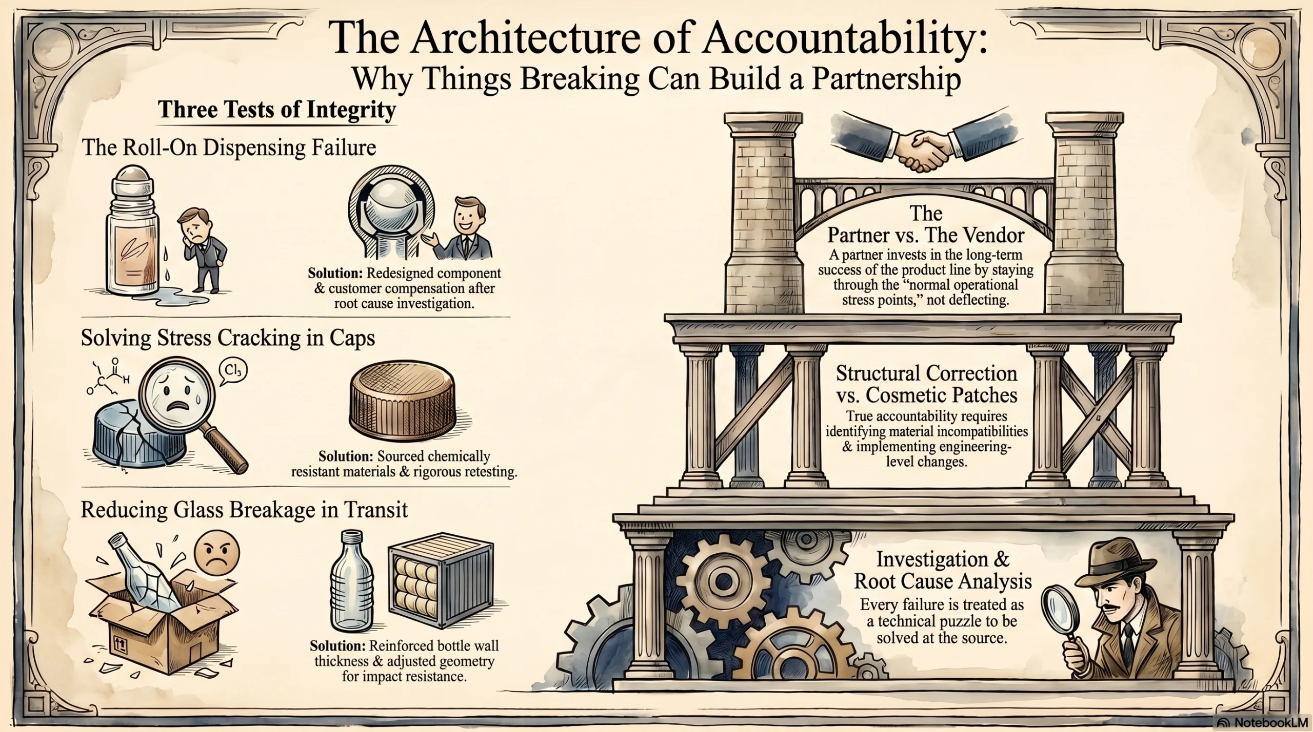
The Hard Part Most Case Studies Skip: What Went Wrong After Launch
A packaging partnership that only talks about what went right is not a partnership worth trusting. The most honest — and ultimately the most persuasive — part of this story is what happened after the product launched and real-world conditions tested the packaging under actual use.
Several issues emerged over the course of the scaling phase.
When Roll-On Performance Failed in Use
One early problem involved the roll-on dispensing mechanism on certain products. Under real use conditions, the application performance did not meet the standard expected. Rather than treating this as a warranty dispute or deflecting responsibility, Jarsking investigated the root cause of the dispensing failure and implemented a corrective fix. The customer received compensation and a revised component.
Fixing Cap Cracking Through Material Redesign
A more technically complex issue involved cap cracking caused by material compatibility problems. When the cap material interacted with the formulation or its solvents over time, stress cracking developed. Solving this required more than a replacement — it required identifying the incompatibility, sourcing a different material with appropriate chemical resistance, and retesting the revised solution. Jarsking worked through that process systematically rather than offering a cosmetic patch.
Strengthening the Bottle Structure to Reduce Breakage
Glass breakage in transit and on-shelf is a persistent challenge for glass-led skincare brands. As order volumes grew and distribution expanded, breakage rates at certain points in the logistics chain required attention. Jarsking responded by implementing structural design changes to the bottles — reinforcing wall thickness and adjusting geometry to improve impact resistance without compromising the visual profile.
Taken individually, each of these problems is unremarkable — they represent the normal operational stress points that emerge when any product line scales. What makes the story worth telling is the response pattern: investigation, root cause analysis, structural correction, and compensation. The customer stayed through every one of these issues not because the problems did not matter, but because the way they were handled proved that Jarsking was a partner, not just a vendor. That distinction is everything in a long-term B2B relationship.
Sustainability and Compliance Became Part of the Partnership Too
As the brand’s positioning evolved and its distribution expanded, sustainability and compliance moved from aspirational talking points to operational requirements.
The brand’s public identity has always emphasized eco-conscious beauty — choosing ingredients and formats that minimise environmental impact and provide transparent, responsible product experiences. That philosophy needed to extend into logistics and packaging materials. The customer moved toward recyclable and lower-waste transport packaging, adopting a no-foam shipping approach that replaced conventional foam padding with more sustainable alternatives. Jarsking supported this transition, adapting carton and protective packaging specifications to meet the brand’s sustainability brief without compromising the protection needed for glass products in transit.
Compliance requirements added a further dimension. As beauty brands operating in or aspiring to European markets navigate evolving packaging regulations — including requirements tied to recycled content, material labelling, and end-of-life recyclability — packaging partners who can anticipate and support those changes become increasingly valuable. Based on industry developments in EU packaging regulation, brands exporting into European markets face tightening requirements that make proactive material planning a genuine competitive necessity. Jarsking’s ability to advise on material adjustments and support future compliance-ready transitions gave the brand a more resilient packaging strategy as its distribution ambitions grew.
From Remote Screens to the Same Room: Why Meeting in Person Changed Everything
There is a moment in most long-term B2B partnerships where the dynamic quietly shifts — and it rarely happens over email.
For this partnership, that shift began when the two teams finally met in person. What had been built almost entirely through digital channels, rendered images, and disciplined follow-up across time zones now had something no video call could replicate: shared physical presence. Over the course of the relationship, meetings took place across multiple locations — in Europe, in Dubai, and in China — each one deepening the working relationship in ways that remote communication, for all its convenience, simply cannot achieve.
Why In-Person Meetings Matter More Than Most Businesses Admit
Research consistently shows that over 80% of senior executives prefer in-person meetings to virtual alternatives, citing their ability to support complex strategic decisions and build the kind of trust that holds under pressure. That preference is not nostalgia. It reflects something real about how human beings process credibility, assess character, and commit to long-term decisions.
In a B2B manufacturing context specifically, the stakes of that trust are unusually high. A brand that relies on a packaging partner is not buying a one-time deliverable — it is extending its visual identity, its quality standards, and its operational continuity into another company’s hands. The confidence required to do that at scale is not built through a well-worded proposal. It is built by seeing how a partner operates in person, how they handle questions they were not prepared for, and how they carry themselves when no one is performing for a camera.
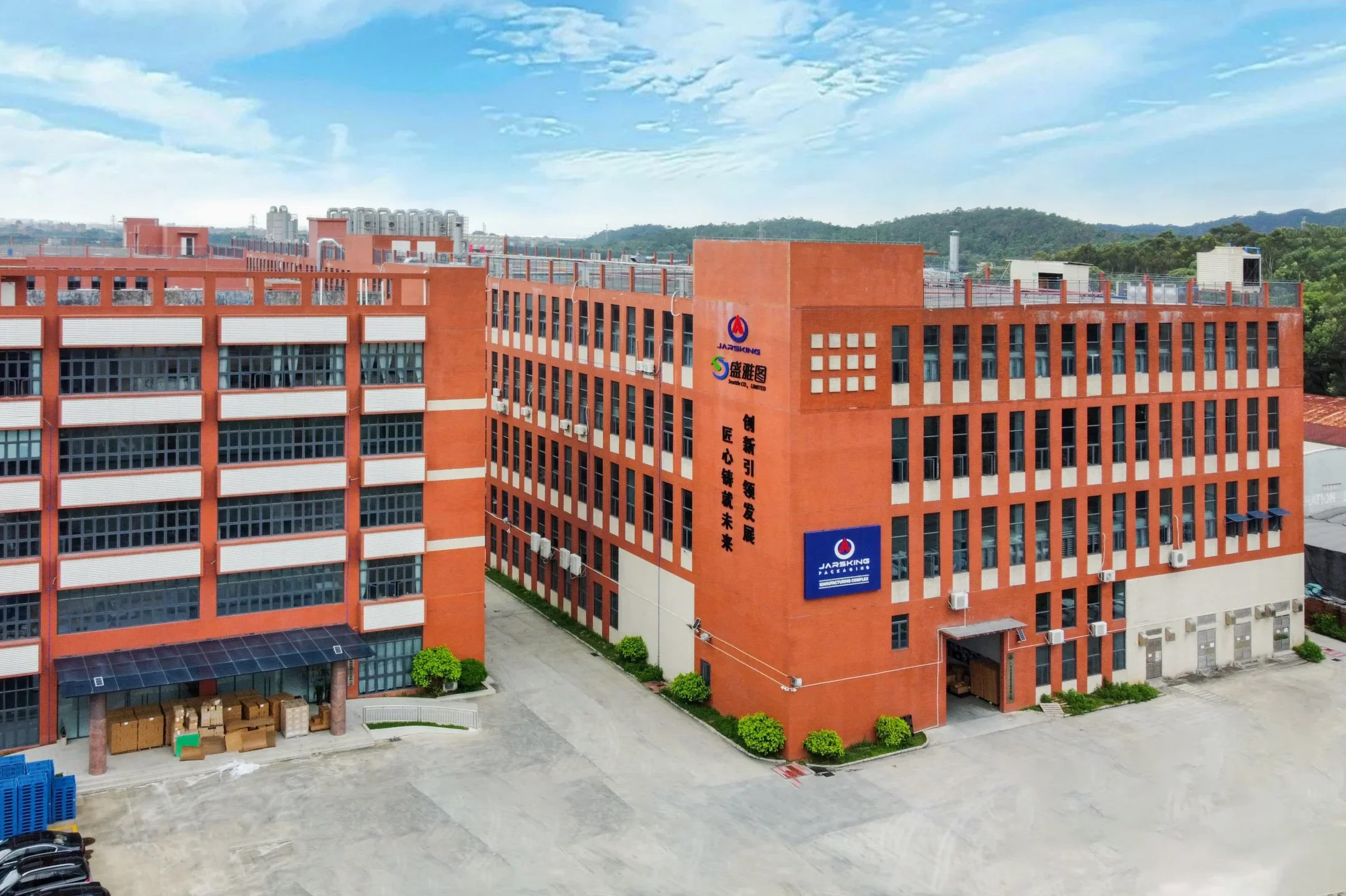
What a Factory Visit Actually Communicates
For cross-border packaging partnerships specifically, a factory visit is not just a logistical convenience. It is a statement of intent — from both sides.
A study published in the Journal of Business Research found that customer participation in factory tours led to measurable economic benefits, with a substantial increase in annual revenues across multiple subsequent years following the visit. The mechanism is straightforward: seeing a production environment in person replaces abstract trust with concrete confidence. A brand that has walked the factory floor, met the team responsible for its orders, and watched its specifications being applied in practice is a brand that orders with more certainty and commits to larger volumes with less hesitation.
In Jarsking’s case, inviting this brand’s team into the factory was a natural extension of the operational transparency that had characterized the partnership from the beginning. The same team that had followed up on the production floor during remote development — documenting color progress, reviewing samples, communicating findings — could now show the customer directly what that work looked like in practice.
What Changes After You’ve Been in the Same Room
The meetings in Europe and Dubai served a different purpose from the factory visits in China, but they were equally important. Trade events and neutral-ground meetings offer an environment where both sides can talk strategy with less operational pressure — where long-term questions about category expansion, market positioning, and future packaging needs can be explored without the urgency of an active production cycle.
In-person collaboration is consistently shown to drive better outcomes for exactly these kinds of conversations. Brainstorming, problem reframing, and long-range planning all benefit from physical co-presence in ways that structured video calls struggle to replicate. When both parties are in the same room, the conversation can move more fluidly between adjacent topics, follow a thread of curiosity, and surface ideas that would never have appeared in a scheduled agenda.
For this partnership, those wider conversations opened new chapters in the relationship. Topics that had started as operational questions — new product categories, evolving compliance requirements, packaging sustainability — evolved into joint planning. The brand began to think of Jarsking not just as the company that produced its current packaging, but as a partner to think with about where the brand was going next.
What This Success Story Says About Jarsking's Role in Beauty Packaging
The story of this Russian skincare brand is a useful illustration of something broader about how packaging value is actually created for growing beauty brands.
The conventional framing of a packaging supplier relationship focuses on unit economics: price per piece, minimum order quantity, lead time, and quality consistency. Those factors matter. But they are not where the decisive value lives for brands at the stage this customer was at when the partnership began.
The decisive value lived in Jarsking’s willingness to do several things that are harder to quantify:
- to pursue a lead that had gone cold because the brand’s potential was worth the effort;
- to expand a narrow brief into a coherent packaging system that gave the brand real strategic equity;
- to navigate a remote development process with the rigor and visual discipline it required;
- to make an aesthetic judgment call on color direction that turned out to be central to the brand’s identity;
- to handle post-launch quality problems with accountability rather than evasion;
- and to grow alongside a customer as its complexity and ambition increased.
These are not manufacturing capabilities. They are partnership capabilities — and they are precisely what separates packaging partners who contribute to brand growth from suppliers who simply fulfill orders.
Conclusion: A Partnership Built to Grow With the Brand
A Russian natural skincare brand with strong product ambitions and a clear visual identity needed packaging that could match its market positioning and support a growing product range. The packaging it started with was basic and uncoordinated. What it needed was a system — a family of containers, a consistent color language, a coherent aesthetic identity, and a supplier partner capable of delivering and maintaining all of it across years of growth.
Jarsking provided exactly that. From the persistence of initial follow-up through the creative problem-solving of color development, the discipline of remote execution, the accountability of post-launch quality recovery, and the strategic breadth of a full-ecosystem packaging partnership — the value delivered was not a single order or a single design. It was a compounding series of contributions that helped build a brand capable of scaling.
The result speaks through the brand’s public presence today: a visually cohesive, premium, eco-conscious skincare line that looks exactly as intentional as it is.
If your brand is navigating a similar moment — ready to move from basic packaging to a premium, scalable system — Jarsking has the experience, the process, and the partnership approach to help you get there. Explore Jarsking’s packaging solutions or contact the team for a consultation tailored to your brand’s growth stage.
FAQs
Jarsking works with brands to build coordinated packaging families — not just individual bottles. That means developing a consistent design language across multiple sizes, formats, and product categories so every SKU looks like it belongs to the same brand. For growing beauty brands, this is far more valuable than sourcing containers one at a time.
Yes — and this case study is direct proof. The entire development phase, including color selection, sample review, and design approval, was completed remotely due to travel and shipping restrictions. Jarsking handles on-site factory follow-up, documents progress through photography and rendering, and maintains structured communication throughout. A factory visit adds value when the time is right, but it is not a prerequisite for getting started.
Color development is a collaborative process. Jarsking presents multiple directions, tests samples against the brand’s aesthetic and target market, and provides honest feedback — including when a direction is not working. For this Russian skincare brand, the first color direction was rejected and the second round refined toward a softer Morandi-style palette that ultimately defined the brand’s visual identity. Getting color right sometimes takes more than one round, and that iteration is part of the process.
Jarsking investigates the root cause rather than deflecting responsibility. In this partnership, real issues arose — roll-on performance failures, cap cracking due to material incompatibility, glass breakage, and component mix-up errors. Each one was addressed with a combination of compensation, structural redesign, material changes, and process controls. After-sales accountability is not a bonus — it is a core part of how Jarsking operates.
Yes. Jarsking supports brands with recyclable and lower-waste transport packaging, no-foam shipping alternatives, and material planning aligned with evolving export and compliance requirements — including regulations affecting brands distributing into European markets. Sustainability support is built into the partnership, not treated as a separate add-on.
The timeline depends on the complexity of the packaging system, the number of development rounds required, and logistics factors. For this brand, the process from initial contact to first major order spanned several months and included multiple color development cycles — all managed remotely. Brands that arrive with a clear brief move faster; those building a system from scratch should allow adequate time for sampling and refinement. Jarsking’s team will set realistic expectations from the first conversation.