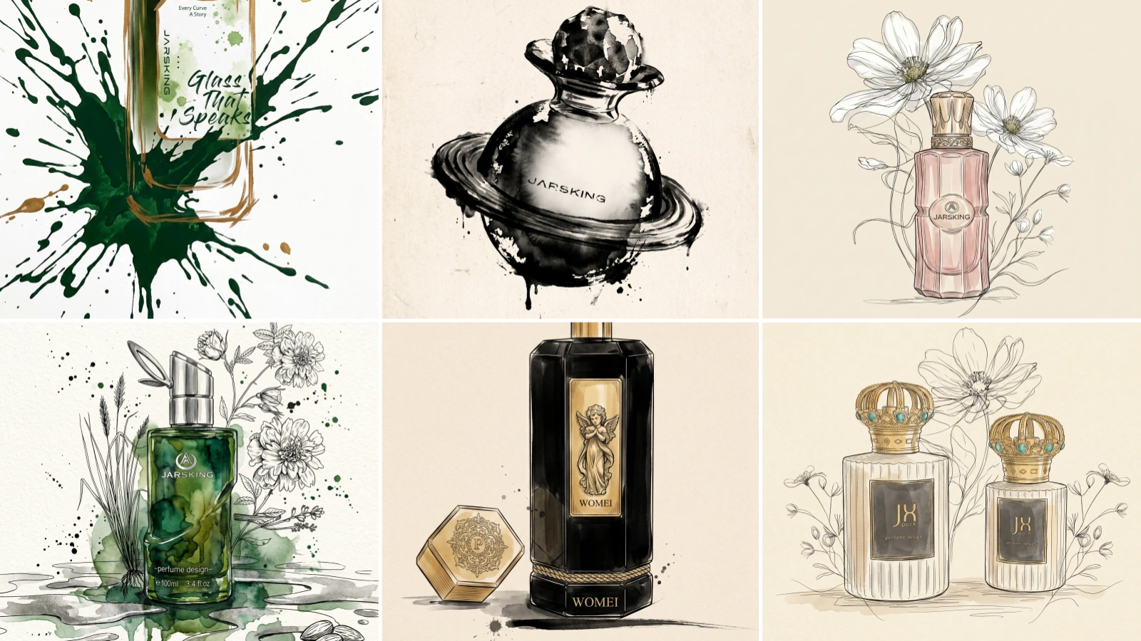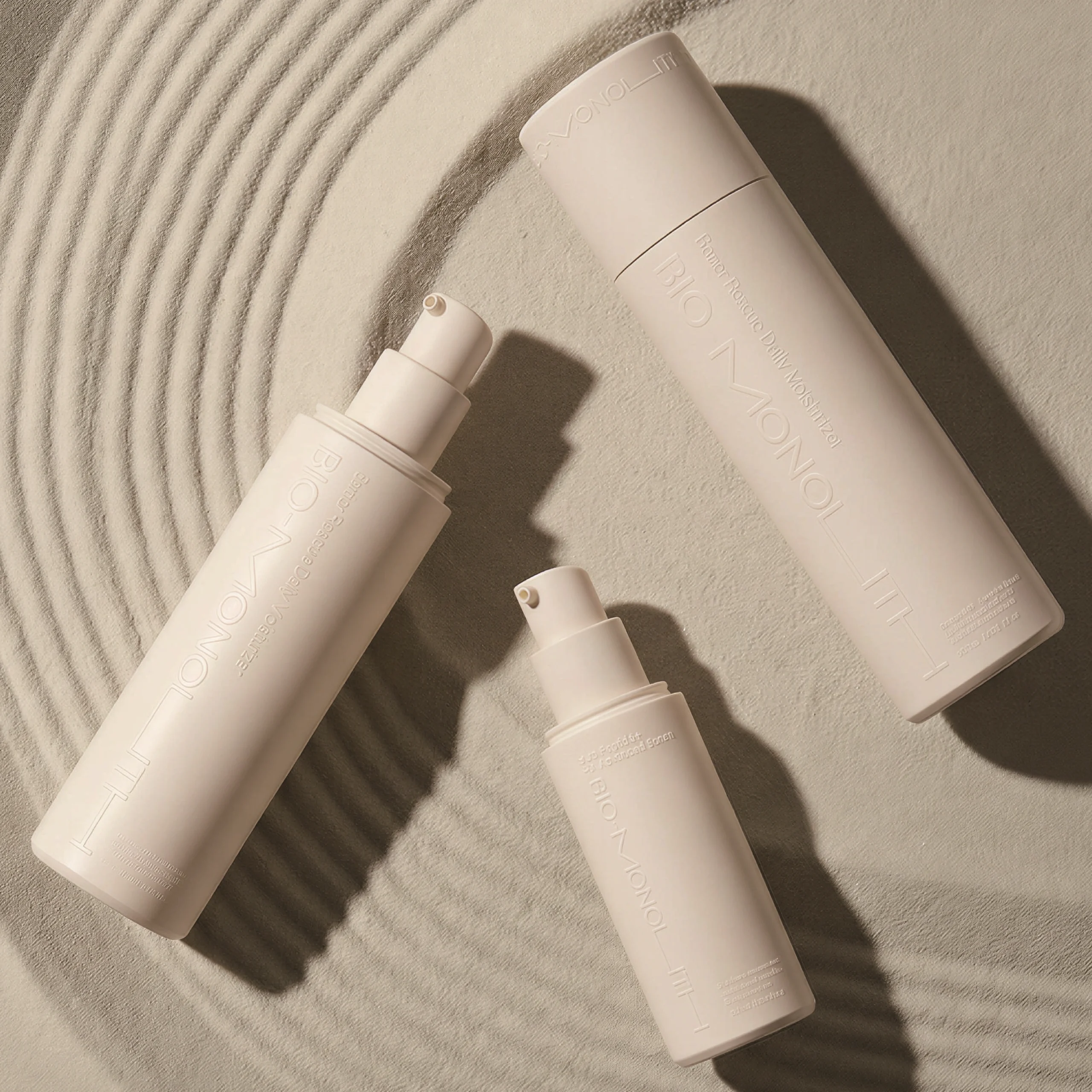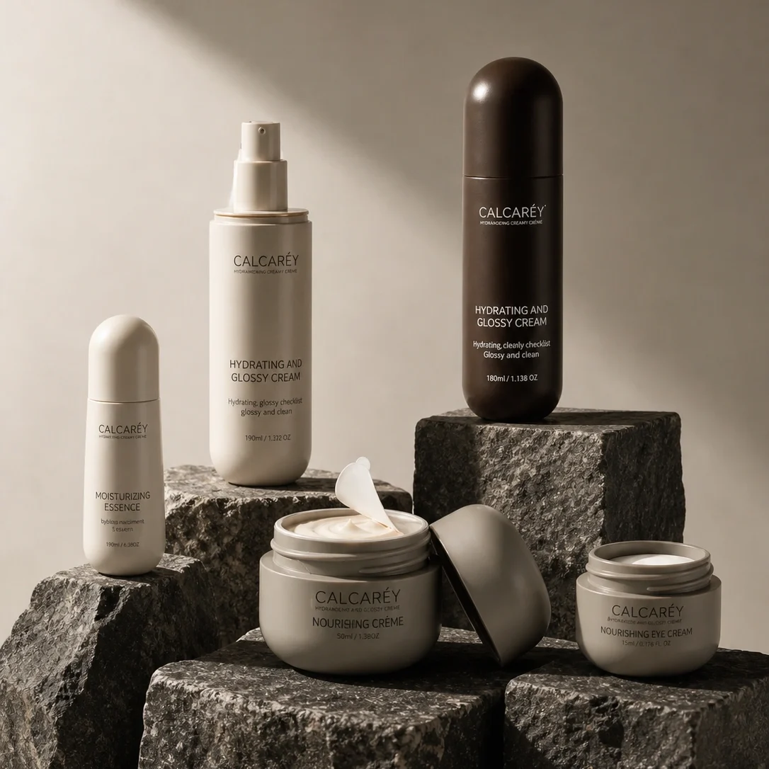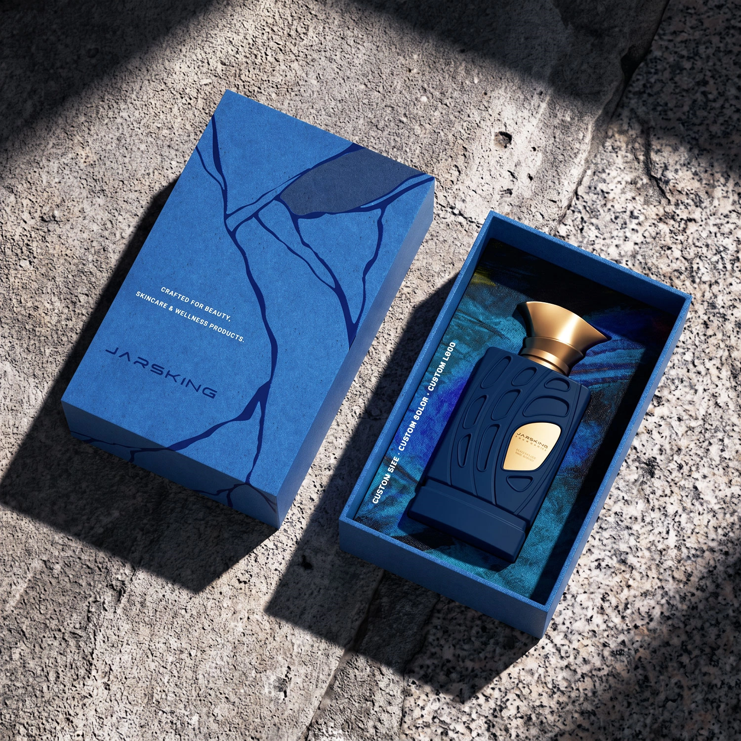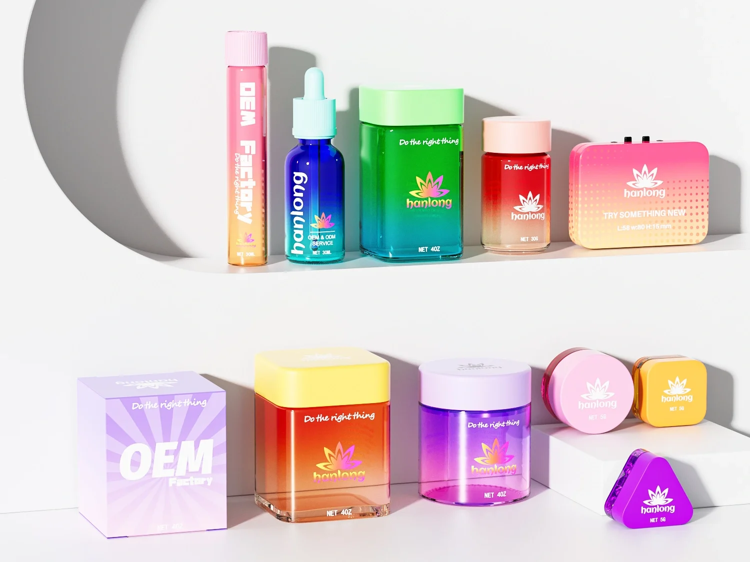


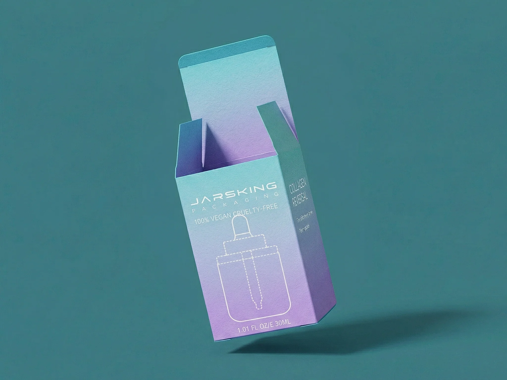










The best cosmetic packaging decoration technique is the one that delivers the intended brand effect on the chosen material while surviving production, filling, distribution, retail handling, and consumer use. Screen printing, hot stamping, spraying, metallization, labels, engraving, embossing, and other processes can all create strong results—but they do not solve the same problem, and they are not interchangeable.
For buyers, the difficult part is rarely identifying a finish that looks attractive in a rendering. The difficult part is turning color, material, finish, artwork, component geometry, and quality expectations into a decoration system that can be sampled, measured, repeated, and approved.
This guide explains the major cosmetic packaging decoration techniques, how they interact with glass, plastic, tubes, caps, and cartons, and what to evaluate before production. It also includes selection matrices, a decision tree, a project workflow, and realistic scenarios. Any MOQ, decoration limit, tolerance, ink system, test protocol, or substrate compatibility must be confirmed per project.
Key takeaways
- Start with the package material and geometry, not the finish name.
- Separate base-color treatment from graphics, metallic accents, texture, and information.
- Use color, material, and finish—CMF—as one coordinated system across the complete package.
- Approve physical decorated samples under defined viewing and handling conditions.
- Test the actual decoration-substrate-formula combination; a process that works on one pack may not work on another.
- Treat decoration as part of design for manufacturing and design for recycling, not as a final cosmetic layer.
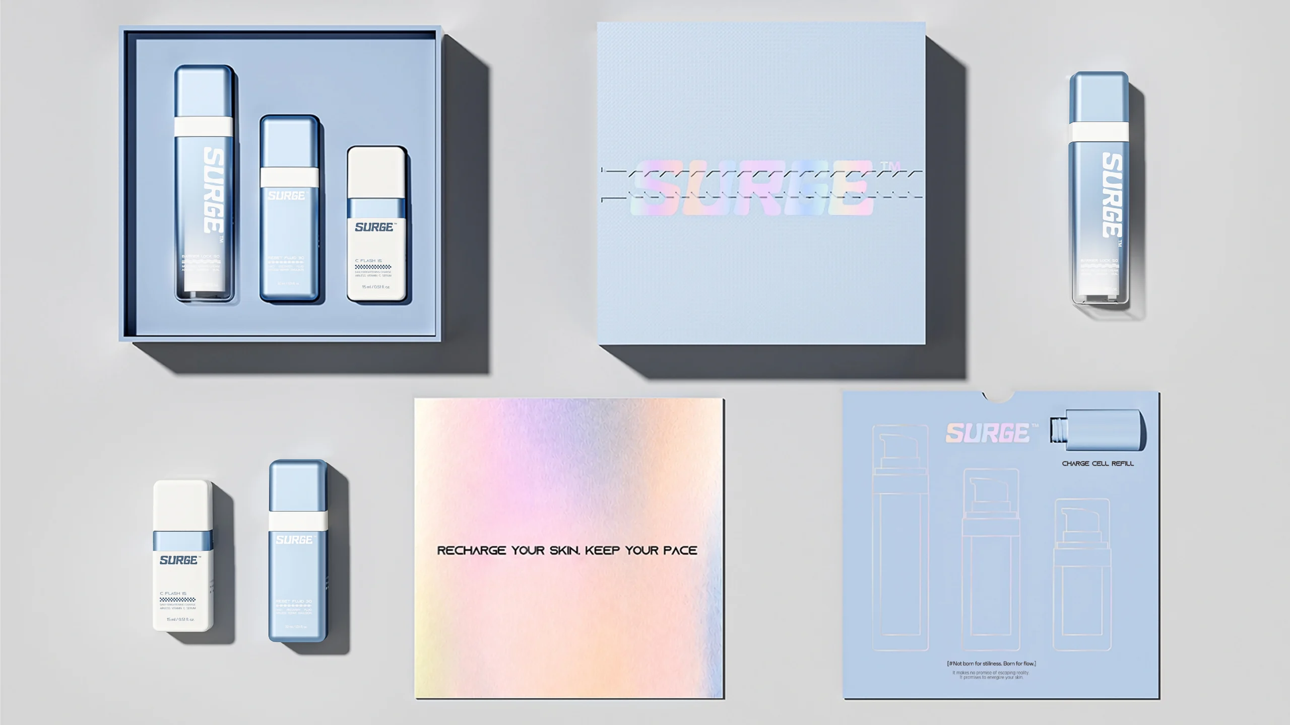
What is cosmetic packaging decoration?
Cosmetic packaging decoration is the set of processes used to add color, graphics, texture, reflectivity, information, and branded visual effects to a container, component, tube, label, carton, or gift box.
Decoration can perform several jobs at once:
- Establish the package’s dominant color and sheen
- Apply a logo, product name, directions, or legal copy
- Create contrast between matte, gloss, transparent, and metallic areas
- Coordinate the bottle, pump, cap, collar, jar, tube, and box
- Differentiate variants across a product range
- Communicate a clinical, natural, playful, prestige, or fragrance-led identity
- Protect printed information from routine handling when the selected system is validated for that use
Decoration is not the same as structural customization. A new bottle shape, closure system, neck, wall profile, or custom mold changes the physical package. Decoration modifies the visual or tactile surface of an existing structure.
In practice, the two must still be developed together. A dramatic curve may limit printable area, a sharp shoulder may complicate a gradient, and a deep recess may prevent consistent contact during a transfer process.
It is also important to separate decoration from formula protection. A metallic appearance does not automatically create a functional light barrier, and a colored coating does not prove compatibility with a cosmetic formula. Barrier performance, formula compatibility, dispensing, transport, and regulatory testing require their own project-specific evidence.
The following matrix organizes decoration by the job it performs. It is a starting point for a brief, not a universal process specification.
| Decoration family | Primary visual job | Common design strengths | Key buyer questions |
|---|---|---|---|
| Screen printing | Direct graphics and text | Solid logos, readable copy, controlled color areas | Is the surface printable? How many passes and colors are practical? What adhesion and rub checks apply? |
| Hot stamping | Reflective or colored foil accent | Metallic logos, borders, small premium details | Can the geometry support clean foil transfer? How will registration and wear be evaluated? |
| Spraying or coating | Base color, translucency, texture, gradient | Full-body color, frosted effect, soft matte or special-effect base | Is the coating external or in contact with product? What pretreatment, cure, and compatibility checks apply? |
| Metallization | Mirror-like metallic surface | Chrome, gold, rose-gold, brushed, or reflective appearance | How much of the component is metallized? Does the effect influence sorting or recycling claims? |
| Labels and transfers | Graphics, information, variable SKU content | Complex artwork, multiple information layers, late-stage differentiation | What label substrate, adhesive, ink, coverage, moisture, and recycling conditions apply? |
| Engraving or etching | Permanent-looking recessed or altered mark | Minimal logos, tactile identity, subtle premium detail | Is the material and wall geometry suitable? Will the mark remain legible at production scale? |
| Embossing or debossing | Raised or recessed form | Tactile logos and structural brand cues | Is this created in the mold, tool, label, or carton? What detail can be reproduced consistently? |
| Offset or digital print | Detailed, multicolor graphics | Fine artwork, tonal images, tube or label decoration | Which substrate and shape are suitable? How will color and registration be controlled? |
| Sleeves or jackets | Large-area coverage or added outer layer | 360-degree storytelling, strong color blocking, component masking | How does the added layer affect assembly, use, separation, and recycling evaluation? |
Jarsking’s approved manufacturing facts include 20 screen-printing lines, 10 hot-stamping lines, three spraying lines, and metallization in chrome, gold, rose gold, and brushed finishes. Its portfolio also includes labels, folding cartons, rigid gift boxes, inserts, and sleeves.
Other processes, combinations, colors, materials, and performance requirements must be confirmed per project. Buyers can review the current Customization & Deco options as visual inspiration before defining a technical brief.

Start with the substrate: glass, plastic, tubes, components, or cartons
The substrate determines which decoration routes are technically plausible, what pretreatment may be needed, how the finish looks, and how it should be tested.
Glass packaging
Glass offers clarity, weight, and a hard surface that can support direct printing, sprayed color, frosted appearances, and selected metallic or etched effects. Yet “glass” is not a complete decoration specification. Bottle geometry, wall distribution, molded detail, curvature, surface condition, and whether the decoration sits outside or inside the container all matter.
High-clarity flint glass, for example, makes transparent and gradient treatments visually prominent because the undecorated material remains part of the design. A full opaque coating does the opposite: it uses glass for its structural and tactile character while visually replacing the transparent surface.
For format and material context, buyers can also review Jarsking’s glass cosmetic packaging portfolio before building the decoration brief.
For any inside treatment or product-contact risk, escalate compatibility and safety review. In the United States, FDA explains that a cosmetic can be considered adulterated if its container is composed of a poisonous or deleterious substance that may make the contents injurious.
That does not prescribe one decoration process, but it reinforces why product-contact surfaces and migration risks cannot be treated as purely aesthetic decisions. See the FDA’s official summary of adulterated and misbranded cosmetics.
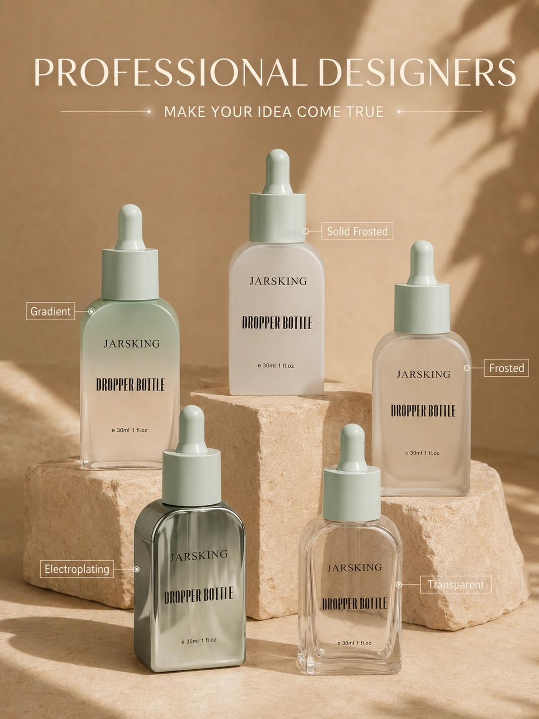
Plastic bottles, jars, pumps, and caps
Plastic decoration begins with the resin, molded surface, additives, color, and component geometry. PET, PE, PP, ABS, and other plastics do not behave identically under printing, coating, heat, or pretreatment. Even within one resin family, surface energy, texture, recycled content, colorant, and molding conditions can change the result.
The complete component should be reviewed. A cylindrical bottle body may accept direct graphics, while its shoulder, pump collar, actuator, and cap require different methods.
A brand that specifies “matte black with a gold logo” must still decide whether matte comes from the molded resin, an external coating, a sleeve, or another surface system—and whether the gold is ink, foil, metallization, or a separate component.
Tubes
Tubes introduce a flexible, squeezable substrate and a seam or layered construction. Jarsking’s portfolio includes PE, aluminum barrier laminate (ABL), and plastic barrier laminate (PBL) tubes. Artwork must account for the print area, tube orientation, crimp area, closure position, distortion during use, and the visual relationship between the tube body and cap.
Complex multicolor imagery may point toward offset, digital, or label-based solutions, while a simple brand system may use fewer solid-color elements. The suitable process, artwork limits, and durability expectations must be confirmed per project.
Caps, overcaps, collars, and pumps
Small components often carry the strongest premium cue and the highest registration risk. A metallic collar may anchor a fragrance design; a hot-stamped cap may repeat the logo; a contrasting actuator may identify the SKU.
The decoration plan should state which surface belongs to which component and whether parts are decorated before or after assembly.
Folding cartons and rigid boxes
Secondary packaging can carry fine information, high-impact foil, embossing, debossing, coatings, labels, and inserts even when the primary package remains visually restrained.
This creates a useful allocation strategy: keep the bottle technically simple and put narrative, complex graphics, or tactile reveal into the carton or gift box.
Jarsking’s carton capabilities include folding, hinged-lid, sliding, and slip-lid boxes, while its secondary portfolio includes labels, magnetic or satin-lined rigid gift boxes, inserts, sleeves, and corrugated shippers. Specific boards, print systems, foils, laminations, and structures remain confirm per project.
How the main decoration techniques compare
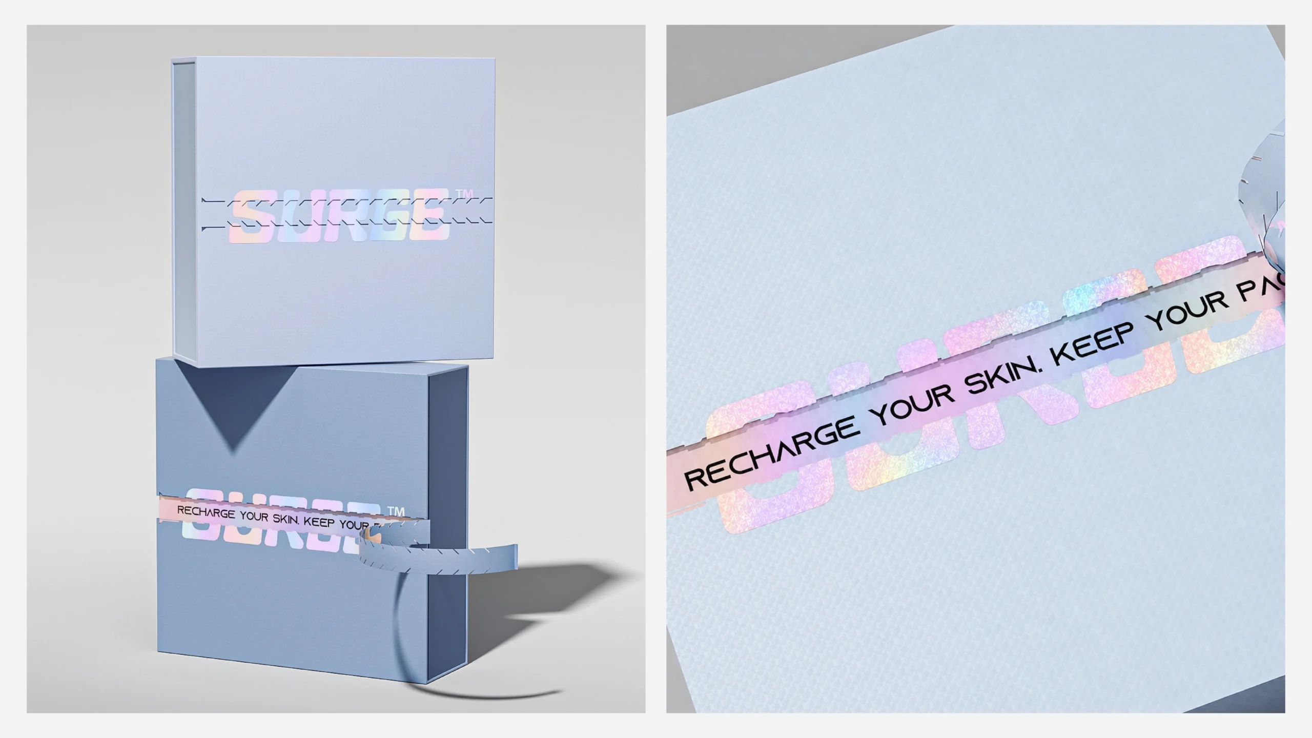
Screen printing: strong for solid graphics and direct brand marks
Screen printing is often considered when a brand needs a direct logo, product name, or bold area of color on a suitable bottle, jar, tube, or component. It is strongest when the artwork can be separated into controlled solid-color elements.
Buyer advantages include direct-to-pack graphics, strong opacity potential, and a clear relationship between each ink pass and artwork layer.
Constraints can include curvature, fine detail, color-to-color registration, surface preparation, cure conditions, and the relationship between ink and any underlying coating.
Ask these questions:
- Is the artwork designed as spot-color separations or as a continuous-tone image?
- Where does the printable area begin and end on the actual geometry?
- Is the printing applied to bare material or over a coating?
- What physical color reference controls approval?
- What adhesion, abrasion, formula-contact, and handling checks are appropriate?
Screen printing can also work as one layer in a combination. A sprayed base can establish the package color; screen printing can carry functional copy; a small hot-stamped accent can create reflectivity.
Hot stamping: best treated as a controlled accent
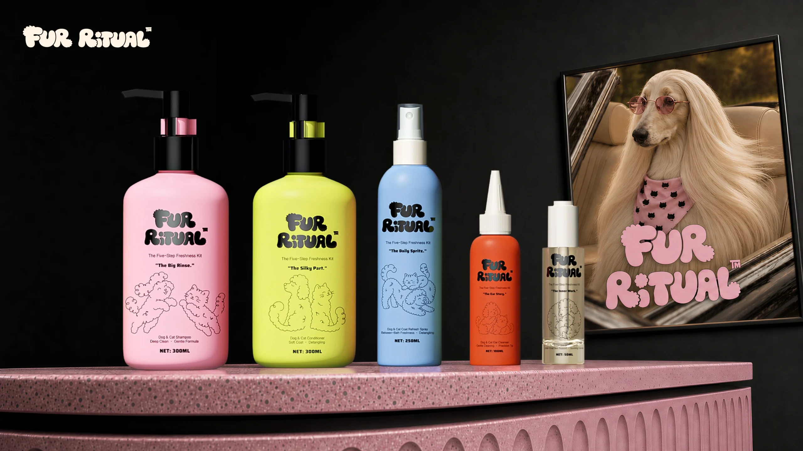
Its appeal is contrast. Reflective detail can stand out against matte, frosted, dark, or transparent backgrounds.
Its risks are equally specific. Curvature, edges, recessed areas, inconsistent contact, and underlying coatings can affect transfer. Fine detail that looks perfect in vector artwork may not reproduce identically on a rounded component.
Use hot stamping when the reflective accent has a clear job. Avoid adding foil everywhere simply because the brand is positioned as luxury. A small, well-registered logo can look more deliberate than a large reflective area competing with the bottle shape.

Spraying and coating: the base layer that changes the entire object
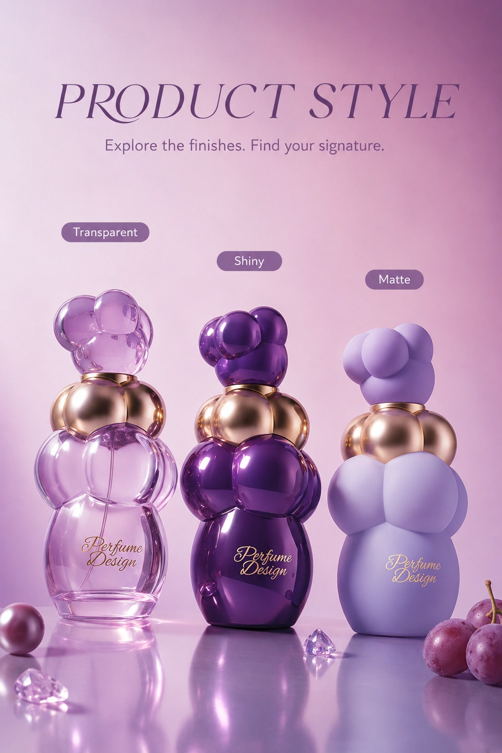
Spraying or coating is used when the package needs a different overall color, opacity, translucency, sheen, tactile impression, or gradient. It can transform clear glass into a soft frosted object, create a controlled color fade, or establish a matte field behind printed graphics.
The buyer should define the effect in operational language:
- Transparent, translucent, or opaque
- Full coverage or partial mask
- Uniform or gradient
- Matte, satin, gloss, pearlescent, or special effect
- External or inside surface
- One component or coordinated across several materials
Words such as “soft,” “premium,” and “luxurious” are moodboard language, not acceptance criteria. Translate them into an approved physical sample, agreed viewing conditions, and project-specific inspection requirements.
Metallization: high reflectivity with system-level implications
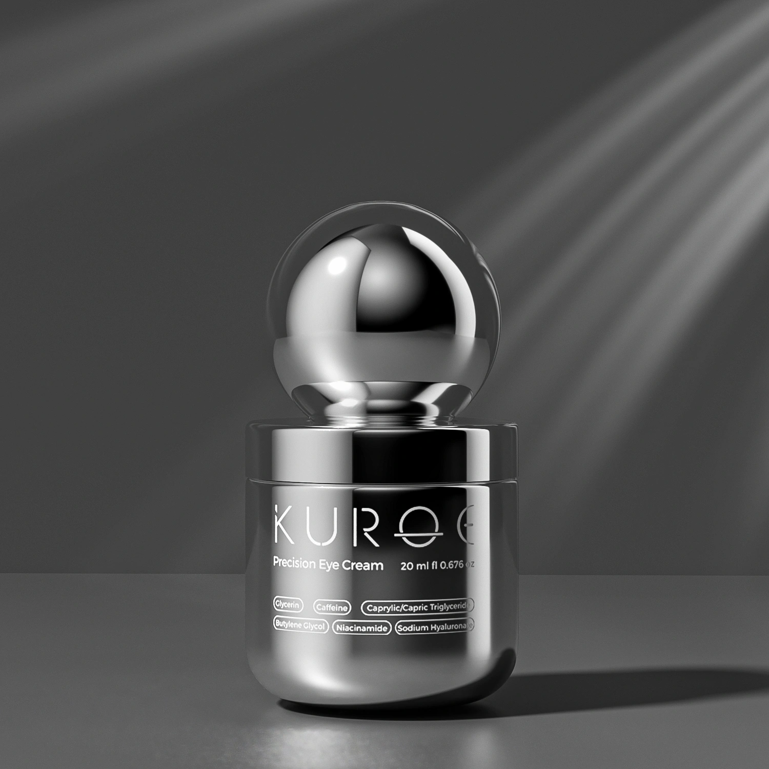
Metallization creates a metallic appearance across all or part of a component. Jarsking’s approved finish palette includes chrome, gold, rose gold, and brushed effects. Availability on a particular component, resin, coating stack, or geometry must be confirmed per project.
Metallization is valuable when the component itself should read as metallic—such as a cap, collar, overcap, or selected bottle area. It should be distinguished from hot stamping, which is usually a localized transferred accent, and from metallic ink, which creates a printed metallic impression.
Design teams should also flag metalized or metallic printed elements during design-for-recycling review. The Association of Plastic Recyclers notes that label surface area, substrate, metal decoration, inks, and adhesives can influence automated sorting and recyclate quality, and it recommends testing in relevant cases. See the APR’s NIR sorting resource.
This does not mean every metallic effect prevents recycling. It means the claim must be evaluated for the actual package system.
Labels, transfers, and sleeves: flexible information architecture
Labels and transfers are useful when the project needs complex graphics, multiple language or SKU versions, regulatory information, or later-stage differentiation.
They shift the decoration problem from direct printing on the container to a system involving label material, ink, adhesive, coverage, application, and end-use exposure.
For e-commerce and bathroom environments, consider:
- Condensation
- Oils
- Repeated handling
- Scuffing
- Edge lift
For recycling review, consider how label material, adhesive, ink, coverage, and metallic decoration behave with the base container.
APR’s guidance for PET thermoforms, for example, emphasizes selecting and testing compatible labels, adhesives, and inks rather than evaluating the container alone. See its PET packaging design resource.
Engraving and etching: subtle identity through surface alteration
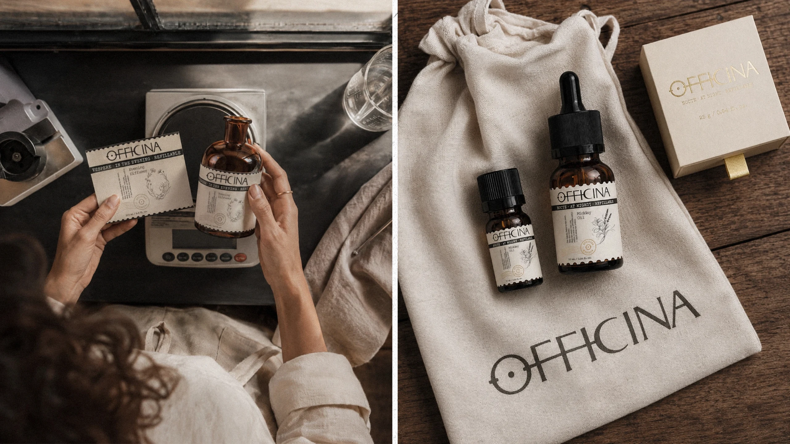
Engraving or etching can create a restrained, tactile brand mark without adding a large printed area. It is often conceptually attractive for fragrance, wellness, and limited-edition packaging because it lets the material carry the design.
The process route and result depend on the substrate, depth, mark size, artwork, equipment, geometry, and required legibility.
Do not assume that every glass or plastic surface accepts the same engraving method. Confirm the process and approve a physical sample.
Embossing and debossing: build texture into structure or secondary packaging
Embossing raises a design element; debossing recesses it. The effect may be created through a mold, forming operation, label, carton die, or another tooling route.
That distinction matters because each route changes cost, detail, location, and development time differently.
For a primary container, a molded logo is a structural decision and should be resolved before tooling. For a carton, an embossed or debossed mark may be a secondary finishing step. Availability and achievable detail are confirm per project.
substrate-to-technique map
| Package area | Strong starting candidates | Watch-outs | Practical approval artifact |
|---|---|---|---|
| Clear glass bottle | Screen print, spray, frosting effect, selected hot stamp or metallization | Curvature, transparency, coating uniformity, contact-surface risk | Decorated bottle with formula-compatible test plan |
| Colored plastic bottle | Direct print, label, selected coating, or metallic component | Resin and additive behavior, surface preparation, scuffing, sortation | Production-material decorated sample |
| Flexible tube | Offset, digital, selected screen print, or label route | Distortion, seam, crimp, closure orientation, repeated squeezing | Filled or simulated-use tube sample |
| Cap or overcap | Hot stamp, print, metallization, molded texture | Small area, curvature, registration, assembly damage | Assembled pack sample |
| Folding carton | Offset or digital print, foil, embossing, debossing, coating, or label | Rub, fold cracking, registration, color match to primary pack | Converted carton, not flat proof alone |
| Rigid gift box | Wrap print, foil, embossing, debossing, inserts, and sleeves | Material joins, corners, opening sequence, component fit | Fully assembled box with insert and product |
Build a CMF system, not a collection of finishes
Color, material, and finish strategy keeps decoration coherent across the whole product range. Without it, individual choices can look attractive alone yet inconsistent together.
Consider a skincare range with a glass serum bottle, PP cap, dropper assembly, plastic travel bottle, and folding carton.
One “warm gold” can appear different as:
- Hot-stamped foil
- Metallized plastic
- Printed ink
- Digital screen color
The goal is not necessarily to make four technologies look optically identical. The goal is to define an intentional hierarchy.
For example, the cap might be the reference metallic, the carton foil the closest supporting match, and printed gold reserved for secondary copy.
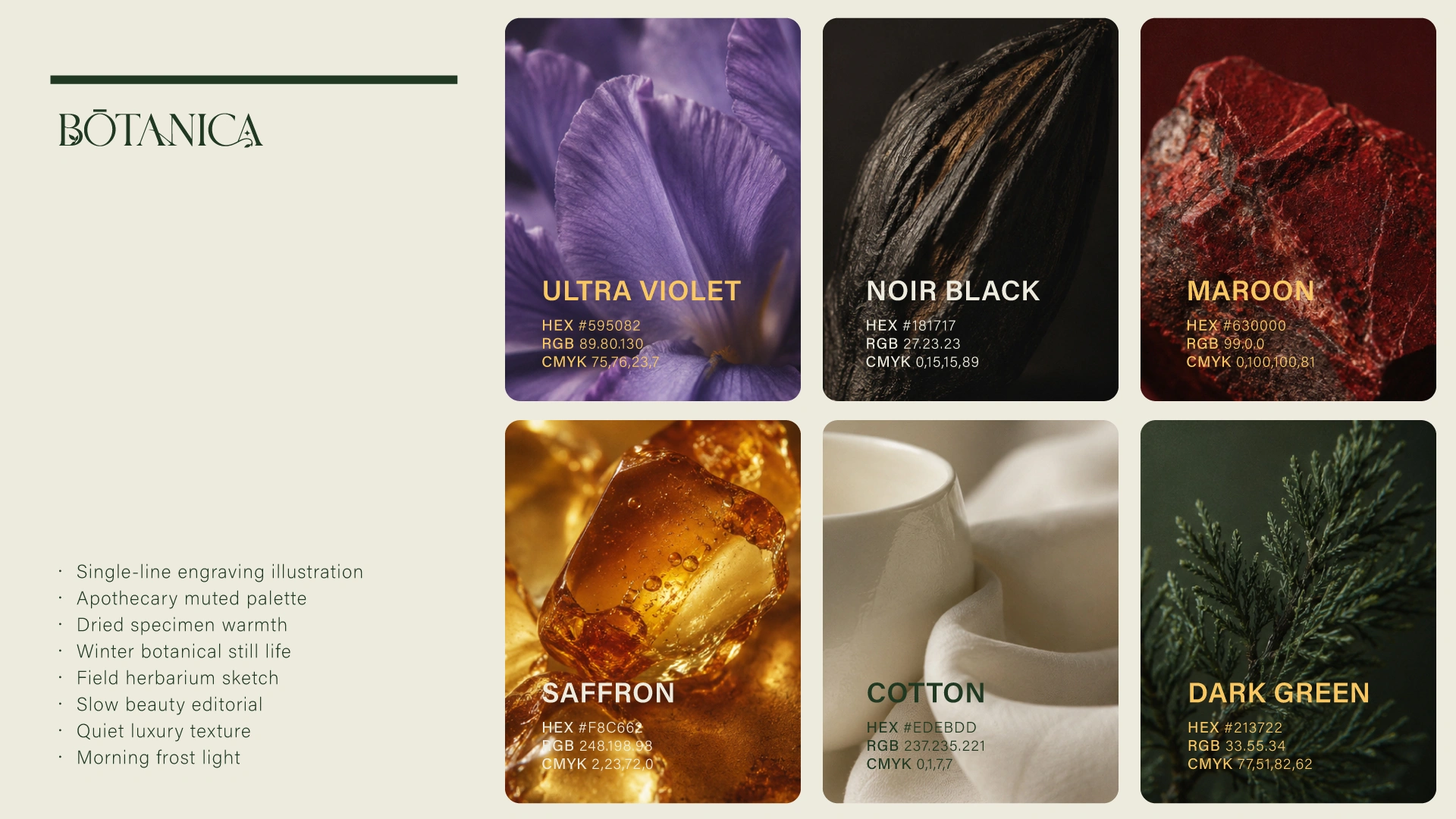
Pantone explains that color appearance can change with material and that some colors may not be achievable on every material. It also distinguishes physical and digital color workflows for print and packaging. See Pantone’s color-system overview.
For Jarsking projects, provide vector AI or PDF artwork plus a Pantone reference or physical color sample.
Define these CMF roles in the brief:
- Hero material: The substrate that should remain visible or tactile
- Dominant finish: The base sheen, opacity, texture, or color
- Brand mark: The logo process and reference color
- Information layer: Product name, claims, directions, or variant code
- Accent: Foil, metallic, gloss contrast, texture, or secondary color
- Cross-component rule: How bottle, cap, pump, and box should relate
- Variant rule: What changes between SKUs and what remains fixed
Artwork preparation: convert creative intent into producible information
Good artwork files reduce ambiguity, but they do not replace a decoration specification.
Send vector AI or PDF files with clearly named layers, defined spot colors, dimensions, orientation, and a reference showing placement on the actual package.
The artwork package should answer:
- Which graphics are printed, foiled, engraved, molded, labeled, or left transparent?
- Which color is the master reference for each process?
- What is the front-facing orientation relative to the pump, cap, seam, or crimp?
- Which copy must remain legible after assembly and filling?
- Are transparent, white, metallic, or underprint layers required?
- Which version controls when the rendering and vector file differ?
- Which areas are intentionally free of decoration?
Avoid approving color from an uncalibrated monitor alone. Pantone notes that on-screen simulations may not accurately match physical Pantone standards. Use the digital file to communicate geometry and separations, then use physical references and decorated samples to approve appearance.
A structured path from the initial packaging brief to production control and continuous project support.
-
01Project foundationBrief
-
02Creative directionColor, Material, and Finish (CMF) Strategy
-
03Technical reviewSubstrate and Geometry Review
-
04Process planningArtwork Separation and Process Selection
-
05SamplingDecorated Sample
-
06EvaluationVisual and Functional Evaluation
-
07Final approvalRevision and Approved Master Sample
-
08Production preparationPurchase Order and Pilot Run
-
09Quality controlMass-Production Inspection
-
10Ongoing managementLot Traceability and Continuous Support
Decoration feasibility, testing methods, acceptance criteria, and project specifications should be confirmed per project.
Test the decorated package against its real use
Decoration approval should cover appearance and use conditions.
A perfect display sample can still fail if:
- Ink scuffs during shipping
- A coating changes under formula contact
- A foil mark wears at the grip point
- A label lifts after condensation
- A collar scratches the bottle during assembly
- An insert damages a decorated surface
Build a project-specific test conversation around the actual risk:
- Adhesion of a coating or printed layer to the substrate
- Abrasion or rub resistance during packing, shipping, and handling
- Resistance to the filled formula, oils, alcohol, surfactants, moisture, or cleaning exposure
- Color consistency under agreed viewing conditions
- Gloss or matte consistency where sheen is controlled
- Light exposure where color stability matters
- Temperature and humidity conditions relevant to storage and distribution
- Assembly effects, including scratches from collars, caps, conveyors, or inserts
- Legibility and registration after filling and final assembly
- Transport testing of the finished pack
Do not copy a generic test list into a purchase specification without confirming applicability.
ISO 2409:2020 describes a cross-cut method for assessing a coating’s resistance to separation from a substrate, while also stating that it is not itself a measurement of adhesion.
ISO 2813:2014 describes gloss measurement at 20°, 60°, and 85° for suitable non-textured coatings on plane, opaque substrates.
ASTM D5264-98(2019) addresses comparative abrasion resistance of printed materials on flat packaging substrates.
These references demonstrate why method, specimen, substrate, and acceptance criteria must be agreed—not assumed.
For visual color review, ISO 3668:2017 describes comparison against a standard using artificial light sources in a standard booth. It notes that special-effect pigments require prior agreement on viewing details.
Metallic, pearlescent, iridescent, gradient, and transparent finishes are especially sensitive to angle and lighting.
Jarsking supports AQL ISO 2859 sampling, lot-number traceability, multi-stage quality control, and third-party audit and documentation support. The precise defect categories, sample plan, tolerances, tests, and acceptance criteria should be written into the project quality plan.
Four scenario analyses
Scenario A: a clinical skincare serum range
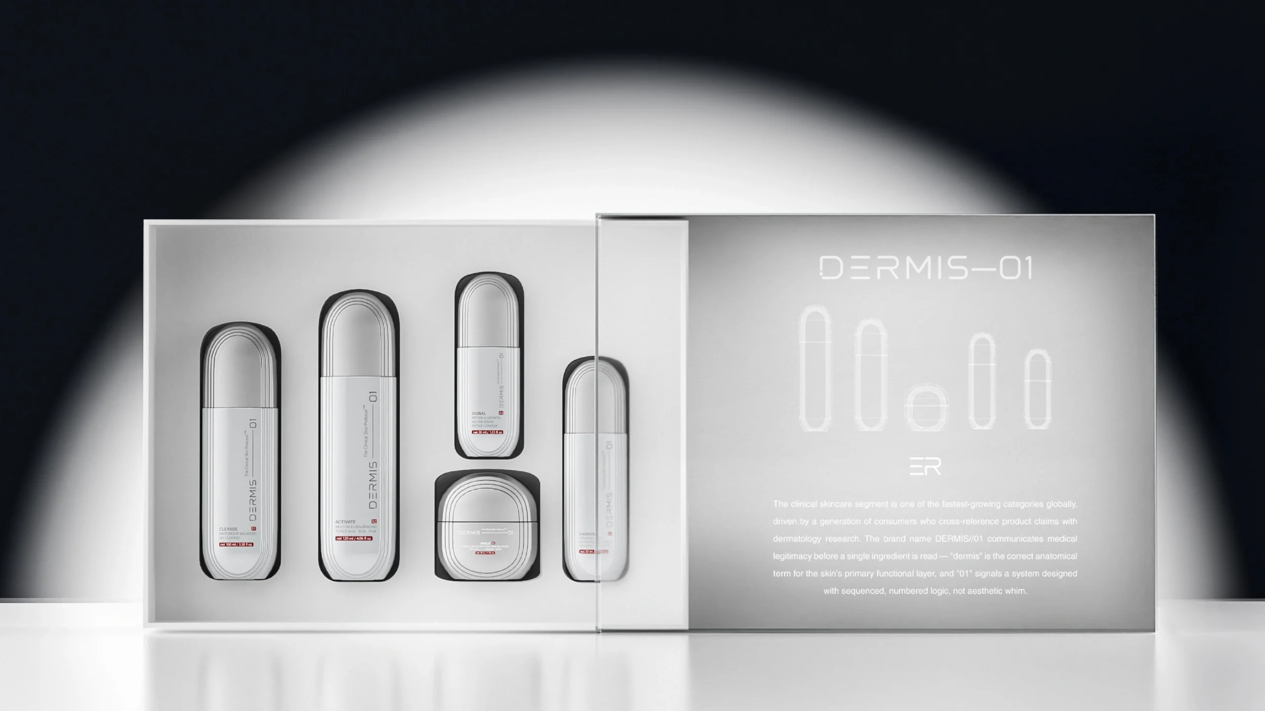
Brief: A skincare brand wants a calm, clinical appearance across a glass serum bottle, dropper assembly, and folding carton. It wants high legibility, controlled color, and restrained decoration.
Recommended direction: Keep the glass as the hero material; use a controlled translucent or matte base only if it supports the concept; apply simple direct graphics for the brand and SKU; reserve any metallic accent for a small component or carton detail.
Why: The system prioritizes readability and repeatability. It avoids asking one decorative effect to carry both clinical information and luxury signaling.
Risks to resolve: Formula compatibility, dropper and cap assembly scuffing, condensation, color variation between glass and carton, and legibility against filled product.
Decision: Approve the assembled, filled-or-simulated system under retail and bathroom lighting—not the empty bottle alone.
Scenario B: a niche fragrance launch
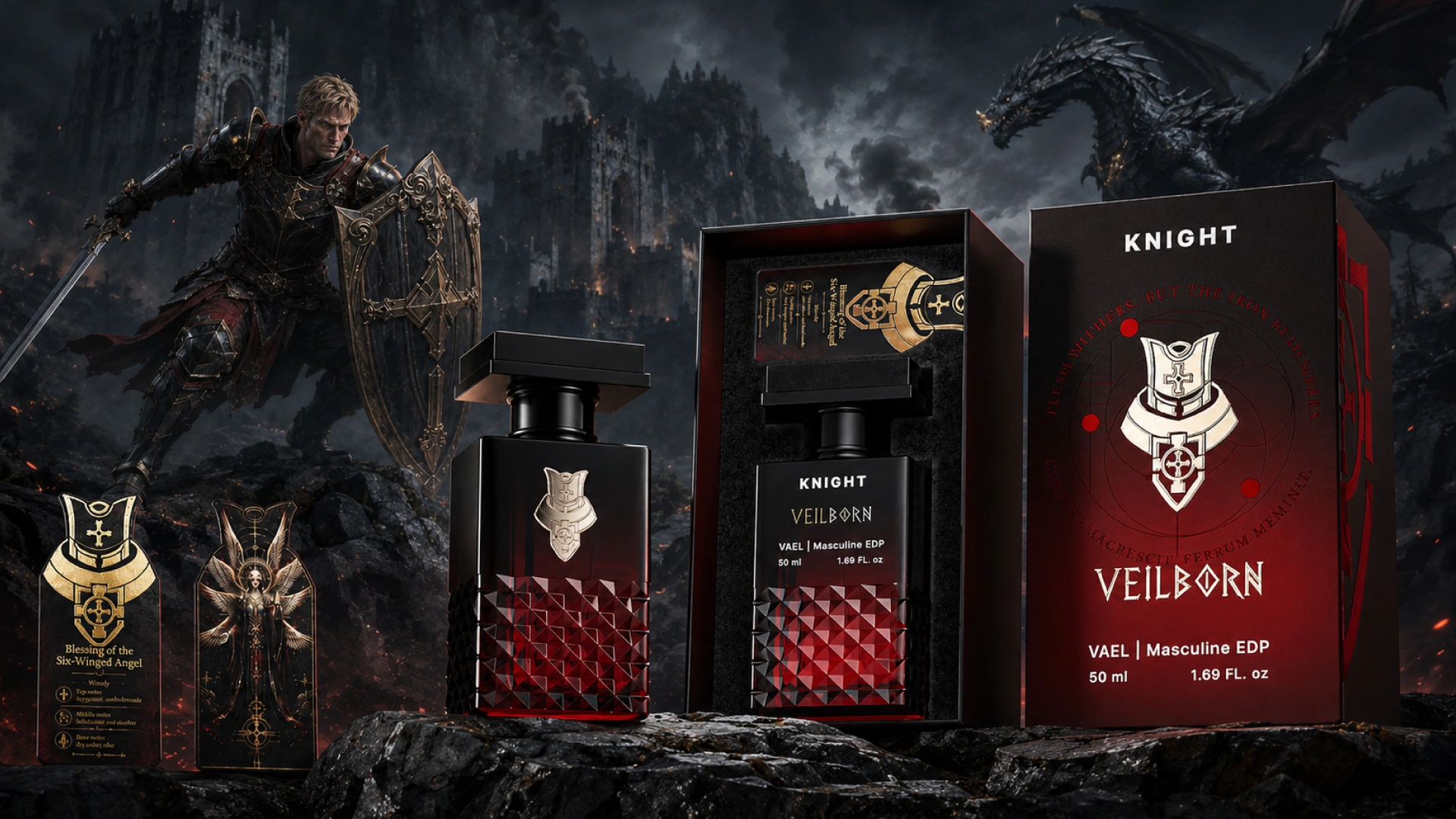
Brief: A fragrance house wants clear premium glass, a dramatic metallic cap, and a small logo that feels permanent rather than printed-on.
Recommended direction: Use glass clarity and shape as the hero; evaluate a metallized cap or collar for the main reflective surface; compare screen printing, hot stamping, or engraving for the logo based on geometry and the desired contrast.
Why: Separating the large metallic statement from the small brand mark prevents the bottle from becoming visually overloaded.
Risks to resolve: Alcohol exposure, finger contact at the grip area, registration on curved glass, cap-to-bottle color relationship, and scratching during assembly or transit.
Decision: Choose the logo process after handling decorated samples with the production-intent cap and atomizer, not from isolated effect chips.
Brands developing this type of system can use Jarsking’s perfume packaging portfolio as a starting point for the container-and-component discussion.
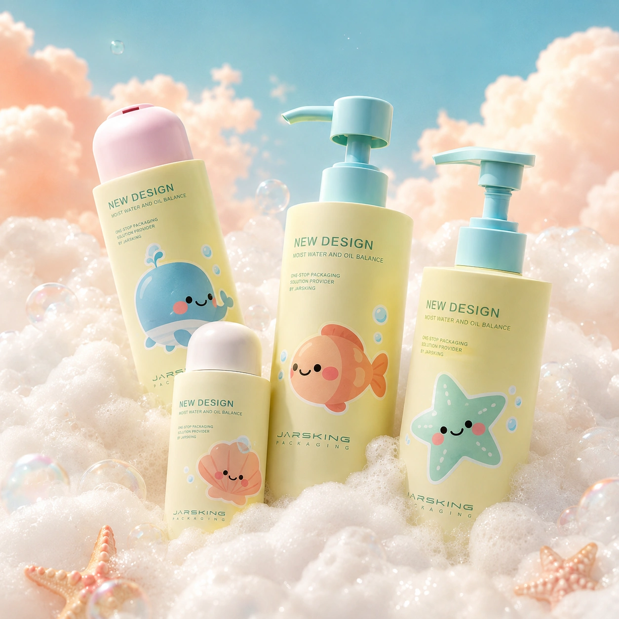
Scenario C: a colorful DTC personal-care line
Brief: A direct-to-consumer brand wants several bold SKUs, clear variant recognition, and efficient artwork changes across plastic bottles and pumps.
Recommended direction: Establish one shared bottle and component system, then use disciplined color and information architecture. Evaluate colored resin, direct print, labels, or a coating route based on the number of variants and change frequency.
Why: The commercial challenge is not simply achieving bright color; it is controlling complexity across SKUs, reorders, and photography.
Risks to resolve: Color consistency between resin, ink, label, and pump; label edge performance; scuffing in e-commerce distribution; and whether decorative elements affect recycling evaluation.
Decision: Build one master SKU first, approve the shared rules, and then extend them to the remaining variants with controlled differences.
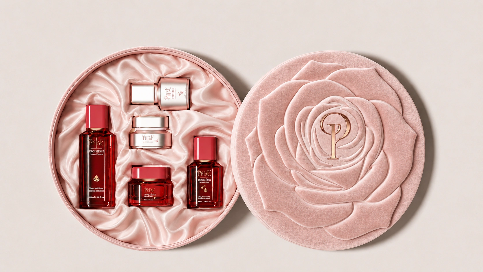
Scenario D: a prestige gift set
Brief: A beauty brand wants a premium jar, cap, spatula, folding sleeve, and rigid gift box for a seasonal set.
Recommended direction: Assign each effect a specific role. Let the jar and cap provide the permanent shelf identity; use the box for tactile reveal, detailed storytelling, and seasonal graphics; use the insert to protect decorated surfaces.
Why: Concentrating every premium effect on the jar can increase complexity without improving the unboxing sequence. Secondary packaging can carry high-impact decoration while protecting the primary pack.
Risks to resolve: Contact marks between insert and jar, foil or coating rub at corners, component fit, box-to-jar color consistency, and whether the set can be assembled without scratching the decoration.
Decision: Approve the fully packed set through opening, removal, replacement, and transport simulations—not separate flat samples.
Decoration Risk Map
| Risk level | Typical situation | Buyer response |
|---|---|---|
| Lower complexity | One substrate, one direct graphic color, generous print area | Confirm artwork, color reference, decorated sample, and basic handling checks |
| Moderate complexity | Coated base plus direct print; multiple components; several SKUs | Freeze CMF rules, test the layer stack, and define cross-component color hierarchy |
| Higher complexity | Gradient or special-effect coating plus foil or metallization on curved parts | Use production-intent samples and define viewing conditions, registration zones, and defect standards |
| System-level complexity | Primary pack, pump, cap, label, carton, insert, and gift box use different effects | Assign one approved master, coordinate suppliers, test assembly and transport, and control changes formally |
| Claim-sensitive complexity | Metallic labels, sleeves, coatings, or colorants on packaging marketed as recyclable | Review the complete package against relevant recycling guidance and substantiate consumer claims |
Decoration and design for recycling
Decoration should be reviewed as part of the complete packaging system because inks, labels, adhesives, sleeves, coatings, metallic elements, and color can influence sorting or recyclate quality.
The correct conclusion is not “decoration is bad” or “mono-material means recyclable.”
The correct approach is to identify:
- The container resin
- Decoration system
- Attachments
- Surface coverage
- Color
- Consumer separation behavior
- Target recycling stream
The team can then apply relevant design guidance and testing.
For US marketing, the Federal Trade Commission advises against broad, unqualified claims such as “green” or “eco-friendly” and says environmental benefits should be specific and substantiated.
Its Green Guides also explain that recyclable claims may need qualification based on access to appropriate recycling facilities. See the FTC’s Environmental Claims summary.
Practical buyer questions include:
- Can the brand achieve the visual hierarchy with less decorated surface area?
- Can a metallic effect be concentrated on a removable component?
- Does a sleeve or label interfere with material identification or separation?
- Are ink and adhesive choices evaluated with the base resin?
- Is a refillable claim supported by an actual refill system?
- Does “PCR” identify the specific component and verified recycled-content percentage?
- Is the environmental claim accurate for the complete package in its target market?
Jarsking offers PCR plastics, refillable and airless formats, PLA, bamboo, and design-for-recycling through mono-material approaches. The correct material, decoration, recycled-content percentage, recycling pathway, and claim language must be confirmed per project.
How Jarsking supports decorated packaging development
Jarsking combines design, development, production, and logistics through one contact, supporting OEM, ODM, and OBM project routes.
- OEM builds to the customer’s specifications and designs while the customer retains intellectual property and control.
- ODM uses more than 30,000 proven molds as a starting point, then customizes color, material, finish, and branding for a faster, lower-cost route.
- OBM is project-based, design-led co-development covering industrial design, structure, and CMF.
The design team includes more than 30 packaging designers working across beauty, fragrance, and wellness, with 3D rendering, rapid prototyping, design for manufacturing, design for recycling, and co-creation workshops.
Manufacturing includes a glass workshop, plastic injection and blow molding, carton production, an in-house Mold Manufacturing Center, and approved surface-treatment capabilities.
This breadth matters because a decorated package is rarely only a decorated bottle. It may be a bottle, pump, cap, label, carton, insert, and shipper that must look coherent and move through production as one system.
FAQs
There is no universal best technique. Choose according to substrate, geometry, artwork, visual effect, handling conditions, formula exposure, production route, and recycling strategy.
Screen printing may suit solid direct graphics, hot stamping may suit a reflective accent, spraying may establish the base color, and labels may handle complex or variable information. Confirm the final process on a decorated production-material sample.
Screen printing is usually evaluated for solid-color direct graphics and text, while hot stamping is evaluated for a foil-like reflective accent.
The better choice depends on bottle curvature, printable area, artwork detail, color requirement, underlying coating, handling, and approval criteria. Some designs combine both, but the layer sequence and compatibility must be confirmed per project.
Not automatically. Material, opacity, texture, sheen, ink system, coating, and lighting change color appearance.
Define a visual hierarchy, provide physical references, and approve the actual bottle, component, and carton together. Metallic and special-effect finishes also require agreed viewing conditions.
Request tests that match the actual risk, such as adhesion or separation resistance, rub or abrasion, formula exposure, moisture, color, gloss, light exposure, assembly scuffing, and transport.
Do not prescribe a generic standard without confirming that it fits the substrate, geometry, finish, and acceptance requirement. The test method, specimen, conditions, and pass/fail criteria must be agreed per project.
It can. Labels, inks, adhesives, metallic decoration, sleeves, coatings, color, and attachments may influence automated sorting or recyclate quality.
Evaluate the complete package against guidance relevant to its resin and target recycling stream. Avoid an unqualified recyclable or eco-friendly claim without evidence for the finished package and market where it will be sold.
Provide vector AI or PDF artwork plus Pantone references or physical color samples.
A useful brief also identifies the package material, component list, SKU count, desired effect, placement, target market, filling conditions, formula type, secondary packaging, testing needs, launch date, and expected quantity.
All technical limits, MOQ, color matching, testing, and lead time should be confirmed per project.