













CASE STUDY // CUSTOM GLASS SKINCARE PACKAGING SYSTEM
JARSKING STUDIO · DESIGN-LED OBM · No.KRE-2026
黒絵
KURE
™ / 東京モノクローム
TOKYO MONOCHROME
TOKYO MONOCHROME
A custom glass skincare packaging system, built on the Jarsking sphere-cap bottle platform.
A four-SKU unisex range for the design-literate urban buyer. Every decision here — closure geometry, colourway, decoration method, carton structure — is a custom-packaging decision made to do commercial work, not just to look good in a render.
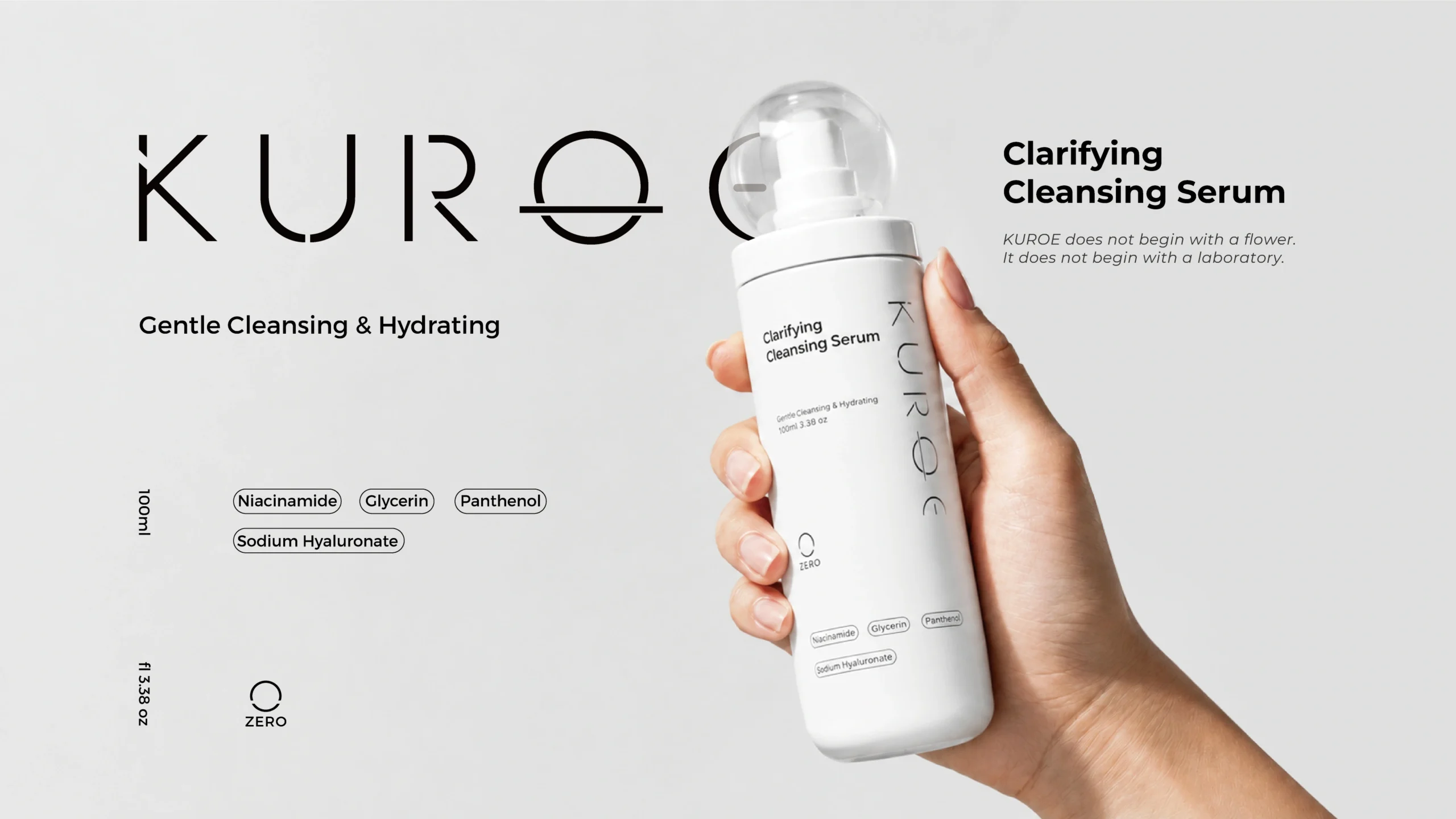
◲ 100ML · STRAIGHT-WALL FLINT GLASS
LOCKABLE PUMP + RESIN DOME
RITUAL SYSTEM
4 SKU
ZERO · LEVEL · DEEP · EYE — one silhouette family
PLATFORM MOQ
10,000
units / SKU on existing molds
TRADEMARK KUROE™
COMPANY JARSKING PACKAGING
PLATFORM SPHERE-CAP GLASS
DATE ----·--·--
TIME 東京 --:--:--_
SEC · 02
BRAND CONCEPT / NAME RATIONALE
黒 = BLACK · 絵 = IMAGE
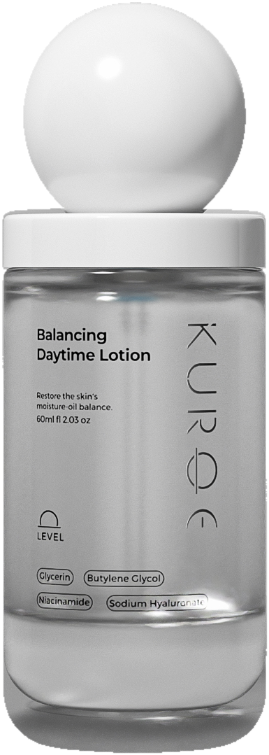
LEVEL · BALANCING DAYTIME LOTION · 60ML
// MANIFESTO — 02:17 JST · YAMANOTE LINE
The train is empty except for you.
No colour.
Only contrast.
Only contrast.
A packaging system that carries its own narrative.
KUROE begins at 2:17 a.m. on the Yamanote Line, between Ebisu and Shibuya — the moment the city stops performing and becomes itself. The name is drawn from the Japanese kuro (黒, black) and e (絵, image), and the whole brand rests on one question: what if skincare looked the way the city feels at its most precise?
That is the romance. The commercial reason it matters: every line here fits on a carton inner-lid, a landing page, and a 500-character marketplace description. The narrative was written to be printable — not to require a campaign to explain it. For an emerging brand, that is the difference between packaging that needs media spend behind it and packaging that arrives already explaining itself.
Not aggressive. Not cold. Disciplined. Deliberate. Stripped of everything that is not necessary.
· THE SPHERE CAP IS THE FULL STOP AT THE END OF A SENTENCE WRITTEN IN NEGATIVE SPACE.
· THE BOTTLE IS NOT MINIMAL. IT IS EDITED.
· THIS IS WHAT TOKYO LOOKS LIKE WHEN NO ONE IS WATCHING.
· THE BOTTLE IS NOT MINIMAL. IT IS EDITED.
· THIS IS WHAT TOKYO LOOKS LIKE WHEN NO ONE IS WATCHING.
ZERO
LEVEL
DEEP
◎ EYE
↑ THREE SUB-MARKS = THE NAVIGATION SYSTEM FOR A 4-STEP ROUTINE.
SEC · 03
LOGO CONSTRUCTION / DESIGN LANGUAGE
One ownable asset, reproducible at every scale.
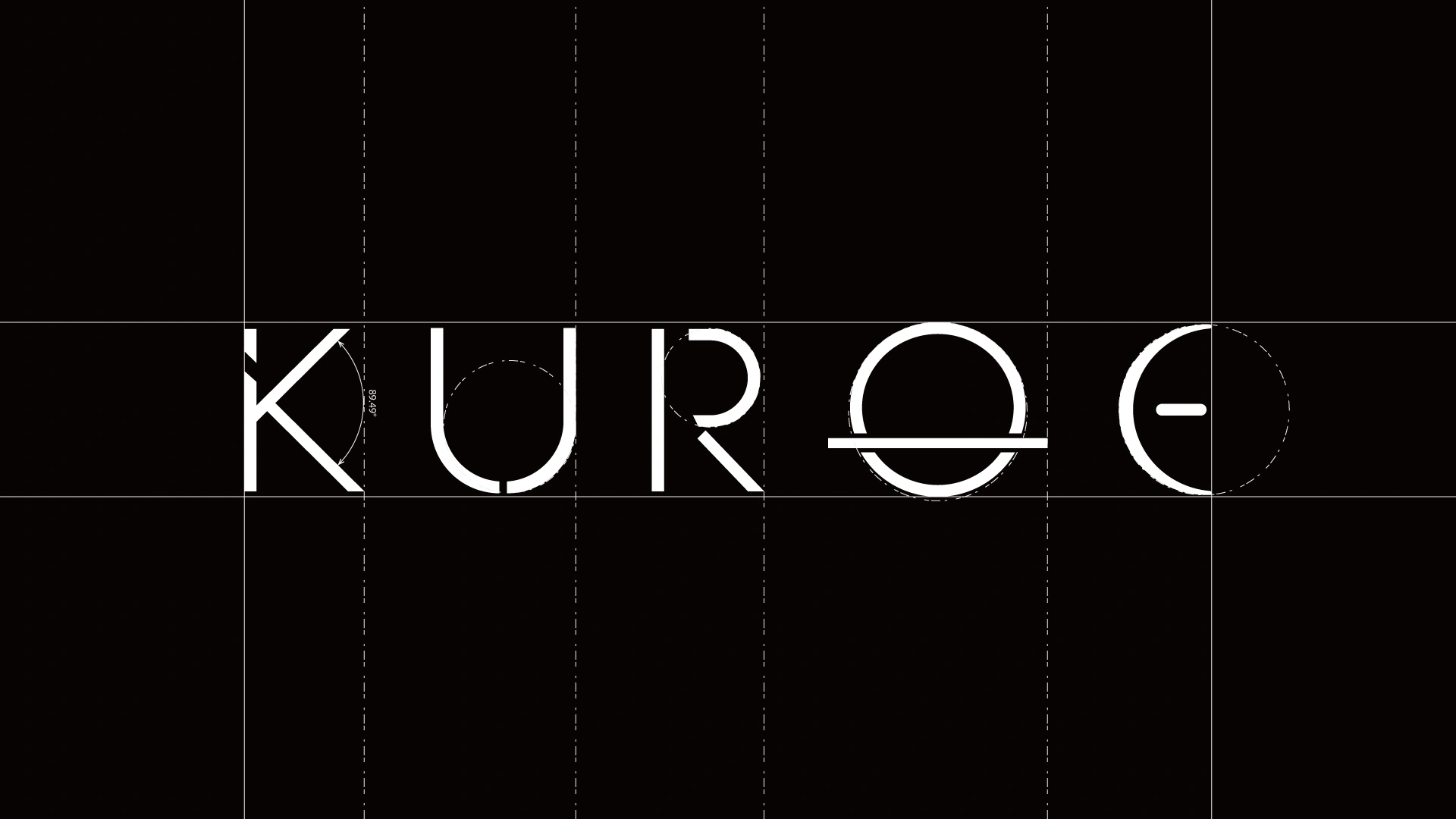
The wordmark is built on a strict geometric grid: even stroke weight, wide tracking, and a single moment of invention — the O crossed by a horizon bar, with the terminal E cut back to an open arc. That mark is the brand's entire equity in one glyph.
For a manufacturer, a fine-line wordmark is a production question before an aesthetic one. Hairline strokes fill in on a poorly set screen, break up on a badly registered hot stamp, and vanish at 20ml scale. Jarsking's decoration lines were specified to hold that stroke weight across four bottle diameters and four substrate colours — recognition at every size the brand will be seen at, from a 1,200px tile to a 40mm carton spine to a 20ml jar in the hand.
IN-HOUSE DECORATION CAPABILITY
20screen-printing
lines
lines
10hot-stamping
lines
lines
03spraying
lines
lines
SEC · 04
VISUAL SYSTEM / PACKAGING ARCHITECTURE
Four silhouettes that read as one family.
Four bottle heights, one shared vocabulary: straight cylindrical wall, sphere closure, vertical brand mark. Drop them against a rain-wet Tokyo street and they still read as a set — because the family logic is in the silhouette, not the graphics. That is a content-production budget line, not a taste preference: one lighting setup generates a year of content.
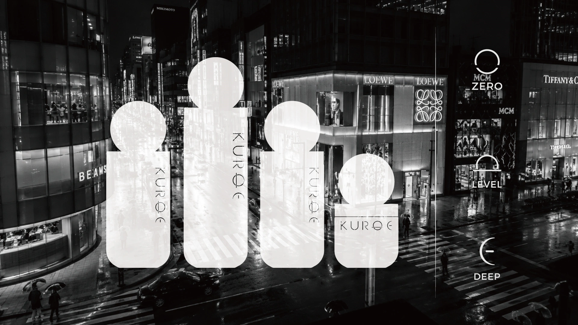
4-SKU RITUAL SYSTEM — ARCHITECTURE MATRIX
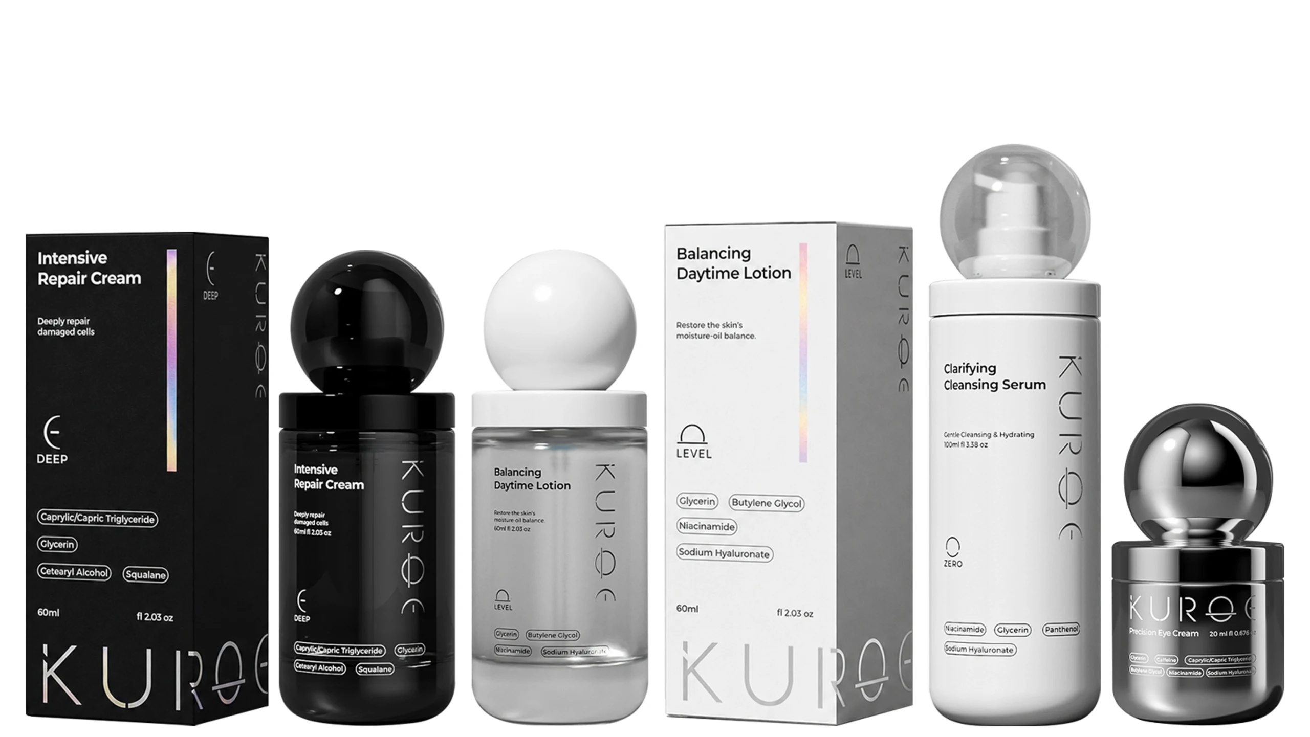
ZERO
Clarifying Cleansing Serum
VOL 100ml
CLS Lockable pump + clear resin dome
CMF Matte white / clear dome
First cleanse — remove, reset, clarify · AM + PM
LEVEL
Balancing Daytime Lotion
VOL 60ml
CLS Pump + white sphere overcap
CMF Clear glass / white sphere
Daytime hydration & barrier balance · AM
DEEP
Intensive Repair Cream
VOL 60ml
CLS Pump + black sphere overcap
CMF Charcoal / black sphere
Evening deep repair · PM
EYE◎
Precision Eye Cream
VOL 20ml
CLS Screw sphere cap
CMF Metallized silver / chrome sphere
Targeted periorbital treatment · AM + PM
MORNING ZERO → LEVEL → EYE
EVENING ZERO → DEEP → EYE
Formulation & efficacy claims are the client's responsibility. Jarsking supplies the empty packaging.
SEC · 05
COLOUR ARCHITECTURE / CMF / MATERIALS
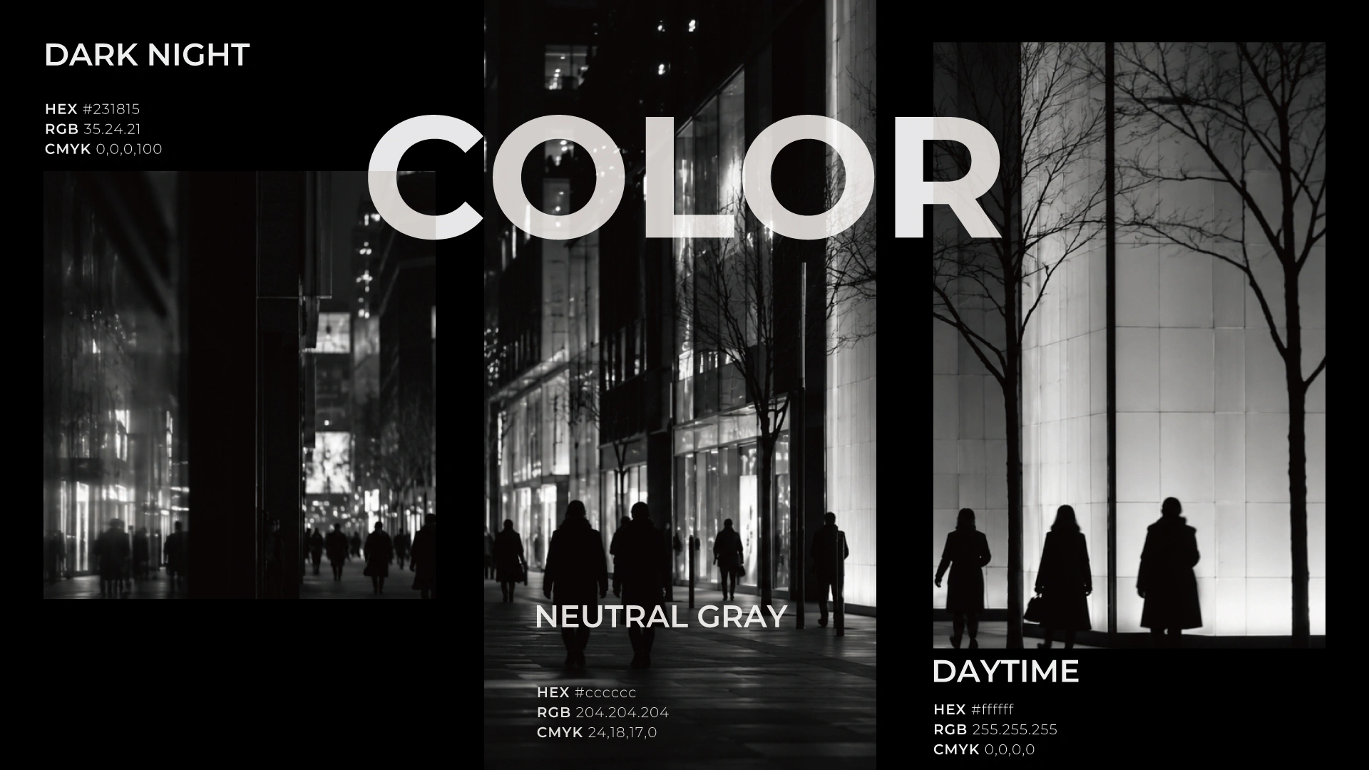
Three values. No fourth.
Three tones, sampled from the same city at three hours of the day. A three-value palette is a manufacturing gift: one white spray formula, one charcoal, one clear glass substrate carry the entire range.
DARK NIGHT
HEX #231815
RGB 35 · 24 · 21
CMYK 0 · 0 · 0 · 100
RGB 35 · 24 · 21
CMYK 0 · 0 · 0 · 100
NEUTRAL GRAY
HEX #cccccc
RGB 204 · 204 · 204
CMYK 24 · 18 · 17 · 0
RGB 204 · 204 · 204
CMYK 24 · 18 · 17 · 0
DAYTIME
HEX #ffffff
RGB 255 · 255 · 255
CMYK 0 · 0 · 0 · 0
RGB 255 · 255 · 255
CMYK 0 · 0 · 0 · 0
+ ONE HOLOGRAPHIC SPECTRUM STRIPE — A SINGLE DECORATIVE EVENT, ONE CARTON SPINE, EVERY SKU.
MATERIALS · FINISHES · DECORATION
Bottle body
High-clarity flint glass; clear, or spray-coated matte white / charcoal. Heavier base wall raises perceived value; glass stress testing in-house.
Sphere cap
ABS / PP, rubber-matte coating; clear resin for the ZERO dome. Cap weight is the tactile signal — specify wall thickness deliberately.
EYE cap & jar
Vacuum metallization, chrome finish. Chrome / gold / rose gold / brushed available in-house.
Brand mark on glass
Direct screen print or hot-stamp foil. Direct print preferred at this tier — no visible label seam.
Carton & set box
Folding carton, matte laminate, holographic foil spine; rigid outer with soft-touch. Single foil pass across all four SKUs — one setup, not four.
// NOTE — ACCENT ROUTE
The brief specified four fluorescent Pantone spots, one per SKU. The executed direction consolidates these into a single holographic stripe across the range — cheaper and more repeatable: one decoration setup instead of four spot inks, each needing its own screen, ink batch and colour approval. Confirm which route before tooling.
SKU · 02 / LEVEL
CLEAR GLASS — HERO FORMAT
60ML
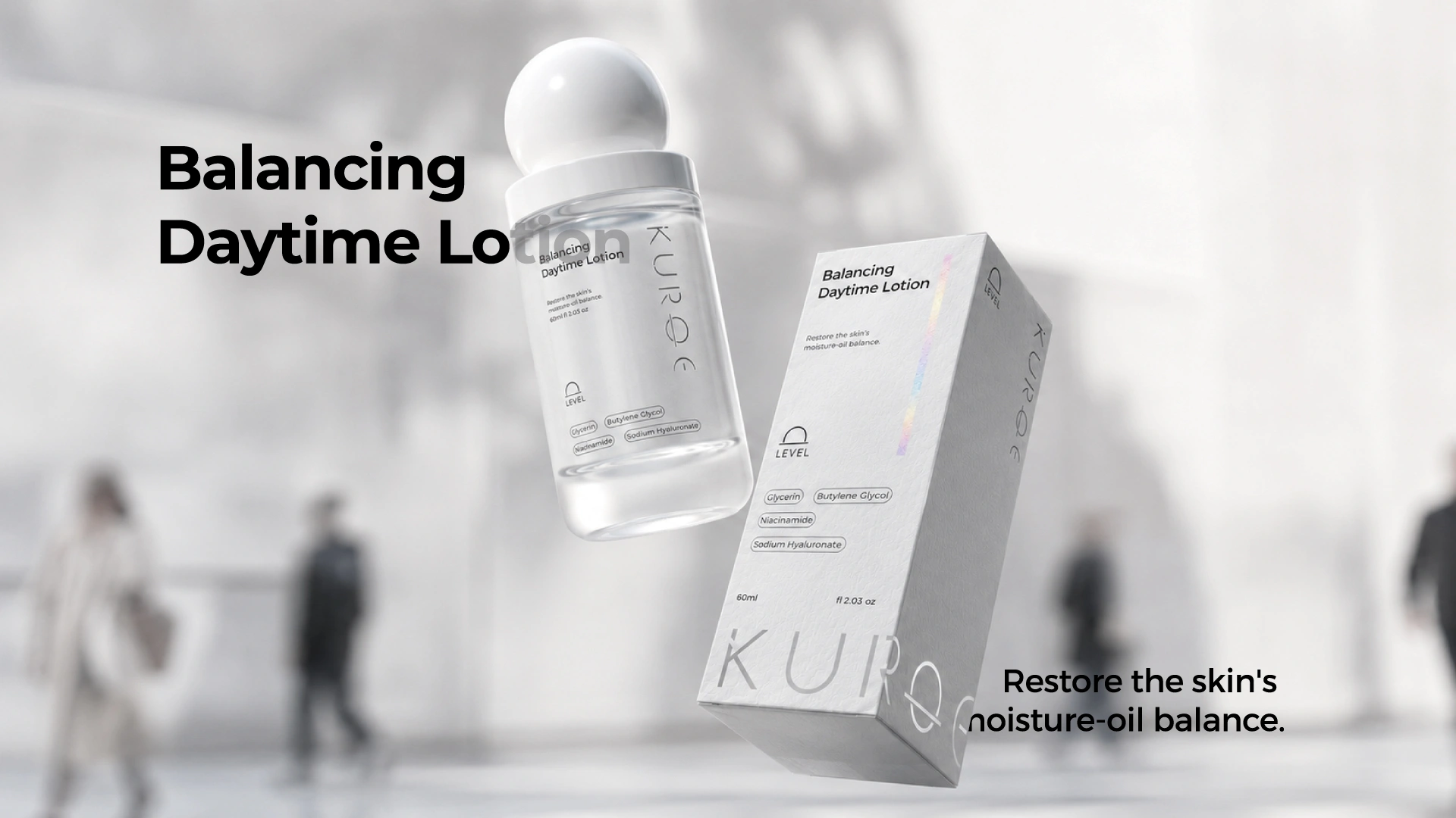
Why clear glass, and why the sphere sits on top.
Clear glass is a confidence position. It says the formula is worth looking at and removes the most common objection in premium skincare — that you cannot tell how much is left. A transparent body also picks up whatever is behind it, which is why the render places it against a soft-focus city plaza and lets the architecture read straight through the glass.
$10.58B
glass packaging market, 2026 [2]
from $9.89B (2025) · 7.8%+ CAGR
from $9.89B (2025) · 7.8%+ CAGR
1×
holographic spine stripe
catches shelf light + phone photos
catches shelf light + phone photos
SEC · 07
SET PRESENTATION / SECONDARY PACKAGING
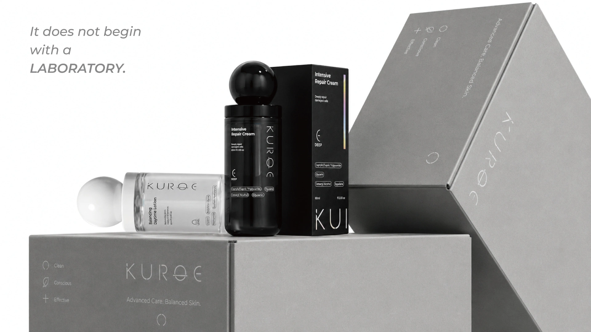
"It does not begin with a laboratory."
The charcoal SKU is the anchor of the whole display.
In a white-dominant family, one charcoal SKU is not a break in the system — it is the anchor that makes the system legible. An all-white lineup dissolves under store lighting; a single dark unit at the centre gives the eye somewhere to land and pulls the set forward on the shelf.
The secondary packaging carries the trust layer the bottles refuse: Clean · Conscious · Effective and the line Advanced Care. Balanced Skin. The bottles stay silent; the boxes do the reassurance. For a gifting-driven launch — travel retail, year-end oseibo, Design Week — the set box is the highest-AOV unit in the range.
FOLDING
HINGED-LID
SLIDING
SLIP-LID
ONE SUPPLIER · ONE TIMELINE
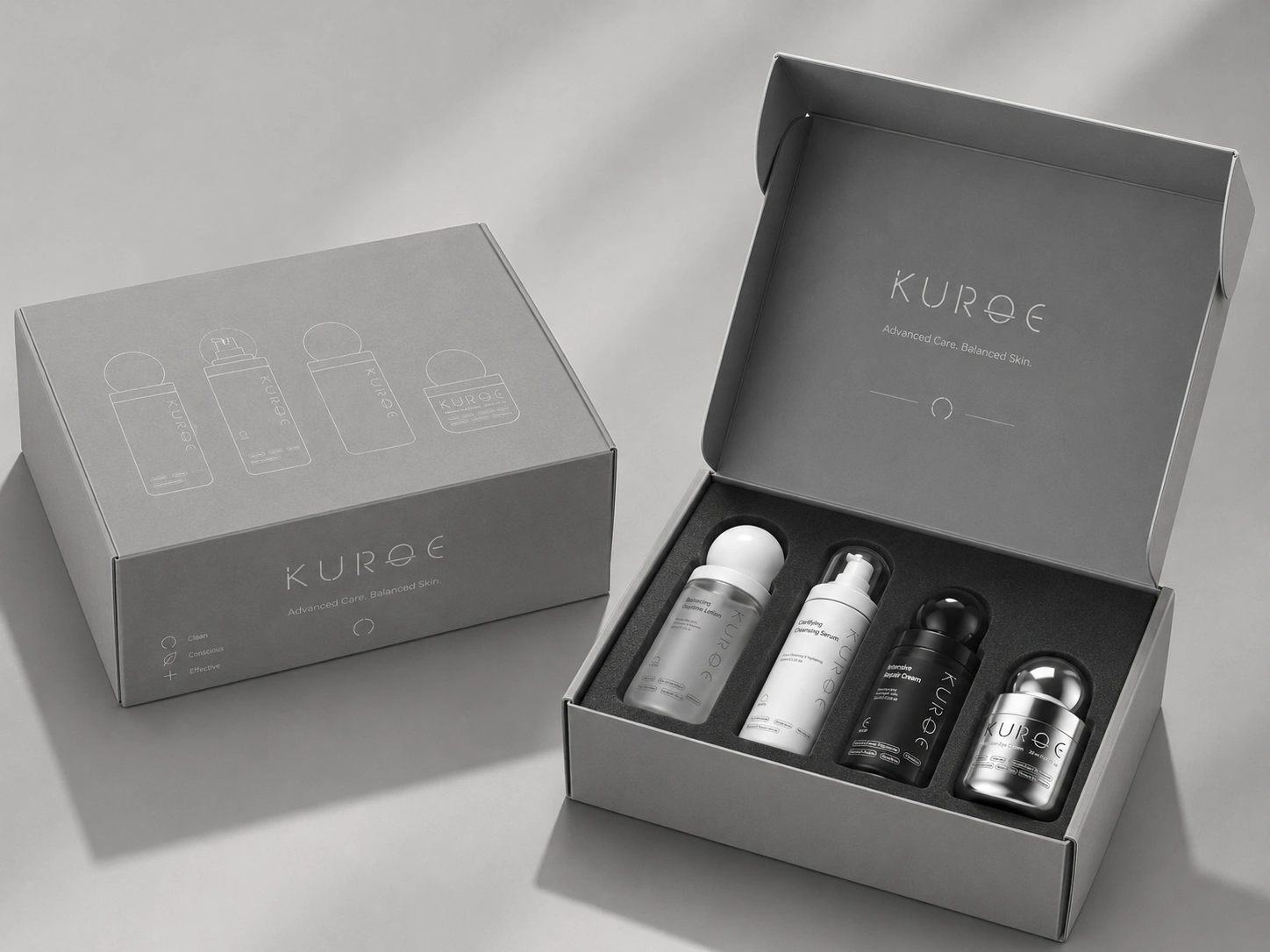
SKU · 03 / DEEP
UNISEX POSITIONING — INTENSIVE REPAIR CREAM
60ML
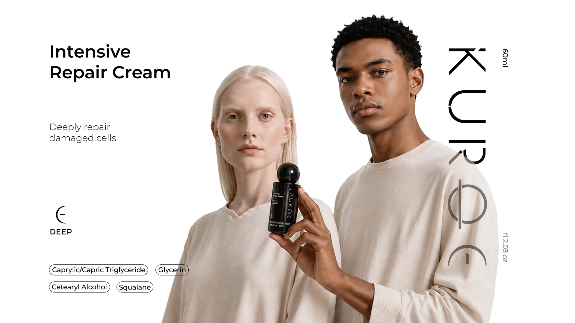
Genuinely unisex — because the object is, not because the copy says so.
Two people, no gendered styling, one object that belongs equally to both. KUROE is not a women's line with the pink removed, nor a men's line with the aggression softened. A single SKU that converts across both audiences carries half the tooling cost, half the inventory complexity and twice the addressable shelf of a gendered pair.
There is a functional argument too: a charcoal-coated body limits light transmission for evening actives. Stability testing remains the client's responsibility; Jarsking advises on material selection and supplies samples for the client's own testing.
SEC · 09
CLOSURE ENGINEERING / DISPENSING
The sphere is a cap. Underneath it is a working pump.
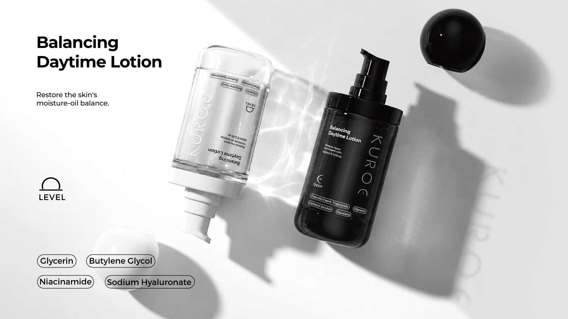
Disassembled, the system is honest about what it is: a straight-wall glass body, a standard-neck lockable pump, and a sphere overcap that seats over the actuator. The sphere is a design gesture wrapped around a proven mechanism — which is why this concept moves to tooling quickly. Nothing here requires inventing a new pump; the engineering risk sits in the overcap geometry and finish, both moldable on existing Jarsking tooling.
01 / WEIGHT
The cap has weight.
A hollow sphere feels like a toy. Wall thickness is the single biggest lever on perceived value in the whole system — worth specifying before anything else.
02 / LOCK
The pump locks.
Down-lock actuation prevents in-transit discharge — which matters equally for DTC shipping and travel retail.
03 / SEPARABLE
The parts separate.
Glass, closure and pump separate at end of life — the honest foundation for future recyclability messaging. No claims without formal lifecycle assessment.
SKU · 04 / EYE
UPSELL FORMAT — PRECISION EYE CREAM
◎ 20ML
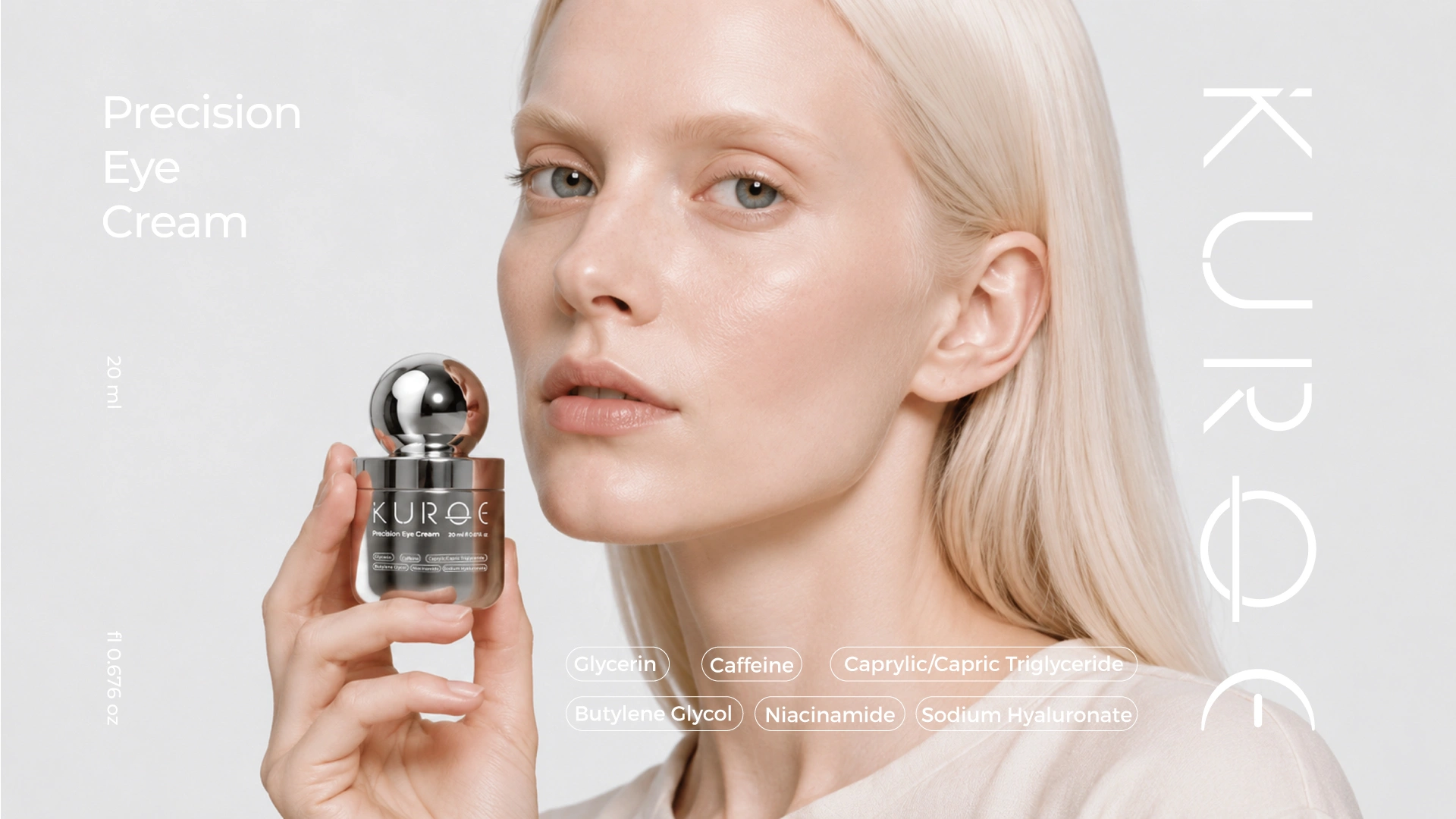
The 20ml unit that completes the ritual and raises the basket.
Every well-built system needs one SKU that behaves differently. At 20ml it is the cheapest entry point, the easiest add-to-basket, the natural gift-with-purchase, and the most collectible. The chrome finish is a deliberate escalation, run in-house at Jarsking, which is what makes a single metallized SKU inside a monochrome range commercially viable — no separate vendor, no separate lead time.

SEC · 11
BRAND WORLD / RETAIL ENVIRONMENT
Designed for a shelf you can walk into.
The hardest environment the packaging will face: warm retail lighting, stone and plaster surfaces, competitors two metres away. Under warm tungsten the white bodies go slightly ivory, the charcoal goes soft rather than harsh, and the chrome EYE jar becomes the brightest object in the room. The system does not fight the environment; it absorbs it — which is what makes it viable for Japanese select retail, where any packaging that shouts gets rejected at the buying meeting.
SEC · 12
RETAIL & CHANNEL PERFORMANCE
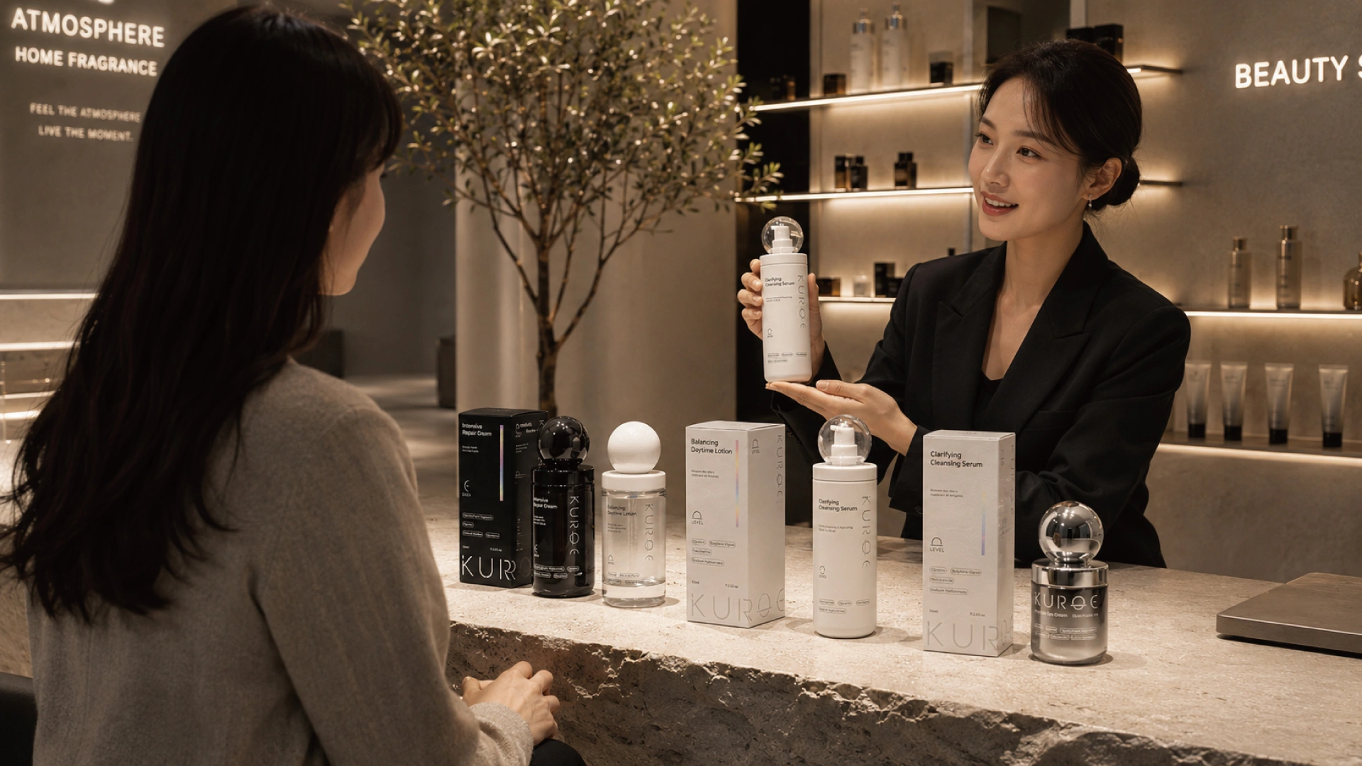
The full range on a counter: where the system earns its money.
The cartons hold the shelf, the bottles hold the counter, and the sub-marks let a customer self-navigate a four-step routine without reading a word of body copy. Set conversion depends almost entirely on grasping the sequence in the first eight seconds. This one can.
CHANNEL STRATEGY — ONE SYSTEM, EVERY ROW
Brand DTC site + app
GLOBALLAUNCH
Narrative control; highest margin
Xiaohongshu (RED) flagship
CHINALAUNCH
Visual discovery; unboxing culture
Select concept stores
JAPANLAUNCH
Design authority; physical experience
Olive Young / Chicor
KOREAPHASE 2
K-beauty premium shelf
Cult Beauty / Space NK / Ssense
UK / GLOBALPHASE 2
International niche credibility
Travel retail · Design Week
APAC / GLOBALPHASE 2–3
Gift trigger; brand-world activation
↳ SAME FOUR SKUS, SAME TWO CARTON SIZES SERVE EVERY ROW. NO CHANNEL-SPECIFIC VARIANT. NO SECONDARY TOOLING.
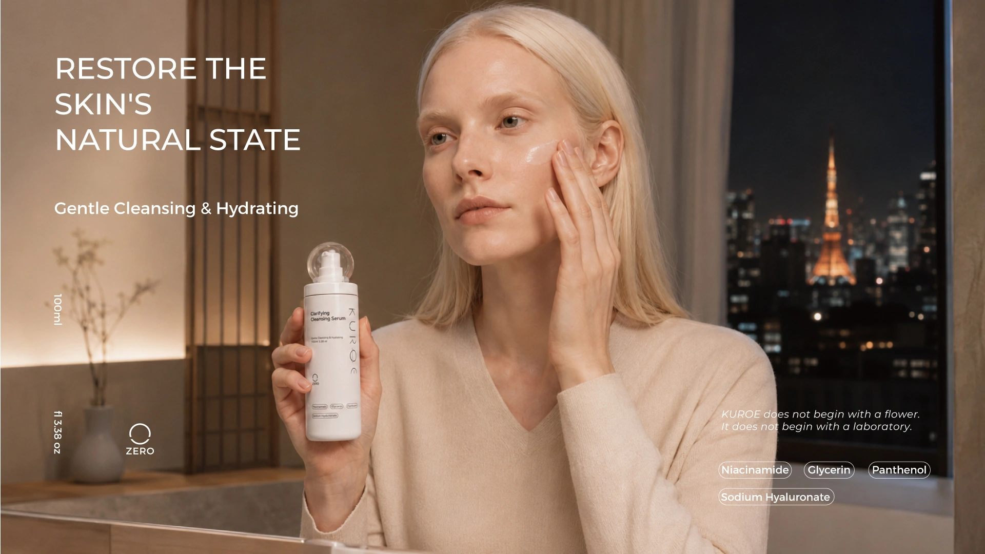
SEC · 13 LIFESTYLE / ORIGIN STORY
Restore the skin's natural state.
The 100ml ZERO bottle, back in a hand, back in the city it came from. Lifestyle imagery is where minimalist packaging usually fails — reduced designs disappear against a warm interior. This one holds: the sphere dome catches light as a discrete highlight and the vertical wordmark stays legible at a distance.
// RELATED — SOURCE PLATFORM & CATEGORIES
// SOURCES — MARKET DATA
[1]Gender-Neutral Beauty Market — Marketintelo · $4.6B (2026) → $8.4B (2034), 8.5% CAGR; skincare 9.2%
[2]Cosmetic & Perfume Glass Packaging — Research Nester · $9.89B (2025) → $10.58B (2026), 7.8%+ CAGR
[3]Men's Skincare Products Market — Future Market Insights · $19.2B (2026) → $52.1B (2036), 10.5% CAGR
[4]Eye Cream Market — Research Reports World · $5.70B (2026) → $10.35B (2035), 6.85%; sub-20ml ≈78%
[5]Japan Cosmetics Market — IMARC Group · $28.7B (2025) → $40.7B (2034)
[6]J-Beauty Products Market — Grand View Research · $39.0B (2026) → $59.8B (2033), 6.3% CAGR
[7]Social Commerce Market — Grand View Research · $1,925.3B (2026); APAC 72.3%

Packaging is the first ad, and the cheapest one.
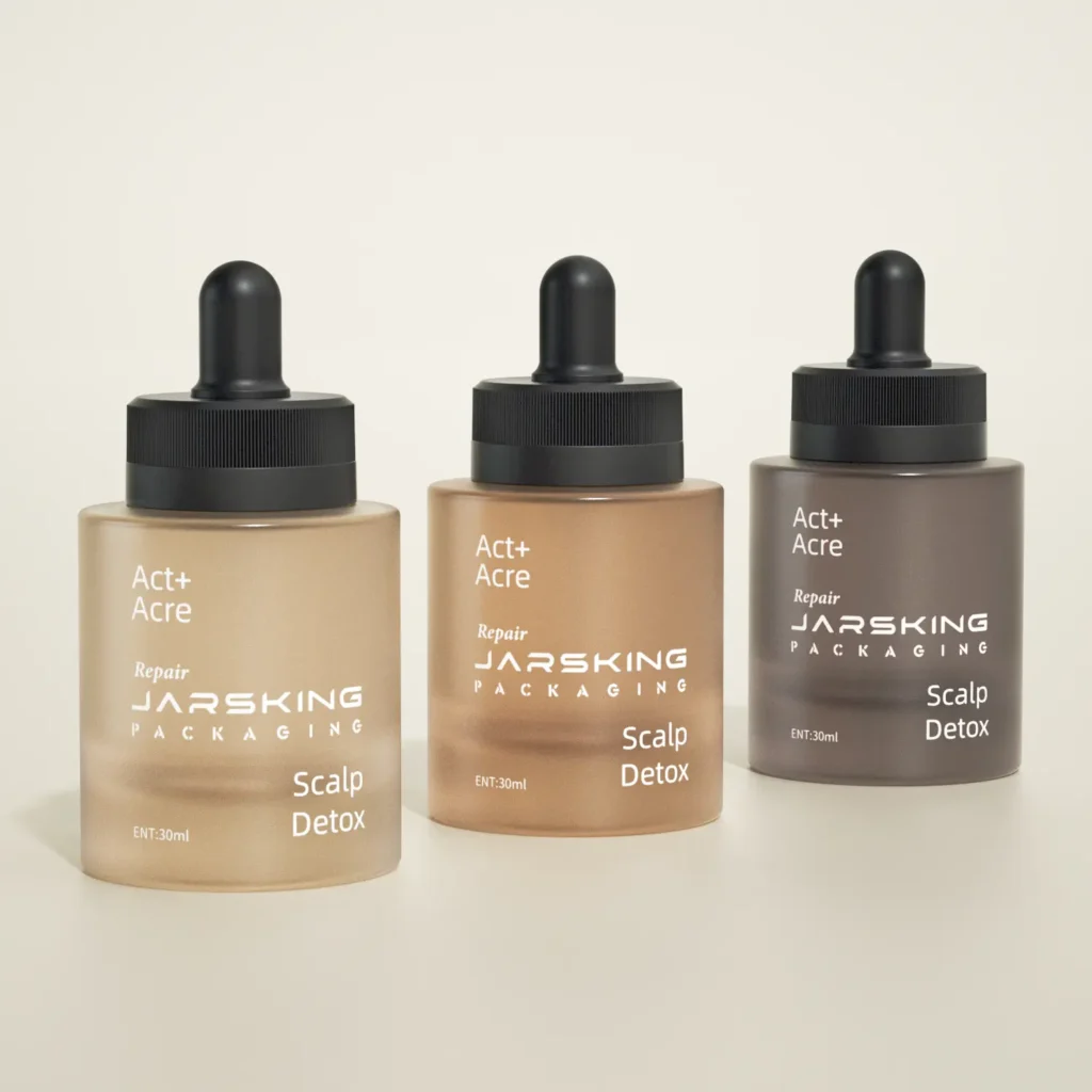
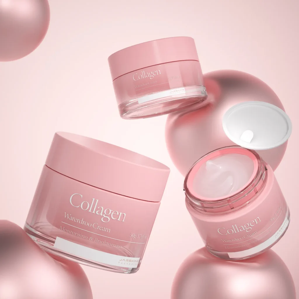
Product-and-carton pair, model-with-EYE-jar, full-lineup group shot. No campaign photography, no location shoot — just the packaging, lit well, against a neutral ground. That is an entire launch-quarter content strategy, available day one: the monochrome palette colour-matches every tile automatically, the silhouette family composes the group shot, and the sub-marks give each post a built-in caption hook.