








#D6B56E
CITRINE
Golden Star Radiance
Warm, luminous and ceremonialتغطي Jarsking جميع أسواق مستحضرات التجميل والقنب والعطور. اطلب حلولاً مخصصة هنا!
المصنع المفضل في العالم لتعبئة مستحضرات التجميل ذات العلامات التجارية المخصصة. تحدث إلى فريق جارس كينج
Custom perfume packaging design · Case study 2026
One Planet. Seven States. The Ring Holds the Light.
A spherical 55 ml glass bottle forms the planetary body. A transparent orbital ring crosses its silhouette, turning the familiar perfume flacon into an unmistakable sculptural object.
The object / the system
Above the spherical glass body, a faceted cap catches and divides the light like mineral crystal. The transparent orbital ring crosses the silhouette and makes the familiar perfume flacon immediately ownable.
The same structure continues through seven distinct color and finish states—moving from radiant gold to atmospheric blue, blush pink, mineral green, clear crystal, smoky taupe and deep black without losing recognition.
SATURNINE does not use space merely as decoration. It translates orbit, changing light and planetary atmosphere into a coherent fragrance packaging system.
Changing light / brand premise
SATURNINE is inspired by a planet whose appearance changes with season, shadow, atmosphere and light—not by space used as decoration.
Saturn rotates once in approximately 10.7 hours and has an axial tilt of about 26.7 degrees. Its long seasons change the way sunlight, haze, clouds and ring shadows appear across the planet. Cassini observations documented a winter hemisphere shifting from blue toward yellow-ochre, rings becoming nearly invisible at equinox, and a northern storm growing until it encircled the planet.
CITRINE, AQUAMARINE, CRYSTAL, MALACHITE, MORGANITE, NOIR and SMOKE are not claims about Saturn’s literal colors. They are seven creative interpretations of how one world can be transformed by season, shadow, atmosphere and light.
The orbital ring remains constant throughout the collection. It is the visual horizon that catches, blocks, reflects or releases the light. Every bottle keeps the same orbit; every finish creates different weather within it.
One planet. Seven states. One unmistakable silhouette.
Identity / orbital signature
Two mirrored “S” forms connect through a central orbit, linking the monogram, wordmark and bottle silhouette in one geometric language.
The monogram combines planet, ring and initials in a single compact mark. Its curved geometry echoes the bottle’s spherical body, while the crossing line anticipates the transparent ring surrounding the finished package.
Wide letter spacing conveys distance and stillness. Interrupted strokes suggest an object seen through shadow or atmospheric interference.
CMF / palette atlas
Each finish gives the same orbital structure a different emotional temperature and retail role, without breaking recognition.
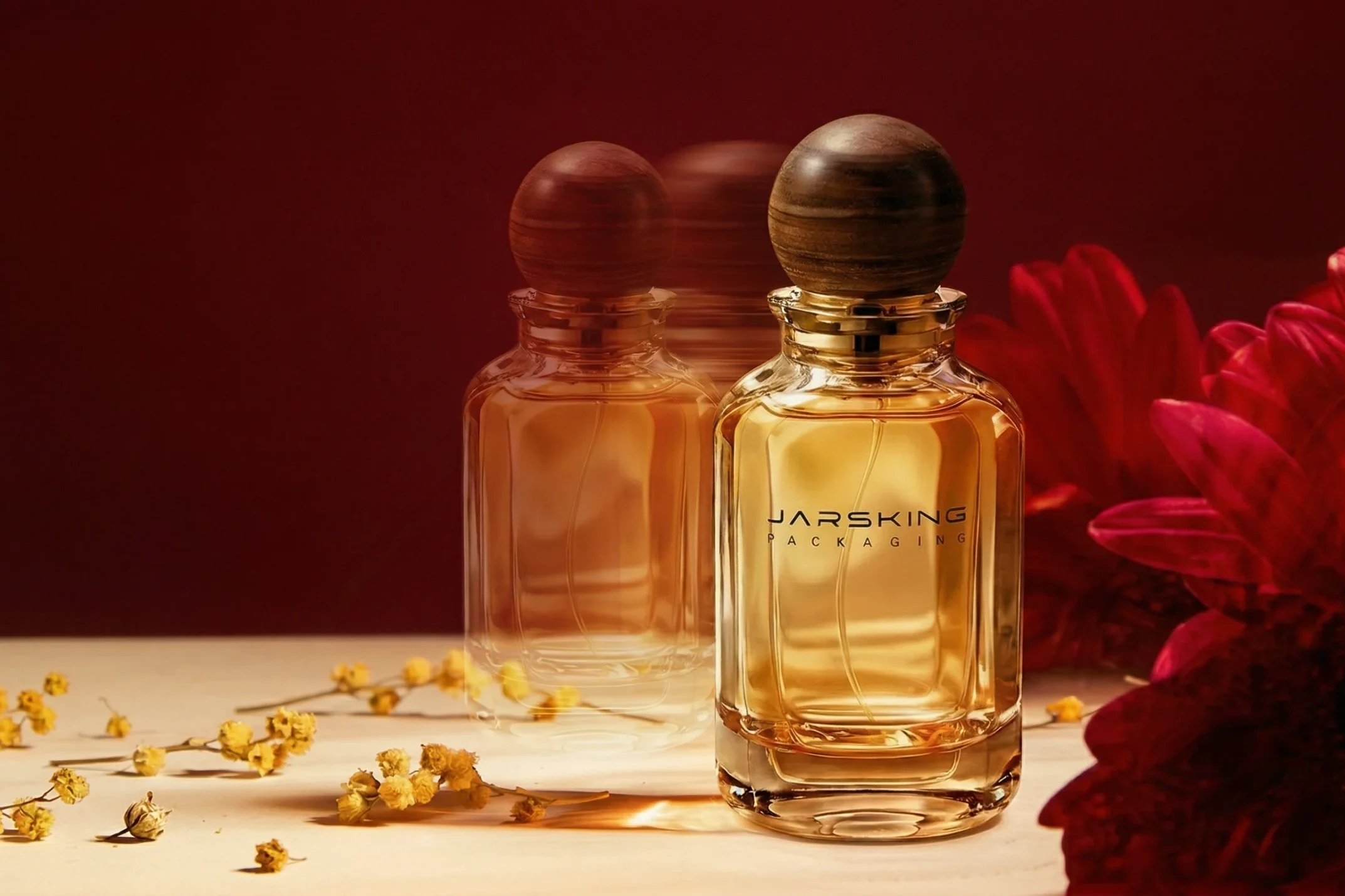
#D6B56E
Golden Star Radiance
Warm, luminous and ceremonial#191615
Cosmic Depths
Dark, reflective and enigmatic#89A9A6
Aurora Veil
Cool, airy and distant#D8B7AE
Nebula Blush
Soft, intimate and sensorial#8C837C
Interstellar Mist
Muted, mineral and atmospheric#E7E4DD
Stellar Clarity
Clean, bright and weightless#2F5A4A
Galactic Horizon
Saturated, energetic and magneticExact production colors should be confirmed through physical standards, approved samples and project-specific decoration trials.
Observatory / development
The design process begins with the relationship between a sphere and its orbit, then translates that gesture into grip, balance, closure alignment and protection.
Early sketches study how the ring can cross the bottle without making the object feel visually unstable. It must be large enough to define the silhouette, yet integrated closely enough to read as part of the bottle rather than an added ornament.
This is where a striking render becomes a development program: industrial design, CMF direction, component coordination, prototyping and production validation working toward the same visual result.
Bottle anatomy / technical architecture
The concept defines a 55 ml / 1.86 fl oz bottle with an approximate overall height of 126 mm, width of 118 mm and body diameter of 96 mm.
Faceted capA crystal-inspired top profile that catches and divides light.
Shaped collarA controlled seat that continues the planetary silhouette.
Fine-mist atomizerPositioned on the central axis beneath the cap.
Rounded glass bodyThe transparent planetary volume at the center of the object.
Orbital ringA transparent ring crossing the body at a controlled angle.
The form is derived from overlapping circles, harmonic alignment and repeated proportional relationships. This geometry helps the bottle, ring, cap and identity appear as one designed object.
Before production, the concept should pass project-specific checks covering cap and atomizer fit, ring alignment, base stability, component tolerances, decoration registration, filled-product compatibility and transit protection.
Dimensions and material descriptions shown in the visual are design-stage references. Final specifications require approved engineering drawings, prototypes and tests.
Collection / seven-state system
Every variant uses the same recognizable orbital architecture. Select a state to explore its finish, creative territory and role in the portfolio.
State 01 · Solar Haze
Golden Star Radiance
Olfactive directions describe brand-side creative territories, not finished fragrance formulas or manufacturing claims.
| SKU | Saturn state | Finish — render authority | Factual anchor | Olfactive direction — creative brief |
|---|---|---|---|---|
| CITRINE | State 01 · Solar Haze | Electroplated accessories · transparent-tinted high-gloss body | Saturn’s clouds appear in yellow, brown and grey; increasing summer sunlight can build yellow hydrocarbon haze | Warm mineral amber, saffron air, dry resin — light seen through atmosphere |
| AQUAMARINE | State 02 · Winter Pole | Matte accessories · transparent-tinted body | Reduced sunlight and haze allowed Saturn’s winter hemisphere to appear blue before yellow-ochre returned with spring | Cold mineral, airy salt, pale woods — distance made transparent |
| CRYSTAL | State 03 · Equinox | Matte + translucent-matte accessories · clear transparent body | At equinox sunlight strikes the rings edge-on, making them almost disappear while long shadows reveal hidden structure | Clear aldehydes, mineral musk, white air — the moment the ring becomes a line |
| MALACHITE | State 04 · Magnetosphere | Transparent-tinted accessories · solid-colour matte body | Saturn’s magnetic field guides charged particles into polar aurorae; green is a deliberate visible translation of an invisible field | Aromatic green, metallic air, cold herbs — energy around a silent mass |
| MORGANITE | State 05 · Dawn | Transparent-tinted accessories · solid-colour gloss body | Backlit observation can set Saturn’s atmosphere and rings aglow; rose is a poetic dawn translation, not an observed natural colour | Soft rose mineral, skin musk, warm air — first light on a curved horizon |
| NOIR | State 06 · Eclipse | Glossy accessories · transparent-tinted body | When Saturn occults the Sun, the planet darkens while its atmosphere and rings glow in backlight | Dark incense, mineral amber, black tea — the planet between eye and Sun |
| SMOKE | State 07 · Storm Veil | Glossy accessories · solid-colour matte body | Cassini observed the 2010–2011 great northern storm grow until it encircled the planet; turbulent clouds lingered after the active phase | Dry woods, iris dust, charred air — weather after impact |
Campaign chapter / Morganite
MORGANITE moves the collection from celestial observation into human emotion—futuristic but not cold, sculptural but still intimate.
The blush bottle is framed between black volcanic textures, pale architectural forms and sharply tailored fashion. Its warm color softens the technical geometry without diminishing the strength of the silhouette.
This contrast creates a position that is dramatic without relying on conventional gender codes. Because the bottle already carries such a recognizable form, campaign imagery can remain visually restrained. Its orbit becomes the brand signature.
Beyond Orbit. Beyond Desire.
08 · Hero state / Citrine
Transparent amber-gold surfaces capture the light while metallic accessories sharpen the cap and ring. CITRINE is designed as a flagship SKU, prestige launch edition or gifting centerpiece.
The colorway is designed to work across prestige counters, e-commerce hero imagery, gift sets and limited-edition launches. SATURNINE answers that environment with a bottle whose structural form is powerful enough to remain recognizable through every finish.
In the first half of 2026, U.S. prestige fragrance dollar sales rose 6%, average selling prices increased 5%, and eau de parfum and perfume formats recorded double-digit growth.
Circana market contextRetail / experience architecture
The circular language expands from bottle to environment without turning the store into a theatrical set. The packaging remains the brightest object in the room.
Concentric ceiling lights repeat the ring above the customer. Circular product platforms establish a central point of discovery. Dark stone, glass vitrines and illuminated mineral specimens extend the celestial story.
Collector set / secondary packaging
Elevated bottle displays create the first reveal. Recessed compartments organize the remaining variants below, guiding the recipient through the collection in stages.
The presentation format can support VIP launches, press seeding, retail discovery, holiday gifting, collector editions, sales presentations and pop-up experiences.
For production, the final insert should be engineered around the bottle’s wide ring profile and tested for orientation, surface protection and transit stability. Material, magnet, ribbon and insert selections should be confirmed against the intended sales channel and shipping conditions.
Sensory ritual / product interaction
Recognize, pick up, open, spray and return to display—the package becomes part of the fragrance experience rather than simply its container.
The rounded body sits as a sculptural object in the hand, while the orbital ring gives the bottle a distinctive orientation. The cap provides a focused opening gesture before the fragrance is applied.
Circana’s 2025 U.S. Self-Care and Wellness Survey reported that 15% of U.S. women aged 18 and older planned to apply fragrance as a way to lift their mood.
Circana B-Book 2026The fragrance formula remains the brand owner’s creative domain. The packaging program supports the intended interaction, presentation and portfolio story.
Launch platform / experiential retail
Monumental arches enlarge the orbital geometry. Water, dark rock and pale surfaces create contrast around the colored bottles.
SATURNINE provides a flexible platform for product launches, fashion collaborations, retail pop-ups, department-store installations, content production, collector previews and international distributor events.
The packaging remains the central object throughout. Architecture, fashion and digital content expand its meaning without replacing it. One strong bottle architecture supplies the visual language for photography, retail, gifting, events and online merchandising.
Presentation / one story
A strong packaging concept should be easy to explain—to consumers, retailers, creative teams, development teams and distribution partners.
Seven changing states held together by one unforgettable orbit.
A coordinated system with immediate shelf recognition.
A repeatable language of rings, spheres, light and mineral color.
A shared 55 ml architecture governed through one CMF program.
A presentation story understood before the fragrance is experienced.
Your journey begins here
Develop a perfume bottle that stays recognizable through every color, channel and campaign.
Request a quoteالطابق السابع عشر، البرج الشرقي، المبنى الثاني،,
مركز يييون للابتكار التكنولوجي،,
رقم 33-13، طريق جينشي الثالث، شارع دايوان،,
منطقة باييون، مدينة قوانغتشو,
مقاطعة قوانغدونغ، الصين
المكتب 10، الطابق الرابع والعشرون،,
برج ون,
943 شارع الشيخ زايد،,
برشا هايتس (الثنية الأولى)،,
دبي،, الإمارات العربية المتحدة
© حقوق النشر 2026 jarsking packaging جميع الحقوق محفوظة.