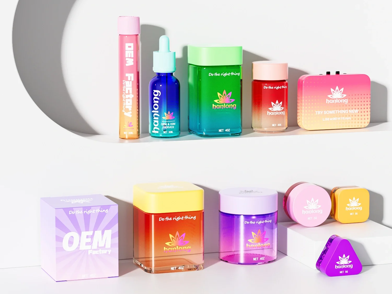
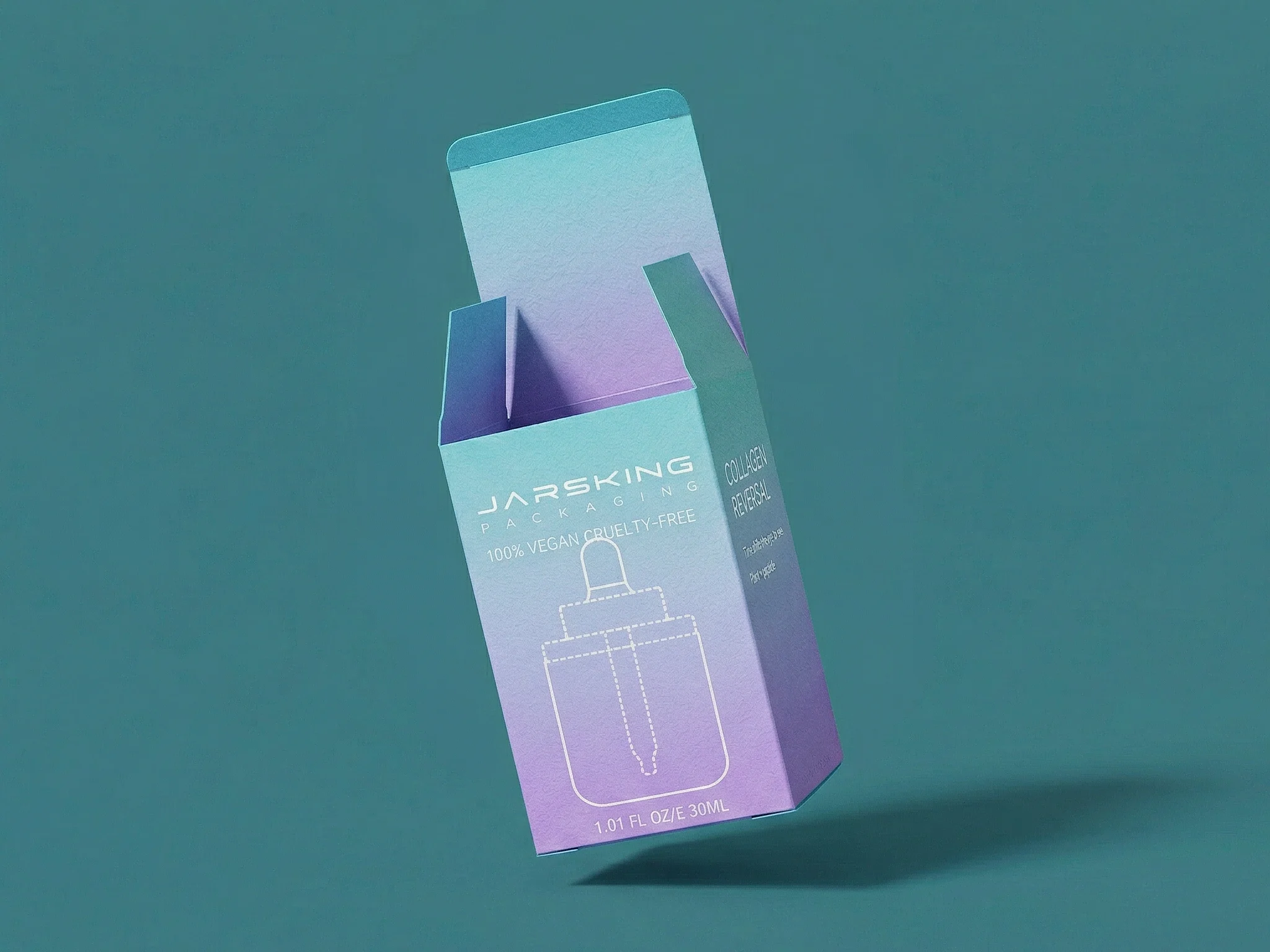
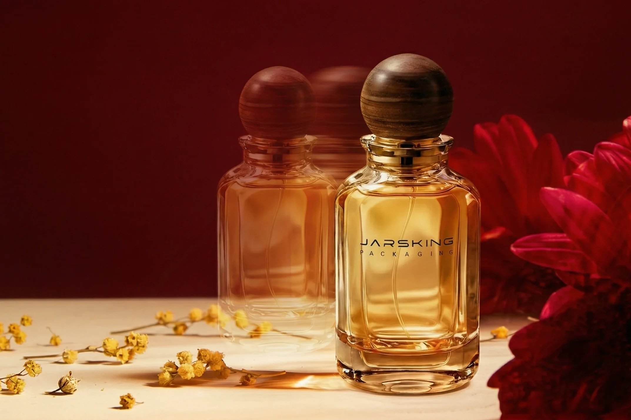
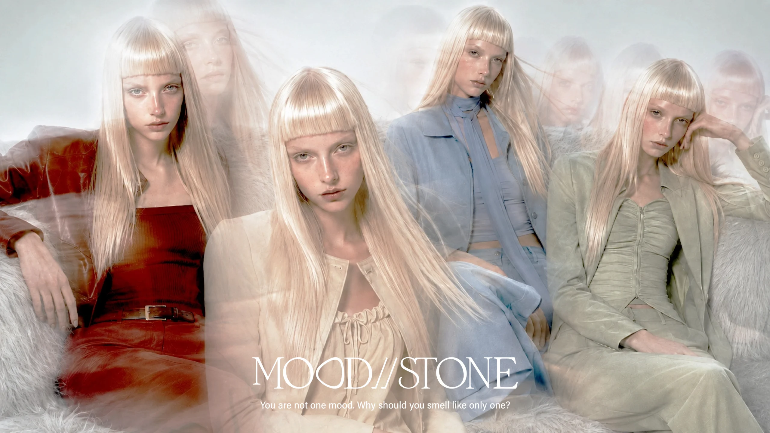
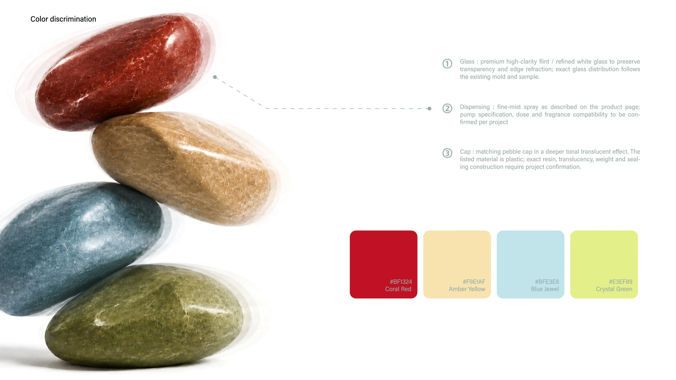
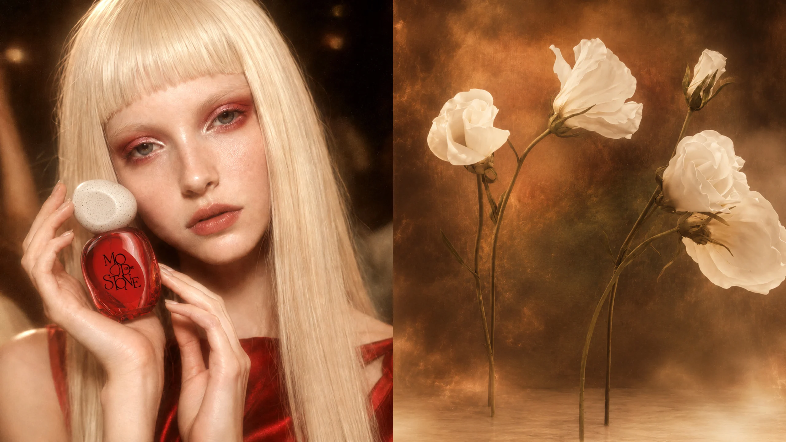
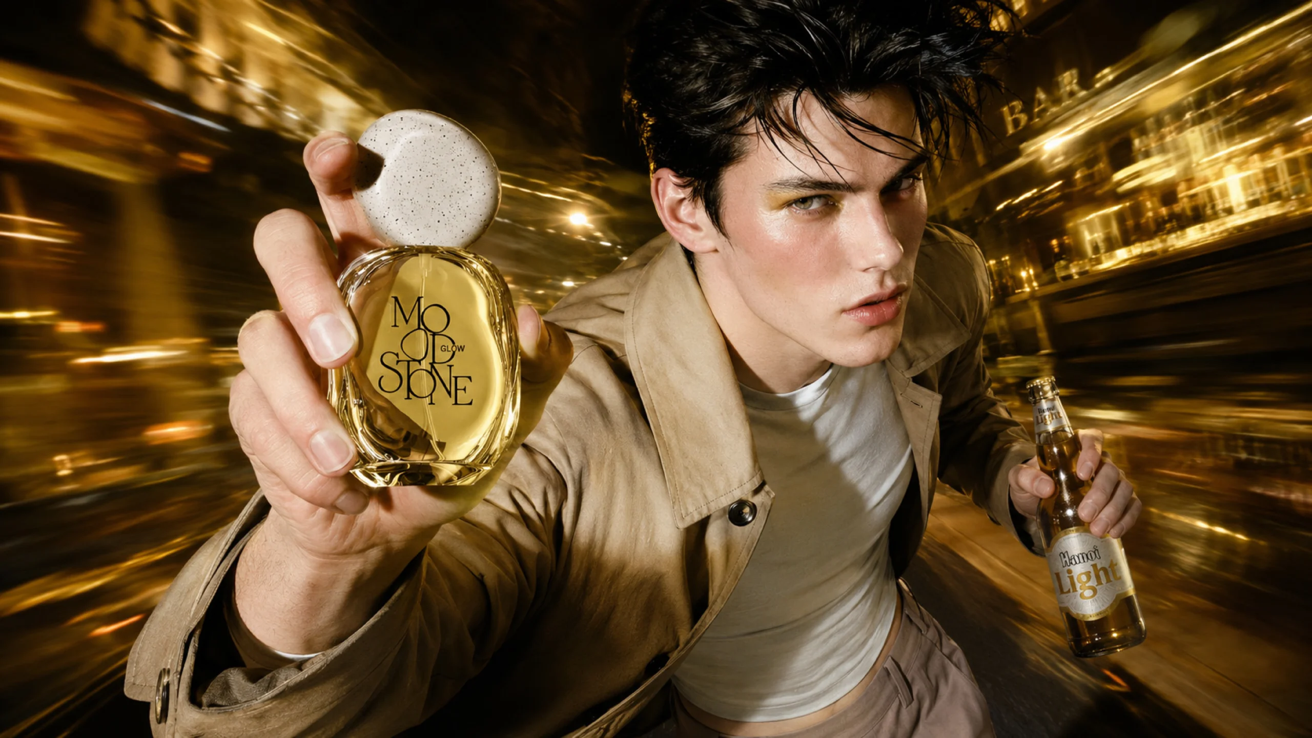
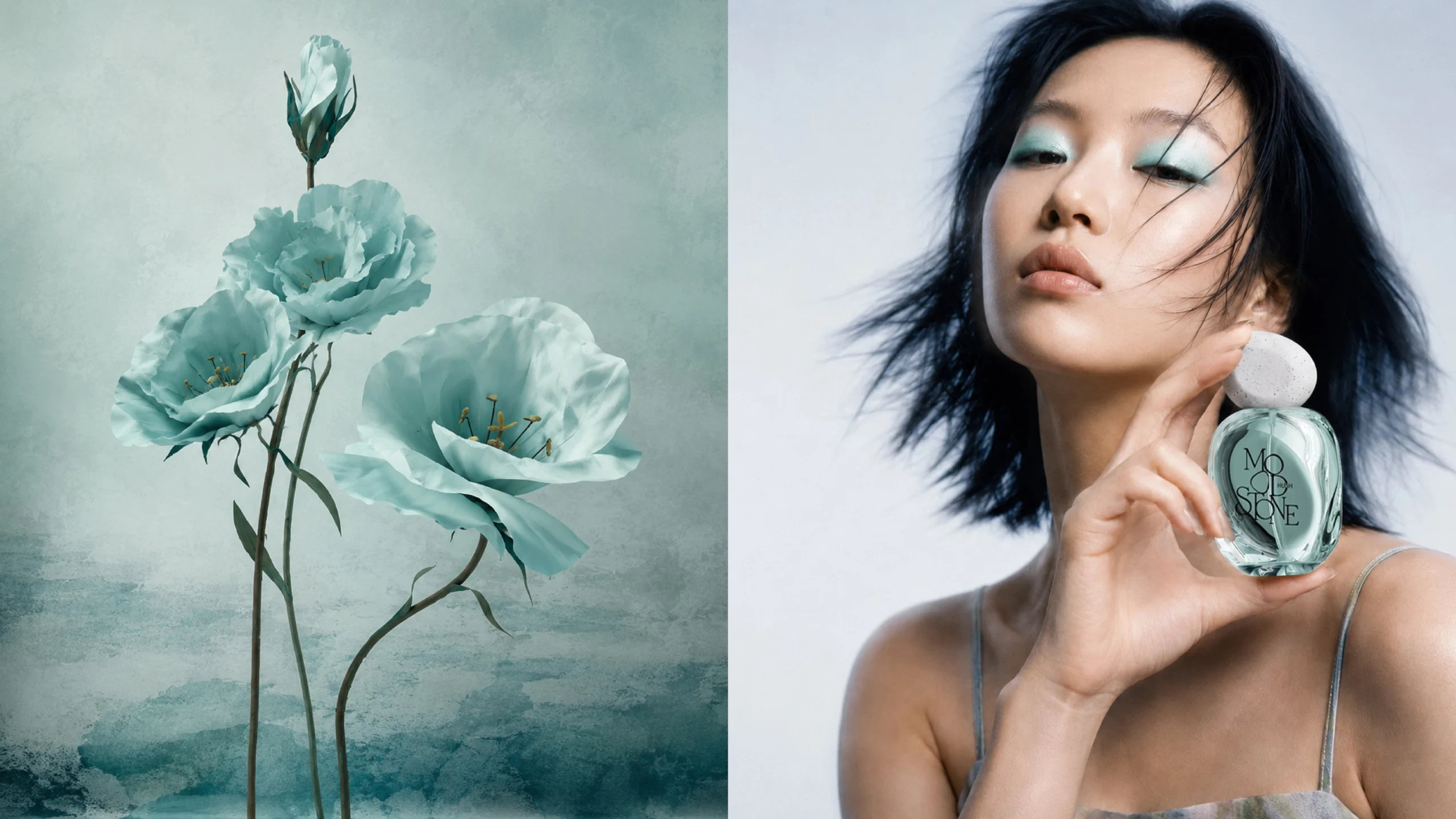
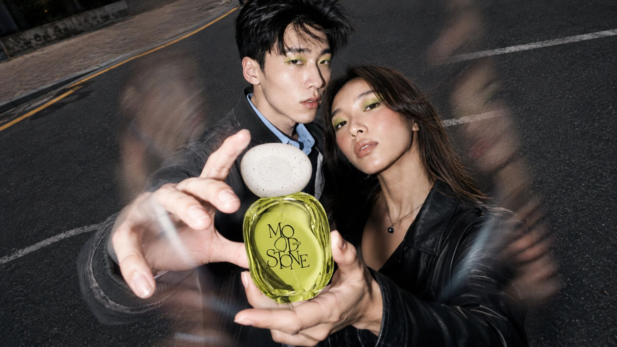
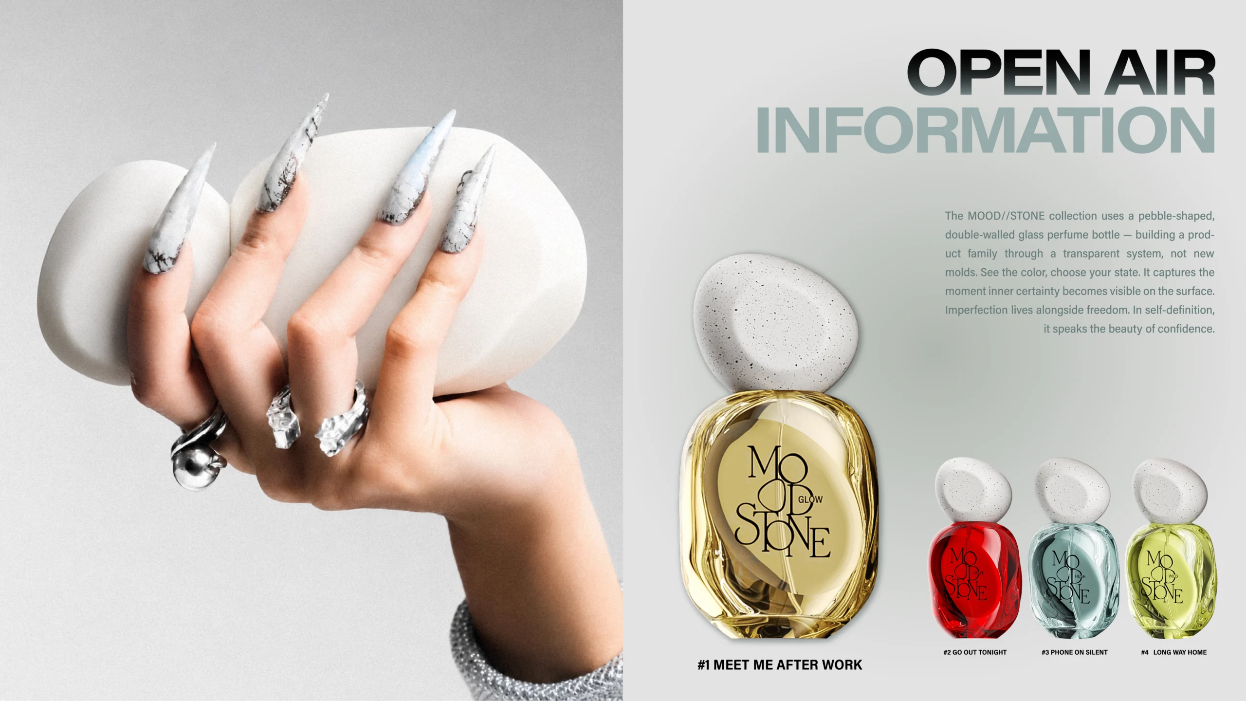
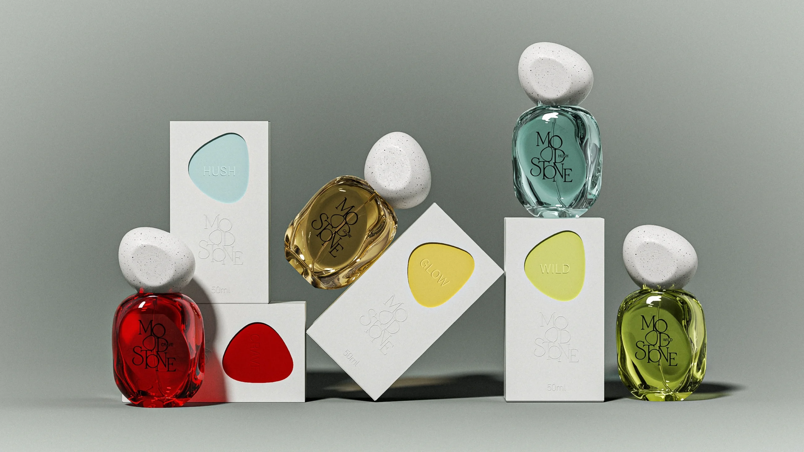
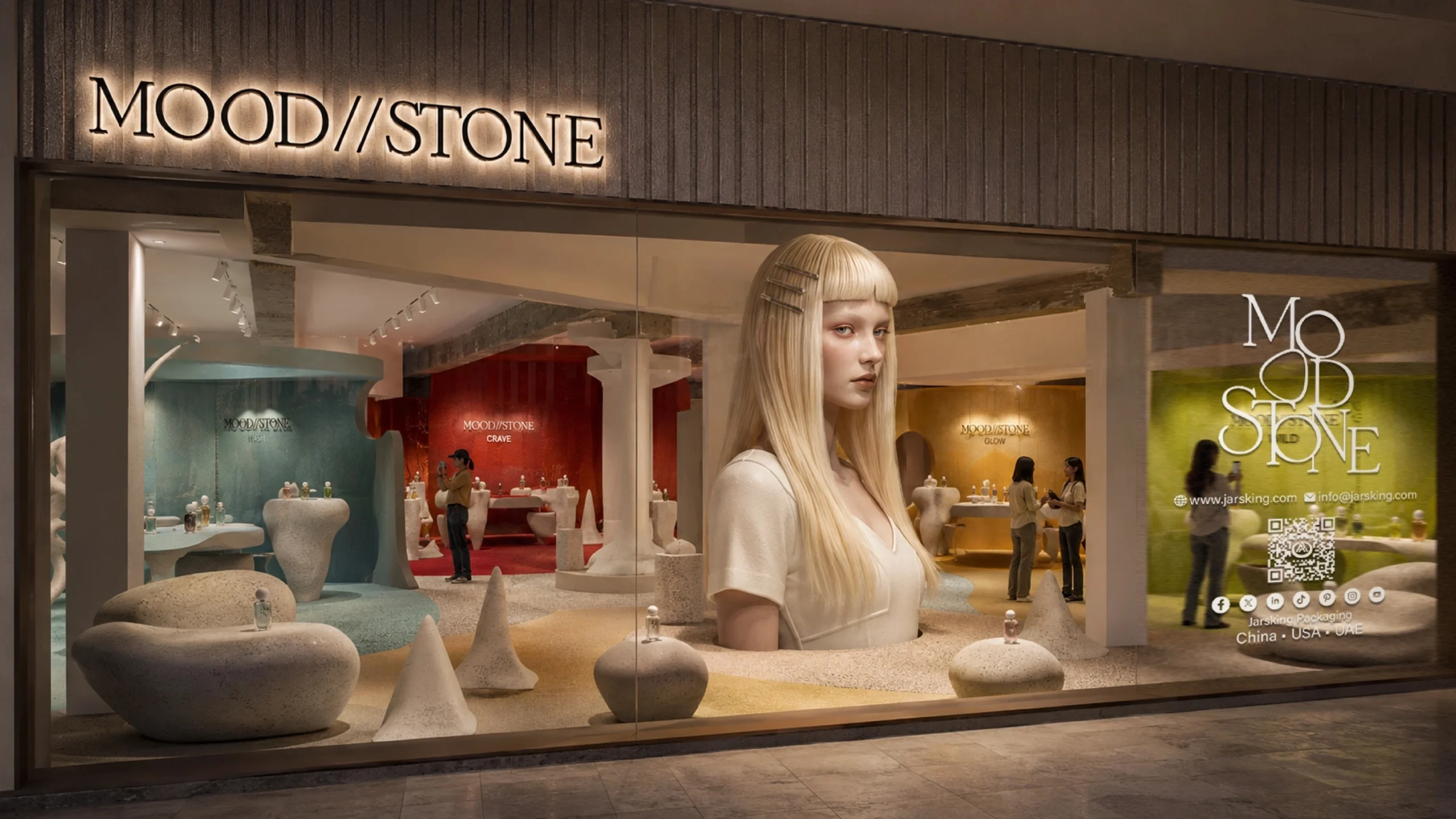
More than a store, this is a curated fragrance gallery designed to reward a slower look. The monumental portrait draws people in; sculptural pebble plinths, organic seating and curved openings lead the eye from one discovery to the next. HUSH, CRAVE, GLOW and WILD become four edited chapters rather than four products on a shelf, with color zoning helping shoppers browse, compare and find the mood that feels like theirs.
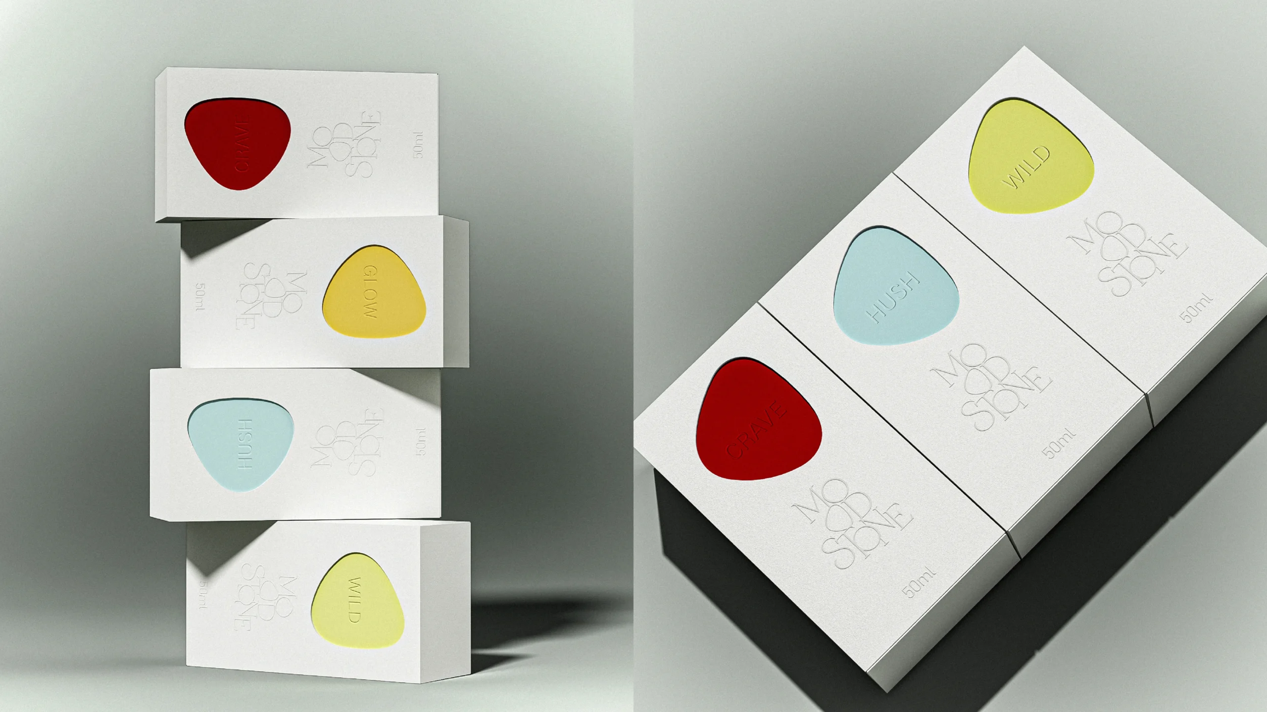
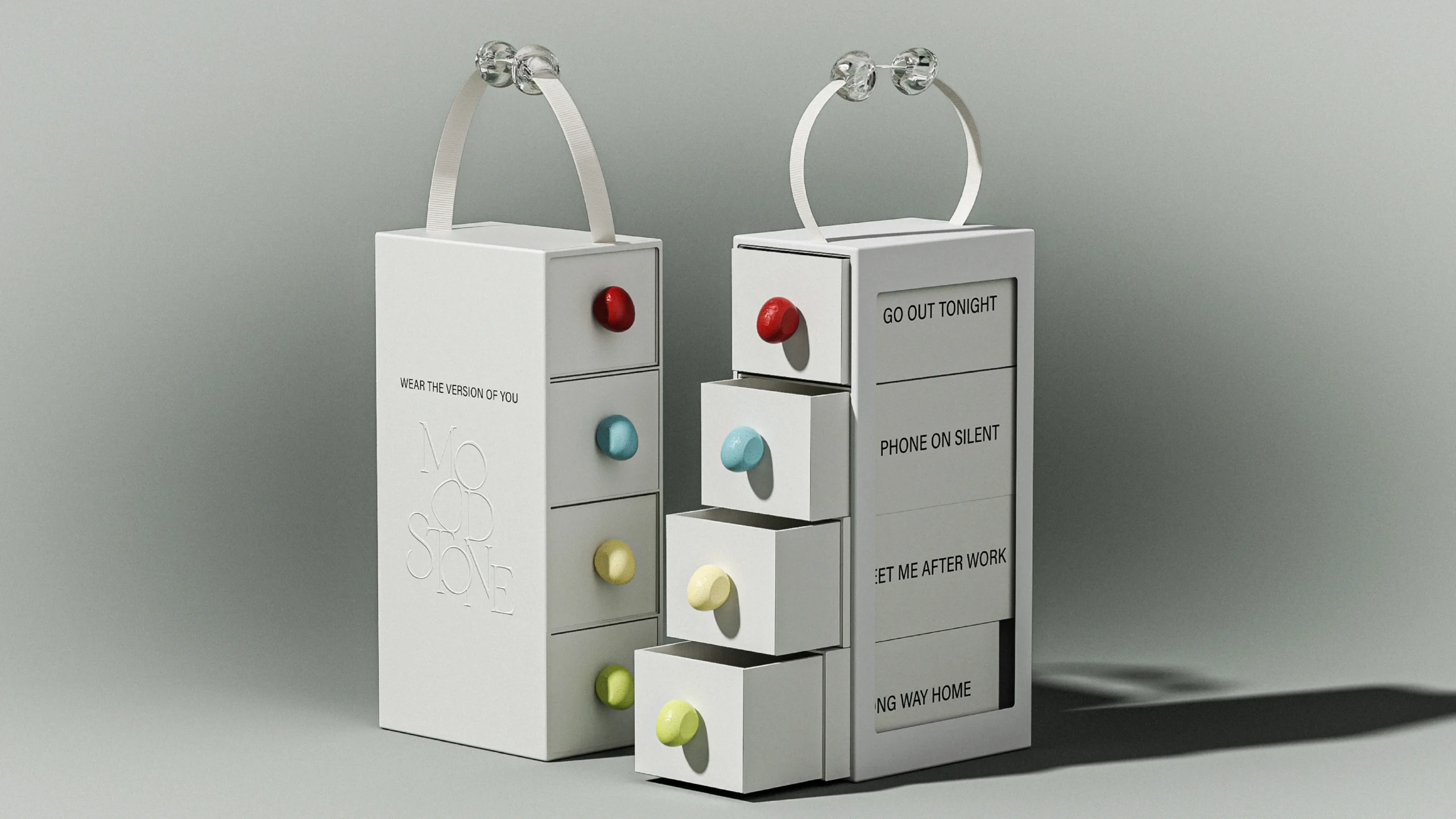
The merchandising grows directly from the packaging. The bottle curve becomes the display form, the speckled cap sets the material language, each SKU color works as a wayfinding device and the illuminated MOOD//STONE name holds every zone inside one world. Because each device repeats a packaging code rather than decorating around it, the space builds brand memory and reads as a wardrobe to browse instead of a single SKU to buy.
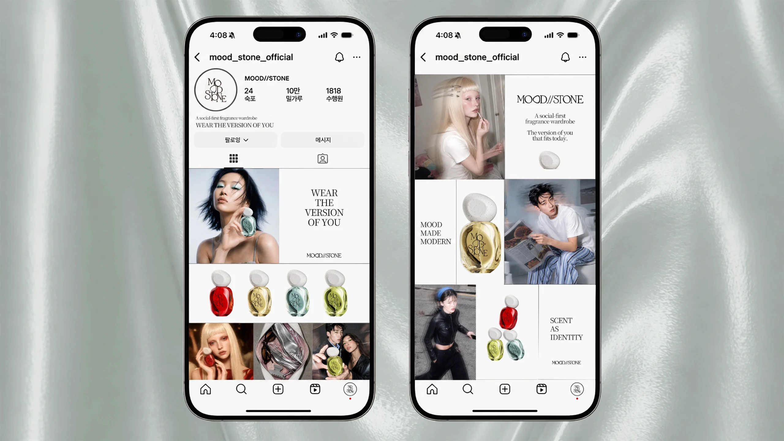
This packaging-led approach fits the current appetite for curated, immersive discovery described by McKinsey, the Fuorisalone 2026 report i TikTok Next 2026. For MOOD//STONE, the packaging is not merely stocked inside the environment; it authors the environment, giving the brand one design system that carries from bottle and carton to retail display, social content and seasonal activation.